Saturday, September 30, 2006

More info on the National Garden

Yesterday's post linked you directed to the U.S. Botanical Garden site, today I have a link to 
the Washington Post with a very good article on the National Garden.

The article goes in depth to the history of the Gardens development. There looks like a lot of
politics involved at times. here's hoping the garden turns out well. We need more culture in
our lives and great public gardens are part of that culture. 

Friday, September 29, 2006

The National Garden to open October 1st

The National Garden, plan view


This drawing shows the layout for the National Garden which is next to the United States
 Botanical Garden in Washington D. C. 

The 10 million dollar project was funded entirely with private money. From  a press release:
When the National Garden opens to the public on October 1, 2006, it will mark the successful completion of one of the first public-private projects undertaken by the Office of the Architect of the Capitol. The project was solely funded by private donations raised by The National Fund for the U.S. Botanic Garden.

This not-for-profit corporation raised $11.5 million in private contributions pursuant to Public Law 102-229. The National Garden's mission is to educate visitors about the great diversity of American plants and their importance to the environment; to help connect people to nature; and to demonstrate the relationships between plants, water, and humans.

As you can see the designers have created several different rooms each with their own separate type functions. It appears this will allow visitors to have many unique experiences as they work there way 
through the gardens. I look forward to visiting


Thursday, September 28, 2006

The Garden "above" the Hot Tub

The Garden Entry

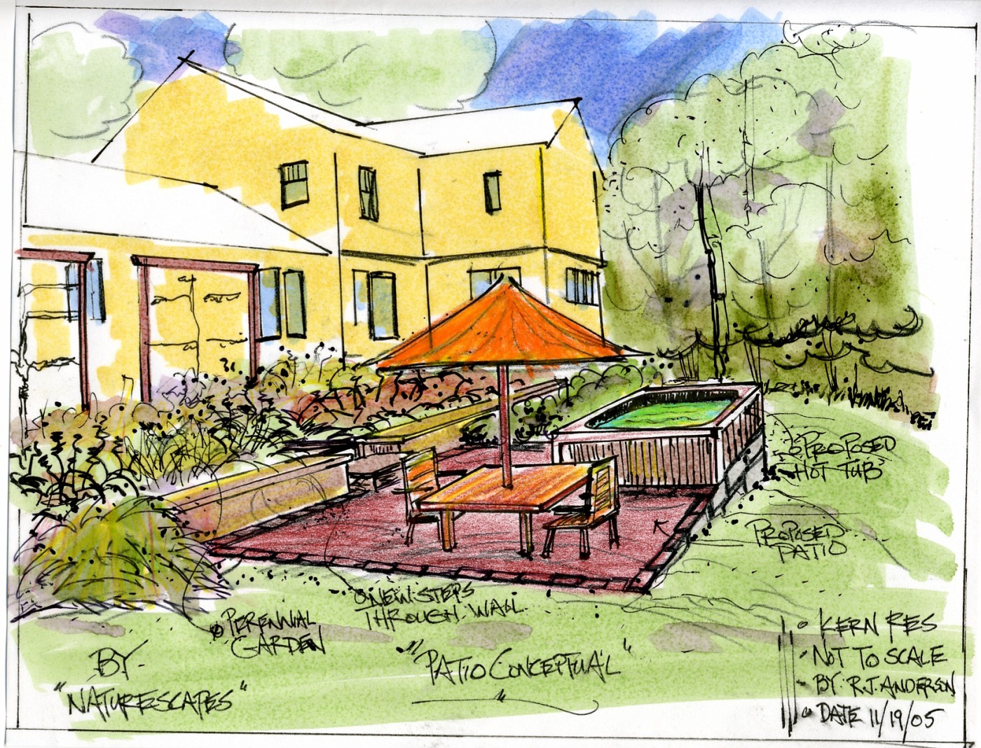
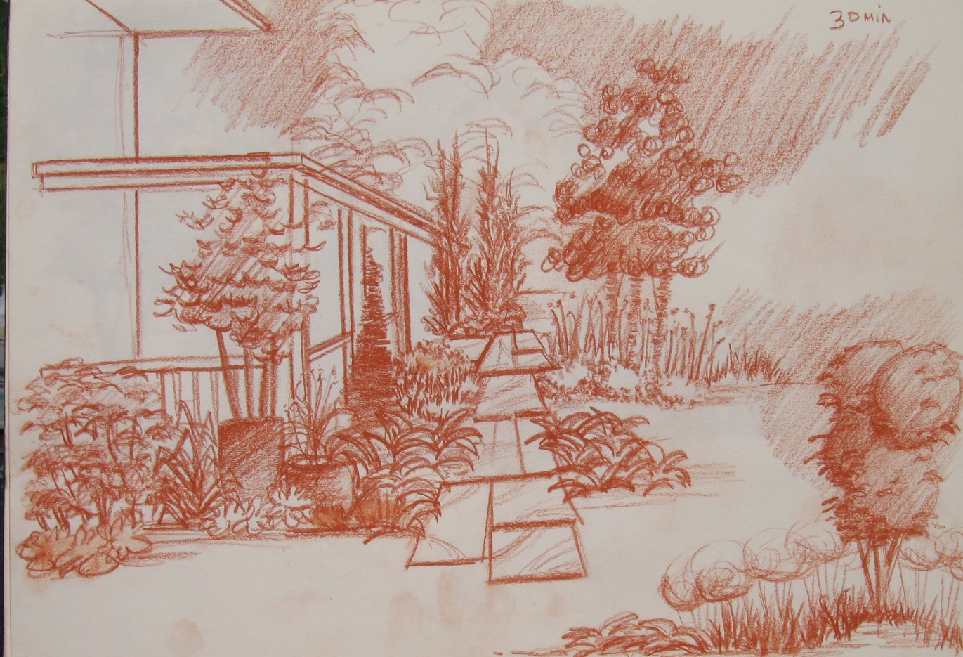
 This concept drawing was to give the homeowner an idea concerning the changes to the upper terrace. Turn the space into a perennial and cutting garden. It is the only part of the yard getting full sun through mid-day and the afternoon.

Plus it allows for a nice walk from the drive to either the back deck or new patio. A nice little pleasant walk. The trellis' are partially up on the left, the homeowner has an interest in espalliers for some apple trees.

The important thing to remember about quick concept drawings like this is to present an idea of where the space could/may go. Realize the fence doen't have to look exactly like this, of the overhead exactly like that. What is important is realize that I am suggesting a short open fence with a arbor type opening.

These quick conceptuals tell that story, and allow for homeowners to visualize their future. Or; has I have mentioned before, they may blow this idea completely out of the water. Time to go in  a different direction. Good designers usually do not have to start over because they have learned one very important thing-listening.

When a good designer listens to their clients they usually are able to come up wtih a good solution, or something very close to what the clients are looking for.

Wednesday, September 27, 2006

More on the Hot-tub

Looking from the Other Direction

 This drawing was done to show the homeowners how this would look from the other direction. This view shows the relationship between the new patio and the small retaining wall. The patio shown here really gives the viewer a better idea of its size for the new landscape.

I stayed with the square layout for the patio, becuase it plays off the square base of the hot-tub. A square patio  fits nicely with the straight lines of the short retaining wall and the straight lines of the deck.

For those of you not familar with this type of design. Straight lines, all right angles, strong squares means we are looking at Geometric design as opposed to Curvilinear or naturalistic.

Geometric must be harder to pull off because just about every landscape I see these days is some sort of wavy line-usually a weak/lazy wavy line. Which everyone likes to call naturalistic; or, "ooooh, look how natural . . . oooh"      Aaahhhh!!! Enough to drive me crazy!

Tuesday, September 26, 2006

Where does the Hot-Tub Go???

This is the Exsisting Landscape
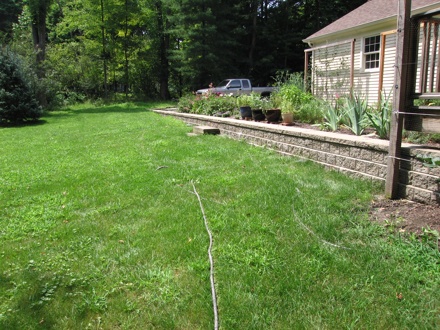
I was asked to come up with an idea for a designed space where the seating area was extended out onto the exsisting lawn, a perennial/cutting garden above the wall, and find a place for a hot-tub.

It made sense to tie the hot-tub into the deck space so there would be good solid footing to get to the tub from the house, and at the same time keep it fairly close to the house and yet be in its own space. While not infringing the patio/entertaining space.

My Version of New Landscape

Designing hot-tubs into these spaces, heck designing hot-tubs into almost any backyard . . .  is tough. They are big clunky boxes, even the best designed ones are big clunky boxes. Add in the logistical requirements needed to run hot-tubs. The electrical, plumbing, servicing, etc.

Whats even worse is most designers don't even try to add in the hot-tub in a harmonius way. Homeowners . . . forget about it, just drop the box on the patio.

The real problem is that this is usually considered something needed for a private space, but almost always is sited in the most public of spaces, sometimes right next to the picnic table or grill . . . how romantic!!! Which is the context in which most homeowners ask me to find a space for the hot-tub . . . a clam, quiet, romantic place for the husband-wife.

Where space considerations are a factor usually the best we can do is place the tub in a corner of the patio. The corner chosen should be the one where there will be the least amount of traffic or commotion. Away form the back and forth of people. Hopefully the patio will be large enough to allow for furniture and other stuff to be placed on the opposite end. Add to that landscaping that will compliment the space, and compliment the mood of the space.

A Conceptual Plan View of the Landscape Design
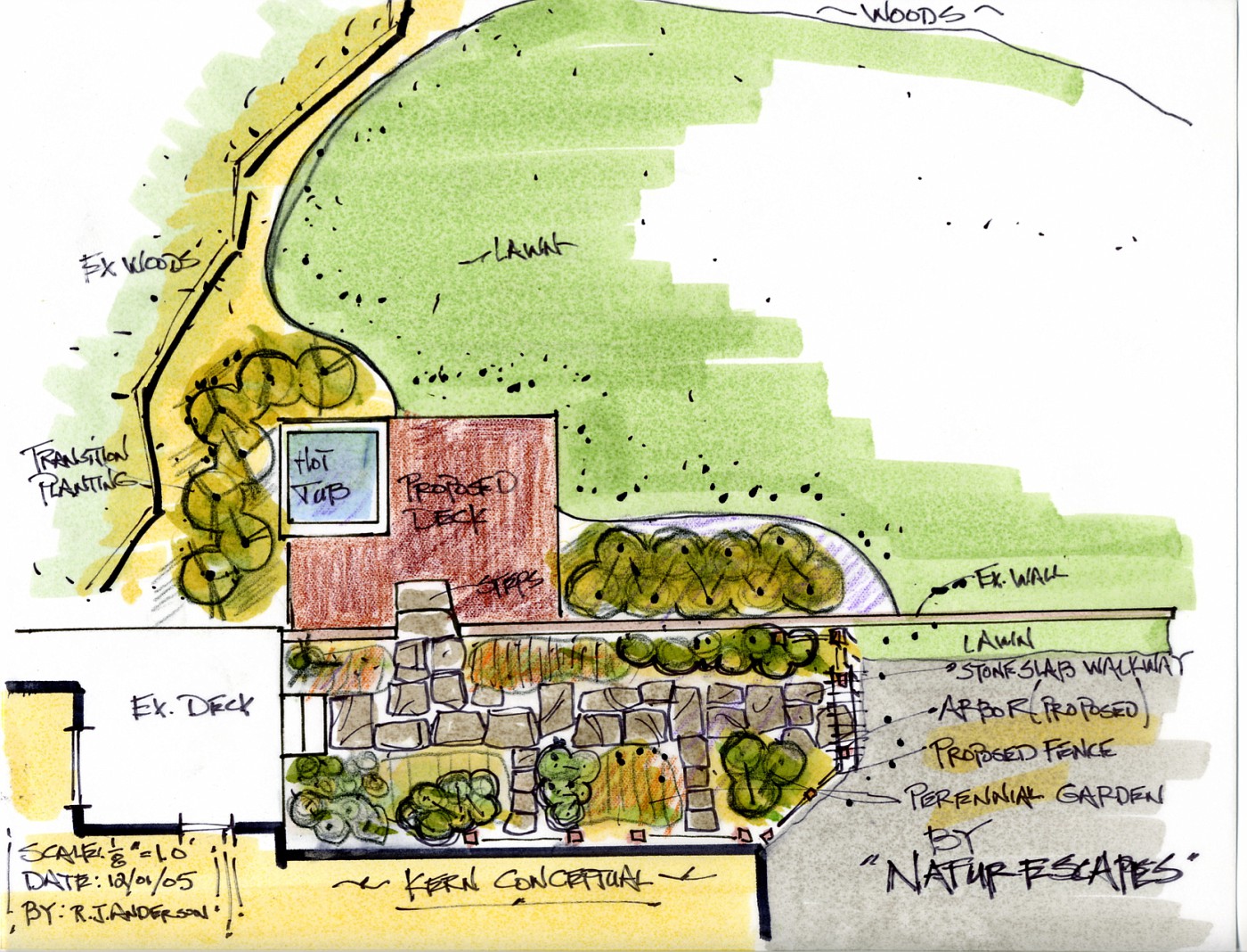
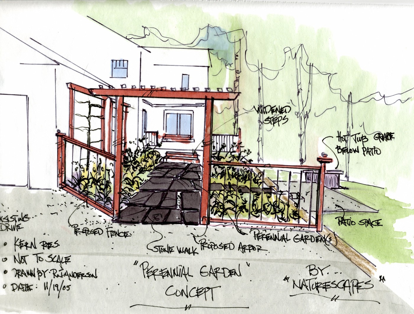
This is a plan view drawing of the same space shown in the rendering above. These conceptual drawings work together to tell the story of where this space could go.

I have spoken about this before, the plan-view drawing is how most designers/contractors present their solutions to homeowners-it doesn't work. Most Americans can't read a road map, and most people are not good at visualization. The plan-view drawing helps solve neither of these issues. Where the rendeering does solve those problems.

The solution is right in front of them, it's like the story of a picture is worth a 1,000 words. Well then, what's a rendering worth? To the homeowne? To the contractor?

The rendering shows the potential of the space, and the plan-view drawing shows the scale of the impacted space. Together they present the entire story of the space's potential.

Monday, September 25, 2006

Bloglines re-subscribe

I've noticed that I have the dreaded red exclamation mark in my Bloglines feed, plus a reader of mine was kind enough to point out the problem also; thanks Anna.

What I had done in the past was go back to the site and just re-subscribe to the url, I think that has worked for me. So what I have done this morning is to put a new Bloglines button im my sidebar for those of you using Bloglines for a news reader.

I like the Bloglines set up for going through blogs so I hope this works. This has happened to me 5 or 6 times. So I hope this works for you. The orange button leads you to the Feedburner RSS for this site and there you can choose your feed if you don't want to use Feedburner.

I guess all of dig in the dirt types need to stick together, and just struggle our way through cyberspace.

Questions, yell at me.

p.s. you can also get this sent to your mailbox, just check the box on the sidebar.

Sunday, September 24, 2006

An Appreciation of Stone 10

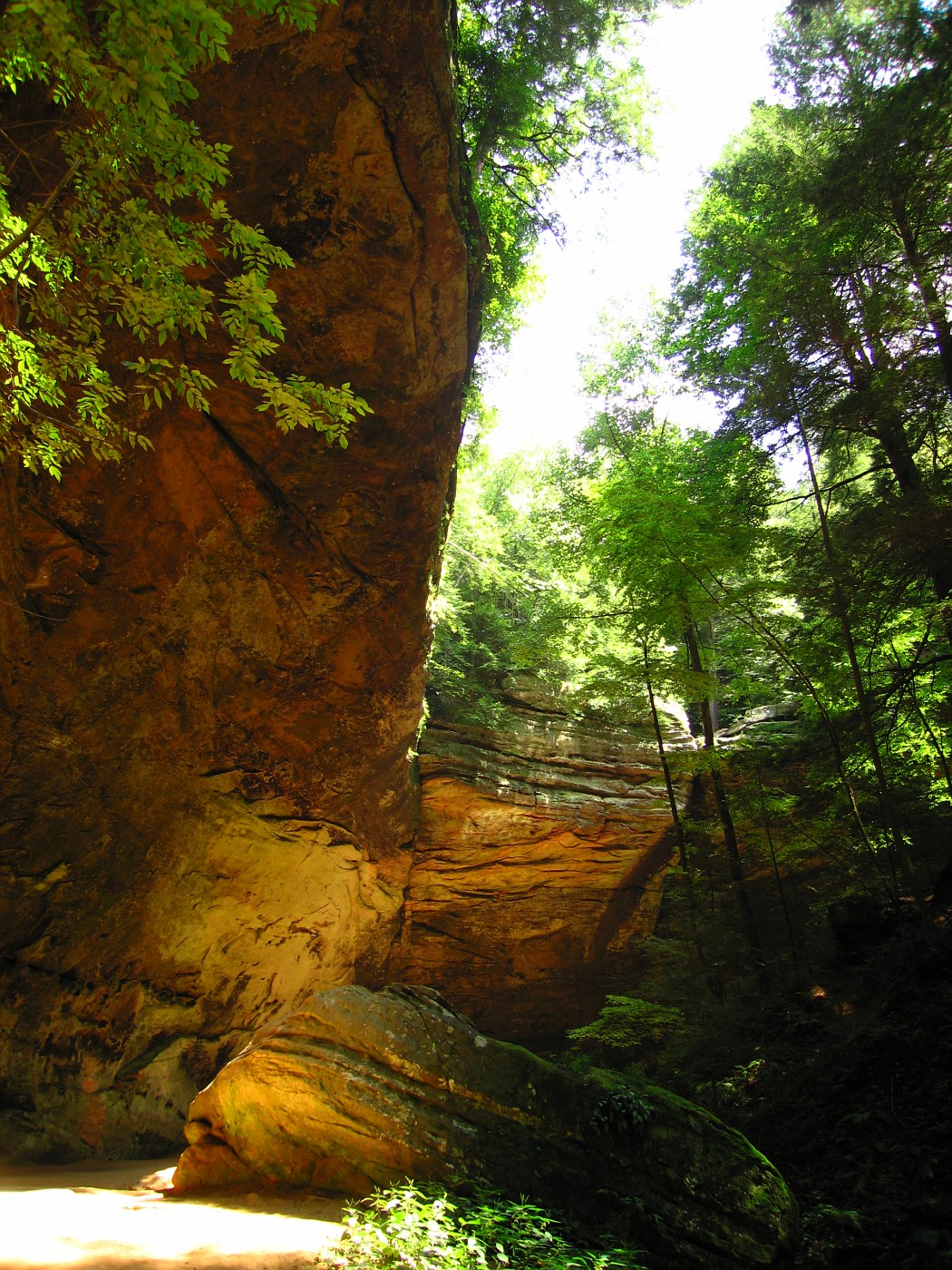
Somewhere in Southeastern Ohio

300 million plus year-old sandstone formation. The younger sandstone at the top
 is harder than that below, accounting for the awesome overhang.

I also appreciate the interplay of light and shadow, something all designers should work for.
Though we rarely get to work at this scale. From the top of the ledge to bootm of the
"hollow" is over 90 feet.

Saturday, September 23, 2006

Einstein . . . on nature


 "The most beautiful thing we can experience is the mysterious. It is the source of all true
art and science."                     -Albert Einstein
"I shall never believe that God plays dice with the World."                     -Albert Einstein

   "You and I
Are suddenly what the trees try
To tell us who we are;
That their merely being there
Means something; that soon
We may touch, love, explain."
-John Ashbery, Some Trees

Friday, September 22, 2006

Another great Link

 During the last week I had several folks stop by and drop comments on several different topics, this of course, leads you to look at their sites. One of those commenters was Alina Chau who is a illustrator and artist. And a artist she is.
 
I hope everyone takes a look at her site. Most importantly take a long look at her doodles and sketchbook
post. It shows great insight into the design process. Which every designer including yours truly needs to continually improve and adjust. They are terrific. Thanks Alina!

Someday I think I will have to host a seminar where we do nothing but lok at the design process, 
through the doodle, rough-sketch, sketchbooks, loose line way of graphic thinking. 
To my way of thinking this is where I see a lot of CAD Landscape Designers fail. 

They do no rough sketches, doodles, anything. Just straight to the layout of the house/property and right onto the landscape . . . probably having it look just like the last 10 designs. I've seen 
a lot of these designs from other LD's where it is just the same thing over and over.

At any rate go look at Alina's great work, very inspiring!!!

Woo Hoo I was #2

Well, that was short lived, at the #2 spot on the Top Gardening sites. Now that my 15 minutes
 of fame is over it's back to serious business. I never even considered all this peripheral stuff when I started. Just talk about the field of landscape design the best way I know how was/is my goal.

Thanks for stopping by.

Wednesday, September 20, 2006

Woo hoo!!! I'm #2

For reasons I still don't understand I am now up to #2 on the Top 100 Gardening Sites. So I'd like to 
thank all  of those who got me here.  Even though I've no idea how you got me here.

I realize my bump on blogger has helped so it will be interesting to see how that translates over when I go off the top 10 of the Blogger, Blogs of Note.

All that aside, I am having a good time with this and have enjoyed answering questions that you've asked me. So keep 'em coming and I'll do my best to answer them.

And remember . . . we're #2 !!! Even if Vince Lombardi dsagrees;

"There is no room for second place. There is only one place in my game and that is first place. I have finished second twice in my time at Green Bay and I never want to finish second again. "             -Vince Lombardi


Plan View Drawing

Residential Plan View


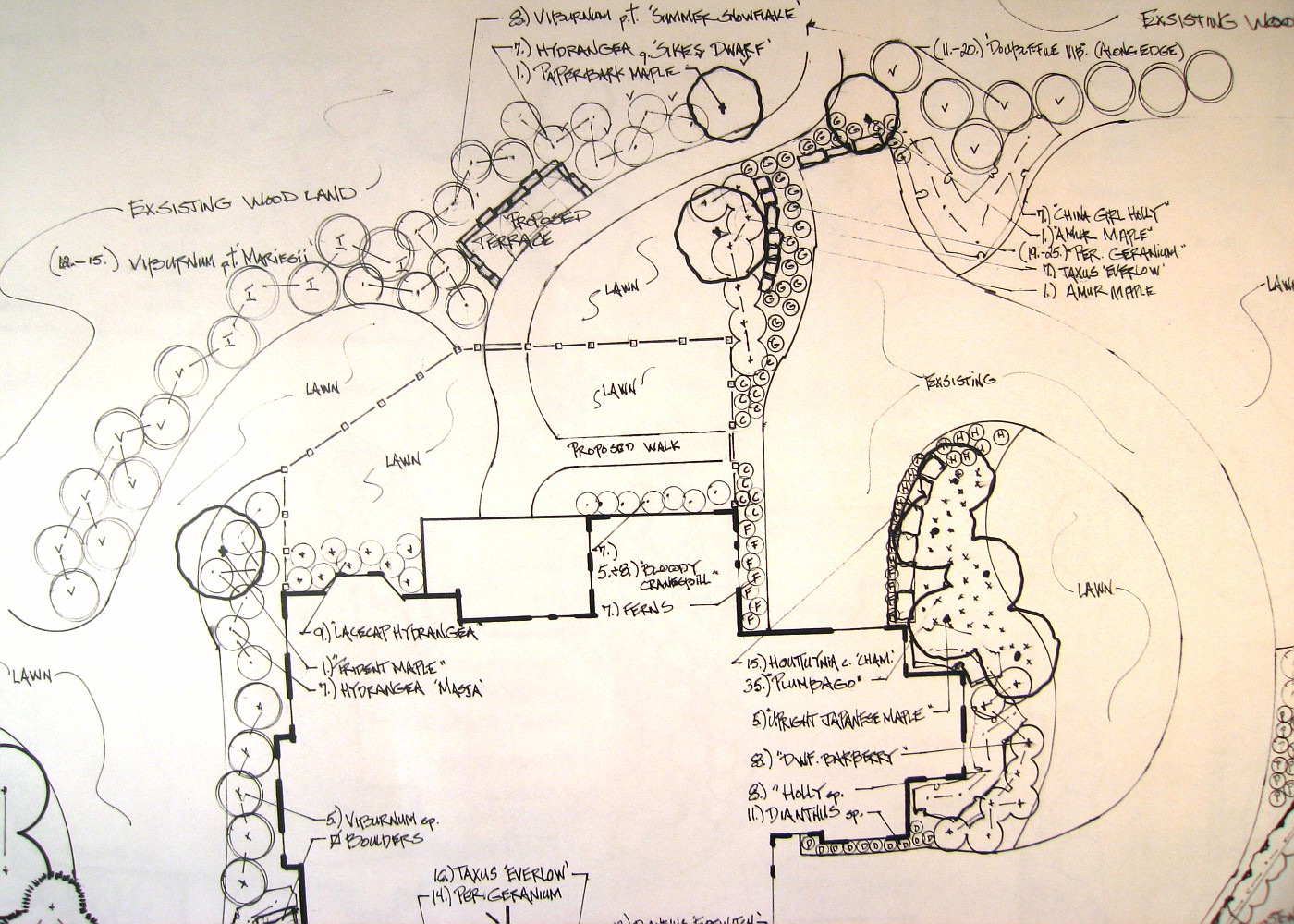
This is an example of a plan view drawing. Most in this industry call this the master plan drawing. The reasoning behind this, everything is on the plan. The hardscape layouts, fence lines, driveway, bed areas, and all plants are labelled. 

You'll notice the plants are labelled with common names instead of the botanical names. I do that with most homeowners to lessen the confusion. There may be another list made with the Latin names so there will be no confusion when it comes to the buying of plant material. Most of you know common names can cause confusion, and mis-identification of plant material.

Sometimes I will just give a plant grouping a generic label and then we will decide on the exact cultivar that will go in that area. The important thing is that I know the form, shape, size and texture of what I believe works best in that area. This way everything works with what has already been identified.

The house is a very typical upscale house in a neighborhood where most houses are priced between $400,000 and $1,000,000 down. A brick two story on a cul-de-sac. Homeowners asked for the typical stuff, asked me to figure out the drive, and to show a area for small dogs connected to the back of the house.

The atypical part is the stone terrace overlooking  the ravine and the surrounding landscape. This was a request that turned out to be the budget buster for contractor.  This and the stone wall at the end of the drive just added up to more than where the homeowner wanted to go. We tried to work out alternatives but in the end it was to no avail. The homeowner fell way back in his ambitions and went with something about $40,000 less.

The irony to this story is he still refers the contractor I worked with on this job and we have gotten a couple of nice jobs from this. Why do I show this? To show that it is important to talk about the losses along with the wins. It's just how life works.

Tuesday, September 19, 2006

So, what is a quick-cut saw???

Stihl cut-off saw


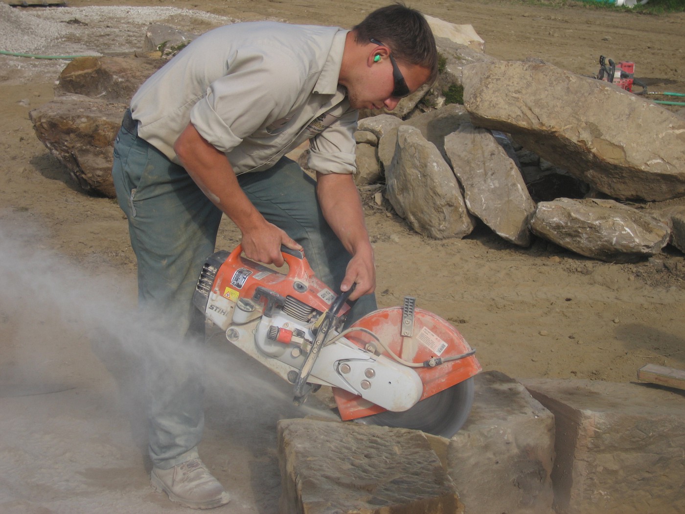
This Stihl cut-off saw is often called a "quik-kut" saw or a "quickie" saw. Guys in the trade refer to thse saws that way for an obvious reason-they're fast. They get the job done quickly and for the most part efficiently.

Stihl; of course, is not the only maker of this type of saw. There are several different manufacturers where the main difference is power and weight of the saw. 2 sizes of blades are usually avaiable for use, those being 12" or 14" circular blades. The blades are made to several different specifications to use on a wide range of materials from stone to asphalt to sewer tile.

I bring this up because of several questions I received about this saw stemming from Mondays post, and what exactly is a quik-kut saw. I am glad this happened because it allows me to post separately on what this saw is/does.

In the day, I used this saw a lot to shape and sculpt sandstone for walls and walkways, especially large slabs for walkways. Frankly the biggest drawback to this type of saw is the physical toll it takes on the human body (ouch) my lower back hurts just thinking about it. There is also the mental strain of using a tool that is so dangerous, very dangerous.

Even though these saws can be rented, I do not suggest the typical homeowner do so.You need some guidance and training to learn these saws and all their quirks. The noise, the dust, the whirling blade it's a real ass-kicker.

Negatives aside, the tool will do a lot for you, and has a lot of flexibility, but not as much as one of those new chain saws running wet (hose hook-up) with a diamond blade. If your a homeowner don't risk it with these two tools-hire the professional. Work smart, be safe.

Monday, September 18, 2006

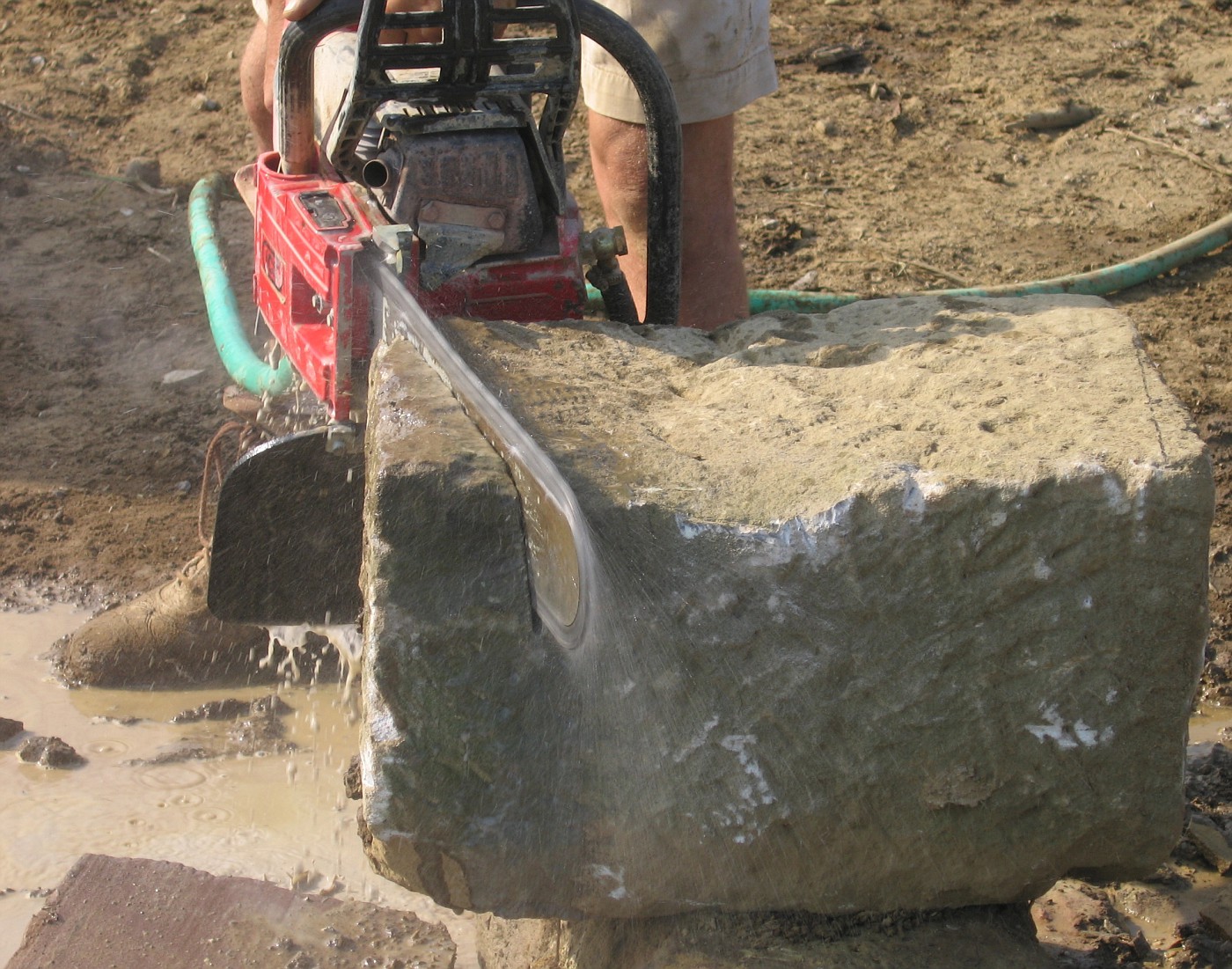
Now thats a Chain-Saw !!!

In order to get this circle . . .

The contractor was trying to get some old foundation stone circled up to create a firepit for a backyard entertaining area. Previous times we would have used a quik-cut saw with a 12" or 14" circular blade. Which would have meant more handling of the stone. Flipping this way, flipping over, etc.

Before the quik-cut saw. A tremendous amount of hand work, a lot more labor intensive, chisels and hammers pounding away to split these blocks. Time moves on and the tools get better.

You need this saw

 This is the latest and greatest in splitting stone with a high degree of accuracy. This water-fed chain saw has been available for awhile, but it has been cost prohibitive. Especially the blades/chain. Landscape contractors who invest in this technology improve their install work, increase labor time rates, and allow for a wider range of work because of this.

Rough boulder stone taken out of quarry piles can be easily edged/shaped/fitted to improve the quality of boulder wall work. I'd like to also mention this keeps the dust down when cutting sandstone which is of great benefit to the tool operator.

Another from the sketchbook

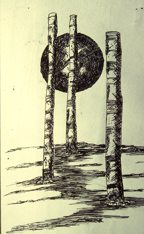
Monolith type Yard Art

Maybe someday, somewhere for somebody . . . .

Sunday, September 17, 2006

An Appreciation of Stone 9

Stones and Water

 
Yes I seem a little prejudice when it comes to stone and water. I will always feel that the most powerful element added to any designed space is water because it works on so many levels, but the element that adds a sense of permanence, and definition is stone. After all . . . look at the pyramids, they're still hanging in there.

So . . .  put these two together and you get the best of the most important elements to create a truly dynamic element/space in the garden. 4 seasons of movement, sound, light, reflection, life, and tranquility.

My goal in building any water feature like this is to attempt to leave the observer feeling as though they are looking at something that has naturally occured as opposed to man-made. If you can just sell that illusion for a little bit you have succeeded as a designer/bulder.

Saturday, September 16, 2006

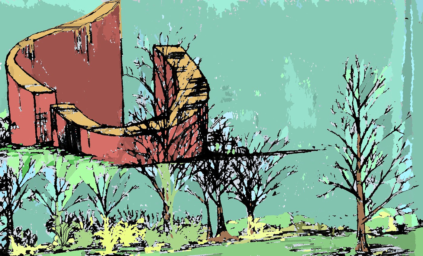
From the Sketchbook

Waterfeature

 This was a black and white line drawing I had scanned from one of my idea books, and turned into a color drawing using Paintnet. I guess what I am really doing is using several different types of mediums now when I doodle.

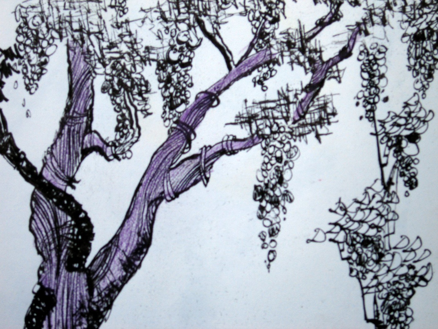
I have often talked about how important it is to doodle if you are in a creative field or endeavor.Doodling switches me into a total different mindset, and I've noticed the more I doodle-or if my doodling gets real intense-a lot of ideas begin to flow, and flow fast they do.

What's really fun; especially when it's late . . . like right now as I post this. Is that the World seems so quiet I can go with that quiet for one kind of thought process/ solution finder, or I can go totally opposite. Put on the headphones, crank up the music, and let it just rip.

I have actually reached the point where I can watch my right arm draw-very weird to watch. It's like there is some sort of dis-attachment between mind and body. I guess it's what some would call  being in the zone. Heck-in my case it may be me out of the zone.

So I think that the doodling thing . . . is good.  for many reasons:

  • To kill time.
  • To start the creative process.
  • To warm up for actual rendering/design work.
  • To find solutions in a quick, stress-free way.
  • To aggravate teachers (yes I was one of those).
  • Work with different tools . . . as in no pressure to draw with the pen/marker that a final drawing will be completed with.
  • Impress people who can only draw stick men and circle trees . . .
So there you have it, get busy doodling, it's only 10 till 3:00 AM my time.

Friday, September 15, 2006

Caladiums


 I think most good Landscape Designers love and appreciate the use of foliage . . . this is pretty good evidence why that is true.

Thursday, September 14, 2006

Landscape Rendering, and Elevational Drawing

Never Built

This was a fairly quick rendering that I have pulled out of my archives. Its dated Fall, 2002. The drawing show the possibility of a gazebo that has a stream and falls wrapped around on a hillside.

I always thought the contractor of record did a poor job of selling this job and lost it to another contractor who put in something much less substantial for almost the same amount of money. Sour grapes on my part-maybe so.

Then again maybe I could have come up with a better set of drawings to help sell the project. I know that if I were to draw this today it would be at more of an angle to the gazebo, and there would be some color thrown in .

Wednesday, September 13, 2006

Avon calling??? I think not . . .

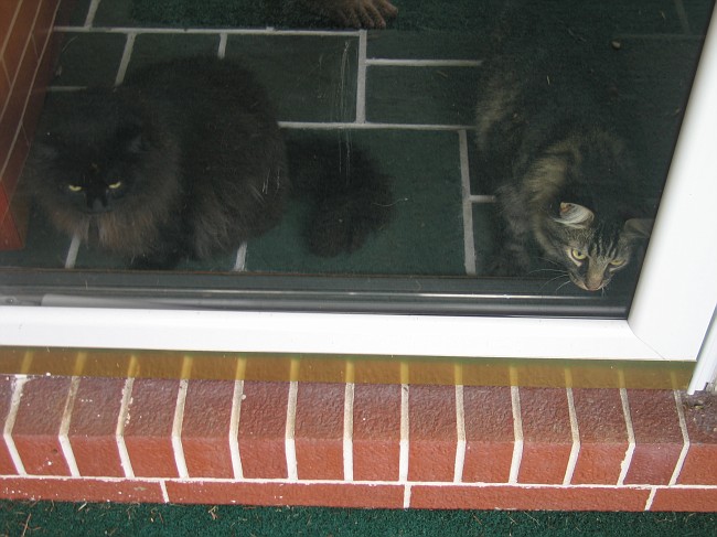
Oh Deer!

 
Well I had an unexpected caller today. "Spike" as the neighbors (all 3 0f them) are prone to calling him just showed up at the front door today. I'm not sure exactly what he wanted but he hung around for awhile, I think he was having a pretty good time. Spike wanted to come in but I didn't think it would be a good idea, besides there was some other opinion on whether or not anyone should come in.


So at the behest of others, Spike stayed outside and the gang stayed inside. Spike wandered down to the old apple tree and everything went back to normal. Well at least, what passes for normal in our part of the World.

What does this have to do with Landscape Design? Not much, but it does have everything to do with the World we live in, and our respect for nature. Which has everything to do with Landscape Design. Enjoy the day.

"Twisted"


 "An intelligent man is sometimes forced to be drunk to spend time with his fools."
 -Ernest Hemingway

"When the going gets weird, the weird turn pro"           -Hunter S. Thompson (1937-2005)

"Ever notice that 'What the hell' is always the right decision?"               --Marilyn Monroe

"24 hours in a day, 24 beers in a case. Coincidence? I think not."            -Stephen Wright

"You can lead a horticulture but you can't make her think."                   -Dorothy Parker

"I feel sorry for people who don't drink. When they wake up in the morning,
that's as good as they're going to feel all day. "                                               -Frank Sinatra

Tuesday, September 12, 2006

Subscribing to the WCI Blog !!!

 Now that you've been here and looked at all my great stuff . . . I know you'll be back! Well I am trying to make it easier for you to do that. On the sidebar you can click on one of the two chiclets to subscribe to the feed-thats one way.

The other is just below that on the sidebar. You can now get all this great stuff right in your e-mail. Thats right the Whispering Crane Institute straight to your mailbox . . . over your morning coffee. What could be simpler???

The way I understand how this works (remember, I've spent most of my life digging in the dirt) is that if your e-mail allows for HTML you will be able to see images, if you are set up for plain text only you will not see the images. So there you have it.

I am really enjoying be able to share my work with all of you who stop by and keep stopping by. I truly love this profession. It is one of those that really changes the World in a positive way. We fix problems, add beauty, tranquility and serenity to many peoples lives. I can never see myself retiring from this profession/career-after all it really isn't what I consider work. I am lucky and I hope I never forget how lucky I really am.

Monday, September 11, 2006

Color Rendering of Entry

Final Color Rendering for Presentation

This is the drawing that will be presented at the next meeting. There is still a little detail to add to finish it out. Hopefully to make it jump off the page just a little more. The previous post on Sept. 5th, and Sept. 9th were the steps before this drawing.

By showing those very simple conceptuals we were able to grasp where the client wanted to go with the entry, the wow feeling they were after. By putting in the time on these presentation drawings a few things will happen. The excitement level has been; and continues to build, for the clients. This will allow the contractor to put together a dynamic proposal to install the work at a higher number than what was originally discussed. The drawing will also be used as a sales tool  by the client to get others involved and also be used as a marketing tool until the landscape can be installed.

I should point out that this is not the entire drawing-this is a cropped copy of a digital image shot with a camera looking down over the table.  So you are not seeing the entire drawing.

If you're interested the are a lot more before shots of this project here. I believe most of the rough conceptual drawings and a lot of cropped images of the larger drawings are there also.

If everything goes well here the next big decision will be to decide on the height of the falls, and to start to get into specifics on the plant material. As you can see by the drawing we are in agreement on the form and spread of the shrubs-now we need to match based on the desired effect and the scene we are trying to create.

More on Yesterdays Post

The Circle in Winter

 
I've often talked about how much I appreciate the way water looks in the wintertime and how the liquid flow of the water cuts through the clean white snow.

Before I had designed my 1st firepit in this style I did spend some time contemplating how this would look in the winter- after all it's where we live, we have to deal with the snow, and should appreciate the change of the season. Unfortunately that is something that a lot of Landscape Designers fail to do, and that's too bad because in most of the country(World) we have 4 distinct seasons and all  4 seasons should be planned for. Besides . . . Fred would have done the same thing.

An aside; I had not contemplated the owner adding a bowl to the center of the firepit. She added this brass bowl to burn small fires in. Does it take away from the natural feel of the space-maybe. However you look at it,any Designer should remember we work for the client. Our job is to work with them, using our knowledge,  the cultural concerns of the site, and the clients wishes, dreams, desires for their landscape.

And celebrate all that nature has to offer us.

Sunday, September 10, 2006

An Appreciation of Stone 8

Firepit; Rick Anderson style.

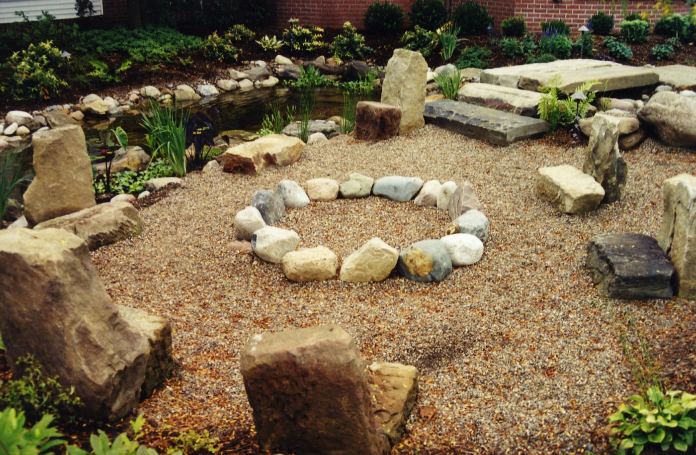
This is a firepit area I designed for a client, my thought process was simple here: What if Fred Flintstone was a Landscape Designer?

Thats how I came up with the stone seating for the circle, a ring of stones for the fireplace, and of course a stone bridge over the stream spilling into the pond. This was only a couple of weeks after completion and thats why everything still looks so pristine.

The seats are recycled from old barn foundation stone and I think they add a real sense of permanence here. A couple of great things about stone seats:

  • They never need painted.
  • No need to bring them in during the winter.
  • Guaranteed not to rust.
  • A heavy person cannot break them.
  • Almost impossible to steal !!!

Top 100 Gardening Sites

 Still feeling appreciative about being noticed as a Blog of Note, I just noticed that my rating in the Top 100 Gardening Sites has jumped up pretty high- to #6. I am sure this is  attributed to the big bump from Blogger traffic.

To those of you who come and fins something of interest great. I will keep plugging away talking about the great outdoors and the designed spaces that we live in, or want to live in. I hope you come back. Questions-shoot me an e-mail as it seems most questions come to me this way, or feel free to leave a comment.

Saturday, September 09, 2006

Color Renderings and Plan View Conceptual

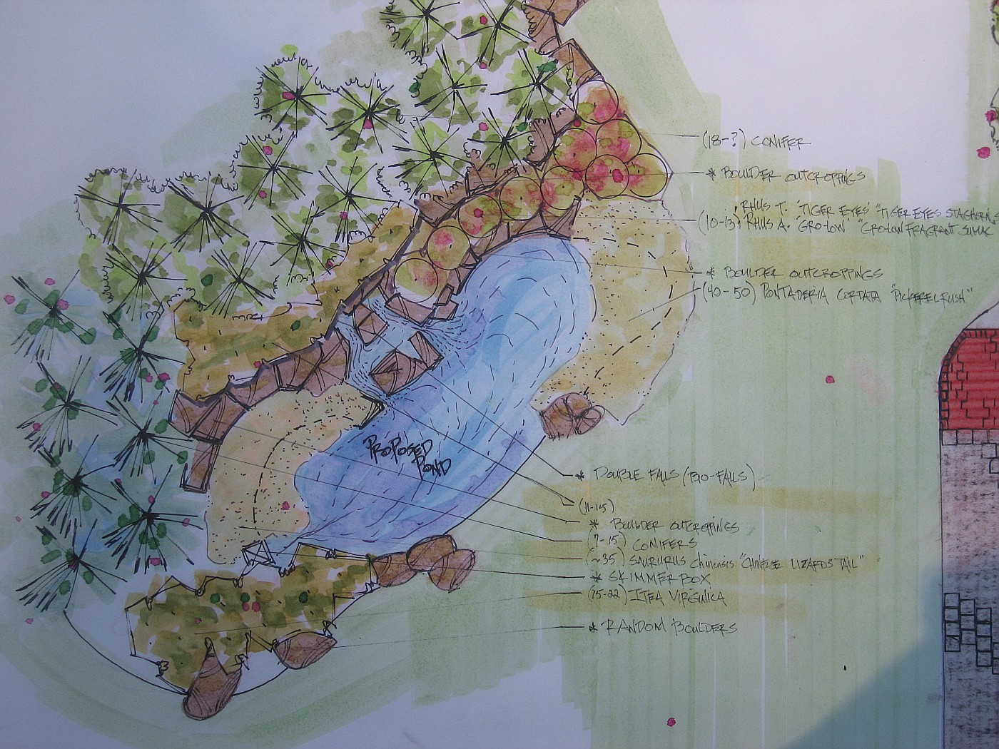
Plan view of the Pond


This shows the lagoon-pond area in plan view. The backdrop of the conifers, and some of the surrounding plant material, including the aquatics that flow from the pond out on the edges of the banks of the pond.

The drawing also shows the relationship of this area to the actual entryway, and the space involved for the area to flow together. The hillside for the falls will have to be made and the the backdrop of conifers will be added to sell the illusion of a natural waterfall.


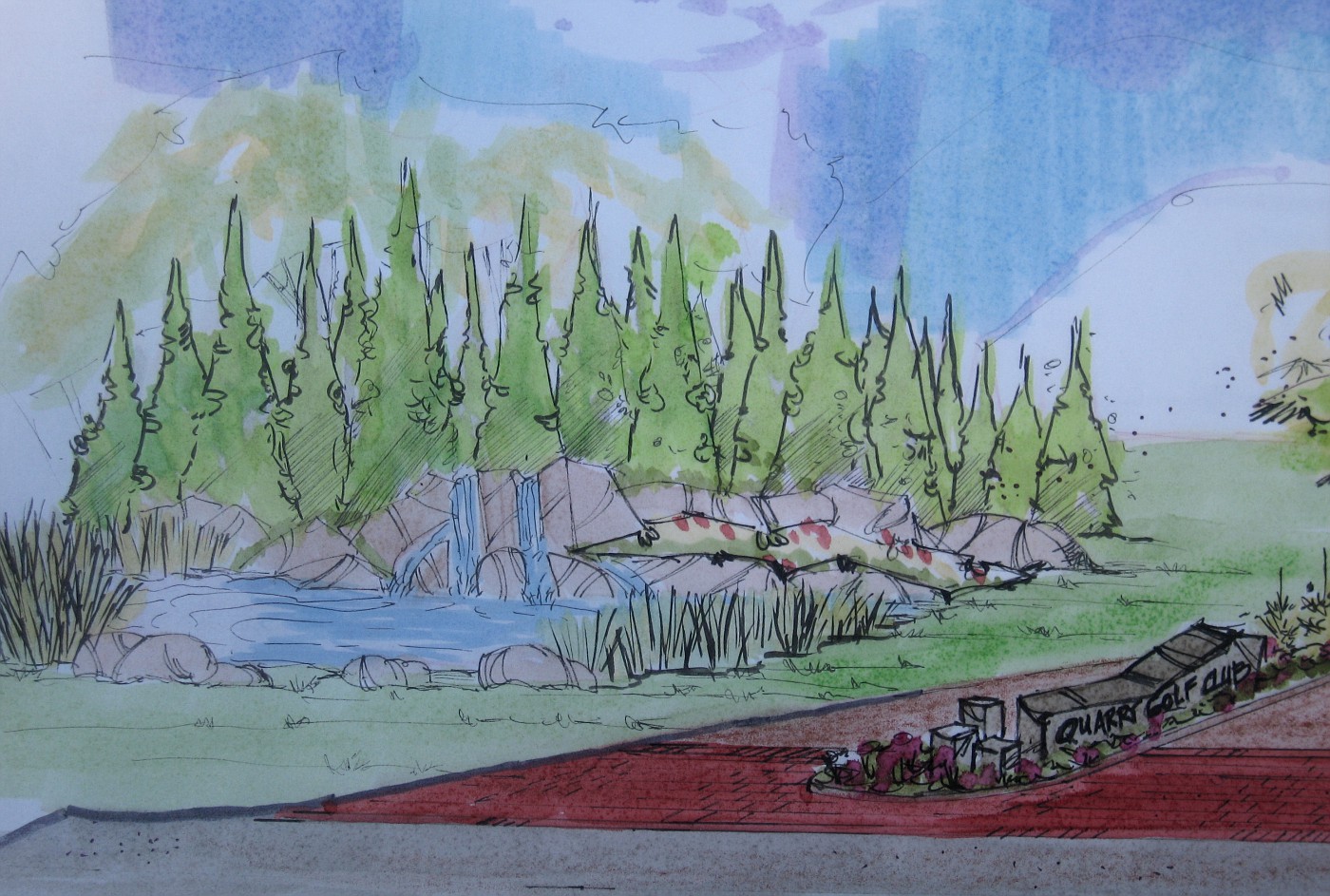
Rendering of Entry and Pond


This is the follow-up to the September 5th entry on the Blog. This is part of a larger drawing that will be shown to the clients to give them an idea of the entire picture for the possibilities on what the entrance could be.

The big difference in this drawing is to show a larger number of conifers for the backdrop. This was a specific client request after seeing the initial concept drawings for the entry.

Friday, September 08, 2006

Thoughts from Others.


"As soon as you talk to someone about an idea you have-they're going to dilute it."
-Leonardo DaVinci

"Go to the pine if you want to know the pine." -Basho

"A lie can travel halfway around the World, before truth can even tie its shoes."
-Mark Twain

Thursday, September 07, 2006

Wow! all I can say is wow!

Possibilities

The Blogger Team as posted me up as their latest Blogs of Note. Thank you. I'm not sure what to say. I started this to pass along info to those in my profession who were looking for more on Landscape Design. I will continue to do so as long as I have any interest in this profession.

When you consider all the things, philosophies, news, stories, tech stuff, etc. out there in Blog World, that the profession of Landscape Design would be considered in this way-well you've made my day. Thank you again.

To those of you who keep coming back, keep e-mailing me, asking questions, or calling me. Thanks for your support. I appreciate it very much and I will continue to try and make this a site for great information on the World of Landscape Design and all the surrounding elements of this profession.

The drawing is titled possibilities because as Landscape Designers we do 2 things 1st and foremost:

  1. Solve problems: people/clients call us because they need us to remedy a bad situation and make something great happen.
  2. Possibilities: A good designer can take an average space/yard; whatever, and turn it into something great, something worthwhile-we improve the quality of peoples lives. Its a great feeling.

Tuesday, September 05, 2006

The Entryway

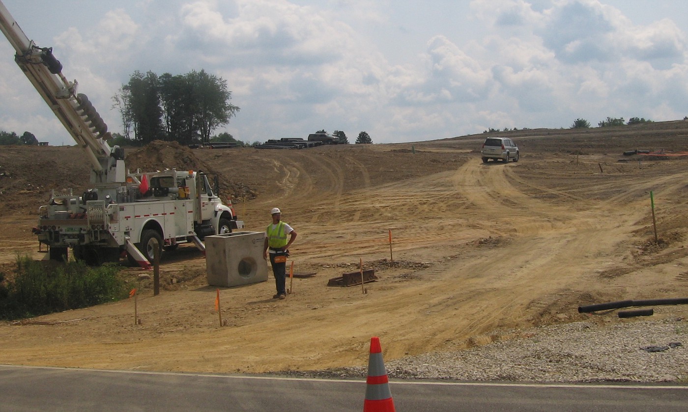
The Before Shot

The stakes in the middle of the drive are where I was told the island would be placed, plus I was given a Engineered drawing of how the lanes would be laid out and their dimensions.

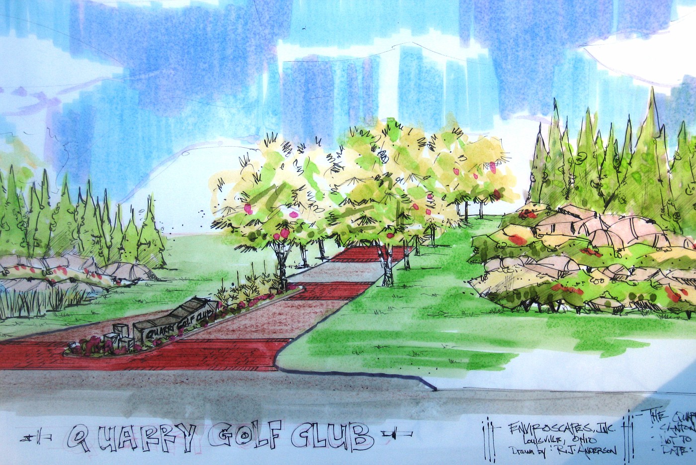
I was asked to come up with a sign for the island and show how some of the surrounding landscape could possibly look.

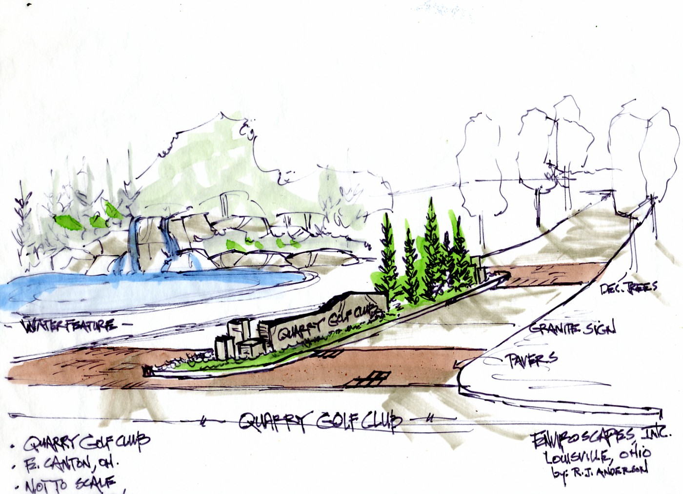
The Rendering

 So this is the initial color rendering of what I see happening in this area. This has been shown to the client and I am re-working drawings right now to show where we are looking at possible final solutions. for the entryway.

A cnage in the apron, a slight change in the brick strips, an additional paving surface, and a fleshing out of the landscape along the way up the hill.

Monday, September 04, 2006

Hydrangea Madness

The Hybridizers have been working overtime on creating new and improved cultivars of Hydrangeas and there
are some really nice cultivars out there. In todays NYTimes a nice article on the newest happenings in the world
of Hydrangeas.

Heres a good follow-up article in the trade from the Oregon Nursery Association

As I look around I do not see any slowing down here of the trend to find ways to add more Hydrangeas to the landscape. Spectacular colors and color form, large flowers, great for cutting, a variety of sizes, added fall interest, ease of growing. This is where the hybridizers are going.

A link to the American Hydrangea Society.

Finally this is a site from an amateur grower who really loves Hydrangeas, what makes it great is her obvious enthusiasm.

Crikey!

One of my favorite TV personalities was killed yesterday. Steve Irwin the Crocodile Hunter was killed filming a underwater documentary by a stingray. I guess this is the way you suppose a guy like this would go out, but with to small children 8 and 3 it is a real shame.

I will always appreciate his championing of the environment and the rights of animals. Here's to you Steve you were a true original.

Sunday, September 03, 2006

An Appreciation of Stone 7

Stone, Water and Winter

 
This is more than an image of stone this week but it combines that stone with water to show my favorite part of nature-stone and water.

Plus I have always loved the look of open, running water during the winter. Going all the way back to the days of the small creek that ran through my backyard. The water babbling on down through the watercourse, the ice forming at the edges, and the banks covered in clean white snow.