Friday, June 30, 2006

Sandstone Slabs


Here's a few shots thrown together of a few projects that I had put together with some sandstone.

The bench in the upper-right is a sandstone called Tennessee Web-wall. I guess the locals have named it as such because the striking rings of mineral elements in the sandstone look like webbing. I've not use any in a few years and it looks to be in short supply from what I was told.

The other 2 shots are of the same stone being used in simple sculptural elements in the garden. An attempt to add a vertical element with some 4 season interest.

The lower right is some pieces added to a Children's Garden for the AHS in Alexandria, Virginia back in the mid-90's. I've no idea if my stuff is still there, moved, tossed, just no idea . . .

Anyway; it's good to look back once and awhile-to measure how far we have come, and how far we have-yet to go. Posted by Picasa

Thursday, June 29, 2006

Sketchbook sampler

 
Just a little something from the sketchbook. I guess you would call it doodle time. Posted by Picasa

Tuesday, June 27, 2006

Concept Drawing leads to project


Patio, lower landing area, and stone courtyard combined with space to add a spa bring together everything you need for a dynamic outdoor space. These elements are all show in collaboration with each other in this rendering. The clients were very happy with this layout and the only real changes will be to expand the upper area directly next to the house.

On the design it reads at/about 11 ft. They wish to push that out to 14ft., this also means the roof line will be pushed out almost as far. (Look at the dahed line on the plan-roof line). It was decided this expansion would not take away any other space involved in the layout.

This project is also exciting because of the fact the materials will be almost 100 percent stone. Old Foundation Stone used for walls, and large slabs of sandstone for the patio and the walks.

Finally; unlike a certain TV show on a certain TV network, unrealistic demands/desires/wishes were not asked for with an equally unrealistic budget. Clients knew they were going to get into some expense in such an elaborate project. A great working arrangement all the way around.

I've said/written this before, if the Designer "LISTENS" and I mean listens . .. . to the client, to the site, and to the own experience. Good things will happen.

Monday, June 26, 2006

Doodling a Landscape Rendering

 
This was the simple black line drawing before anything was done.
 
Rendering after adding some color pencil, decided to just fool around with pencils this morning, and not soak up any fumes from markers. I don't really like to render in pencil only, I use pencils to enhance the marker work done for presentations. For me I hae not been able to make the pencil work come alive.

I have seen artist who are great with colored pencil; but for me personally I cannot justify the time to make that type of drawing for for a landscape rendering.
 
Here is my completed color pencil drawing. This is just a simple design based on the pergola/seating area that I had been working on last week. The difference here is that I am showing different scenarios for columns.
 
Paint.NET was used to color this drawing. I had scanned the black and white drawing in and the fooled around with the program to come up with this rendering. There are a lot of effects in the software, and you have to ability to layer in, so this could look a lot different with some depth and dimension added, but I haven't been able to put in the time yet.

Paint.net was made to help manipulate photo's and I would be able to render right over the images I take,(creating a before and after)and manipulate that way. Right now it is a case of I am committed to work on making my hand-drawn renderings better. More depth, more dimension, more jump off the page.

Paint.net is fun to play with, and I will continue to do so. I have no real desire to learn more advanced/complicated software for drawing. Nor do I want to get into one of those software programs that "image" landscapes.

I guess you could say I am "old-school" and I intend to stay that way. Posted by Picasa

Sunday, June 25, 2006

Land+Living Network

On the 22nd James Lippincott from Land+Living.com gave me a shout out in his "Clippings" area. I would like to thank James and at the same time suggest you take a look at their site.

They look at any; and all sorts of design-no matter the field. Design is design. Land+Living will track it down.

I had been going there for quite some time, and had sent him a note telling him so. He was gracious enough to ask for my address to take a look here.

Next thing I know he's got me up in the Clippings section. James; thanks again. To my readers if/when you have a chance take a look over there-it's some good stuff.

Been a few days . . .

I have actually not seen a computer since Thursday, I had been camping for a few days, so I had been away from posting-obviously.

Tomorrow I find out how some of my other presentation drawings worked out and will share that info here.

Thursday, June 22, 2006

Conceptual for Campus Entry


More on this later. Conceptual shows more of a Boulevard look for the campus. Right now it is a simple two-lane road, parallel parking on one side, pull-in parking on the other.

The trees lining the street would also be new additions.

Opera vs IE, My Personal Browser War

I have done some tweaking to my sidebar, and made a slight change in the overall layout to the site. After doing this I looked at how this page displays in both IE and Opera (which is the browser I use almost 100%).

As a Designer I am amazed at the differences. Mainly how much cleaner my page looks in Opera and how everything lines up so well on the sidebar. It's very clean, much like my preference in how I design a lot of Landscapes.

I have not looked at the page in Firefox and would welcome any feedback from someone who has.

A question I have for someone familiar with this type of blog (Blogger) How do I get rid of those division lines at the bottom of the sidebar??? Also small buttons started to show up on some of my list on the sidebar (this is in IE only)how do I get rid of those?

At any rate I will stick with Opera and hope those of you who drop in on IE are not too inconvenienced. if you're having problems drop me an e-mail. Thanks.

Wednesday, June 21, 2006

"Further"Pergola Study, a Color Rendering

Rendering above was done with Paint.NET which I spoke about on the 19th. It was done in this style so I could e-mail a color conceptual to the contractor enabling them to easily identify the different areas in the landscape. This rendering was/is never meant to be used as a tool in the face-to-face dialogue between myself and the final client.


The large hand-drawn (17x24)above is meant to be used as a tool to open dialogue between the client, and contractor. (I also posted on this same area on the 15th and 16th of this month.) My job will be to listen and observe. Find a way to hear what the client really wants.

They had asked to turn this parking area (right now this is all asphalt), into a place to gather before and after events, and to be used during the school week for everyday functions as part of the Campus Center.

The large columns mimic columns on the front of the building, the smaller background columns play off a gathering space on the other side of building. The pergola covers about 30% of the area with tables/chairs/planters etc. This area will have a paver floor throughout.

The area showing shrubs, lawn, and trees is also asphalt. It will also allow for gathering, create some nice green space and the trees will act as a separator between drive and pavilion. The canopy will also provide screening for the large amount of HVAC on the roof of the building.

The area to the left will also be re-landscaped to hide the service area and dumpsters.
All in all, quite a challenge. I'm sure there will be changes to the above 'Landscape Concept', hopefully it is a good jumping off point.

Posted by Picasa

Tuesday, June 20, 2006

Sphere, searching for blogs.

Just wanted to make a mention of this web site. Sphere has listed me as one of the most relevant blogs for "Landscape Design". A big thanks from me, as my little presence continues to grow on the WWW.

I will continue to try and bring relevant info on design to this site, especially in the work that I am doing. I will also try and remember to keep some more of the "trash" drawings, scan them in, and post them here. Enabling you to see the process I am going through to get to the final product/design/rendering.

I had never seen enough of the "process" in past seminars, symposium, lectures, workshops, etc., I had been to, and I feel that is important to show-"the process" through the working drawings. I am sure that will be lots more on this.

Monday, June 19, 2006

More on the Entrance, from yesterday.

I usually do all my thinking on just black line drawings-usually just a Sharpie, red line pencil, or blue lead pencil. Those are my thinking tools. In this case I needed to throw in a little quick color and send this to the contractor of record.

So I opened up this rough plan view drawing in Paint.NET which is a handy little software deal that is free. I am assuming it is mostly used as a imaging editor, but I have used it for a lot of things. Including preparing images for Powerpoint presentations.

This is more along the line of how I think on paper, trying to come up with solutions for the space. The idea behind this 30/60 degree walkway is to create a more "dynamic" entrance into the building. Using plantings that will enhance and compliment the site, and add some seating for those that wish to linger.
A really rough sketch, this may have been one of my 1st ones-these are the ones done on cheap tracing paper and usually hit the trashcan, no one, and I mean no one ever sees these. Uhh, well . . . except you guys. This rendering is also based on the 30/60 theme.
Another for the trash can. This is the 1st of many for an entrance with several areas for seating. I would/did overlay several more sheets of trace and play/manipulate with this for awhile if I liked the way the "idea" was working. Posted by Picasa

Sunday, June 18, 2006

Rendering for Administrative Entrance

I don't know, I just don't know . . . . . what really doesn't work for me is the drawing perspective vs. what I see in my head. I think this would be a nice unique design but this angle and most of the others I have drawn from any rendering type just don't show it.

The walkway is at a 30 degree angle to the face of the bldg. All angles are at either 30 degrees or 60 degrees from bldg. front and/or sidewalk, which is running parallel to the bldg. and 64 feet from building to sidewalk.

There'll be more on this as I take several other looks at this predicament in the next few days.

An aside . . . this is a photograph of a drawing (explains weird discoloration) the drawing is actually 17x27.

Another aside, not sure about how my 2 types of ornamental grasses rendered out-what do you think??? Posted by Picasa

Friday, June 16, 2006

Further Pergola study

Another rendering of the site-before any labeling. This is at an angle further back than yesterday's post. Also no embellishment, dots doo-dads etc. Looks strange without those final little marks to make a presentation drawing.
I will probably present this in the initial meeting-because we are in the exploratory stage. Not the stage were we have ideas we feel so strongly about . . . we need to show big time graphic presentation.

Some call this type of drawing axonometric (I believe). Taken off plan view it shows a pretty good idea of how a lot of vertical elements might play out in the designed space. Posted by Picasa

Thursday, June 15, 2006

Rendering to find solutions in Landscape Design

This is after several attempts at where to start the uprights for the pergola system. This is to act as an entryway into the courtyard of an outdoor seating area and cafeteria, it's also close to the football field and other venues so it will be used for pre/post game get-togethers.
This area right now is all asphalt and my proposal will get rid of all of that. This greenspace will act as a buffer between the drive and courtyard, soften the remaining asphalt/structure. and hopefully become a gathering space in its own right. soft berms to sit or lay back on-like a mini-park hopefully.
A little further along, just throwing in some green to help further evaluate the space. Tomorrow I will draw in the uprights a little tighter once I get spacing.

These 3 drawings were all done off the same before image that I had taken during my initial site evaluation and walk-through of the project(s). So they are not to "scale" but are correct proportionally/ratio wise.

No entourage-I'm still in the thinking stage and at any time may sink the whole idea. So there seems no need to add people or stuff. Unless I wanted to practice drawing those items (I need the practice, but skipping them anyway). After all that's what these renderings are for-to work through the process of finding a way to create great space(s). Posted by Picasa

Wednesday, June 14, 2006

A Quick Illustration

On the left are examples of planting directly on top of the berm and the effect this has on the planting. The scheme on the right has plantings spaced out going up the side of the berm and up on to the top of the "ridge".

Hey, for me, my money is on the right side. I just like that look more. It feels more naturalistic in the setting we have created. It's looser, more free flowing while still giving definition to the space.

In those case where the planting is all along the ridge line the feeling is that of a shopping mall, or hiding a parking lot (or dumpster), or a sub-division. You know . . . "hey! lets build a big berm, steep sides, and throw some pines on the top to hide all these - whatever's".

I would like to see more of this, and while we're at it . . . please-use more than one type of plant. Let's see some variety, some spice, some pizazz! And, oh by the way, let's keep a monoculture from killing all of the plantings at one time.

This doesn't even get into spacing, flow, rhythm, etc. Just hoping to get others to look at the use of the entire berm instead of just the ridge line. Posted by Picasa

Tuesday, June 13, 2006

More on the Dozer, and the mounds

It's great to be able to get a dozer out on the site to move a lot of soil-quickly. Some of these operators are so skilled at moving soil, leveling off, prepping for drainage, etc. That when a job comes along where there are some rolling mounds involved and some interest in the topography-real interest. They are excited about the challenge(s) ahead.
The key is to create the rolling interest and at the same time make sure the berms appear differently from other viewpoints. To remove an uniformity to the berm height, width, and depth. Also, none of this burial mound lookk where the whole length of the mound is same in height and width.

We also want to stay away from the cliche of planting trees directly on the top(s) of the mound, have no lawn roll onto or over the mound, and the sides be so steep they look totally out of place.

When the lawn starts to come in I will repost this shot and the new lawn shot together, to give you an idea how this came out. Posted by Picasa

Monday, June 12, 2006

Conceptual drawings: Plan View vs. Rendering

This is the plan view drawing for a project from a couple of yrs. ago. This was done after the drawing below was presented to the client. Here I am trying to show; in scale, how everything relates in this space. Patio, bridge, stream, pond, waterfalls, firepit, and plantings.


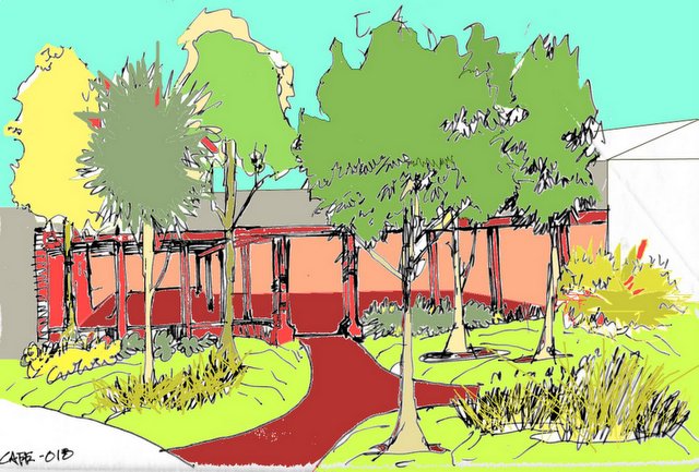
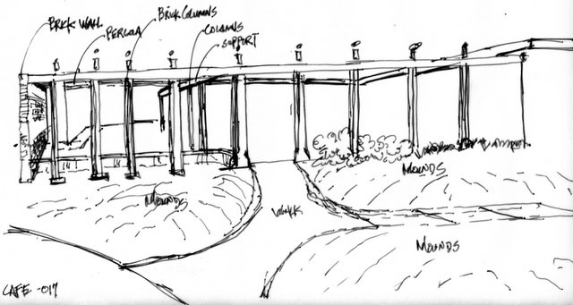
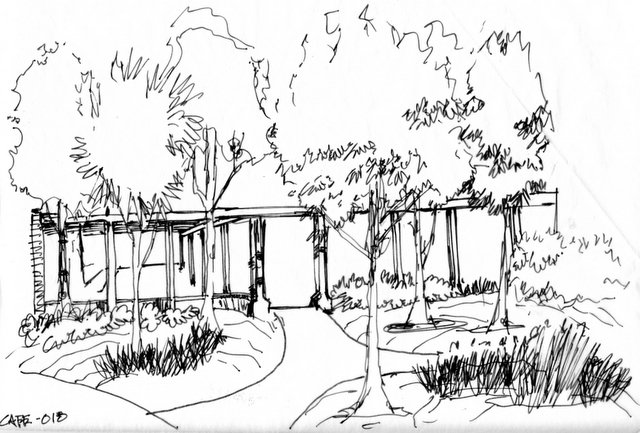
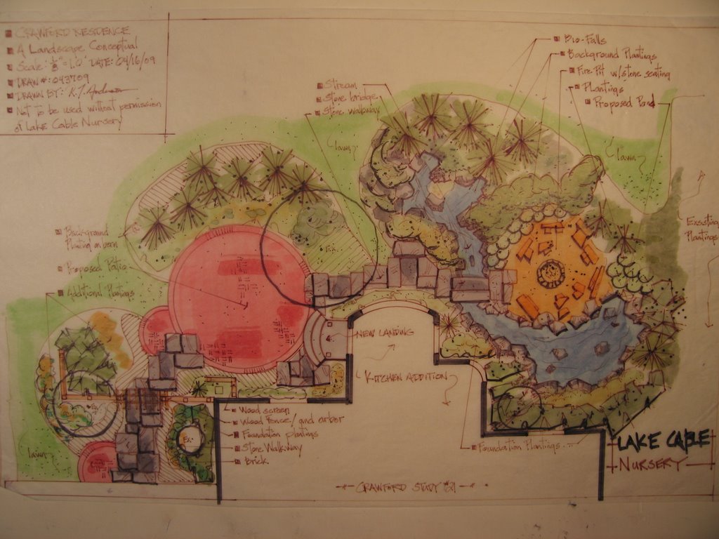
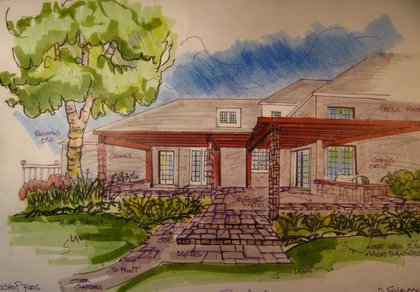
This was the 1st drawing that was shown to the client, this speaks to how the owners would actually relate to their new backyard space after the kitchen addition had been added on.

The idea was to show how they would be tucked into a nice comfortable room with a pond on one side and a fully planted berm and on the other.

It also show how the screen planting might relate to the new addition. This rendering (sectional) really shows " possibility". Something you can not get plan view drawings to do.

Renderings also allow for the dialogue to begin between homeowner and designer-working down a path to create the best possible space for the homeowner to enjoy, and live in.

Saturday, June 10, 2006

Bulldozers, Bobcats, and mini Trac-hoes

On Thursday afternoon we had it all going on in trying to create some rolling berms for a residential project. Too often we let the given state of terrain act as a given and do nothing to enhance the typography.

What makes higher end residential work more compelling is having the budget to allow for some sculpting of the soil to create a more interesting setting. Too often designers skip this possibility and just try and make the sight more interesting through hardscape and a lot (and I mean a lot) of plant material.

I gotta believe Designers are (A) either selling themselves short, or (B) not taking advantage of the ground plane-either by ignorance, lack of skill, or trepidation to think bigger.

When given the budget or opportunity----explore all the possibilities, all the dimensions of space you are working in, take chances to be more creative in the framework of the site you are working in. By framework I mean the berms need to be of a "certain: height to fit the scale of the project, and to not look like Civil War revetments, or Indian Burial Mounds. Lastly do not sculpt mounds for plants alone.

The plants only mounds are one of my great pet peeves, roll some grass up on that sucker!! play with the way the planting beds and lawn space interact. Think about how shadows will work across the berm(s).

My thanks to Enviroscapes Inc, of Louisville, Ohio. Not only to bring me in on this project, but to post their men and machines in action. Posted by Picasa

My other "Traveling Wall " pics

As mentioned in the previous entry I would post this link as soon as I uploaded other pics on-line. Thanks to all those who took a look yesterday and dropped me a line.

Something of interest on Maya Lin; Current sculptural exhibit. This PBS site has a lot of info and discusses a wide variety of her projects very interesting stuff.

Friday, June 09, 2006

"The Traveling Wall" Vietnam Veteran's Memorial

"The Moving Wall" is visiting in my little part of the World from June 8th through the 11th, it contains all of the names and stirs lots of emotions just like the permanent wall in Washington, D.C.
I visited this afternoon around 1;30 and there was a decent crowd the was continuing in at a steady paces, I talked to a few organizers and they said it was possible a 100,000 could come through by the end of the weekend. Even this replica has the ability to bring strong emotion and time for deep reflection in each visitor.
There were many of these personal memorials along the wall, from the more elaborate pictorials as this, to a simple service photo, each touching in it's own way.
The field across the drive hosted this display of American flags;over 1500 of them, signifying each of the Ohioans lost in Vietnam. It was a touching tribute. I have always found this type of display very compelling. The designer in me believes it has to do with the repetition and simple lines-ideas which relate to everyone. It might be as the American in me is lured in by the Red, White and Blue placed against the green back drop.

From a design standpoint the "Traveling Wall" only misses on one powerful aspect that the permanent Wall has. In Washington you walk down into the wall, each step taking you further down in, down in to where it seems only the black granite, the names - 58,132, and your reflection exist.

It's powerful stuff, I commend the designer Maya Lin greatly, and the original committee who approved her design.

To those who put together "The Traveling Wall" my thanks go out to you also, if you get a chance go visit-you will not be disappointed.

I'll have more links on this later, including the rest of my photos. Posted by Picasa

Thursday, June 08, 2006

Rhythm in Landscape Design

Rhythm is one of the keys to great landscape design, and there are several types of rhythm that make design more powerful. Whether is be alternation, crescando, descending, or one of many others this is an excellent tool for designers.

The other important (or one of the other), thing is understanding the space between the actual elements that are used. The voids are just as important as the mass. It is this interplay between mass-void that create the defined space. The tricky element to understand is that each type of mass/structure/plant/stone . . . whatever; needs its own type of void to be successful. The requirements also differ depending on the style, site and needs of the participants who will use the space.

Tricky-yes. Rhythm is something that should be continually thought about, and used accordingly. Posted by Picasa

Monday, June 05, 2006

Terrace Design

This was a proposal for a terrace overlooking a valley in some rolling Ohio farmland. The space was a 100 or so feet from the house and would have been a nice walk over; coffee cup in hand, to enjoy the morning.

Unfortunately this was the 1st area cut from the budget, actually the budget was obliterated. So this will never happen. Still I thought I would post this to give some ideas for those searching for hardscape ideas.

There have been a lot of hits to the site lately by those looking for info on hardscape design/planning/materials/installation. Hopefully this is just more food for thought.

The real key with planning hardscapes is to realize they will be the focal point in the area they are installed and secondly they need to be planned for-not only for final design, but what I really mean-is the construction. There is a lot of material(s) involved and the work needs to be done in correct sequence. The access must be appropriate in size/width and ease of approach.

Don't forget below ground either. Pipes, wires, plumbing, etc. Need to be dealt with in the earliest stages of construction. Consider future projects and plan accordingly. Run extra sleeves for any pipe or wires that may need to be installed down the road. Heck, it is a lot easier to dig ditches early, than to have to "dig up" stuff-dig ditches, and then replace stuff.

A last thought on surface, don't get cute with a funky paver color or pattern, find something that feels right within the site you are working. Some pattern is fine, otherwise it becomes busy-too noisy (visually). Which can be a bad thing. The World is busy enough . . . create clean simplistic, strong lines. Lines that are restful to the eye but still dynamic in appearance and design. Posted by Picasa

Saturday, June 03, 2006

Architect wins the Pergola Battle (part 3).

 
This isn't exactly what I was hoping the final pergola design would turn out to look like. I think the design of the overhead is fine, the color is fine, and the post work with the house.

My area of concern was the walls, planters, etc., do not tie in with the house, and there were going to be three ways to exit the patio. I was hoping to only get the one exit to have the observer taken along on a journey getting from the patio to the side entrance, and visa-versa. On this point I was given some latitude and it seems to be the way we are going to end up.

The architect has a lot of himself invested in the residence, and my conceptuals prompted him along to come up with some ideas to play off his house to come up with the final pergola design. The clients (who are going to live here) seemed very interested in the back and forth between all the design professionals, giving equal time to all points of view. I think they allowed all the design professional to do what they do best while at the same time imparting their wishes, and being respectful to the site we were working on.

Considering the size and scale of this job the architect and interior designer were both great to work with. Hats off to both of them. As the final plantings go in I will post more shots of this project to give you an idea how it all finishes out. The initial renderings were posted here last Spring. Posted by Picasa

Thursday, June 01, 2006

Pergola Design 2

 
This is a look at the same area of the previous entry on Tuesday. This look not only shows the overhead area, but it also shows the proposed layout for the patio space, walls, and cooking area.

The patio only has the one exit, my intent here was to bring guest along a garden walk bringing them to the back patio.

The color I rendered the pergola in is not indicative of what I am looking for in the final project, it just seemed to me for rendering purposes this was the best way to go Posted by Picasa