Monday, July 31, 2006

More on the Waterfall

 
This is a view looking back down at the angle from where I shot Saturday's post shot, and talked about this project. I wasn't kidding this is a difficult site to work in/with.
 
Back; almost, to the original photo. You can see there are some windows on the right for the interior portion of the spa. The outdoor area is a therapy type deal where folks are supposed to be submerged up to their neck.

Looking at where they want this waterfall and how they want it, I am for sure up to my neck.

I was out in the field all day going over projects or looking at projects. Lots to design and re-design this week and we will be talking about all of it right here.

Including an update on the terrace and steps I had been showing here last week. Let me say it didn't/isn't/hasn't went the way I thought it would go . . . . . . so far. Especially when it comes to step placement. Posted by Picasa

Sunday, July 30, 2006

An Appreciation of Stone 2

 
This was taken in Central Ohio last fall along the Kokosing River. It is so beautiful in its utter simplicity that there's nothing to add.

Except . . . . I wish I had done that. Posted by Picasa

Saturday, July 29, 2006

Waterfall


Yippee !!!! Look what I get to design and work on . . . after the fact. The spa is poured, the walls are up, and the deck has been installed. Now they want the waterfall(to look natural) to go in against this wall; look dramatic, look natural, and work perfectly. Uh, did I mention it was to look natural?

Man, do I ever love my job!!!

p.s. Did I mention the the decking(stamped concrete)had been installed. Posted by Picasa

Friday, July 28, 2006

"The Three Rules of Work"


1. "Out of clutter, find simplicity."
2. "From discord, find harmony."
3. "In the middle of difficulty, lies opportunity."
-Albert Einstein Posted by Picasa

More on the Terrace Design

 
This is another drawing of the same angle with different materials. I'm going to call this a warm-up drawing for the day. I did change the paver material color and lower how the plants would look.
 
Sectional Drawing: Not quite a true sectional because I added a few things that would not be on the section line I cut through the plan view. It does show the homeowner a good look at the relationship between the porch/steps/ and patio. A real quick drawing with the number one intention of showing how the steps would work out.

This was not taken off a photograph. Sectionals are good to show transition, change of elevation, and spacing. For me personally it is always better to show in some type of scale so these relationships show correctly. Posted by Picasa

Thursday, July 27, 2006

Kew Brew, my kind of Beer

What does an English Ale have to do with Landscape Design?Well this is also about Horticulture isn't it? In that case Kew Brew by Youngs and the Royal Botanical Gardens at Kew have teamed up for a good cause: Beer in honour of Garden's Work.

Now then . . . Hops anyone???

Wednesday, July 26, 2006

Rubber Sidewalks are here

While perusing through Yahoo news I caught this story about rubber sidewalks. The story refers to doing something with all the tires that we Americans dispose of every year. They also mention cost-3 times what concrete would be. . . that's expensive. Especially in a commercial or municipal setting. Which would be the best use scenario.

The folks at Rubber Sidewalks in their FAQ say the cost is 1/3 more than concrete. So the numbers don't jibe. I like the idea for sidewalks and other heavy pedestrian use areas. A great way to get rid of concrete and of course I am always up for getting rid of some concrete.

This will be interesting to follow and see where it goes. A recycled product that is better for the trees around it, and easier to walk on can't be all bad though I need to see it in person before totally jumping on bandwagon.

Tuesday, July 25, 2006

Conceptual Drawings for Terrace and Patio 2

 
This is a continuation on the previous post, so if you're new to the party-start there. Above is my note page for this backyard, in the old days . . . before digital images, and before the Kodaks with the instant photo there would have been a lot more note taking, a lot more. Now with digital I can take fewer on-site notes and do more scribbling-in my head.

I tend to let the site roll over for a few daye before I make any commitment to a drawing, or sketch, or stick through the dirt. Sure I may go back to my 1st instinct from that 1st moment on the site, but I have at least explored the many possibilities the site has to offer. Which is better for everyone involved.

So a few outlines, and a few measurements are taken (accurately) I can now work to scale when the time comes. The renderings are not to scale but they are to ratio, or proportion giving me a sense of the place. I can then see how the possibilities work to scale on plan view.

This is opposite of how most Landscape Designers work, but over the years this has become the best working method for me. I want to see the site, and what it may hold for the client, the development of the space.
 
This is a real rough plan view of the site. I have on occasion shown this level of drawing to the client-in the conceptual stage meeting. Everything is laid out space wise-the relationships between areas are easily seen/defined. Now is a good time to get client feedback.

Here is where I find out if I have been listening to the client, the site, and my instincts. These 3 parts make the whole complete.
 
This drawing . . . a doodle, a time-killer. When your stuck-move on, move out, get moving. Any kind of different action from the project you are working on. Go water the garden, get the mail, doodle . . . free your mind. It sounds corny. Is "corny" still a good word to use??? Do you relate? Can you dig it?

But I digress, it's here because it signifies a break in the action. It works for me.
More on this project tomorrow. Posted by Picasa

Conceptual Drawings for Terrace and Patio

 
This is the before picture. Homeowners acting as their own general contractors have called us in late. There is no good access to lower area. The boulder retaining walls were built in such a way as to actually minimize usable space. Add to that there is only the narrow, obvious, perfectly centered set of steps to the lake. Symmetry where there shouldn't be any symmetry.
 
Here is a early pencil sketch for a possible solution. Everything seems tight.
 
Furthering the solution along-everything seems tight, and it is because the space is small. The homeowners have really boxed me in, and the contractor is hoping I come up with a solution.

I need a terrace, a set of steps (not two sets of steps), a small patio out on the edge (this is a must, it's a great spot), and some planting space to soften transitions. Oh, I also need a firepit, though I think this is going to have to go below.

If anything comes out of this blog I hope it is this. If you are a homeowner; actually a "building" homeowner (or about to build) . . . get the landscape designer involved as soon as possible. Even before you site your house on the property.
We deal with these spaces, access, drainage, lines-of-sight issues, etc. 100's if not 1,000's of times. The sooner the Designer is involved the sooner the homeowner starts saving money.

More on this later today/tomorrow Posted by Picasa

Monday, July 24, 2006

Hardscape Ideas

 
Here's one for you to try, a combination of brick and stone. The small retaining wall stone is sandstone from Briar Hill. It's a quarry in central Ohio. I have other pictures from the quarry here.
 
This is the final product brick and stone. For fun add a 2,700 lb. bench. Comments? Questions? Okay then, get started and e-mail me those finished pics.

These are scanned images from slides of a job finished in 2000. The job is in South Carolina and the stone was shipped down on two flat-bed semi's. The brick, is brick. It is not a concrete paver and is from a local supplier. Posted by Picasa

Sunday, July 23, 2006

An Appreciation of Stone

 
Some really nice red sandstone. This is a church in Barnesville, Ohio. The masonry work is very well done, including the facing of the stone to create the wonderful textures at the joint lines.

I think I will devote Sunday postings to "appreciation". Whether it be the material, the craftsmenship, or nature. Posted by Picasa

Saturday, July 22, 2006

Ascension, more images.

 
I posted about this project on Wednesday the 19th, and mentioned something about putting more photos online-well then go here if you have some time to kill.

There are images for the drawings I completed for the proposal and many shots of the job in action, including a traffic jam and the Fire Dept. hosing off quartzite.

What I wish I had were some night shots-someday. Posted by Picasa

Friday, July 21, 2006

More on Yesterday's Waterfeature

 
The inflatable soccer ball is a nice touch-don't you think??? As you can see the aquatics are pretty much having their way and the water clarity looks pretty good-but the soccer ball . . .
 
Here in the stream you can see where the grass is growing, this would drive most suburbanites absolutely crazy, just crazy. Not here though, they love it-I think.

So all kinds of stuff is going on-it's wild, it's wet, it's . . . you decide.

By the way, if you click on 'em they get bigger. Posted by Picasa

Thursday, July 20, 2006

The Principles of Landscape Design: TIME


The above image was taken on Monday by me. I had a chance to go through this neighborhood and inspect a job we had going in nearby. While there I decided to look in on a few others. I was most curious about this one. I was curious about how neglect and the influence of time had affected what I had installed almost 4 years earlier.

The story:I knew the plant contractor who installed the material away from the pond and falls was also going to maintain the project for a year. He had asked me to come in and build the waterfeature on this one-I obliged. What did this mean? I knew he might not be there for the long haul because maintenance was not his focus-installation was. I had no idea what would happen from there.

I also had heard the pond was "for play"-- to be something for the kids to play in and through. This is almost always bad in a closed system-the number of ways to screw the thing up are endless. It's not like the creek running through my backyard when I was a kid . . . . this is artificial-it needs man's hands to keep it running. I immediately declined any type of contract to maintain, and I specifically mentioned that the 1st time "Junior" ran through the pond with toys the liner warranty was no longer in effect. Well, just what does all of this mean?

It means I tried to design and build accordingly. To use large/heavy stone at transition points and to anchor and wedge them in place. For the stream and waterside plantings, I tried to use stuff that was tough, adaptable, hardy, and would tolerate neglect. It was to become the survival of the fittest. It was to become a war zone.

Here we are 3+ years after the fact. What do you think? Tomorrow I'll add a shot from another angle and throw in a shot of the pond-which has been neglected and abused -- especially the edges.


Year 1 The image below (Photo 2) was taken during the middle of the 1st year growth in plant material at this series of streams and waterfalls I built. The plant maintenance looks okay. It looks like it could be spectacular one day.

Photo 2

16 months These 2 images were taken about a year after Photo 2 and about 2 years before the photo at the top of the post. You can see the way time is working its magic. The growth of the material and its influence on the landscape.


The final thought. This waterfeature is in one of the upscale neighborhoods from a few years back where the property lots were usually an acre plus with 2,3,4 story houses, built back off the street. Everyone has a "lawn service" -- that type of place. I would think if this backyard was anywhere but backed up to an unbuildable area (where they had neighbors looking in) there might be some finger pointing going on. Everything is not perfectly clipped, straight, square or otherwise. On the other hand, different observers may look at this feature in its present state and say "they love it".

"IT" truly is in the eye of the beholder. Personally, I like how the groundcovers are\have been, waging a war (it looks like the Houttuynia is winning) to end all wars. Other plants are sneaking in; grass is growing in the stream bed-always a good thing when looking for a naturalistic feel. I like it. Others would call this "too unkempt".

In this analysis-the homeowners are living with it. Someone at the house when I was there said they "loved it". By the way, I'm not sure who that someone was. They enjoy the scene, the space, the sound, the movement. They are living with time's effects.

Time's effects will continue and with no real maintaining of the site, (the aquatics area-pond plants and plants surrounding the aquatic area-everything growing along/in the stream bed). How long will it be until all control is lost? Just how long will it be before time's effects overtake a man-made environment making it no longer enjoyable?

Where do you draw that line? What is the criteria? What exactly is over-run??? vs., say, the "natural look"??? Posted by Picasa

Wednesday, July 19, 2006

Trac-hoes, 100 Ton Cranes, and VERY large Boulders.

 
I have just put up what I am going to call a "project page" on my website. It concerns this sculptural piece that I named Ascension It is on a hillside going into a large city in South Carolina, and I had hoped it would look like whitewater tumbling off the hillside.

In the above photo you are looking at the quarry where the stone came from. A mica-schist for the outcroppings, big boulders, banks, etc. and a quartzite to represent the whitewater (lots of mineral deposits and flakes to make it shine --especially at night with lights).
 
Right now I just have a lot of images up and am going to add a narrative in a day or two. Two things will always stand out from this project for me. One---it took 3 times as long to prep as it did to execute the installation of the project. Two--- it was a lot of fun, a lot of fun. I'd do it again, given the opportunity.

The above shot is the crane in action. We spent 2 full days just preparing the correct base for the crane and it's outriggers to stabilize on. It's good to be careful when moving boulders weighing as much as 13/14 ton.
 
Placing boulders-this one probably weighs in under 2 and a half ton -- a mere lightweight. So safety at all times - which is really about being alert. While those guys are doing the final prep, the crane operator and I did a strange dance to communicate where and how I wanted the boulders placed.

The other nice thing about this was that it was not a pedestrian area so I had some latitude in placement. After all, my primary viewer was going by in cars at 40-55 mph making detail in placement a non-issue.

The city did a little bit of planting around the edges to soften the area, I would have liked to put in several hundred grasses but there was no budget for that sort of planting.

Final thoughts, it was a great challenge - especially logistically, but it was a lot of fun. I hope it brings a little bit of enjoyment to those that drive by everyday.
Ascension Posted by Picasa

Monday, July 17, 2006

Rendering . .. Designing with Graphic Thought (2)


More examples of how I look at graphics to think/create/decide visually. For you designers on the less-experienced side-do not be afraid to go through a lot of "trash" to get you to where your design needs to get to.
Overlay, on top of overlay, on top of overlay-work those lines. Work to create that magic. Look at the interplay of elements in the space -- it's about spatial relationships. You will also notice there is very little mention of specific plant material/names. That's for detail time - right now is for evergreen/deciduous/tall/short/weeping/upright, etc. The details will come after spatial relationship is decided.

One other thing about this design process-do not be afraid to jot notes down along with the graphic thoughts. In classes that I have taught what I see a lot of beginners do is work with lines (timidly), or they come in off a site, lots of notes-but then stare at the paper . . . DRAW!!! It won't bite back. Posted by Picasa

Sunday, July 16, 2006

Rendering . . . Designing with Graphic Thought


For me the design process is a continual manipulation of lines on a surface(paper). At some point I achieve what I am looking for. Well, most of the time I find what I am looking for-though I am not sure some of my friends would agree with this.

So what are we looking at? This is an early conceptual for a plaza in a small town. A couple of buildings were slated to be torn down and they were looking for some ideas on how to use the space. In this case, the budget fell completely apart early in the project and nothing became of this.

I bring this up because of the plaza project I had just been working on, and the idea of the seat wall working it's way through the tree line, making it (in my mind) kind of "arty".

"Arty" -- I'm not exactly sure how you would define that. It's sort of how homeowners use the word "natural". For the most part they have no idea what that means-most likely that is the same with me and "Arty" Posted by Picasa

Seminar sketchbook 3


Well this is another scan out of the '97/'98 book. It looks like I was in a class on drawing people-a lot of my former studente were terrified of drawing people, just terrified.

Actually, all it takes is an oval, a hangar, some folds, a "W" and some tiny "o's". and you've got a person. See? Don't you feel better - you can draw people.

Friday, July 14, 2006

A Decision Reached

 
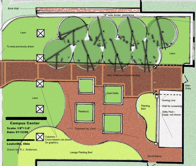
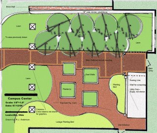
A couple of posts ago, I talked about this plan view conceptual vs. the other example posted. I discussed the pros and cons of each and added a few other thoughts. This was the one that was chosen for the project.

The client liked the possibility of students being able to interact between the seating areas available to them. They also liked the collection of trees on the other side and the overall feel of the courtyard.

The important thing for any designer to remember is that given the task of defining space with a lot of people and traffic---give them a space for "community", allow them space for interaction and possibility.

I think I learned this lesson best when I hop-scotched all over Central America. There was a great sense of community and interaction in the city plazas where there was:

1. Seating -- and lots of it.
2. Focal points to congregate -- around-steps, platforms, statuary, tree-planters.
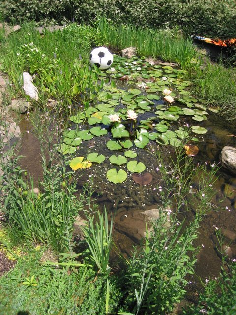
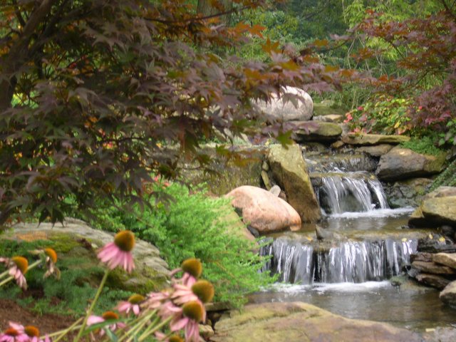
3. Trees, trees, trees -- for all the obvious reasons and the fact that trees provide a sense of enclosure.
 
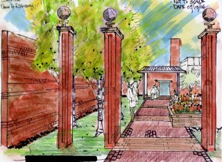
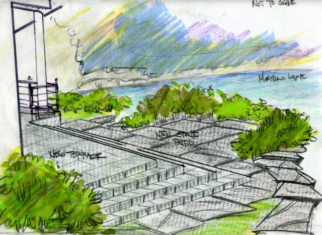
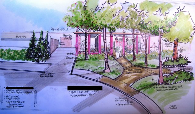
This color rendering also helped seal the deal. Although I personally think this is a technically bad drawing, it does speak to how the space could look.

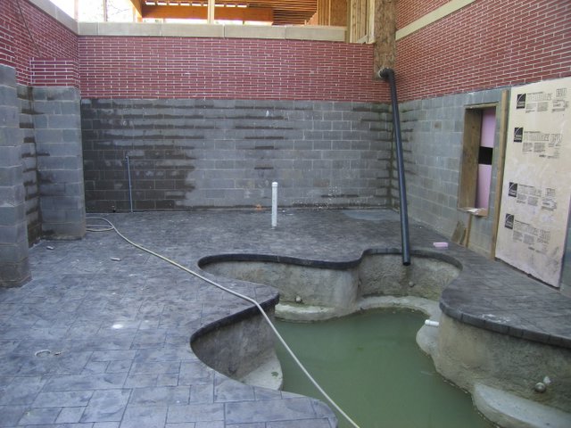
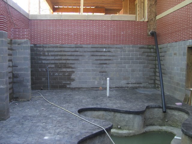
In the construction layout, we are looking at 16-17 feet between the walkway and the brick wall on the left. They are still talking about 8' high; I hope that is scaled back to 6' or so.

That wall is important as it screens off the service/delivery dock. Anything less than a solid wall would kill the feel of the plaza space.

When I speak about technically poor, I am referring to the way I used color here, and the heavy hand with the color.
 
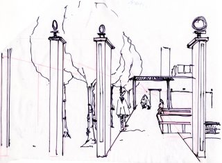
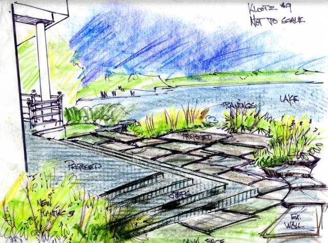
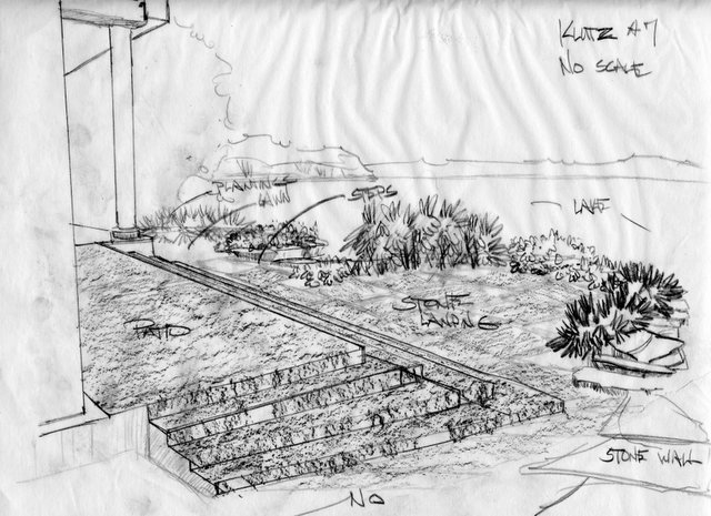
Ahhhh, a black and white line drawing. This is my kind of landscape rendering. The stage shown is the step before the color drawing. There were 4 trash drawings before this one. Each drawing builds upon the last. When I finally get to a place I like, the drawing is then done in a style that is presentable to the client.

To the laymen out there, this is a one-point perspective drawing; one of the simplest styles to use and because it is simple, it is effective and powerful as a design tool.

I was trying to give the observer a view from just outside the threshold entrance to the plaza, to show how it would look upon entering the area. All other renderings of the entire space had the observer standing in the street or halfway up the hill - about 100 feet from where we are now standing.
 
This rendering is a reminder to also show the scene outside the plaza area. I posted these drawings a couple of weeks ago and there are a few more to go along with it.

This tells the story of what the observer would see coming down the street or coming to the plaza area from the football stadium. The trees are not only here for all the obviously good reasons, but there is a lot of equipment on the roof of that building which these trees will screen away.

It was these drawings, along with some others, that have cemented an agreement between the contractor and the client. There are changes that will be made, and tweaks along the way, but the concept, the feel, the flow, will remain. To be sure, some enthusiastic choices about plant material, spacing, etc. remain.

The project starts later this summer and is to be completed around the 1st of September. I will post pictures and we'll see how close the concept came to reality. Posted by Picasa