Showing posts with label Plan view drawings. Show all posts

Saturday, November 25, 2006

A link kind of day

Some old Doodle:
A interesting article from Southern California about ripping out the yard and filling it full of plants.

Katie Campbell has written a book called Icons of Twentieth-Century Landscape Design, here's an excerpt:
In her book, Icons of Twentieth-Century Landscape Design, Campbell explores 29 sites, from Parc Guell, Gaudi's Art Nouveau extravaganza in Barcelona, to the stark landscape around the Jewish Museum in Berlin; and two Scottish gardens have made their mark on the international design scene.
This article goes into the thought process behind the book and what Ms. Campbell is hoping to accomplish, I look forward to reading this one.

Do you like maps? Do you know how to read a map? Some folks consider large landscape plan drawings-maps. Well I like maps and heck I can even read a complicated landscape plan. Here's a Blog that looks at the World of maps, strange maps to be exact.

Saturday, November 18, 2006

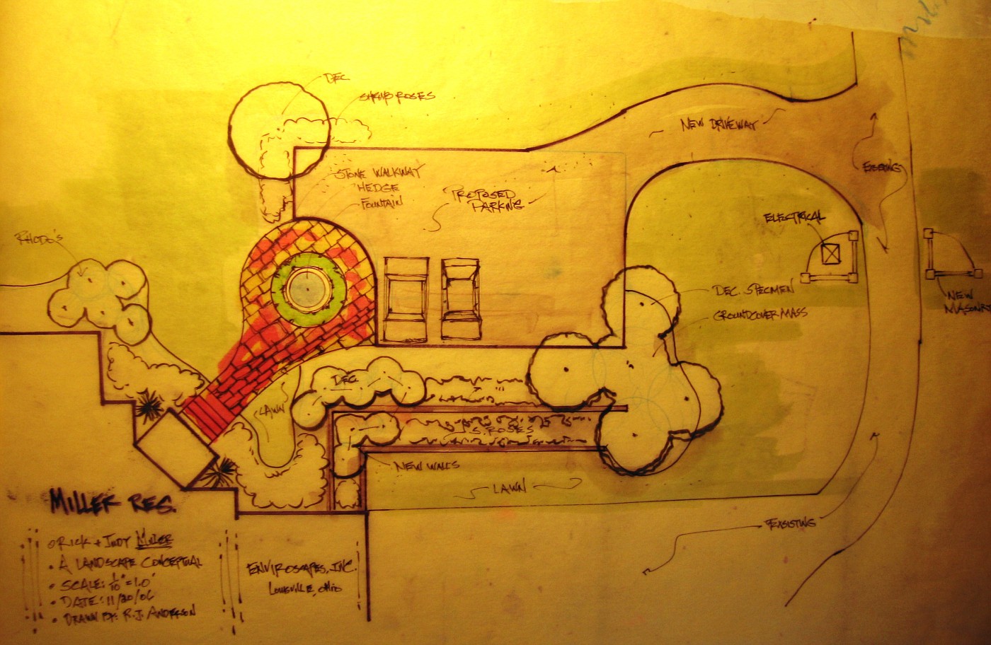
Plan View Rendering (fountain)

This drawing goes with previous renderings.
Okay all the hemming and hawing about the fountain and where it goes, what goes with it, or not with it, etc . . . . well here it is.

This is a photo that was shot off the drawing board right after I had finished this drawing. In the lower part of the drawing is the driveway for the garages, from there to the new parking court the height differential is about 8.0' foot.

Everything on the drawing would be new. There are no walls right now, no plant material of any kind, no walkway-nothing. That drive on the far right is there, the drive goes around to the horse barns, but we have to come past the utility boxes to start the new drive up to the parking court.

What does this plan view show us? A new entry drive, a parking court, a walk to the front door, a gathering place (where the fountain is), and how the beds for the plant material would/could work.

Now that I am showing this drawing does it make any more sense? Does it make any more sense to me? I am still not sure I like how this thing lays out, or the flow, but it is, what it is . . .

Thursday, November 09, 2006

Backyard Patio story continues.

Single water falls, and tan sandstone walkways
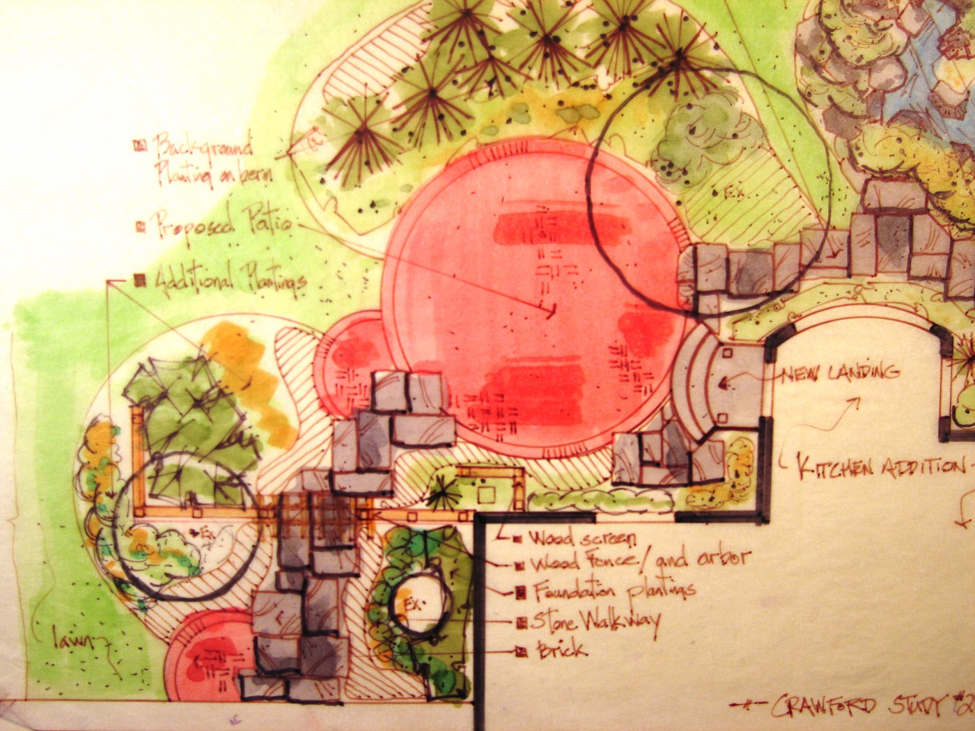
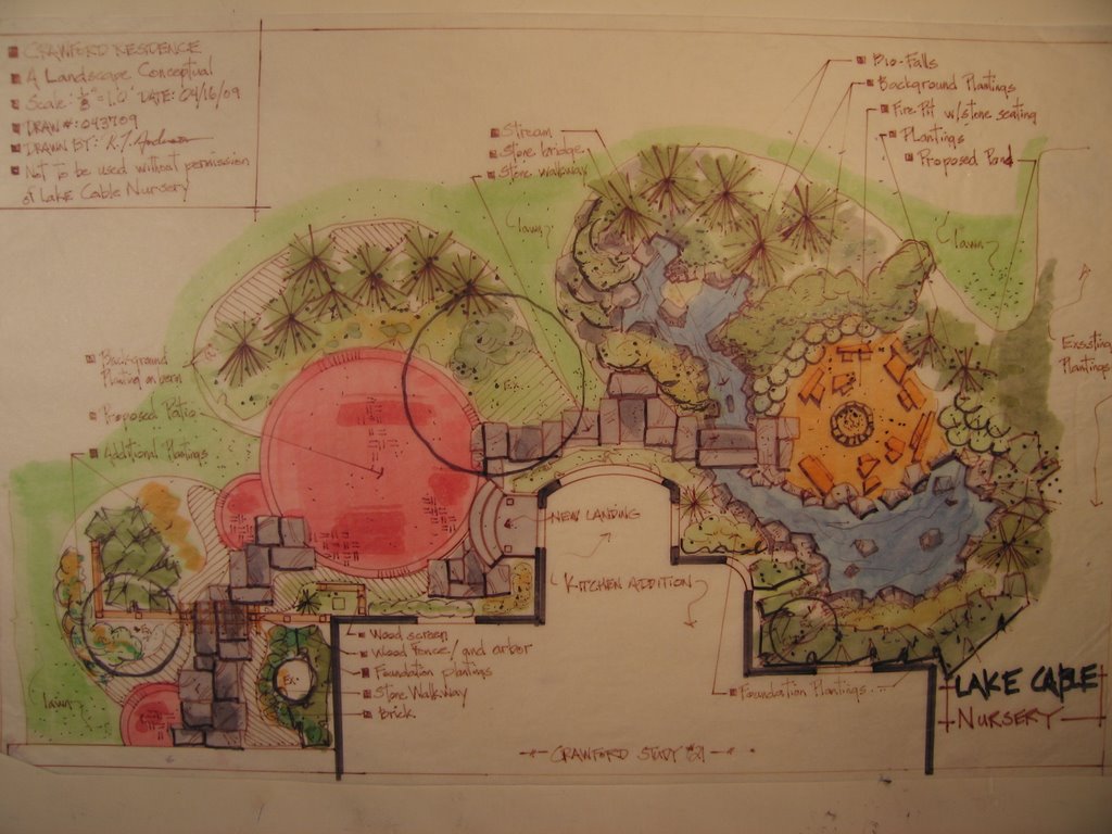
More on the previous post. This was the 1st plan view color drawing that was shown to clients. Take notice that in this conceptual drawing there is only one waterfall, and the walkway is tan in color. the homeowners looked at this drawing and were very impressed.

I then remember them . . . starting to study the drawing and going over ever detail. It was decided pretty quickly they didn't want brown sandstone for the walkway-they were positive about this.

2nd they were very concerned that the one falls would not make enough noise to screen out the eat of the neighborhood noise, and would only one waterfall be loud enough to hear in the kitchen, and breakfast nook.

Normally, I would just show them a different color of stone (actual stone piece), and take some overlay paper and draw the other falls in the hillside. That wasn't going to work here, they wanted to see another drawing (specifically the wife).

So, I called the contractor and said I had to do another drawing for the homeowners, for x amount of hours to do the work (which he hadn't agree to pay me for). He asked me if they were excited about the conceptuals and were they close to jumping in?

I said; heck yeah, they're ready! . . . .

So the previously posted drawing is what they looked at, and of course they jumped in, over original budget request . . . because it was everything they wanted, in a logical layout, and the best parts could be enjoyed/viewed from inside the house.

Color rendering of pond and fire ring
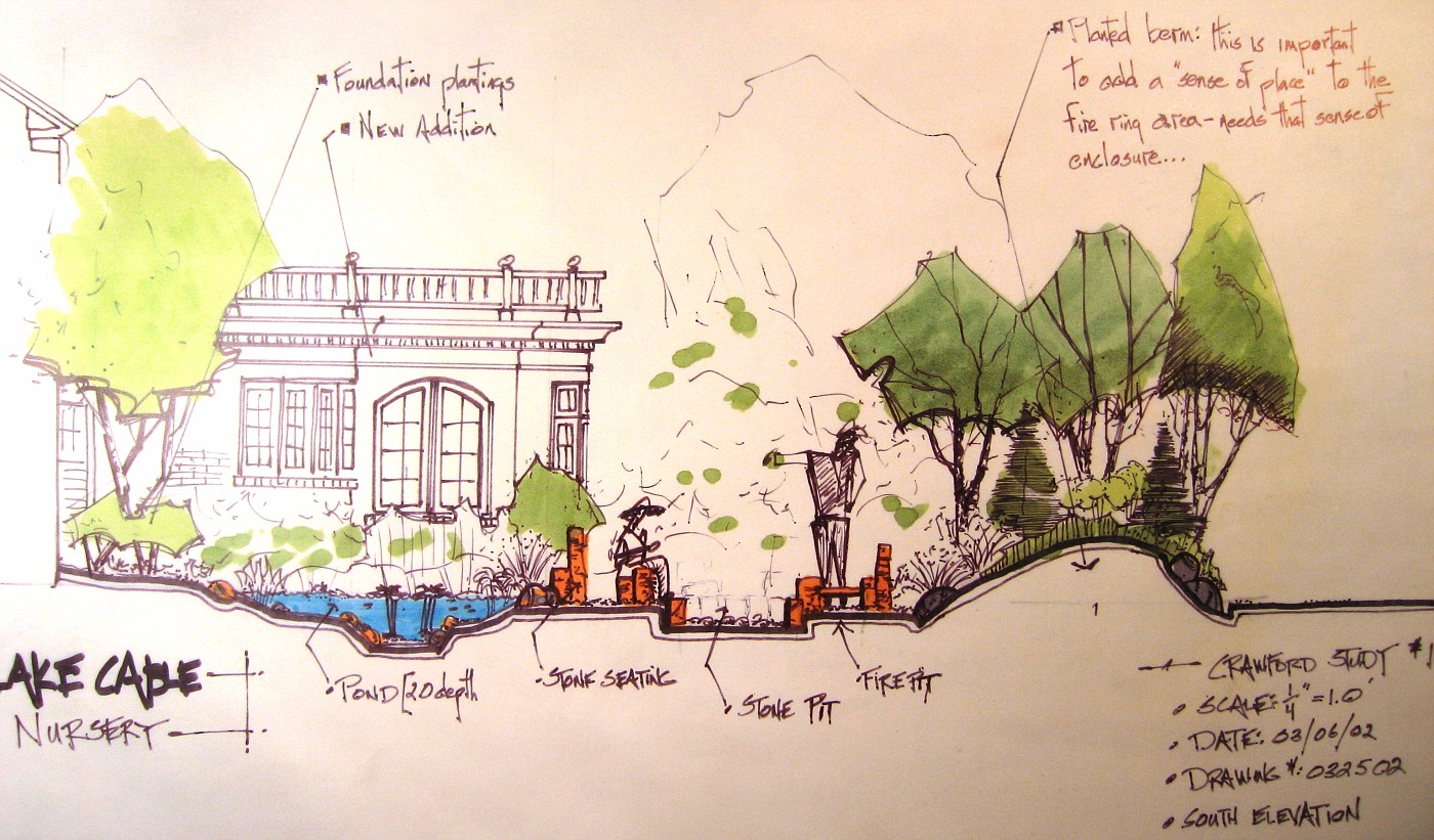
Along with the plan view rendering, I showed the clients this conceptual rendering of how this area would relate to the new kitchen addition.

The addition is shown only in black line. I was trying to present the landscaping to add to the backyard, which is why my stuff is in color. We needed to excite them about tha landscaping, Heck they had already agreed to add the kitchen-no need to promote that.

I did; however, have to show how the new landscape would relate and enhance the new space. This rendering does a much better job than anything I could have done on a plan view drawing.

This drawing was the deal-clincher for this side of the backyard. I basically laid this on the table and it was over. Let's go, let's put it in, we can't wait . . . those were the comments.

I've said this before, and will say it some more (hey, I'm a poet!), if you design hardscapes, structure, level transitions, etc . . . you must render. This is the only way to really communicate what you are trying to achieve to the client.

Has for this drawing, I'll have more on my evolution as a designer . . . tomorrow.

Monday, November 06, 2006

Sandstone Walk, with Paver Patio, the drawing

Color Landscape Rendering
(This drawing goes with last weeks photos)

This was the plan view drawing that was shown to the client. to help finalize how the design would work, and how we could make the patio space work with the new kitchen addition.

The hardscape is so overwhelming here it was really important to get it right on paper. We all wanted the clients to be happy with this layout, and by giving them a precise scale drawing the contractor was able to give the client a very good, and accurate estimate to install the project.

I had been requested by the homeowner to stay within a range of numbers after we had looked at several sets of conceptual drawings. These early conceptual's had rough numbers attached to them, so between those numbers and the rough landscape drawings we were able to come up with this plan rendering.

I was hoping to post some of those rough conceptuals, but, dang it! I can't find them.

Anyway take a look at the drawing, (if you click on it, it enlarges). Then compare to the actual install of the project. I think you'll agree we came pretty close.

Wednesday, October 04, 2006

Sectional, and Plan View Drawing

Sketchbook drawings, on-site

These conceptual drawings are from the same job site as yesterday.  Yes, I know  . . . I wrote yesterday about 
using a green marker for plant material, and boom! here we are showing plants in brown. Well it is the only 
marker I had with me on-site.

The top drawing is a rough plan view drawing of the site and the lower is a quick elevation drawing of the
site. If I remember correctly I drew the plan view drawing 1st then the elevation. On-site I would say I draw
the elevation 1st about 75% of the time. Even more than that if the client is standing there. After all this type of landscape rendering tells the real story.

The follow up of the plan view shows spatial relationship. The circles  for the plants are rough and fast, the idea is to show that I am looking at several varieties, and of several sizes. The elevation drawing even better shows the plant differences and height variations.

At no point though are we specific on the varieties. The only specific is the use of barnstone for the wall, and that there would be a terrace designed above and slightly back to the left.

p.s. This design did not go in. The owner was given a deal on a Unilock display, and since they are a Unilock dealer that's what they put in.

Friday, September 29, 2006

The National Garden to open October 1st

The National Garden, plan view


This drawing shows the layout for the National Garden which is next to the United States
 Botanical Garden in Washington D. C. 

The 10 million dollar project was funded entirely with private money. From  a press release:
When the National Garden opens to the public on October 1, 2006, it will mark the successful completion of one of the first public-private projects undertaken by the Office of the Architect of the Capitol. The project was solely funded by private donations raised by The National Fund for the U.S. Botanic Garden.

This not-for-profit corporation raised $11.5 million in private contributions pursuant to Public Law 102-229. The National Garden's mission is to educate visitors about the great diversity of American plants and their importance to the environment; to help connect people to nature; and to demonstrate the relationships between plants, water, and humans.

As you can see the designers have created several different rooms each with their own separate type functions. It appears this will allow visitors to have many unique experiences as they work there way 
through the gardens. I look forward to visiting


Tuesday, September 26, 2006

Where does the Hot-Tub Go???

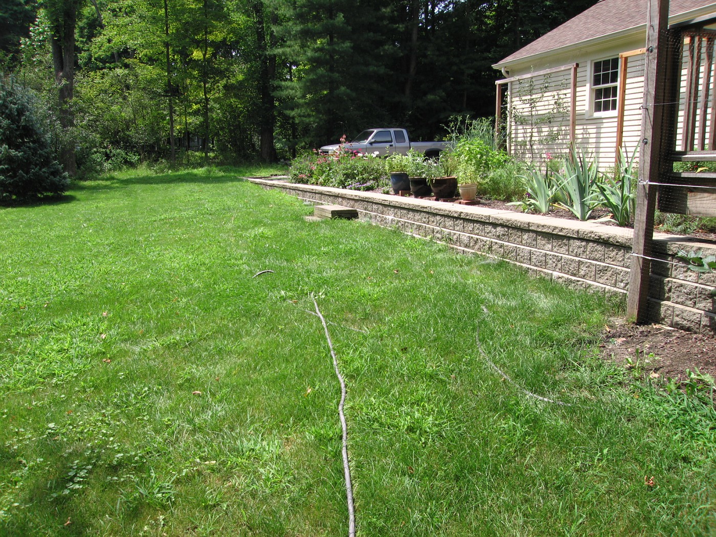
This is the Exsisting Landscape

I was asked to come up with an idea for a designed space where the seating area was extended out onto the exsisting lawn, a perennial/cutting garden above the wall, and find a place for a hot-tub.

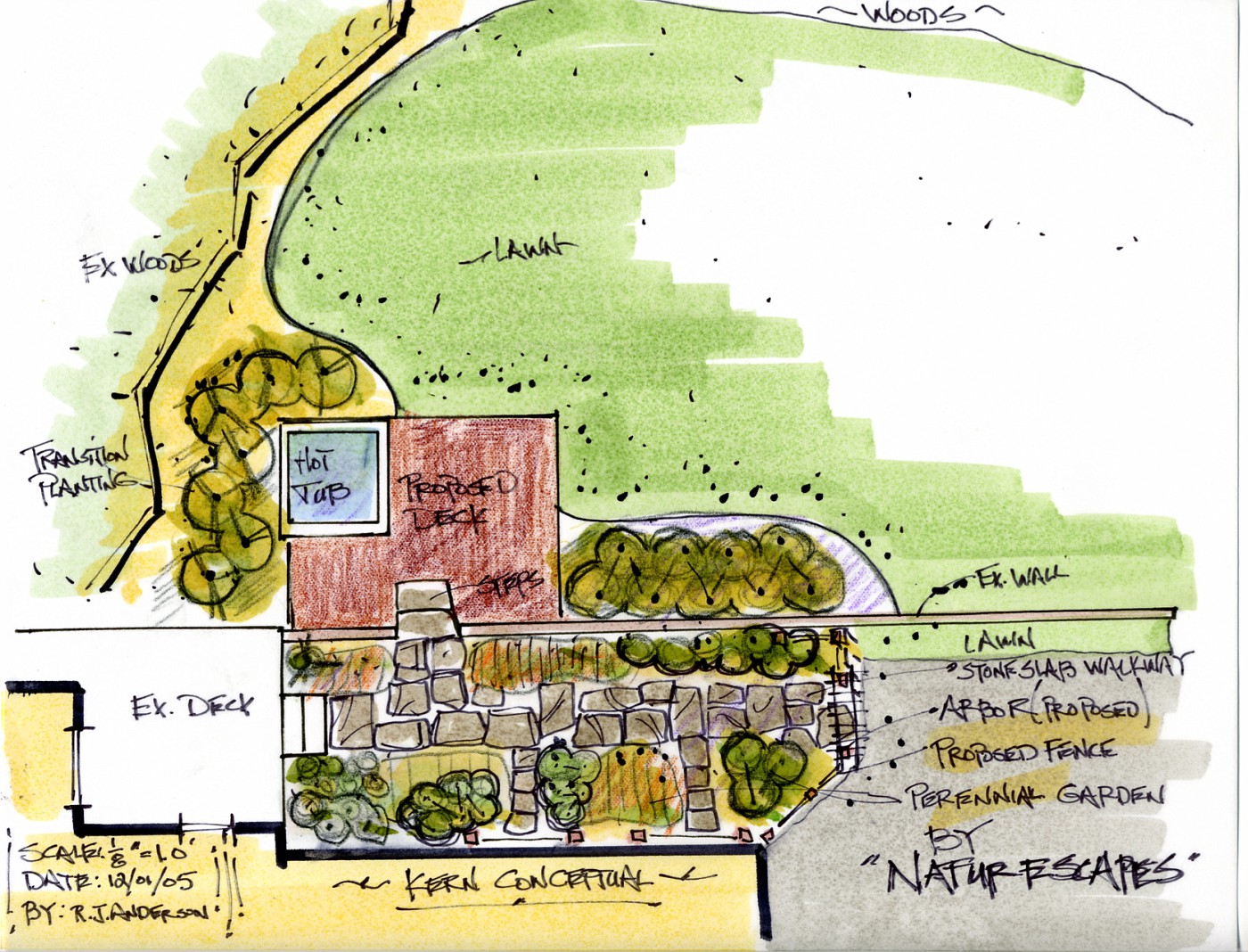
It made sense to tie the hot-tub into the deck space so there would be good solid footing to get to the tub from the house, and at the same time keep it fairly close to the house and yet be in its own space. While not infringing the patio/entertaining space.

My Version of New Landscape

Designing hot-tubs into these spaces, heck designing hot-tubs into almost any backyard . . .  is tough. They are big clunky boxes, even the best designed ones are big clunky boxes. Add in the logistical requirements needed to run hot-tubs. The electrical, plumbing, servicing, etc.

Whats even worse is most designers don't even try to add in the hot-tub in a harmonius way. Homeowners . . . forget about it, just drop the box on the patio.

The real problem is that this is usually considered something needed for a private space, but almost always is sited in the most public of spaces, sometimes right next to the picnic table or grill . . . how romantic!!! Which is the context in which most homeowners ask me to find a space for the hot-tub . . . a clam, quiet, romantic place for the husband-wife.

Where space considerations are a factor usually the best we can do is place the tub in a corner of the patio. The corner chosen should be the one where there will be the least amount of traffic or commotion. Away form the back and forth of people. Hopefully the patio will be large enough to allow for furniture and other stuff to be placed on the opposite end. Add to that landscaping that will compliment the space, and compliment the mood of the space.

A Conceptual Plan View of the Landscape Design

This is a plan view drawing of the same space shown in the rendering above. These conceptual drawings work together to tell the story of where this space could go.

I have spoken about this before, the plan-view drawing is how most designers/contractors present their solutions to homeowners-it doesn't work. Most Americans can't read a road map, and most people are not good at visualization. The plan-view drawing helps solve neither of these issues. Where the rendeering does solve those problems.

The solution is right in front of them, it's like the story of a picture is worth a 1,000 words. Well then, what's a rendering worth? To the homeowne? To the contractor?

The rendering shows the potential of the space, and the plan-view drawing shows the scale of the impacted space. Together they present the entire story of the space's potential.

Wednesday, September 20, 2006

Plan View Drawing

Residential Plan View


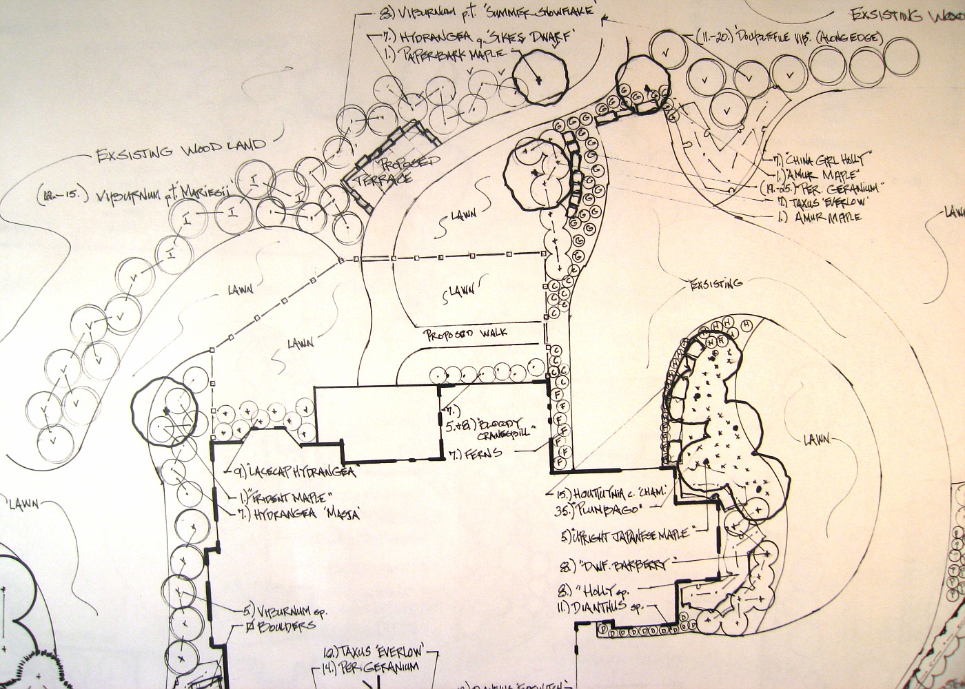
This is an example of a plan view drawing. Most in this industry call this the master plan drawing. The reasoning behind this, everything is on the plan. The hardscape layouts, fence lines, driveway, bed areas, and all plants are labelled. 

You'll notice the plants are labelled with common names instead of the botanical names. I do that with most homeowners to lessen the confusion. There may be another list made with the Latin names so there will be no confusion when it comes to the buying of plant material. Most of you know common names can cause confusion, and mis-identification of plant material.

Sometimes I will just give a plant grouping a generic label and then we will decide on the exact cultivar that will go in that area. The important thing is that I know the form, shape, size and texture of what I believe works best in that area. This way everything works with what has already been identified.

The house is a very typical upscale house in a neighborhood where most houses are priced between $400,000 and $1,000,000 down. A brick two story on a cul-de-sac. Homeowners asked for the typical stuff, asked me to figure out the drive, and to show a area for small dogs connected to the back of the house.

The atypical part is the stone terrace overlooking  the ravine and the surrounding landscape. This was a request that turned out to be the budget buster for contractor.  This and the stone wall at the end of the drive just added up to more than where the homeowner wanted to go. We tried to work out alternatives but in the end it was to no avail. The homeowner fell way back in his ambitions and went with something about $40,000 less.

The irony to this story is he still refers the contractor I worked with on this job and we have gotten a couple of nice jobs from this. Why do I show this? To show that it is important to talk about the losses along with the wins. It's just how life works.

Saturday, September 09, 2006

Color Renderings and Plan View Conceptual

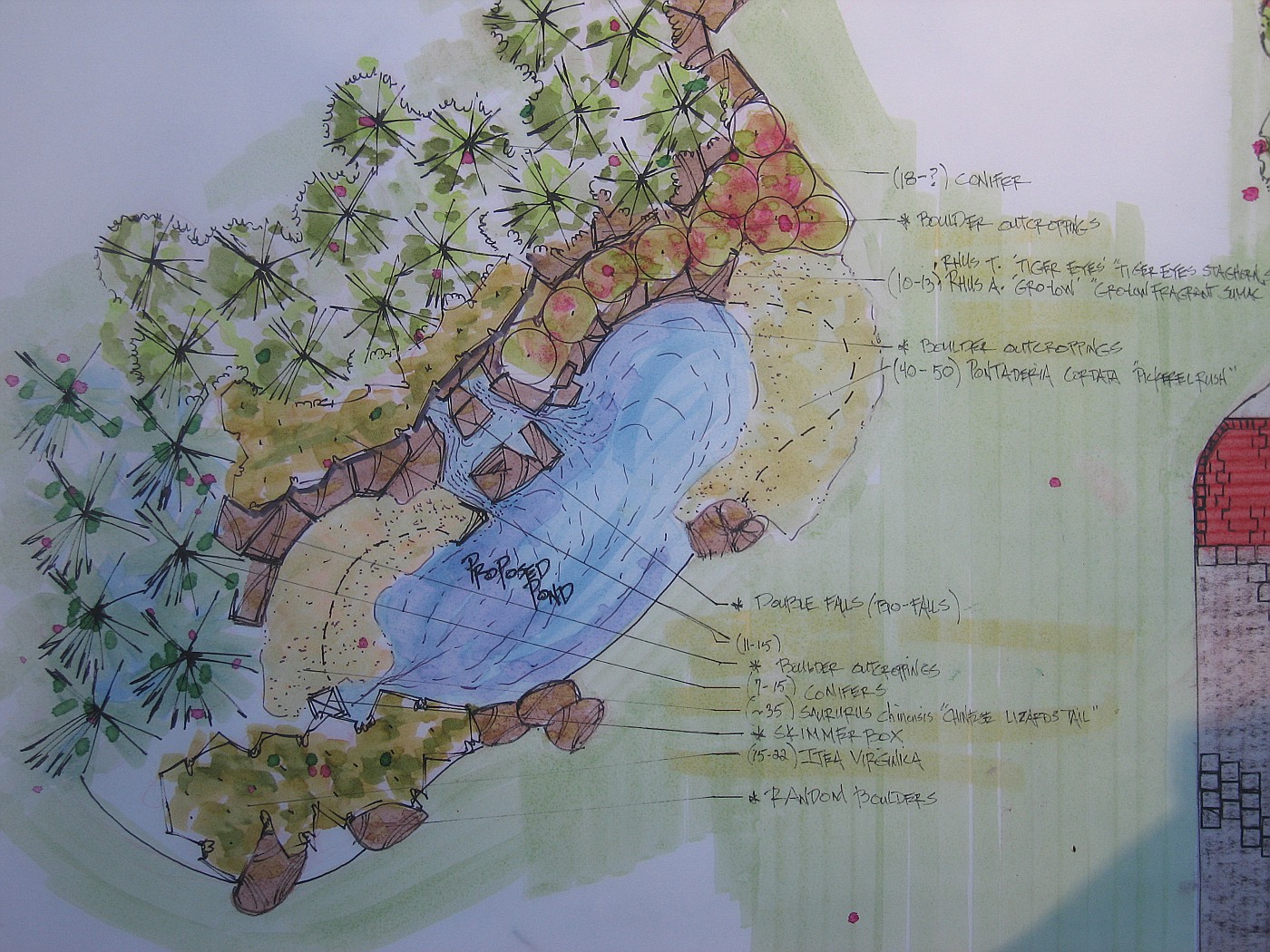
Plan view of the Pond


This shows the lagoon-pond area in plan view. The backdrop of the conifers, and some of the surrounding plant material, including the aquatics that flow from the pond out on the edges of the banks of the pond.

The drawing also shows the relationship of this area to the actual entryway, and the space involved for the area to flow together. The hillside for the falls will have to be made and the the backdrop of conifers will be added to sell the illusion of a natural waterfall.


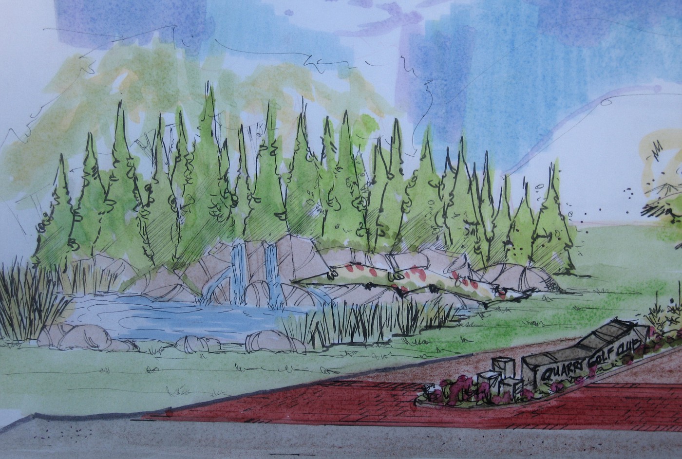
Rendering of Entry and Pond


This is the follow-up to the September 5th entry on the Blog. This is part of a larger drawing that will be shown to the clients to give them an idea of the entire picture for the possibilities on what the entrance could be.

The big difference in this drawing is to show a larger number of conifers for the backdrop. This was a specific client request after seeing the initial concept drawings for the entry.

Tuesday, August 01, 2006

Concept Drawings a Great Read

 
This is my version of a concept drawing in the best sense. It's loose but to scale, it's flowing and fluid but the spatial relationships are factual.

The clients are able to read this along with a series of renderings that I take to the meeting and are able to start a dialogue on what they really wnat for the landscape. Heck I'll even give them the pencil and they can start drawing away-they love the empowerment.

This inclusion of the client really makes for a better design. Knowing what they really want allows me to actually go farther into creating great spaces. This enthusiasm from the client allows me to push my envelope even wider.

To this day and as long as I do this I will never understand how Designers, Architects, or large Design-Build firms (the biggest offender) think they can go from a simple interview to a finalized Master Plan with no discussion in between, none. To me this does no justice to the client, or the site. Especially when this gets into large dollars, as a matter of fact the larger the job the more meetings involved-it becomes a process.

Is this necessary for a $2,000.00 job? No, of course not. But when I hear, am told, or actually see projects that go from a interview to master plan for $40,000.00, $60,000.00, or even $100,000.00 I am baffled, and sometimes this happens without the designer even doing the interviewing! Its done by a salesperson. If there are any homeowners reading this; please, interview with the designer and not the sales guy, things/desires/wishes/likes/dis-likes will be lost in the process.

These concepts are just that-concepts, and they should be explained that way. A work in progress, a jumping off point, a place to open up real dialogue about what the space needs-or should look like. This is not only where we really find out what the client wants, but what they don't want. How very important.

These plan conceptuals along with the renderings tell a story, a real story about where a site is going-its a great read. Posted by Picasa

Tuesday, July 25, 2006

Conceptual Drawings for Terrace and Patio 2

 
This is a continuation on the previous post, so if you're new to the party-start there. Above is my note page for this backyard, in the old days . . . before digital images, and before the Kodaks with the instant photo there would have been a lot more note taking, a lot more. Now with digital I can take fewer on-site notes and do more scribbling-in my head.

I tend to let the site roll over for a few daye before I make any commitment to a drawing, or sketch, or stick through the dirt. Sure I may go back to my 1st instinct from that 1st moment on the site, but I have at least explored the many possibilities the site has to offer. Which is better for everyone involved.

So a few outlines, and a few measurements are taken (accurately) I can now work to scale when the time comes. The renderings are not to scale but they are to ratio, or proportion giving me a sense of the place. I can then see how the possibilities work to scale on plan view.

This is opposite of how most Landscape Designers work, but over the years this has become the best working method for me. I want to see the site, and what it may hold for the client, the development of the space.
 
This is a real rough plan view of the site. I have on occasion shown this level of drawing to the client-in the conceptual stage meeting. Everything is laid out space wise-the relationships between areas are easily seen/defined. Now is a good time to get client feedback.

Here is where I find out if I have been listening to the client, the site, and my instincts. These 3 parts make the whole complete.
 
This drawing . . . a doodle, a time-killer. When your stuck-move on, move out, get moving. Any kind of different action from the project you are working on. Go water the garden, get the mail, doodle . . . free your mind. It sounds corny. Is "corny" still a good word to use??? Do you relate? Can you dig it?

But I digress, it's here because it signifies a break in the action. It works for me.
More on this project tomorrow. Posted by Picasa

Monday, July 17, 2006

Rendering . .. Designing with Graphic Thought (2)


More examples of how I look at graphics to think/create/decide visually. For you designers on the less-experienced side-do not be afraid to go through a lot of "trash" to get you to where your design needs to get to.
Overlay, on top of overlay, on top of overlay-work those lines. Work to create that magic. Look at the interplay of elements in the space -- it's about spatial relationships. You will also notice there is very little mention of specific plant material/names. That's for detail time - right now is for evergreen/deciduous/tall/short/weeping/upright, etc. The details will come after spatial relationship is decided.

One other thing about this design process-do not be afraid to jot notes down along with the graphic thoughts. In classes that I have taught what I see a lot of beginners do is work with lines (timidly), or they come in off a site, lots of notes-but then stare at the paper . . . DRAW!!! It won't bite back. Posted by Picasa

Friday, July 14, 2006

A Decision Reached

 
A couple of posts ago, I talked about this plan view conceptual vs. the other example posted. I discussed the pros and cons of each and added a few other thoughts. This was the one that was chosen for the project.

The client liked the possibility of students being able to interact between the seating areas available to them. They also liked the collection of trees on the other side and the overall feel of the courtyard.

The important thing for any designer to remember is that given the task of defining space with a lot of people and traffic---give them a space for "community", allow them space for interaction and possibility.

I think I learned this lesson best when I hop-scotched all over Central America. There was a great sense of community and interaction in the city plazas where there was:

1. Seating -- and lots of it.
2. Focal points to congregate -- around-steps, platforms, statuary, tree-planters.
3. Trees, trees, trees -- for all the obvious reasons and the fact that trees provide a sense of enclosure.
 
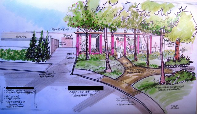
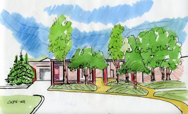
This color rendering also helped seal the deal. Although I personally think this is a technically bad drawing, it does speak to how the space could look.

In the construction layout, we are looking at 16-17 feet between the walkway and the brick wall on the left. They are still talking about 8' high; I hope that is scaled back to 6' or so.

That wall is important as it screens off the service/delivery dock. Anything less than a solid wall would kill the feel of the plaza space.

When I speak about technically poor, I am referring to the way I used color here, and the heavy hand with the color.
 
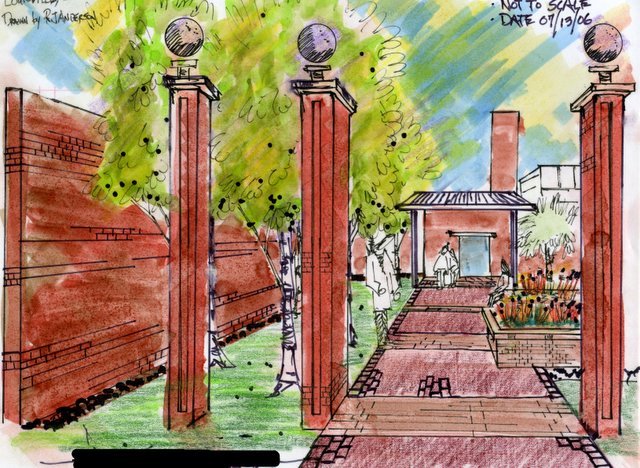
Ahhhh, a black and white line drawing. This is my kind of landscape rendering. The stage shown is the step before the color drawing. There were 4 trash drawings before this one. Each drawing builds upon the last. When I finally get to a place I like, the drawing is then done in a style that is presentable to the client.

To the laymen out there, this is a one-point perspective drawing; one of the simplest styles to use and because it is simple, it is effective and powerful as a design tool.

I was trying to give the observer a view from just outside the threshold entrance to the plaza, to show how it would look upon entering the area. All other renderings of the entire space had the observer standing in the street or halfway up the hill - about 100 feet from where we are now standing.
 
This rendering is a reminder to also show the scene outside the plaza area. I posted these drawings a couple of weeks ago and there are a few more to go along with it.

This tells the story of what the observer would see coming down the street or coming to the plaza area from the football stadium. The trees are not only here for all the obviously good reasons, but there is a lot of equipment on the roof of that building which these trees will screen away.

It was these drawings, along with some others, that have cemented an agreement between the contractor and the client. There are changes that will be made, and tweaks along the way, but the concept, the feel, the flow, will remain. To be sure, some enthusiastic choices about plant material, spacing, etc. remain.

The project starts later this summer and is to be completed around the 1st of September. I will post pictures and we'll see how close the concept came to reality. Posted by Picasa

Wednesday, July 12, 2006

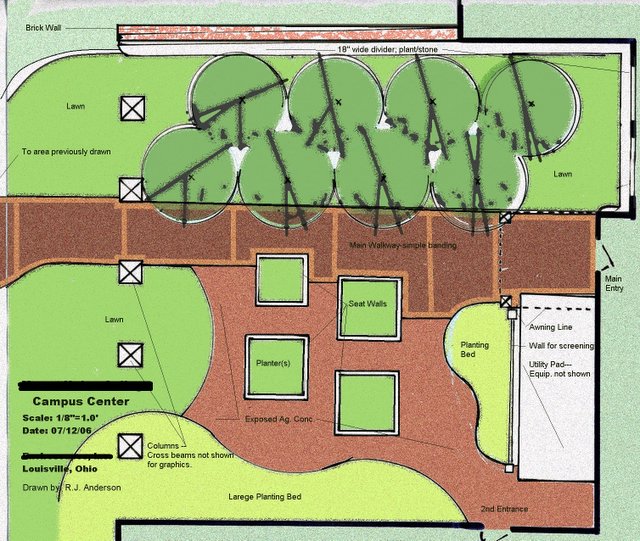
A Tale of Two Conceptuals

 
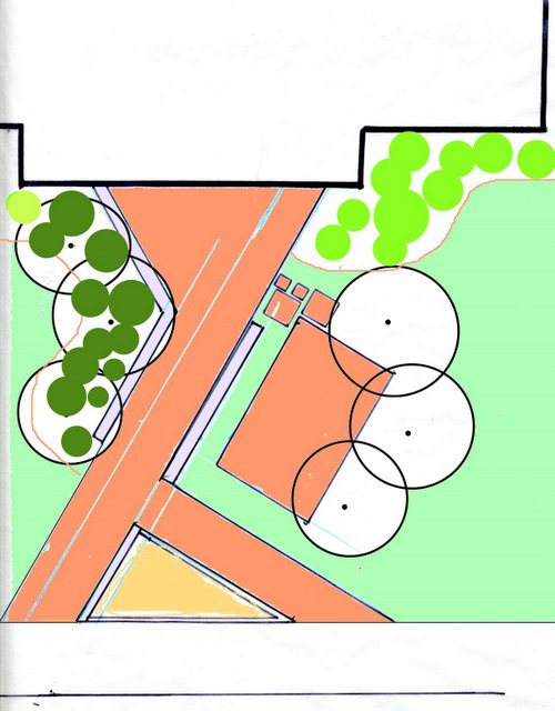
This conceptual uses a design principle called "arc and tangent". Where everything (most things) start out as rectangles and squares, and then are rounded off-connecting arcs/ I have been using a lot of this lately and there is a reason why.

I; personally, was getting lazy with a lot of lines. Lines for walks, lines for beds, lines for planters, etc. I was making work in curvilinear form, and you know what? It was easy . . . easy to do, easy to think of, and easy to implement.

I have noticed that most American Landscapes are some sort, or form of curvilinear. Not just for the "easy" reason,, but . . because it also is the best design principle to use when you start thinking about "Natural".

"Ooooh, I want something that looks natural!" Please dont' get me started on that subject-today. Maybe this winter, but not today/not today.

The upper part, or walkway through the boulder seats, is my ode to the "Japanese stroll garden". It really isn't fleshed out here and there is a reason for that. The client doesn't know it's coming! It will be a surprise and a departure from what's there, and it is totally different from the other side of the main walkway-"The Congregation side".

For a conceptual plan I have drawn a lot of the lines in pretty hard-there is a budget issue along with the design side, and we are working hand in hand. We (the contractor of record and I) feel that if the design is strong enough-the money will follow; as in, raise the budgeted amount.

 
This conceptual is totally different-some Geometric to be sure but the bed lines, hmmm, the bed lines are definitely curvilinear.

The Planters are the same as in the above conceptual, to do double duty: hold plants, and act as a seat wall. Above the main walkway are two rows of trees on some rolling lawn. something to kick back on should the mood strike.

Speaking of the main walkway-it needs some work. Especially going from left to right the right side (along the bottom) is just not good. but, hey! it's a conceptual. There is no reason to tighten that up right now, until they have seen the ideas we have presented to them.

So this is for a high traffic area going into the back of a high use building on a small college campus. Which one do you pick. I know my preference-they'll probably pick the other.

I'm gonna guess this is my longest entry to date. I hope I haven't bored anyone. I do appreciate the e-mails for the "way-to-go's", "keep it up". As long as somebody is reading or listening-I'll keep writing or talking (scary thought). Posted by Picasa

Tuesday, June 27, 2006

Concept Drawing leads to project


Patio, lower landing area, and stone courtyard combined with space to add a spa bring together everything you need for a dynamic outdoor space. These elements are all show in collaboration with each other in this rendering. The clients were very happy with this layout and the only real changes will be to expand the upper area directly next to the house.

On the design it reads at/about 11 ft. They wish to push that out to 14ft., this also means the roof line will be pushed out almost as far. (Look at the dahed line on the plan-roof line). It was decided this expansion would not take away any other space involved in the layout.

This project is also exciting because of the fact the materials will be almost 100 percent stone. Old Foundation Stone used for walls, and large slabs of sandstone for the patio and the walks.

Finally; unlike a certain TV show on a certain TV network, unrealistic demands/desires/wishes were not asked for with an equally unrealistic budget. Clients knew they were going to get into some expense in such an elaborate project. A great working arrangement all the way around.

I've said/written this before, if the Designer "LISTENS" and I mean listens . .. . to the client, to the site, and to the own experience. Good things will happen.

Monday, June 19, 2006

More on the Entrance, from yesterday.

I usually do all my thinking on just black line drawings-usually just a Sharpie, red line pencil, or blue lead pencil. Those are my thinking tools. In this case I needed to throw in a little quick color and send this to the contractor of record.

So I opened up this rough plan view drawing in Paint.NET which is a handy little software deal that is free. I am assuming it is mostly used as a imaging editor, but I have used it for a lot of things. Including preparing images for Powerpoint presentations.

This is more along the line of how I think on paper, trying to come up with solutions for the space. The idea behind this 30/60 degree walkway is to create a more "dynamic" entrance into the building. Using plantings that will enhance and compliment the site, and add some seating for those that wish to linger.
A really rough sketch, this may have been one of my 1st ones-these are the ones done on cheap tracing paper and usually hit the trashcan, no one, and I mean no one ever sees these. Uhh, well . . . except you guys. This rendering is also based on the 30/60 theme.
Another for the trash can. This is the 1st of many for an entrance with several areas for seating. I would/did overlay several more sheets of trace and play/manipulate with this for awhile if I liked the way the "idea" was working. Posted by Picasa

Friday, June 16, 2006

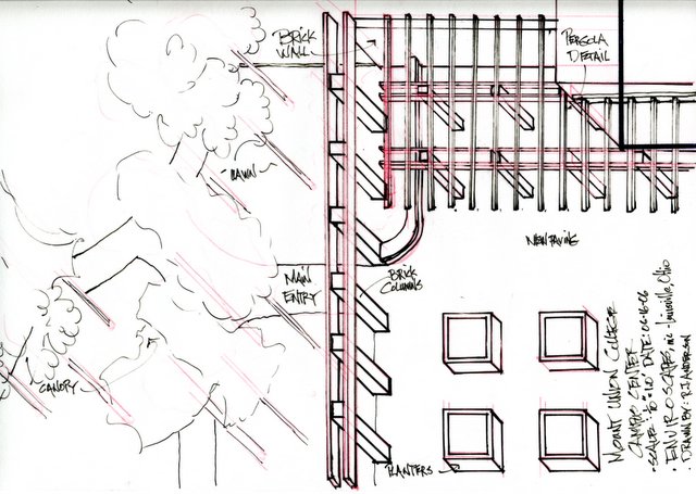
Further Pergola study

Another rendering of the site-before any labeling. This is at an angle further back than yesterday's post. Also no embellishment, dots doo-dads etc. Looks strange without those final little marks to make a presentation drawing.
I will probably present this in the initial meeting-because we are in the exploratory stage. Not the stage were we have ideas we feel so strongly about . . . we need to show big time graphic presentation.

Some call this type of drawing axonometric (I believe). Taken off plan view it shows a pretty good idea of how a lot of vertical elements might play out in the designed space. Posted by Picasa

Monday, June 12, 2006

Conceptual drawings: Plan View vs. Rendering

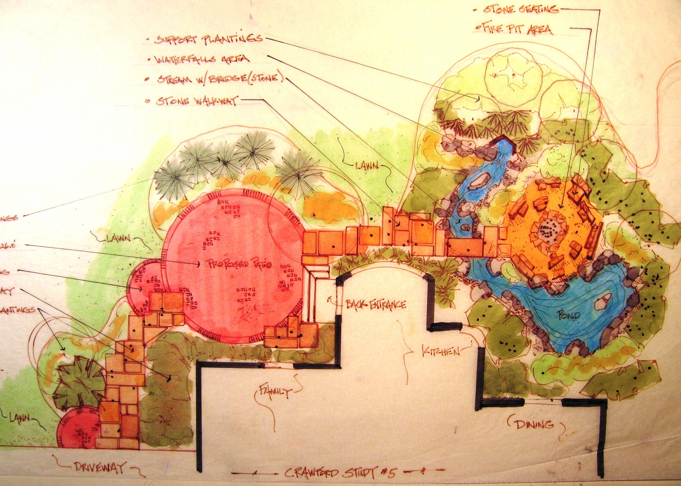
This is the plan view drawing for a project from a couple of yrs. ago. This was done after the drawing below was presented to the client. Here I am trying to show; in scale, how everything relates in this space. Patio, bridge, stream, pond, waterfalls, firepit, and plantings.


This was the 1st drawing that was shown to the client, this speaks to how the owners would actually relate to their new backyard space after the kitchen addition had been added on.
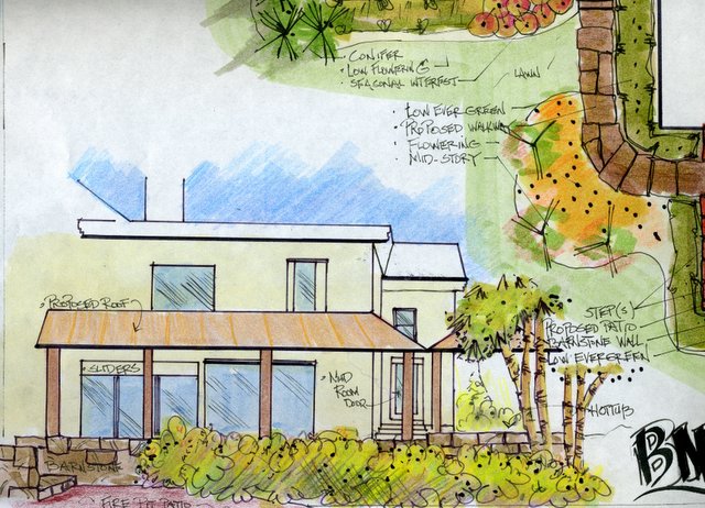
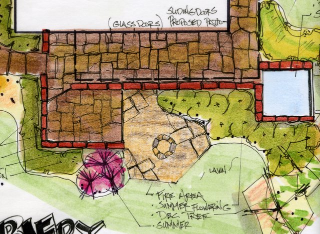
The idea was to show how they would be tucked into a nice comfortable room with a pond on one side and a fully planted berm and on the other.

It also show how the screen planting might relate to the new addition. This rendering (sectional) really shows " possibility". Something you can not get plan view drawings to do.

Renderings also allow for the dialogue to begin between homeowner and designer-working down a path to create the best possible space for the homeowner to enjoy, and live in.

Monday, May 22, 2006

Conceptual Plan

This rendering was in the lower right hand corner of a large color conceptual for a large living space off the house. The idea is to provide some shade but not overwhelm them with shade (darkness) in the back of the house.
The large stone patio is framed by a sandstone retaining wall that steps down onto a full sun level, that steps down onto the grounds surface level that is not quite as "perfect" as the other levels. The long dash line refers to roof line. Posted by Picasa

Friday, April 21, 2006

Backyard retreat

This is the plan view conceptual of the same space as shown in the previous two renderings. Here the relationship of how the entire backyard would lay out and the space between the upper and lower terrace is explained in this conceptual drawing.

Everything starts with the steps and walk off the drive and down into the upper terrace. A fairly wide set of stairs separates the upper terrace and its lawn from the more public pool area, and the large opening coming from the 2 sets of doors from the walkout basement.

Where the pergola is shown there has been a lot of discussion about some sort of poolhouse to be installed. It seems now this is the way the project is headed.

There is also strong interest in keeping the folly/ornament at the top of the hill. We are now investigating possibilities for this structure. Posted by Picasa