Backyard Patio story continues.
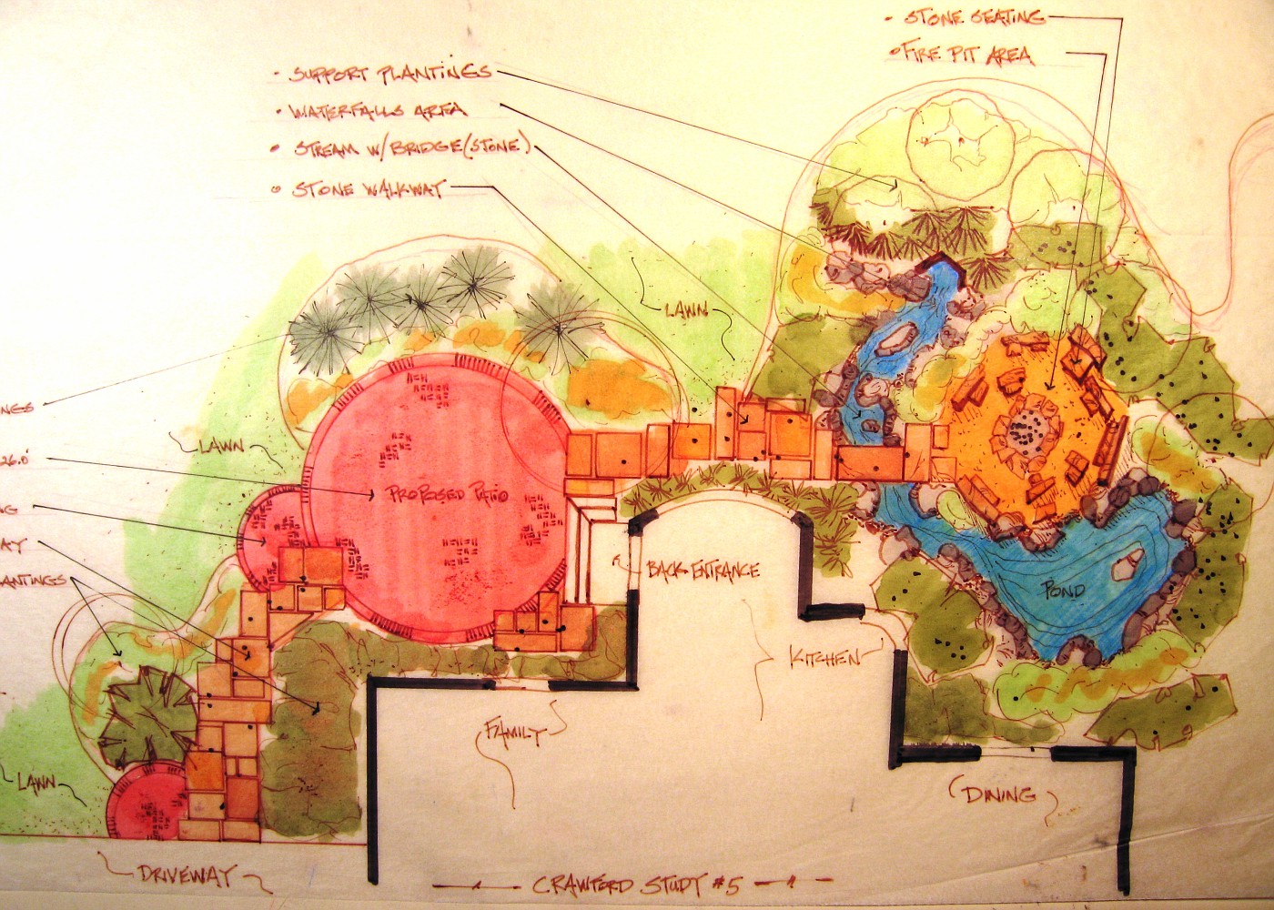
Single water falls, and tan sandstone walkways More on the previous post. This was the 1st plan view color drawing that was shown to clients. Take notice that in this conceptual drawing there is only one waterfall, and the walkway is tan in color. the homeowners looked at this drawing and were very impressed.
I then remember them . . . starting to study the drawing and going over ever detail. It was decided pretty quickly they didn't want brown sandstone for the walkway-they were positive about this.
2nd they were very concerned that the one falls would not make enough noise to screen out the eat of the neighborhood noise, and would only one waterfall be loud enough to hear in the kitchen, and breakfast nook.
Normally, I would just show them a different color of stone (actual stone piece), and take some overlay paper and draw the other falls in the hillside. That wasn't going to work here, they wanted to see another drawing (specifically the wife).
So, I called the contractor and said I had to do another drawing for the homeowners, for x amount of hours to do the work (which he hadn't agree to pay me for). He asked me if they were excited about the conceptuals and were they close to jumping in?
I said; heck yeah, they're ready! . . . .
So the previously posted drawing is what they looked at, and of course they jumped in, over original budget request . . . because it was everything they wanted, in a logical layout, and the best parts could be enjoyed/viewed from inside the house.
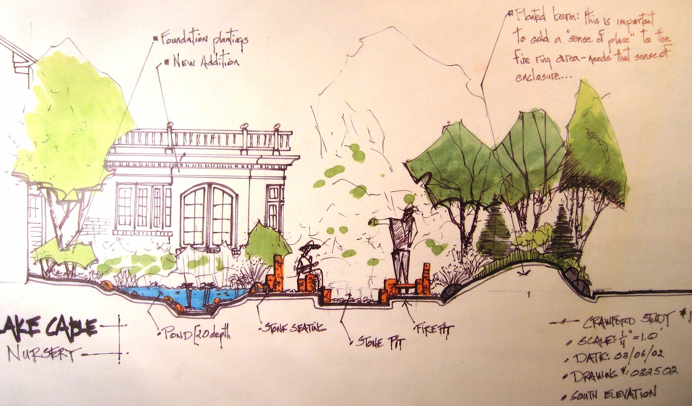
Color rendering of pond and fire ring Along with the plan view rendering, I showed the clients this conceptual rendering of how this area would relate to the new kitchen addition.
The addition is shown only in black line. I was trying to present the landscaping to add to the backyard, which is why my stuff is in color. We needed to excite them about tha landscaping, Heck they had already agreed to add the kitchen-no need to promote that.
I did; however, have to show how the new landscape would relate and enhance the new space. This rendering does a much better job than anything I could have done on a plan view drawing.
This drawing was the deal-clincher for this side of the backyard. I basically laid this on the table and it was over. Let's go, let's put it in, we can't wait . . . those were the comments.
I've said this before, and will say it some more (hey, I'm a poet!), if you design hardscapes, structure, level transitions, etc . . . you must render. This is the only way to really communicate what you are trying to achieve to the client.
Has for this drawing, I'll have more on my evolution as a designer . . . tomorrow.


1 comment:
I totally got an idea here. Sometimes we forgot the color combination of our design thus we just focus in the elements of landscaping.
Post a Comment