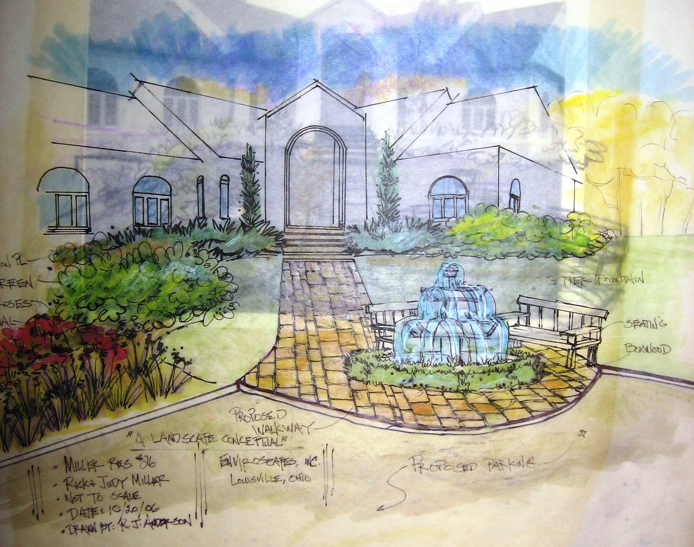
A Front Entry Fountain
A Fountain for nowhere, maybe? This is the image I spoke of a few posts earlier. I took this right after I finished the drawing. You can see the tracing paper beneath and the original photo beneath that.
On the tracing paper is a sketch done in pencil, what I was after was a outline of the fountain and how it related to where I was guessing the end of the walkway would be-and it was a total guess.
The foreground is the parking court. I would call this an entry garden, or entry courtyard. The homeowners got themselves in a little bit of trouble here. They designed the back of the house to face the primary view (a 5 acre lake). The drive came into the side with a 3 garage door entrance, which wound up being an entire story below the main living level. And the grandiose front door??? Well here it is completely detached from the drive, the garages, the view . . . everything.
So they have lived in the house for awhile and have now realized why no one comes to the front door . . . no one can get to it!!!
So in order to get there we have to get a driveway up there, and we have to park the cars, of course, and then we have to be able to get folks from the parking court to the front door. While we are at it we might as well make the journey from the car to the door interesting. We also need to have a gathering place to say hello or goodbye.
They also need to add some plant material to transition from the house to the surrounding grounds. Right now there is nothing, zip, zada, zero! The softer perennial/grasses to the left act as a buffer zone between the parking and one of the retaining walls to be added.
Do I like the design? not sure . . . I can't decide on the fountain, it seems too exposed and it appears I have taken a very formal subject and placed it in a very informal setting. I'm just not sure it works.
As for the actual drawing . . . by now my loyal readers know I am never satisfied with those drawings, need to keep working on those.


5 comments:
Just looking at the drawing, what I feel the need for is something behind those two benches to cover my back and feel safe. A hedge, an arbor--not sure what. In reality it might be closer, but in the drawing the house feels too far away to provide that (admittedly psychological) security.
I agree. And I think a pod-room out by the curve takes away from the drama of the beautiful walk to the door.
Try somthing lower and more "interesting" but less "stare at me."
Like maybe this:
http://www.execo.co.uk/associates.htm
(I'm not crazy about the traingular aspects of this - for THIS application.)
And wire in a light... a nice glow and gurgle.
That walkway has to start about 40 feet from the door because I had to put in a parking court with a minimum size of 36x45 to accommodate 4 vehicles, and include a turn around.
Any closer and the paving is just to close to the house, and at the shape the house is . . . well . . . I couldn't make it work. So now only does it feel far but it is far.
CC I will take a look at the fountain you are referring to. My biggest obstacle here is these clients are really being obstinate on this idea of a big 3 or 4 tier classical fountain.
Sometimes, we just have to swallow hard and make things fit. I will say this though . . . if we do some sort of mock-up and it looks bad or out of place I will tell them.
I just never have gotten a good feeling about this job.
My son has the same trouble with what little web design he has done (basically for friends and family). He doesn't agree with the artistic vision (or lack of it) and winds up putting his name to it (at the "client's" insistence) to something that makes him wince.
I'm glad you didn't take offense at my back seat driving.
Take offense? No way, as for the client, well this is the way it works out some times.
Post a Comment