Hardscape Design
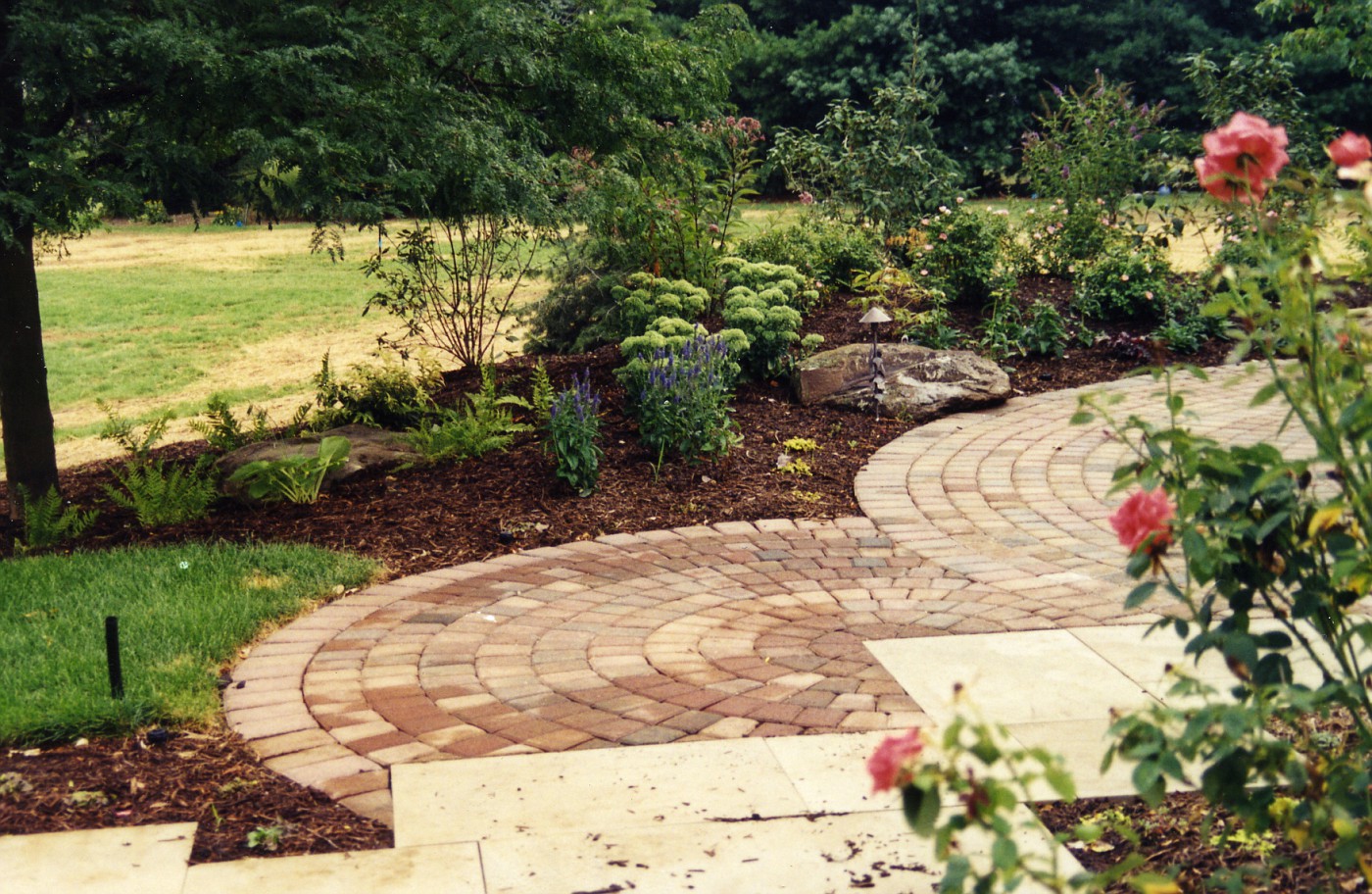
Continuation on Monday's post This image is just a pull back from Monday's post and gives you a better idea of how that smaller circle works. The sandstone slabs in the foreground continue to where the gate opening is to enter this garden.
What we are looking at here is what you(the observer) sees when 1st entering this garden space.
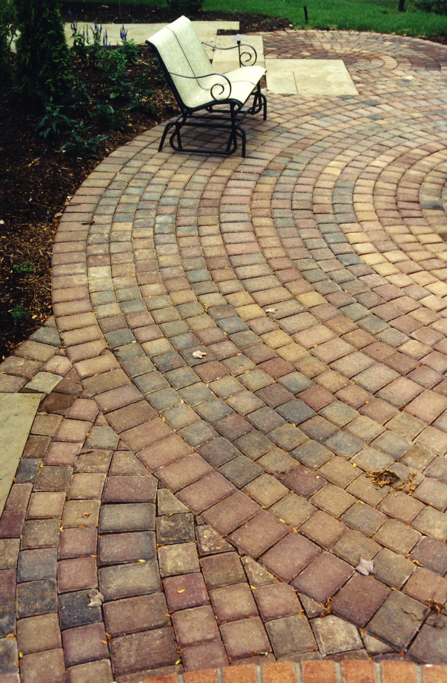
A few more steps and a look to the right is where the double waterfall, stream, pond, and fire pit are located. The direction we are looking back to is where the 1st photo was taken from. I would say we can now appreciate the size of the main circle. This patio space had to be large enough to hold a 6 seat table, a couple of small benches, a chaise lounge or two, and a grill whew!!! A lot of stuff.
Plus enough room to navigate around all this stuff without feeling pinched in, cramped, stumbling over each other.
Right at the very bottom of this photo you can see a different color of brick. This is the landing step coming out of, or going into the kitchen. That brick work is all mortared, and the patio is dry-laid on limestone stone dust.
Ohh, one other thing, see that little bit of sandstone to the bottom left, that was specifically designed as a space for the grill. Convenient to the kitchen access, but completely out of the way of foot traffic and other patio furniture.


3 comments:
Wow, that's a gorgeous hardscape design, Rick. I love how the whirls of bricks are bisected by the sandstone... that's the kind of contrast/tension that I crave, and it works very well with the more restful plantings around it.
Why thanks,
I was looking for the constant grounding of the paver circles to work with the confusion of the staggered sandstone slabs
hey guys, i found a very useful and helpful tips about landscaping...
check this out:
http://homefixfree.com/index.html
Post a Comment