Monday, July 17, 2006

Rendering . .. Designing with Graphic Thought (2)


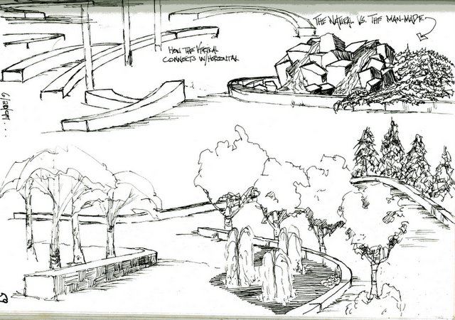
More examples of how I look at graphics to think/create/decide visually. For you designers on the less-experienced side-do not be afraid to go through a lot of "trash" to get you to where your design needs to get to.
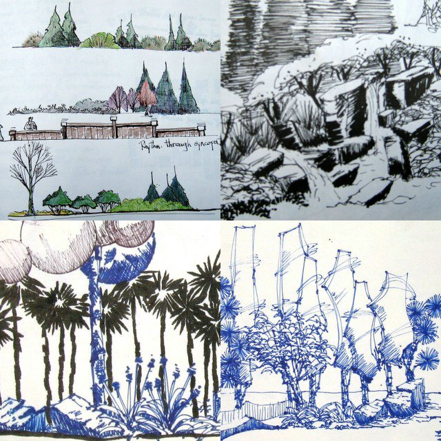
Overlay, on top of overlay, on top of overlay-work those lines. Work to create that magic. Look at the interplay of elements in the space -- it's about spatial relationships. You will also notice there is very little mention of specific plant material/names. That's for detail time - right now is for evergreen/deciduous/tall/short/weeping/upright, etc. The details will come after spatial relationship is decided.

One other thing about this design process-do not be afraid to jot notes down along with the graphic thoughts. In classes that I have taught what I see a lot of beginners do is work with lines (timidly), or they come in off a site, lots of notes-but then stare at the paper . . . DRAW!!! It won't bite back. Posted by Picasa

Sunday, July 16, 2006

Rendering . . . Designing with Graphic Thought


For me the design process is a continual manipulation of lines on a surface(paper). At some point I achieve what I am looking for. Well, most of the time I find what I am looking for-though I am not sure some of my friends would agree with this.

So what are we looking at? This is an early conceptual for a plaza in a small town. A couple of buildings were slated to be torn down and they were looking for some ideas on how to use the space. In this case, the budget fell completely apart early in the project and nothing became of this.

I bring this up because of the plaza project I had just been working on, and the idea of the seat wall working it's way through the tree line, making it (in my mind) kind of "arty".

"Arty" -- I'm not exactly sure how you would define that. It's sort of how homeowners use the word "natural". For the most part they have no idea what that means-most likely that is the same with me and "Arty" Posted by Picasa

Seminar sketchbook 3


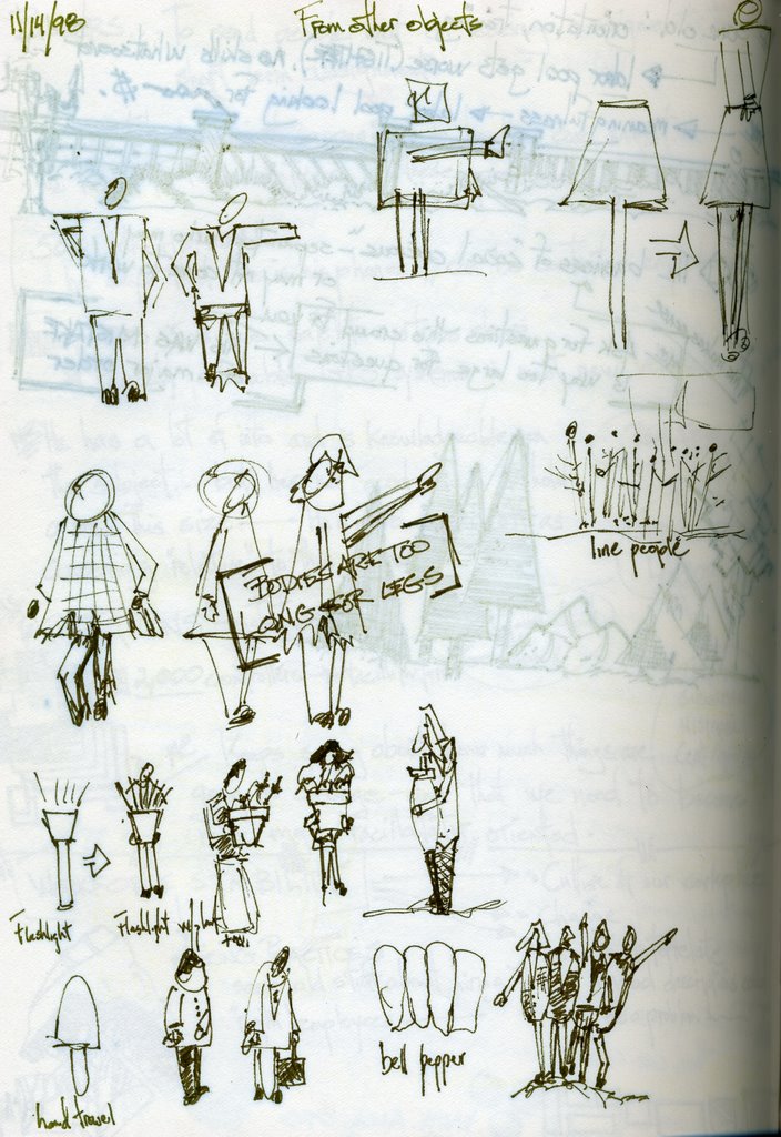
Well this is another scan out of the '97/'98 book. It looks like I was in a class on drawing people-a lot of my former studente were terrified of drawing people, just terrified.

Actually, all it takes is an oval, a hangar, some folds, a "W" and some tiny "o's". and you've got a person. See? Don't you feel better - you can draw people.

Friday, July 14, 2006

A Decision Reached

 
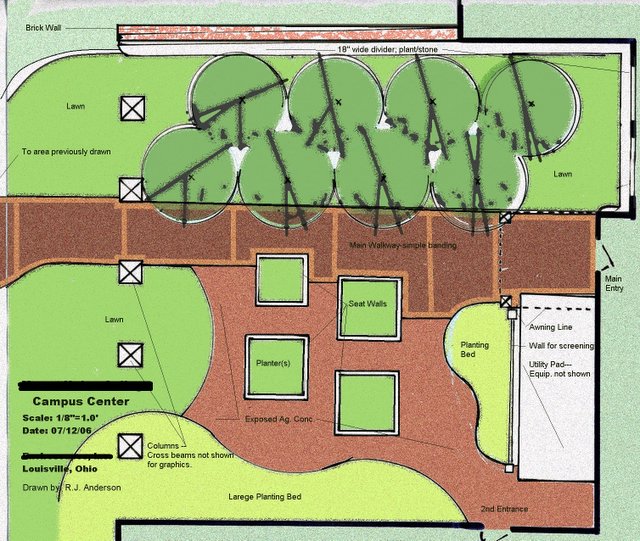
A couple of posts ago, I talked about this plan view conceptual vs. the other example posted. I discussed the pros and cons of each and added a few other thoughts. This was the one that was chosen for the project.

The client liked the possibility of students being able to interact between the seating areas available to them. They also liked the collection of trees on the other side and the overall feel of the courtyard.

The important thing for any designer to remember is that given the task of defining space with a lot of people and traffic---give them a space for "community", allow them space for interaction and possibility.

I think I learned this lesson best when I hop-scotched all over Central America. There was a great sense of community and interaction in the city plazas where there was:

1. Seating -- and lots of it.
2. Focal points to congregate -- around-steps, platforms, statuary, tree-planters.
3. Trees, trees, trees -- for all the obvious reasons and the fact that trees provide a sense of enclosure.
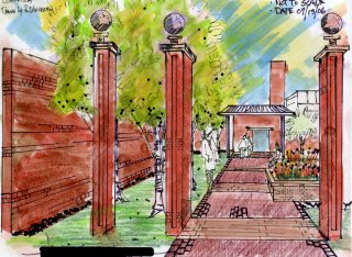
 
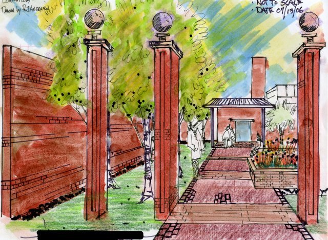
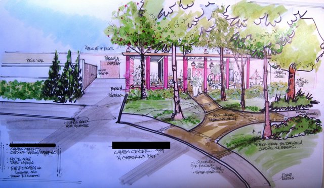
This color rendering also helped seal the deal. Although I personally think this is a technically bad drawing, it does speak to how the space could look.

In the construction layout, we are looking at 16-17 feet between the walkway and the brick wall on the left. They are still talking about 8' high; I hope that is scaled back to 6' or so.

That wall is important as it screens off the service/delivery dock. Anything less than a solid wall would kill the feel of the plaza space.

When I speak about technically poor, I am referring to the way I used color here, and the heavy hand with the color.
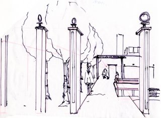
 
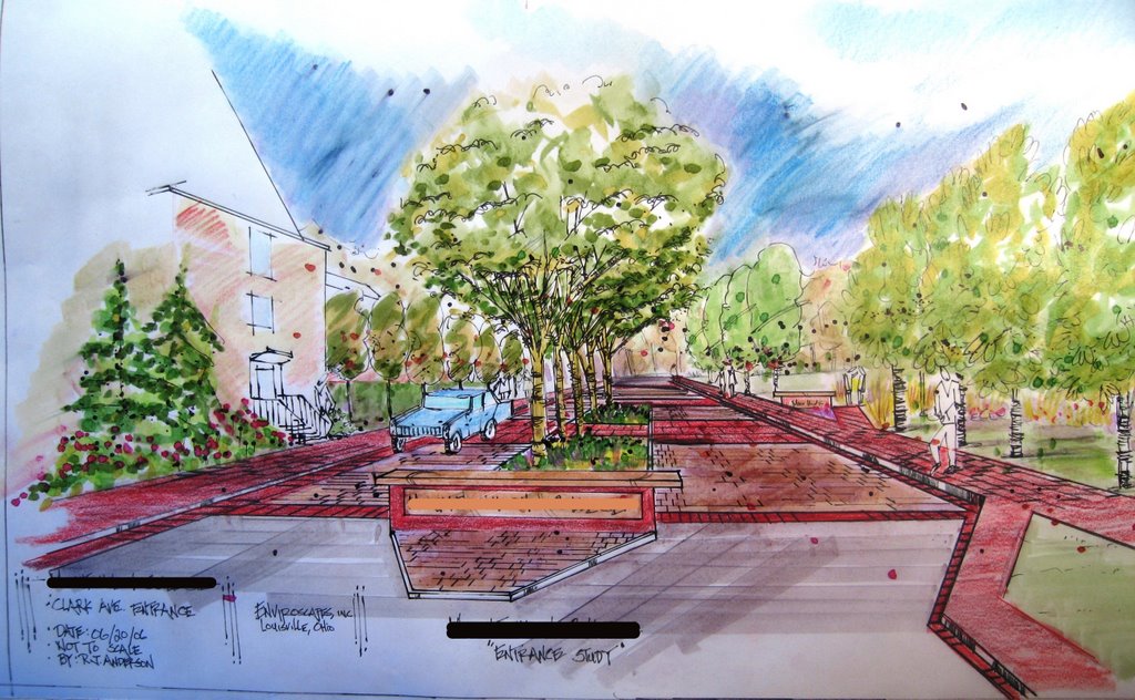
Ahhhh, a black and white line drawing. This is my kind of landscape rendering. The stage shown is the step before the color drawing. There were 4 trash drawings before this one. Each drawing builds upon the last. When I finally get to a place I like, the drawing is then done in a style that is presentable to the client.

To the laymen out there, this is a one-point perspective drawing; one of the simplest styles to use and because it is simple, it is effective and powerful as a design tool.

I was trying to give the observer a view from just outside the threshold entrance to the plaza, to show how it would look upon entering the area. All other renderings of the entire space had the observer standing in the street or halfway up the hill - about 100 feet from where we are now standing.
 
This rendering is a reminder to also show the scene outside the plaza area. I posted these drawings a couple of weeks ago and there are a few more to go along with it.

This tells the story of what the observer would see coming down the street or coming to the plaza area from the football stadium. The trees are not only here for all the obviously good reasons, but there is a lot of equipment on the roof of that building which these trees will screen away.

It was these drawings, along with some others, that have cemented an agreement between the contractor and the client. There are changes that will be made, and tweaks along the way, but the concept, the feel, the flow, will remain. To be sure, some enthusiastic choices about plant material, spacing, etc. remain.

The project starts later this summer and is to be completed around the 1st of September. I will post pictures and we'll see how close the concept came to reality. Posted by Picasa

Thursday, July 13, 2006

Seminar sketchbook 2

 
From the '97/'98 book. must have been looking at a small waterfeature and stone walkway project with a Japanese Aesthetic.

Plus it's bigger than what would go on the back of a business card . . . this is a blog insider joke, of probably which I will be the only one who gets it. Oh well, hey-it's my blog. Posted by Picasa

Rumblin', Stumblin' Bumblin'

So I get an e-mail from Oldroses at Garden Voices which is part of the GardenWeb.com site. Letting me know that she had linked to my site and posted the sketchbook story. The Garden Voices page is one of those sites where they do a lot of clipping from stuff around the Web-as I understand it. Lots of work, lots of perspective, a great source for Gardeners

While there I stumbled across Sign of the Shovel by Michele Owens. Michele I love your The Shoveler's Manifesto. I was laughing pretty hard. What else I like about this site is . . . it's about gardening, but it isn't about (my battle with the whiteflies) kind of gardening site. Check it out. Nice stuff, and a great find/link from Caren at Garden Voices.

So, snooping around I noticed a link to Garden Rant Uprooting the Gardening World. And I love it. great, great, great-very funny stuff. Just think about it ladies (Amy, Michele, Susan) I am part of that Horticulture Industry and I do lots of landscaping (well, actually Landscape Design) and I love to work with plant materials. Yet, I still love your Blog.

This, however, I will not hold against you and I will certainly add you to links that I "know" are linkworthy. Keep it up, keep up the fight. There are a lot of "yahoo's in my industry" . . . afterall, why do you think I'm here?

I gotta get me one of them Tip Jars . . .

Wednesday, July 12, 2006

A Tale of Two Conceptuals

 
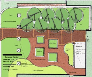
This conceptual uses a design principle called "arc and tangent". Where everything (most things) start out as rectangles and squares, and then are rounded off-connecting arcs/ I have been using a lot of this lately and there is a reason why.

I; personally, was getting lazy with a lot of lines. Lines for walks, lines for beds, lines for planters, etc. I was making work in curvilinear form, and you know what? It was easy . . . easy to do, easy to think of, and easy to implement.

I have noticed that most American Landscapes are some sort, or form of curvilinear. Not just for the "easy" reason,, but . . because it also is the best design principle to use when you start thinking about "Natural".

"Ooooh, I want something that looks natural!" Please dont' get me started on that subject-today. Maybe this winter, but not today/not today.

The upper part, or walkway through the boulder seats, is my ode to the "Japanese stroll garden". It really isn't fleshed out here and there is a reason for that. The client doesn't know it's coming! It will be a surprise and a departure from what's there, and it is totally different from the other side of the main walkway-"The Congregation side".

For a conceptual plan I have drawn a lot of the lines in pretty hard-there is a budget issue along with the design side, and we are working hand in hand. We (the contractor of record and I) feel that if the design is strong enough-the money will follow; as in, raise the budgeted amount.

 
This conceptual is totally different-some Geometric to be sure but the bed lines, hmmm, the bed lines are definitely curvilinear.

The Planters are the same as in the above conceptual, to do double duty: hold plants, and act as a seat wall. Above the main walkway are two rows of trees on some rolling lawn. something to kick back on should the mood strike.

Speaking of the main walkway-it needs some work. Especially going from left to right the right side (along the bottom) is just not good. but, hey! it's a conceptual. There is no reason to tighten that up right now, until they have seen the ideas we have presented to them.

So this is for a high traffic area going into the back of a high use building on a small college campus. Which one do you pick. I know my preference-they'll probably pick the other.

I'm gonna guess this is my longest entry to date. I hope I haven't bored anyone. I do appreciate the e-mails for the "way-to-go's", "keep it up". As long as somebody is reading or listening-I'll keep writing or talking (scary thought). Posted by Picasa

Tuesday, July 11, 2006

Sketchbook Rendering

 
A rendering from the old days . . . this was taken out of the '97/'98 seminar sketchbook. I have kept these books since 1988/'89. That way I have all my notes since that time from all seminars attended-save one.

I was leaving the .ANLA Management Clinic in Louisville, Kentucky one year when I heard a strange noise behind the car. The noise was my seminar book hitting the road(it had been left on the trunk of the car-apparently). I stopped the car, got out . . . and never did find it. Very puzzling.

I guess the information was so good from the Management Clinic that whoever immediately came behind, or saw it fly off the trunk-just had to snatch it up.

But I digress-this was a concept drawing for a stone grouping, plants and water. A Rick Anderson vignette . . . if you will.

So how 'bout it? Want me to build one for you-let me know. Posted by Picasa

Monday, July 10, 2006

Squidoo

Squidoo, what is Squidoo??? exactly what I was thinking when I ran across it in the Pinko marketing Blog. What is the Pinko Marketing Blog? it's a Blog I stumbled into while reading 10 resons why the internet is good on horsepig cow.

Think about it horepigcow to Pinko Marketing to Squidoo on The Whispering Crane Institute. It must be the internet.

Back to the original question. What is Squidoo it is a on-line community with folks talking about what is near and dear to them in something they call a Lens. A single page on a specific topic, this is what Squidoo has to say . . .
"We have built a new online platform and community that makes it easy for anyone to build a single page--called a lens--on a topic, idea, product or cause he is passionate about. These lenses in turn help finders get unique, human perspectives instead of computer-selected and often irrelevant search results. Not only can Lensmasters spread their ideas, get recognized for their knowledge, and send more traffic to their Web sites and blogs—they could also earn royalties.

Squidoo's goal as a platform is to bring the power of recommendation to search. Squidoo's goal as a co-op is to pay as much money as we can to our lensmasters and to charity. And Squidoo's goal as a community is to have fun along the way, and meet new ideas and the people behind them."


Why am I using Squidoo? It looks like a good place to sit down some very specific information on very specific topics, and it looks like another great way to promote this blog-which needs all the promoting it can get. My Blog will continue to be the number one source for information.

A postscript-if you want to sign up for Squidoo, please use this reference link:

http://www.squidoo.com/lensmaster/referral/rickanderson

Sunday, July 09, 2006

Nature as Teacher (3) Setting Stone


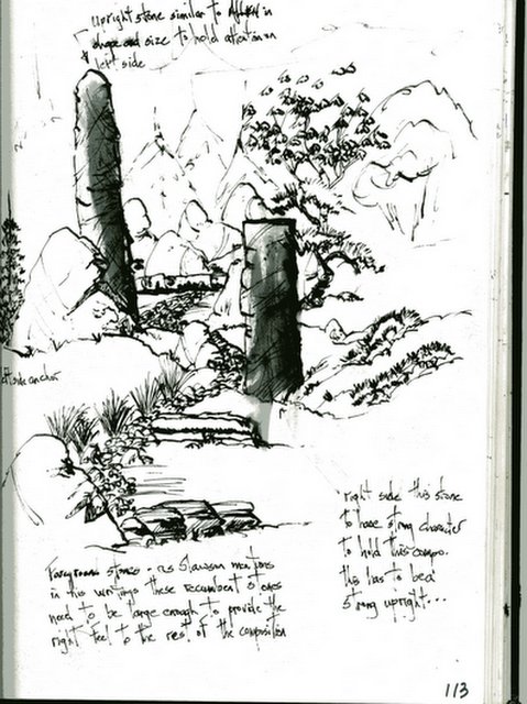
The unusual alignment of the upright stone really appealed to me. This stone added something to the space that I found very compelling. Though the stone is much smaller it adds a strange kind of balance to the space. and also acts on it's own. I guess I am a sucker for upright stones like this-they send a great message or add character to their space.

When it came time to build this set of vertical falls I really wanted to try and add some uprights to the composition. Not only do they hold the left side of the "build" together, the two stones bring "something powerful" to this designed and built waterfeature.

It's been written in a lot of literature about stone pointing-directional and all types of symbolism with the uprights, history abounds with this discussion. well I just really like the look and the way the stone seems to speak for itself-very powerful. Plus I feel good about using the uprights because I have seen the same pattern in the natural World.

In most cases the majority of the stone should be composed with the grain running in the same pattern-to mimic what occurs naturally. Something a lot of professionals seem to forget, not think about, or just plain dis-respect the occurrences in the natural World.

If you really get out and study stone as it occurs you will see the "Contrarian" stones in their natural settings and understand where this type of stone work happens. Big rushing violent water, long drops, cliff bottoms, geological catastrophe, etc.

So break the rules of stone setting-only after you have learned the rules-and most importantly studied the occurrences in the natural World. Posted by Picasa

Friday, July 07, 2006

Nature as Teacher (2)


Root Flare:
Look at how beautiful and striking the root flare is . . .really gorgeous. We don't see a lot of that in today's American suburban landscape.

Why is that you ask??? Either (1.) The tree came to the site too low in it's container or root ball. (2.) Was planted too low. (3.)Mulch-Man there is a whole lotta mulching going on! mulch that is applied and how it is applied really irks me. I wish I could find some of those slides I have where the mulch is piled up a few feet high around the base of a tree. 7 or 8 inches deep in beds-but I digress.

This has to be one of my greatest pet peeves that I see in today's landscaping practices-whether it be homeowner or professional. Too much mulch !!!! So lets get that under control. For me-give me some great root flare any day. Posted by Picasa

Thursday, July 06, 2006

Nature is the Teacher

 
"When we pick up anything, we find that it is hitched to everything else."
--- John Muir
 
"If faith is put in a stone, it takes care of anything, if not it remanis a mere stone." ---Hindu Proverb

 
"Resilience is like a muscle. The harder we work it, the stronger it gets."
--- Beth Miller Posted by Picasa

Wednesday, July 05, 2006

Stream, Falls, several years ago

 
Not as happy with this final project-can you guess why???

This was taken about 6 months after completion.

The stone is a West Virginia field stone. Posted by Picasa

Saturday, July 01, 2006

A Stream for the residential Waterfeature


Stream pictured is in it's 3rd season (early), and is coming along nicely.

I've found the key is to use as little stone as possible-even though I love stone. I am referring here to the "piling" of rock along the stream edge. This is the lazy way out. Rather than looking to berm correctly, develop good plantings, or create good shallow work----"heck let's just pile up some rock".

Stay consistent with plant material-using fewer varieties, in larger groupings.

Create shallow areas, and mini rapids-achieved by "fish-scaling" small flat stone in the creek bottom. This slight overlapping of stone is tough to do to create the rippling effect desired. I have seen a lot of experienced builders never achieve this look. Too much round stone in the creek bottom.

Also all this talk about wanting to remove all algae and go to the pristine look-waterfeature builders do not educate themselves on the proper ecological balancing act and cater to the lowest common denominator; which is . . . Pile in the rock, open streamway, little planting(s), and heavy reliance on "kits" to do the work, along with some bacteria. No real thought on the pond or stream planting-just a by the numbers of a few plants. Also giving in to homeowners on the type and number of fish a pond can handle. Am I ranting??? probably so . . .

I guess I better not even get into the plantings around the pond, or the foreground presentation for the pond-yeeeeesh,now I am about really ready to get started!


Build good waterfeatures-get out and study nature-really study nature . . . wade through a few streams . . .ha!, get your feet wet! Posted by Picasa

Friday, June 30, 2006

Sandstone Slabs


Here's a few shots thrown together of a few projects that I had put together with some sandstone.

The bench in the upper-right is a sandstone called Tennessee Web-wall. I guess the locals have named it as such because the striking rings of mineral elements in the sandstone look like webbing. I've not use any in a few years and it looks to be in short supply from what I was told.

The other 2 shots are of the same stone being used in simple sculptural elements in the garden. An attempt to add a vertical element with some 4 season interest.

The lower right is some pieces added to a Children's Garden for the AHS in Alexandria, Virginia back in the mid-90's. I've no idea if my stuff is still there, moved, tossed, just no idea . . .

Anyway; it's good to look back once and awhile-to measure how far we have come, and how far we have-yet to go. Posted by Picasa

Thursday, June 29, 2006

Sketchbook sampler

 
Just a little something from the sketchbook. I guess you would call it doodle time. Posted by Picasa

Tuesday, June 27, 2006

Concept Drawing leads to project


Patio, lower landing area, and stone courtyard combined with space to add a spa bring together everything you need for a dynamic outdoor space. These elements are all show in collaboration with each other in this rendering. The clients were very happy with this layout and the only real changes will be to expand the upper area directly next to the house.

On the design it reads at/about 11 ft. They wish to push that out to 14ft., this also means the roof line will be pushed out almost as far. (Look at the dahed line on the plan-roof line). It was decided this expansion would not take away any other space involved in the layout.

This project is also exciting because of the fact the materials will be almost 100 percent stone. Old Foundation Stone used for walls, and large slabs of sandstone for the patio and the walks.

Finally; unlike a certain TV show on a certain TV network, unrealistic demands/desires/wishes were not asked for with an equally unrealistic budget. Clients knew they were going to get into some expense in such an elaborate project. A great working arrangement all the way around.

I've said/written this before, if the Designer "LISTENS" and I mean listens . .. . to the client, to the site, and to the own experience. Good things will happen.

Monday, June 26, 2006

Doodling a Landscape Rendering

 
This was the simple black line drawing before anything was done.
 
Rendering after adding some color pencil, decided to just fool around with pencils this morning, and not soak up any fumes from markers. I don't really like to render in pencil only, I use pencils to enhance the marker work done for presentations. For me I hae not been able to make the pencil work come alive.

I have seen artist who are great with colored pencil; but for me personally I cannot justify the time to make that type of drawing for for a landscape rendering.
 
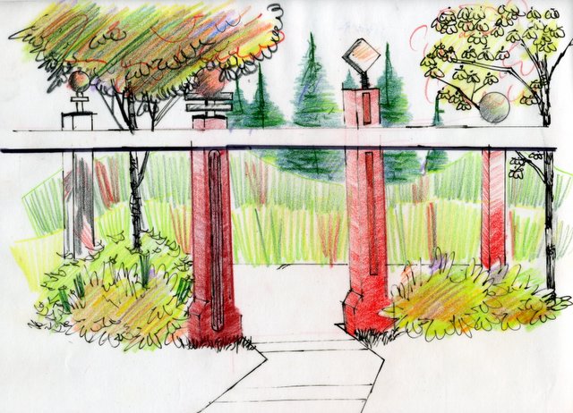
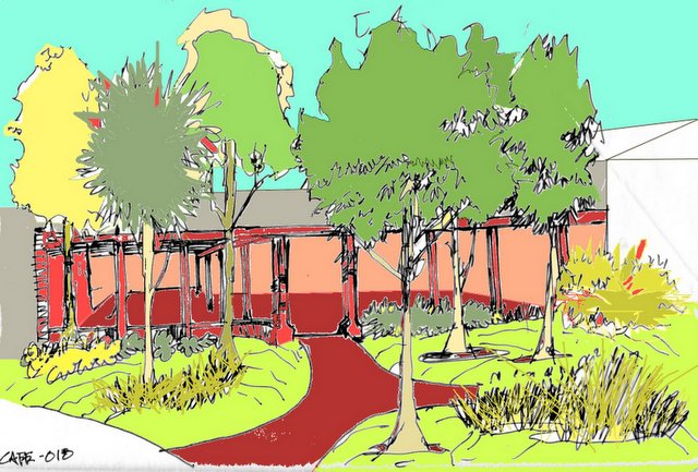
Here is my completed color pencil drawing. This is just a simple design based on the pergola/seating area that I had been working on last week. The difference here is that I am showing different scenarios for columns.
 
Paint.NET was used to color this drawing. I had scanned the black and white drawing in and the fooled around with the program to come up with this rendering. There are a lot of effects in the software, and you have to ability to layer in, so this could look a lot different with some depth and dimension added, but I haven't been able to put in the time yet.

Paint.net was made to help manipulate photo's and I would be able to render right over the images I take,(creating a before and after)and manipulate that way. Right now it is a case of I am committed to work on making my hand-drawn renderings better. More depth, more dimension, more jump off the page.

Paint.net is fun to play with, and I will continue to do so. I have no real desire to learn more advanced/complicated software for drawing. Nor do I want to get into one of those software programs that "image" landscapes.

I guess you could say I am "old-school" and I intend to stay that way. Posted by Picasa

Sunday, June 25, 2006

Land+Living Network

On the 22nd James Lippincott from Land+Living.com gave me a shout out in his "Clippings" area. I would like to thank James and at the same time suggest you take a look at their site.

They look at any; and all sorts of design-no matter the field. Design is design. Land+Living will track it down.

I had been going there for quite some time, and had sent him a note telling him so. He was gracious enough to ask for my address to take a look here.

Next thing I know he's got me up in the Clippings section. James; thanks again. To my readers if/when you have a chance take a look over there-it's some good stuff.

Been a few days . . .

I have actually not seen a computer since Thursday, I had been camping for a few days, so I had been away from posting-obviously.

Tomorrow I find out how some of my other presentation drawings worked out and will share that info here.

Thursday, June 22, 2006

Conceptual for Campus Entry


More on this later. Conceptual shows more of a Boulevard look for the campus. Right now it is a simple two-lane road, parallel parking on one side, pull-in parking on the other.

The trees lining the street would also be new additions.

Opera vs IE, My Personal Browser War

I have done some tweaking to my sidebar, and made a slight change in the overall layout to the site. After doing this I looked at how this page displays in both IE and Opera (which is the browser I use almost 100%).

As a Designer I am amazed at the differences. Mainly how much cleaner my page looks in Opera and how everything lines up so well on the sidebar. It's very clean, much like my preference in how I design a lot of Landscapes.

I have not looked at the page in Firefox and would welcome any feedback from someone who has.

A question I have for someone familiar with this type of blog (Blogger) How do I get rid of those division lines at the bottom of the sidebar??? Also small buttons started to show up on some of my list on the sidebar (this is in IE only)how do I get rid of those?

At any rate I will stick with Opera and hope those of you who drop in on IE are not too inconvenienced. if you're having problems drop me an e-mail. Thanks.

Wednesday, June 21, 2006

"Further"Pergola Study, a Color Rendering

Rendering above was done with Paint.NET which I spoke about on the 19th. It was done in this style so I could e-mail a color conceptual to the contractor enabling them to easily identify the different areas in the landscape. This rendering was/is never meant to be used as a tool in the face-to-face dialogue between myself and the final client.


The large hand-drawn (17x24)above is meant to be used as a tool to open dialogue between the client, and contractor. (I also posted on this same area on the 15th and 16th of this month.) My job will be to listen and observe. Find a way to hear what the client really wants.

They had asked to turn this parking area (right now this is all asphalt), into a place to gather before and after events, and to be used during the school week for everyday functions as part of the Campus Center.

The large columns mimic columns on the front of the building, the smaller background columns play off a gathering space on the other side of building. The pergola covers about 30% of the area with tables/chairs/planters etc. This area will have a paver floor throughout.

The area showing shrubs, lawn, and trees is also asphalt. It will also allow for gathering, create some nice green space and the trees will act as a separator between drive and pavilion. The canopy will also provide screening for the large amount of HVAC on the roof of the building.

The area to the left will also be re-landscaped to hide the service area and dumpsters.
All in all, quite a challenge. I'm sure there will be changes to the above 'Landscape Concept', hopefully it is a good jumping off point.

Posted by Picasa

Tuesday, June 20, 2006

Sphere, searching for blogs.

Just wanted to make a mention of this web site. Sphere has listed me as one of the most relevant blogs for "Landscape Design". A big thanks from me, as my little presence continues to grow on the WWW.

I will continue to try and bring relevant info on design to this site, especially in the work that I am doing. I will also try and remember to keep some more of the "trash" drawings, scan them in, and post them here. Enabling you to see the process I am going through to get to the final product/design/rendering.

I had never seen enough of the "process" in past seminars, symposium, lectures, workshops, etc., I had been to, and I feel that is important to show-"the process" through the working drawings. I am sure that will be lots more on this.