Monday, October 30, 2006

The Importance of Hardescape Design

Brick Hardscape Ideas
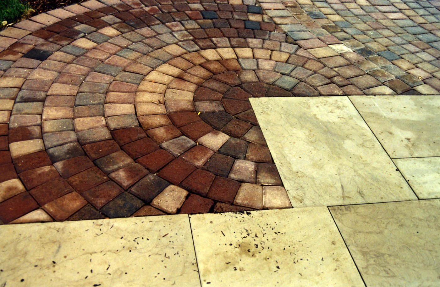
This walkway/patio was one of those tricky designs on paper that you hoped would work out on the ground. It's like I draw this to exact scale, knowing the materials we are using . . . and hoping the field guys can implement the plan correctly.

I knew when I drew this and presented it to the clients that this could look really great in their back yard, I mean really great. I believed one of the keys was making the sandstone work into a good strong pattern.

Luckily for me the supplier was able and willing to give me the sizes I wanted, at the dimensions I wanted. So the stone could be scaled out exactly the way it would w0rk in the space shown. The slabs were cut in some ratio of 12 inches. so the pieces were 1x2, 2x2, 2x3, 1x4.

This also cut down on waste; everything was scaled out, laid out, on paper. That way I knew exactly how many of each piece we needed. I remember we picked up 2 extra of every size in case of breakage, chipping, whatever. These extras were latter used underneath a pergola swing.

After the sandstone walkway was laid out it was a simple matter of laying out a couple of large circles of brick to interact with the sandstone.

I remember moving the circle template around to try and find some sizes that would fit the scene . 1st starting with the largest circle and working to fill in the blanks with the smaller circles; or , slices of circles.

The tri-colored dark pavers are a strong contrast to the tan sandstone slabs. So . . . even with the strong color contrast, a contrast that was, to me very powerful . . . the stone and pavers flow together. I guess you could say the scene is harmonious . . . without being harmonious.

A side note: Over the last few days I had wriggled my way in to a cyberspace argument on planning, specifically . . . why planning is a myth, or bad somehow. I think the above post is a perfect example/explanation of the design process, and is the perfect response to; why design is important, and believe me----Design is important. If you want to move a perennial around, or buy a shrub on a whim . . . go ahead. I just wouldn't recommend buying 7 tons of stone on that same whim.

Sunday, October 29, 2006

An Appreciation of Stone 15

Hidden Millstones
In the above photo the unfinished millstones (grindstones) are sitting in stacks so high, long, and deep it almost looks like the rockface of a hill side. This must be where stones were stored before finishing, or heck, it could be a pile of seconds.
The shape and the outline of the stone is much clearer in this image. The way they're stacked with the outline that is showing (the tracery) . . . this could be a sculptural installation.

I really like how the stone jut out of the hillside, the randomness of the stack, and the shadow lines. It is in those area's of darkness that make the light more pronounced.

The interplay of those elements is a powerful tool in the designers toolbox (How's that for a cliche' ???). The added height of interest, and mystery is great.

Friday, October 27, 2006

Feed the Birds Day

Dinner Time

Tomorrow is Feed the Birds Day, Saturday the 28th. Now I do not know who proclaimed this, or certified this, or what makes the 28th the day, but tomorrow is the day. Maybe it is tied into the day we turn our clocks back, which signifies that autumn is flying by and old-man Winter is near, boooo!!!.

I originally found out about this on the Treehugger site, and from there went to the RSPB site. The Royal Society for the Protection of Birds. Where you will find just about everything you need to know about feeding birds, and I mean everything.

When looking at this; I am starting to wonder, is this a British Day, a International Day, or something we've hijacked for commercial purposes?.

Actually I am now really wondering because I don't know if the Brits practice Daylight Savings Time. Would this confuse the Queen? Hmmmm, it seems that this post is more about questions than answers.

At any rate, a Landscape Designer has a responsibility to create environments that our beneficial to our feathery friends. Personally, I like it when the client remarks about being a birder, and for me, landscaping to accommodate that hobby is important. Designing for birds leads to a emphasis on plants that allow for cover, food, water, shelter, and protection from predators.

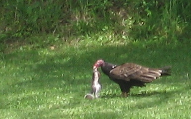
As for the above photo . . . well predators gotta eat, and out here in the country they do a pretty good job of cleaning up road kill. It is part of the cycle of life.

So no matter who's day it is tomorrow here's to our little feathery friends, now go put the cat away . . . at least for tomorrow.

Thursday, October 26, 2006

Creating a Forest Garden

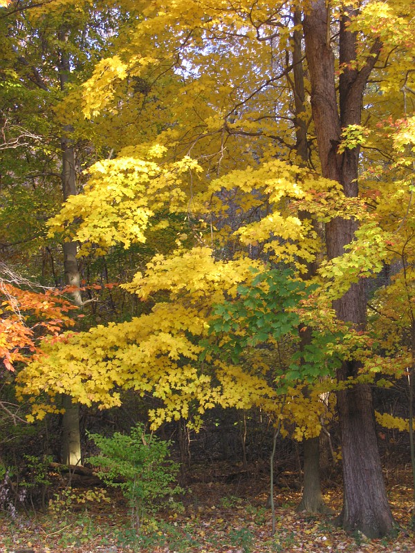
My forest in the fall
The area you are looking at is the start of my forest garden, luckily for me I have this great canopy to work with. From there I had originally thought it was a matter of adding other vegetative layers to make this a successful garden space. How wrong I was about this. There are actually 5 distinct architectural features according to the folks at Edible Forest Gardens. From their site:

  • Soil horizon structure, vegetation patterning, vegetation density, and community diversity are also critical. All five of these elements of community architecture influence yields, plant health, pest and disease dynamics, maintenance requirements, and overall community character.
The ecology of a forest is very complicated and for that reason there is very little recreating of actual forest in Landscape Design. What most of us seem to do is plant a few canopy trees (or borrow those existing on-site), add some shrubs that fit existing soil requirements, and then throw in a few perennial groupings.

I don't even think I have ever referred to my former work as a forest garden. Maybe a vignette of nature, a recreation of nature . . . but never a forest garden. The thought of calling spaces (forest gardens) where the idea would be to develop that ecology just never occurred to me. Add to that this isn't something that comes up everyday in residential Landscape Design.

I was originally peaked on this subject by a article in the Columbian, about the forest garden in the Northwest U.S. and that's lead me on to further exploration.

The 1st site to go is Edible Forest Gardens, this is more than a site hawking a book, there is a lot of good info here to go through. I found a couple of other pdf's worth downloading one is from Cornell, and the other is from The Ohio State University (Go Bucks!); here's the pdf, and here's the fact sheet. which include a plant list that has a lot of info on a wide variety of plants that work in creating a forest garden.

I believe this is an important discussion for us Landscape Designers as we are faced with the continuing struggle of designing on former farmland, field, or forest that has been pillaged to make way for a subdivision. To try and create a sense of space that is warm and inviting with some enclosure. What better way to do that, than with trees.

With trees comes the opportunity to add other varied material, to create diversity, color, opportunity, wildlife, and tranquility . . . the forest garden. The trees are the beginning of the forest garden, a reclamation of former forest, and a gift to future inhabitants.

Monday, October 23, 2006

ANLA, Management Clinic

Every year in Louisville, KY. the American Nursery and Landscape Association (ANLA) holds their yearly conference, they call it The Management Clinic. The dates for the 2007 Clinic-Jan. 31st through February 3rd.

It's very easy for me to describe the Clinic . . . it's a blast! an absolute blast!!! I belong (have belonged) to many organizations in the industry, and attend many conferences, events, seminars . . . the Management Clinic is the best. The ANLA staff is terrific; going way above and beyond the call; and the ANLA members who volunteer to make the Clinic work . . . work like dogs to make this the premiere National Event in the industry.

From the opening session straight through to the Muggets, the Clinic is one learning event, one moment changer, one networking opportunity after another, after another. The willingness of the attendees to share what they know, and the depth of the speakers knowledge is terrific. I can't wait for the time to get here, well I can but you know what I mean.

Need another reason to go . . . ta da! I'm part of the program. This will be my 3rd time as a speaker at the Mgmt. Clinic and I really look forward to participating. This is how the Mgmt. Clinic describes my program:

Changes In The Landscape World - A Provocateurs Perspective:
During the Clinic, speakers will wax philosophic about sustainability, social responsibility, design trends, technology and systems, and marketing strategies. Do you buy what the "experts" are saying? Why make big changes when things are going OK? Should you guide your clients' tastes, or just give 'em topiary if that's what they want?

I'm being asked to reinvent the panel discussion where a bunch of guys would talk about the new petunia, or the next hot spreadsheet. Well . . . to quote Emeril "Bam! let's kick it up a notch!".

I hope to jump start a more lively discussion and really bring the audience into the discussion, I want interaction! I will throw out some new trends I see on the landscape Design/Build side, ask for some input from the crowd, and we'll mix it up from there.

I plan on using this Blog, the Blogsphere, Web Forums, cyberspace, etc., to kick start the discussion and find as much info as I can ahead of time. I hope those of you that stop in and e-mail me about stuff will contribute to my findings. I also am looking for more feedback from those lurkers (I know who you are) around here-speak out! Let me know what you're thinking. Or send me to sites or info I need to see.

One other thing about the Mgmt. Clinic for 2007, Mike Lin is coming back and doing another of his (sure to be terrific) 2-day graphic workshops immediately preceding the festivities. Mike is the man when it comes to teaching graphics in the field of Landscape Design. I mean he is the man. If you want to pick up your game in rendering technique, coloring skills, or drawing speed these 2 days would be worth your time with philosopher Mike. (Do you think this plug will get me in the session???).

The 2007 ANLA Management Clinic, if you are in any part of this industry, this industry that makes the World a better place to live . . . Ask yourself this . . . how can I be anywhere that week, but in Louisville, KY? See ya' at Muggets . . .

Sunday, October 22, 2006

An Appreciation of Stone 14

These Gate columns were laying in the stone yard of a demo/excavator not far from where I live. What I would like to point out here is the level of craftsmenship for the joinery.Including the openings at the top of the columns to accept a decorative cap.

The finish on the columns which has darkened over time from exposure to the elements stops where the stone was buried in the Earth. This is also where the mason stopped working the stone. time being needed to move on to the next project.

Tools today would allow us to cut and face the stone faster, so in this day and age columns are cut smooth their entire length, usually on a diamond embedded saw. The above columns would make great gates, markers, entry columns in today's gardens.

Saturday, October 21, 2006

The Demise of the Pink Flamingo ????


 Say it ain't so ??? Could it really be happening? Could it be the end of the Pink Flamingo? This great American Icons days look to be numbered. . . . . .  Not to be confused with this Pink Flamingo.

For a more complete history on this great piece of Americana, and something that should be part of every front yard landscape you need more information. I think this is some really great background on this perfect piece of yard art. But for others where else but Wikipedia; and it's take on the Pink Flamingo

I originally found out about this story in a blurb on boingboing, and I'm glad I did.  If you're interested in going to the site where the famous Pink Flamingo is sold, here you go.

I'm not sure what will happen . . . will someone step in? Or will the Pink Flamingo go by the wayside? Eagerly sought out at estate sales, yard sales, auctions, or mad bidding on E-bay. Or will this great American Icon go the way of other great American icons, and be made overseas in some small insignificant shop in an uknown, unpronouncable town in a small relatively unknown country.

A Stonemason's website

 I have been meaning to put up a link to The Unturned Stone for a while and haven't gotten around to it till now. The photo they have up on today's post was the final straw. If that really is the look out of their office . . . then wow! what a view.

They don't post a lot but what they do is worthwhile. Go back in a take a look at some of their work. These guys really know how to put stone together

Wednesday, October 18, 2006

Entryway, continued from yesterday . . .

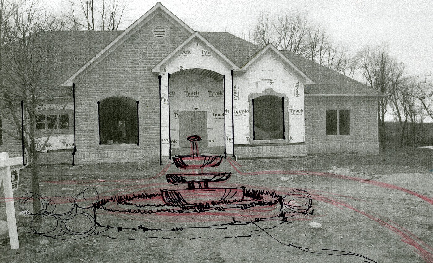
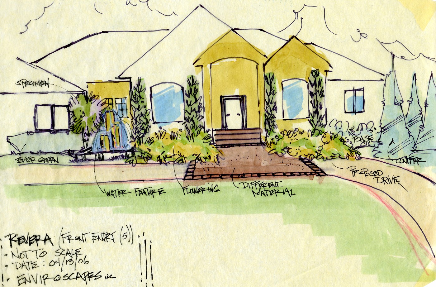
This rough rendering over the photo, gives me an idea of how a fountain may work into the landscape . . . tied into the proposed circular drive. The idea of a fountain here is a request of the homeowners.

This very fast drawing with a Sharpie is just a way of sizing it in. The conceptual drawings shown below were done on trace over the top of this image

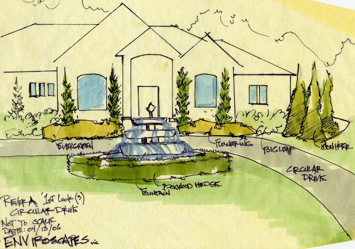
This color rendering was done with the intent to show it to the homeowners during the concept(s) meeting.
The biggest difference between this drawing and the plan view drawing shown yesterday . . . the boxwood is shown wrapped around the fountain.

After seeing the fountain just setting out there all alone, the idea was to extend the parking pad, add space for a gathering spot, and some benches.  Tying the fountain area into the house and landscape.


This last color rendering was a desire by me to give the homeowners another look at how a waterfeature could fit into the landscape. As though it were part of the foundation planting.

The parking pad is designed large enough to also act as a gathering space for guest and the homeowner, while moving the waterfeature off to the side.

This look; to me, is more contemporary in style. The 3-tier fountain out front surrounded by the boxwood is much more traditional. Personally I like the more contemporary look here. The final decision rest with the homeowners.

It is the Designers job to give the homeowner realistic options to get to the final decision. Hopefully one that the homeowners are happy with, and the design works with the site.

Tuesday, October 17, 2006

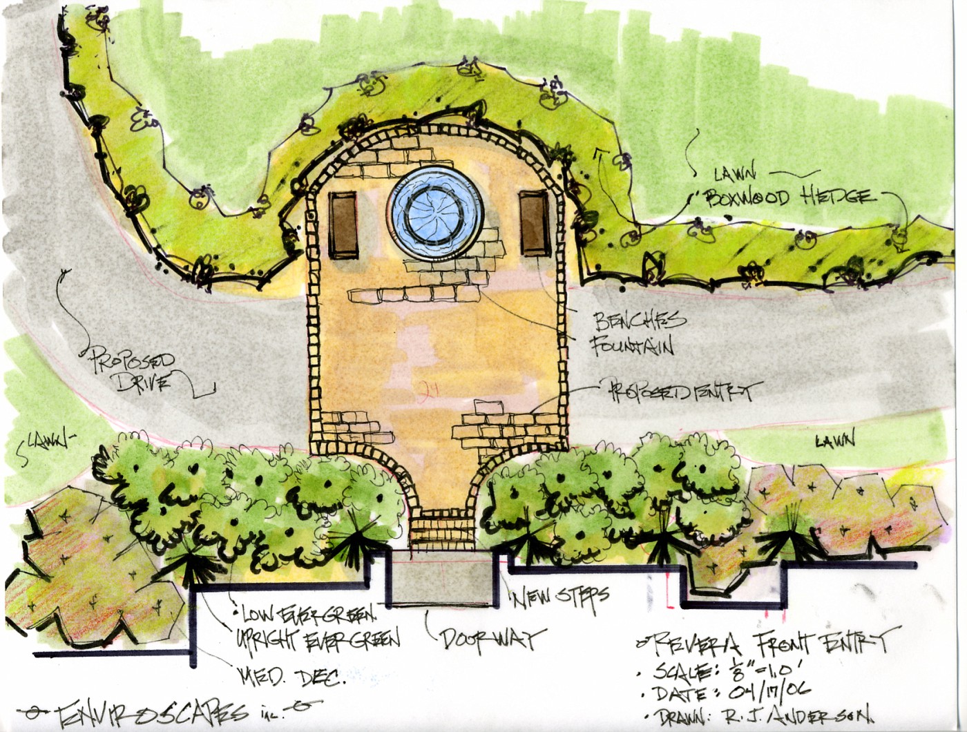
Conceptual drawing for entryway

This drawing was to give the clients a look at a more formal entrway to their front door. Usung a circular driveway paved with a common material, except for the area right in front of the entry into the house.

This area would be out of some sort of paver to play off of the material used on the house, I guess what I want to say there was going to be some brick trim on the house and we were looking to complment those colors.

The idea of the fountain was a request of the homeowner, they wanted to see if I could work it into the landscape. The house, the entry and fountain lent itself to a more formal planting which is shown in the drawing. With the boxwood hedge lining the driveway, and the massing of shrubs along the front of the house.

Added October 18th: The decision to do this drawing in plan view only was to show the spatila relationship between the elements on the parking pad. The rendering above shows how the fountain would look out in open space.

Sunday, October 15, 2006

Sidoarjo, Indonesia no place for me

Mud, mud, and more mud


Indonesia has been having a rough time of it lately with all types of natural disasters. Including earthquakes, volcanoes and that catastrophic 2004 tsunami. Really terrible stuff.

Now, in Eastern Indonesia, East Java (very exotic sounding) comes an unstoppable mudslide. A mudslide that is consuming a place called Sidoarjo, The pictures are unreal, the place is unreal and no one seems to have any answers of when the mud will stop or how much will flow. It may even lead to war.

After doing some reading one thing is very obvious . . . the poor and the downtrodden, those with meager means and abilities seem to be the most affected . . . isn't that how these things seem to happen???

Right now it doesn't quite seem to be the place to live, I think I'll stay in my lttle valley In tuscarawas County.

An Appreciation of Stone 13

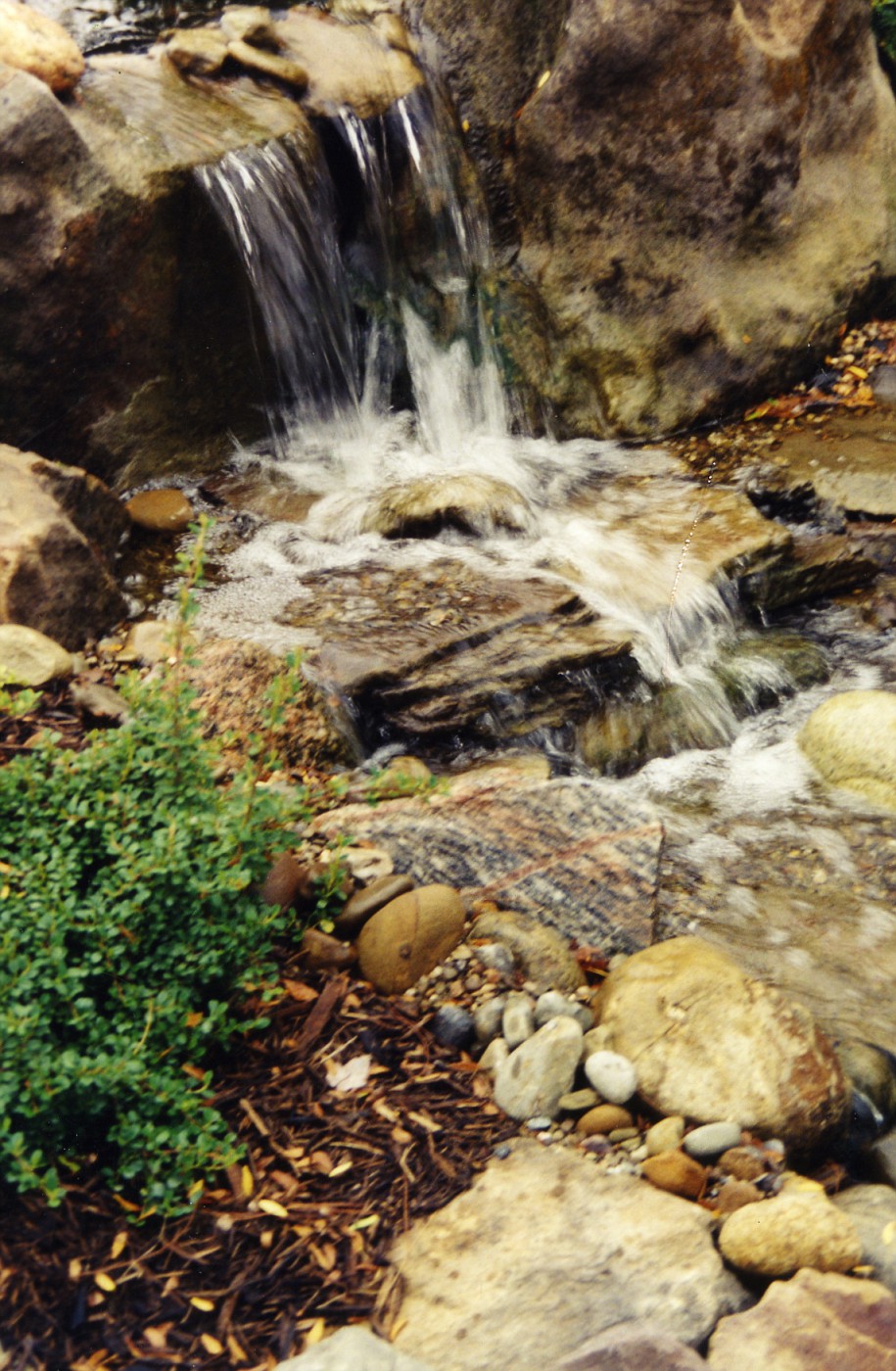
Waterfall, approx. 2.0' high

 The combination of very large stones, medium size, and smaller stone is what helps bring realism to this setting.

Friday, October 13, 2006

27 Books Every landscape Designer should Read

Ta-da! a blog post with a list. I believe this is my second post with a list . . . the 1st was about Viburnums. Anyway as requested here you go. Happy reading.

 This is my partial book list that I think every Professional Landscape designer should have/read:

  • Gardens are for People, by Thomas Church
  • Natural Pattern Forms, by Richard Dube'
  • The Zen of Seeing, by Frederick Franck
  • The Tao of Architecture, by Amos Ih Tiao Chang
  • Space and Illusion, by Teiji Itoh
  • Secret Teachings in the Art of Japanese Gardens, by David Slawson
  • Siftings, by Jans Jensen
  • Isamu Noguchi "Space of Akari & Stone, Chronicle Books
  • In the Company of Stone, by Dan Snow
  • Drawing and Designing with Confidence, by Mike Lin
  • The Inward Gardener, by Julie Messervy
  • Designing with Plants, by Piet Oudolf
  • The Landscape of Man, by Geoffery and Susan Jellicoe
  • Creative Gardens, by James Rose
  • Residential Landscape Architecture, by Booth and Hiss
  • Architecture in the Garden, by James Van Sweden
  • Gardens by Design, by Noel Kingsbury
  • Planting the Natural Garden, by Piet Oudolf
  • Introduction to the Study of Landscape Design, by hubbard and Kimball
  • Noguchi "East and West, by Dore Ashton
  • The Golden Bough, by Sir James George Frazier
  • As a Man Thinketh, by James Allen
  • Who moved my Cheese, by Spencer Johnson
  • Manual of Woody Landscape Plants, by Mike Dirr
  • The Native Plant Primer, by Carole Ottesen
  • Zen Seeing, Zen Drawing, by Frederick Franck
  • From Concept to From in Landscape Design, by Grant Reid

This is only part of what is in my library. I have suggested every one of these books because they have made a difference in my professional career. I know that I am missing a few from this list and when I figure out which ones, I will post those also.

Props to Victoria Scott at Mississipppi State for prompting me to write this list. I hope it will be as helpful to you and all other students who want to enter such a great field has they have (and will continue to be) for me.

Have something you think I should read, or a comment on the above list, let me know . . .

Wednesday, October 11, 2006

Nepenthes truncata what a carnivore

So just when you think Nepenthes truncata only eats insects, you learn something new.

Tuesday, October 10, 2006

Ahhh, I wouldn't call them Landscape Designers

 Other folks call them Visionary Artist. I've seen the term folk artist thrown around for this type of thing. At any rate what all these folks have in common is this. Doing something totally original in their own backyard, and I mean totally original.

You are going to need flash to be able to negotiate through this web-site. A very interesting group of people, my hats off to their particular vision, spirit, and joy of life.

Monday, October 09, 2006

Hybridizers keep on hybridizing

 A nice article from the Washington Post on the quest for the perfect plant. Including some of the newest varities and a sneak peek at some of those varieties. The article links to several sites including the Novalis website, which is worth a visit.

By the way if you are looking for a certain plant through a wholesaler this is the web-site to check. It is  a subscriber site, but they do keep an up to date list.

If you are looking for cutting edge on the retail market the on-line Nursery to check with is Tony Avent's; Plant
Delights Nursery. Great information, good photo's, and he's funny!

Another great on-line site full of information on cutting edge plant material comes from another Southern plantsmen,  Don Shadow. He's another of one of those guys who has forgotten more than most of us will ever know. If you ever get a chance to hear Don speak you will not forget it. A great presentation, what knowledge.

Sunday, October 08, 2006

An Appreciation of Stone 12

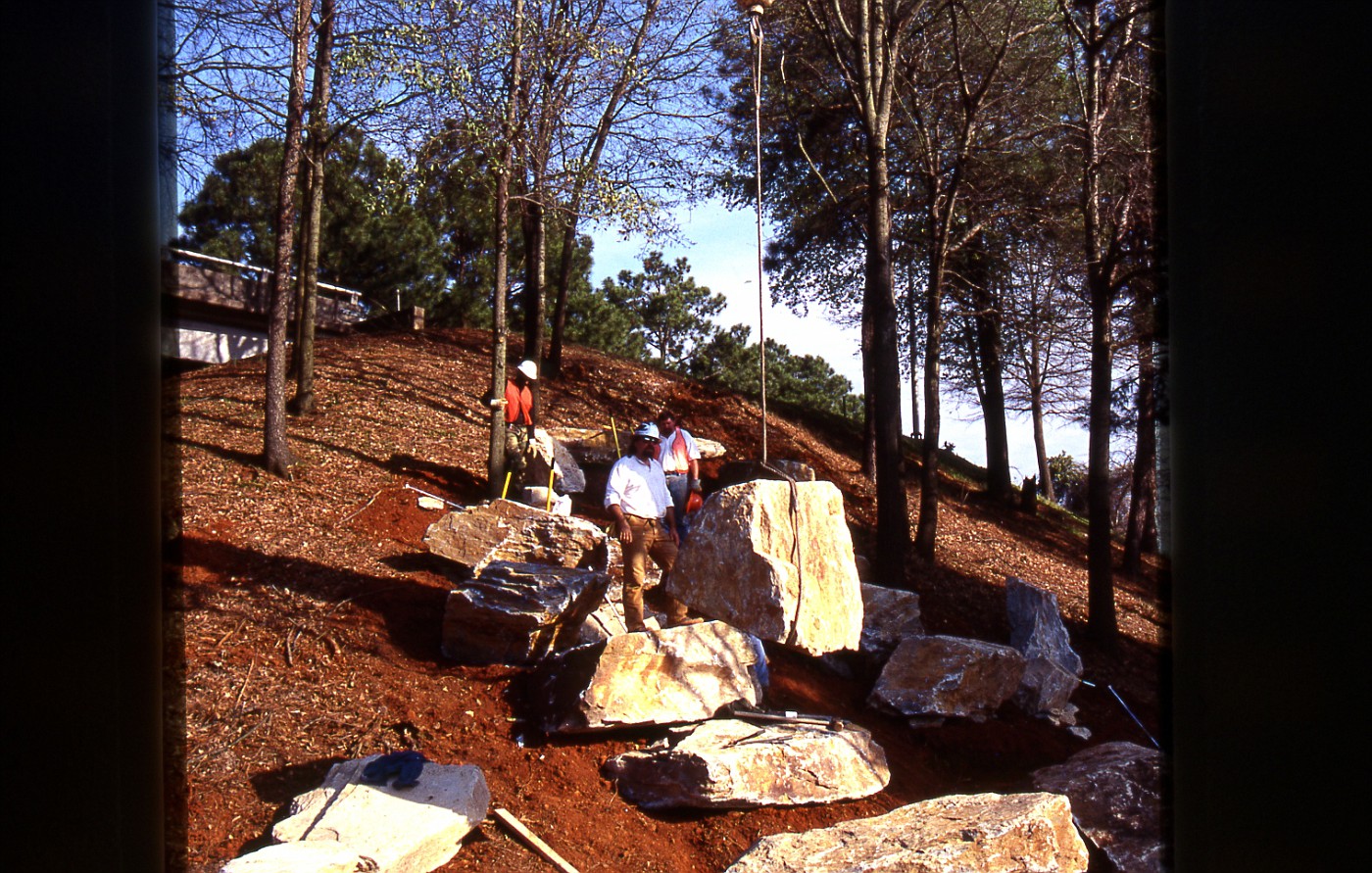
Setting the Big Boulders !!!!

Now this is fun . . . . More shots of this project at my web-site

Friday, October 06, 2006

Stone Wall; Retention and Walkway

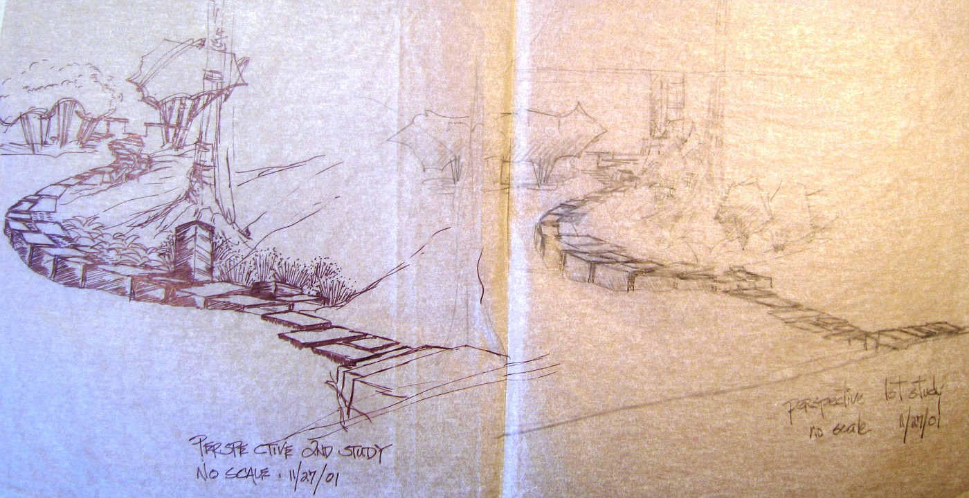
A early conceptual, click to enlarge
A interesting story behind this conceptual drawing. A drawing that was never finished. A drawing that has become no more than a scrap of paper. A scrap of paper that has become a great reminder.

When 1st challenged to look at this site/drawing I thought this was going to be one of my most difficult and unique challenges. The homeowners had asked me to create a walkway from the back of the house, to the street, that was unique and very artistic.

I immediately thought I would have to use large blocks of sandstone to make this happen and that it would be a challenge to put them together . . . on some type of long graceful curve. The type of curve that would be long, slow, sinewy, sexy. I tend to liken that type of curve to the small of a woman's back; you know, the perfect curve.

The above drawings were probably the 4th or 5th page of drawings, I remember having a difficult time trying to relate what I was seeing on the site to what I was putting on paper. I couldn't get the perspective quite right, close but just not there. I remember this drawing being one of the few times I was close to being frustrated with the flow of my work.

This was a point where I could show the conceptuals, these scraps of paper to the homeowners. I went to see them, and could immediately tell something was really wrong. What was it? The concepts? The stone? The flow of the walk? Wow . . . how could I have missed so badly? How wrong I was.

The couple proceeds to calmly tell me that the wife had relapsed in her cancer treatments and the prognosis was not good. They were telling me this in such a way as to not hurt my feelings about how they were cancelling the project, to take care of more immediate concerns.

They handled everything with such grace, courage, and dignity . . . very powerful moment. An event that was another dynamic reminder to live every day, every project, every moment as best we can.

I keep that scrap of paper as a reminder of how fleeting, how fragile, how unknowing life can be. She died a few months later.

Thursday, October 05, 2006

Over 200 Post on Blogger

A small milestone for me, and most likely of no use to anyone else. The only reason to publicly note this is that I have a long way to go and look forward to the continuing journey.

This Winter has paying work goes down I plan to expand on Landscape Design Principles, and go in-depth into the plant material I use, and/or wish I could use.

Wednesday, October 04, 2006

Sectional, and Plan View Drawing

Sketchbook drawings, on-site

These conceptual drawings are from the same job site as yesterday.  Yes, I know  . . . I wrote yesterday about 
using a green marker for plant material, and boom! here we are showing plants in brown. Well it is the only 
marker I had with me on-site.

The top drawing is a rough plan view drawing of the site and the lower is a quick elevation drawing of the
site. If I remember correctly I drew the plan view drawing 1st then the elevation. On-site I would say I draw
the elevation 1st about 75% of the time. Even more than that if the client is standing there. After all this type of landscape rendering tells the real story.

The follow up of the plan view shows spatial relationship. The circles  for the plants are rough and fast, the idea is to show that I am looking at several varieties, and of several sizes. The elevation drawing even better shows the plant differences and height variations.

At no point though are we specific on the varieties. The only specific is the use of barnstone for the wall, and that there would be a terrace designed above and slightly back to the left.

p.s. This design did not go in. The owner was given a deal on a Unilock display, and since they are a Unilock dealer that's what they put in.

Tuesday, October 03, 2006

Conceptual Rendering, Waterfall

A Waterfall Rendering-selling stone.

 These 2 landscape renderings were drawn into my sketchbook on the job site. Normally thses days I make a few notes, shoot a lot of pictures, and just absorb the site. Then I go back and draw something up on the board to present to the client, during the conceptual meeting.

Here  . . . I drew up these 2 conceptuals right on site. My tools of choice for a on-site drawing are; a couple of Sharpie pens (different sizes), and one or two Chartpak markers, in this case  . . . just one . . .  a brown one. Now here's the interesting part about using minimal color.

What is the Focus  ???

Focus; as in, what am I trying to achieve in the renderings for the client. Here, the owner operates a retail stone yard. There focus is to sell stone, whether by wholesale or retail, but the focus is to sell stone. So when I do a drawing for someone like this. I'm going to promote how the stone will be displayed, and used . . . . promote the stone highlighting with a brown or gray marker.

Had this been for a retail nursery what color would I have used? Green, of course! I would want to help
promote the plant material and a way to highlight that plant material would have been the priority. 
The conceptual would have been slightly different, the stone not quite as prominent. 

Had this been for a private residence I would have used very little brown, a swipe or two of 
green, and a blue marker to highlight the water feature. The homeowner usually fixates on the water 
feature anyway, so that's where the focus need to be.

Let's review, for these conceptual on-site renderings . . . keep them fast, loose, un-specific. Keep color to a minimum highlighting the important stuff only. I can't emphasize this enough about highlighting . . . keep it
to a minimum, a touch of color will take you a long way.

Monday, October 02, 2006

Plants; Native vs. Exotic

Another article about the aggressive nature of exotics vs. what was there in the native 
landscape. The reason I post this article from the N.Y. Times is . . . no one is
shouting. The author give some weight to both sides-leaning to native plants, but it
is well-written and presented.

As for my view . . . I am going to hold off on posting this for a few months. I will get 
into this in a much more thought out and deeper discussion. I think it would be a 
great dis-service by me to discuss this in a few lines on one post.

How's that for dodging/fence-straddling/spinning . . . . ???  

Green Industry Conference

*PLANET* which is a merger between ALCA and PLCAA, the Landscape Contractors
group and the  Professional Landcare group is just about ready to have their big yearly conference.

The *GIC* is the Green Industry conference and will be held November 1st through
November 4th in Columbus, Ohio. The Hyatt Regency is the Headquarter Hotel and the
Conference will be in the Convention Center adjacent to Hotel.

I've been to the Columbus Convention Center several times it is well suited to hold
this conference. Even if you can't go to all the educational seminars the show exhibition is
worth the time. It is an equipment junkies nirvana.

I'd like to mention that several of the biggest contractors in america will be there,
and it's a good place to rub shoulders, network, and ask questions of those who have
become successful in the green industry.

If you go, walk across the street and have a beverage at Barley's . . . this is not a paid
endorsed announcement from yours truly.


Sunday, October 01, 2006

Discovery Home Channel

 Aaaaaaaarrrghhh!!! even though it is no longer Talk like a Pirate Day, all I can say is aaaaaaaarrghhh. This morning I caught a show called Garden Police and  all I can say is aaargh.

The premise is that a couple of landscape designers knock on  the door telling the unsuspecting/surprised homeowners their landscaping is busted,  . . . but we are going to fix it in 2 days. This morning the show centered on the homeowners son. He had dug up the front yard over several months attempting to install a putting green . . . never finishing. There were piles of dirt, weeds, and dead grass covering the entire front yard . . . it had apparently been that way for several months, absolutely hideous.

So the Garden Police (along with homeowners, and said son) go about renovating the yard. In another of those cutesy type renovations: impractical, knick-knacky, maintainence nightmare jobs. Aaaaarghh!!!

I was actually asked by my wife to not watch these shows because the threat of where they send my blood pressure. This one about did me in. If they would spend some time on practical information, solid design principles (beyond, oh a nice picket fence here!), and less knick-knacky junk they might have something.

It might also help if the design looked like something beyond what a 3rd grader would draw-it is TV after all . . . shouldn't we be educating besides entertaining . . . . if this is entertainment give me boredom.

Also why do they show before and after in a Sesame Street tone, do the producers think we are 3rd graders??? Discovery Home Channel . . . . you're busted . . . .

Aaaarrrr!!!

An Appreciation of Stone 11

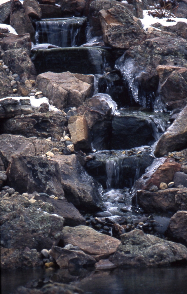
Waterfall in Winter

This waterfall shot was taken right after completion and the weather had just turned
 real cold, real cold. The falling water, the snow and ice. Gotta love it. 

I'm a Blog of the Day

 Blog of the Day has given me some nice props by giving me their Blog of the Day designation. Thanks to Rob for this recognition I appreciate the nod.