Wednesday, August 30, 2006

The Design Process, another example

The Before Shot
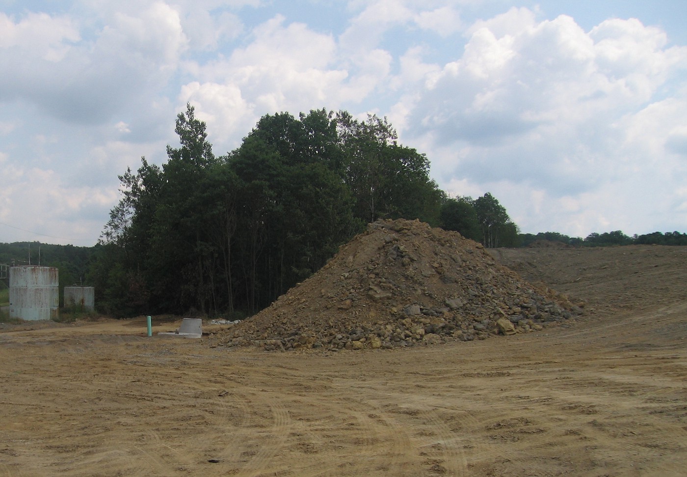
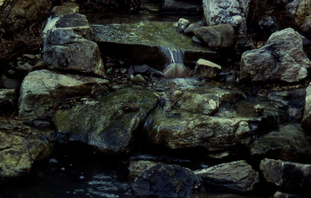
This before image shows the area of focus for the conceptuals. The client is looking for some sort of dramatic water feature into the sub-division and golf course. In order to make that happen we are going to have to build something between 8 and 12 foot high. Then in order to sell the illusion of the falls we will need to add a dynamic and beleivable backdrop. Piece of Cake ?!?

The Warm-up sketch, Initial thoughts, or Day-dreaming.

This is an example of a warm up drawing for me. Before doing any overlays. Since I was doing stone and water I better warm up with . . . stone and water. Plus start gearing my thought towards a strong backdrop.

The Concept sketch on a copy of photo (direct).

Normally I lay down some tracing paper and start looking at possibilities, but I had a pretty good idea of what I wanted to do in this area and started drawing away. The key here is to try and make the ratios look right, and to not mess up proportions of what I am after.

Especially the relationship of the falls and the lagoon, or pond. Remember the goal here is to wet the appetite of the client by showing them the potential of what there site has to offer based on 3 things.

  1. Their request for what they need, and or want.
  2. The site itself, what will it allow or not allow-what it is capable of.
  3. The Designers talents, skill level, knowledge.
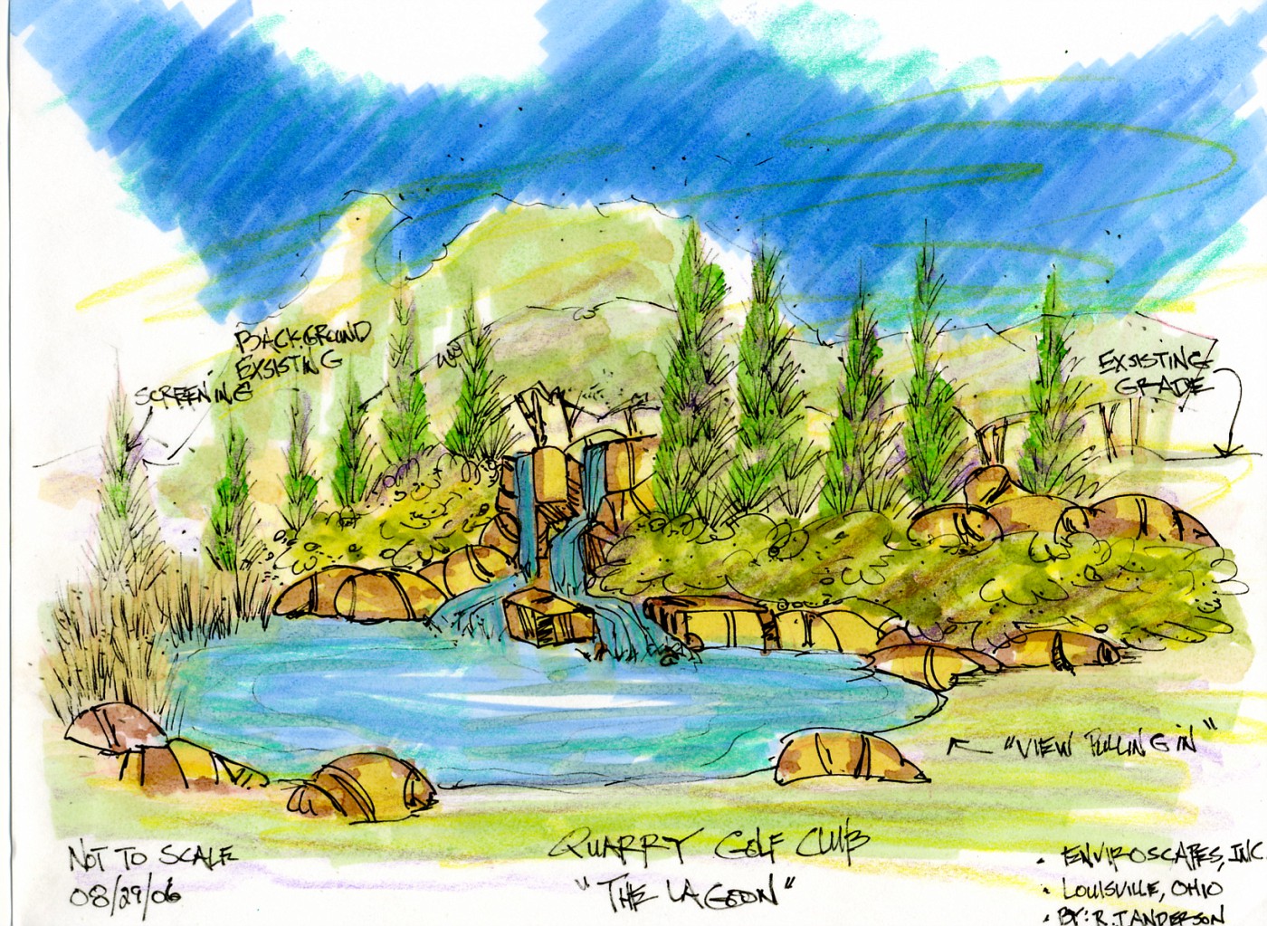
The Color Rendering

This color rendering is good enough to show to the client to give them an idea of how things will lay out. The black and white will also be part of the discussion. This is fine for the 2nd meeting when all these possibilites are discussed in a more informal way.

If there is to be a 3rd meeting with some other higher-ups the drawings will all be in color and more refined. There will also be a plan view drawing showing how this relates to the actual entry drive. Speaking of that drive-more on that tomorrow.
Monday, August 28, 2006

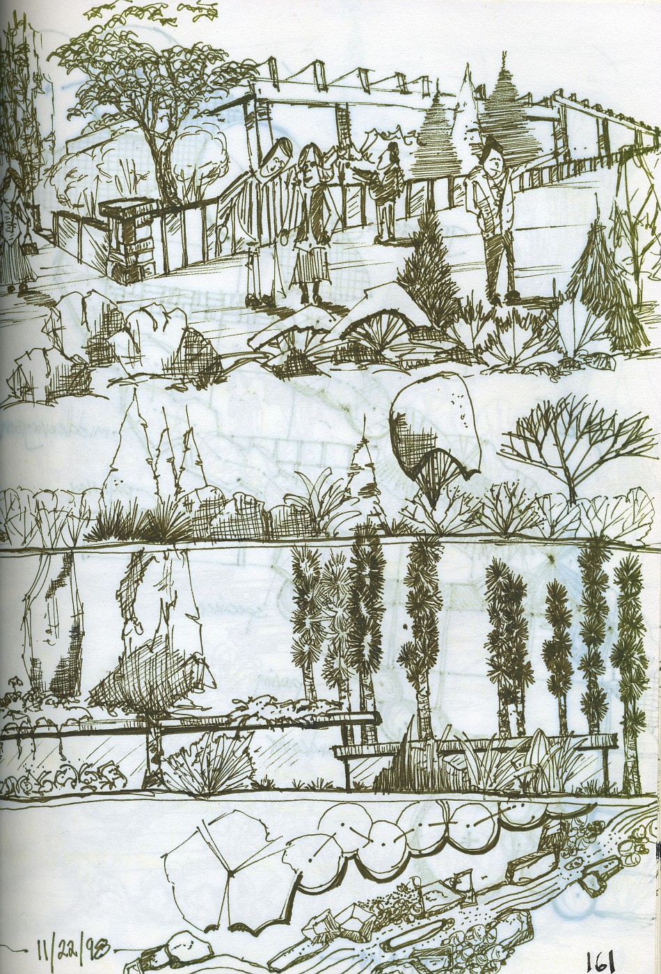
Another from the Sketchbook


One of those days at the conference when it was more about doodling than 
about note taking. 

Sobe anyone??? 

Sunday, August 27, 2006

An Appreciation of Stone 6

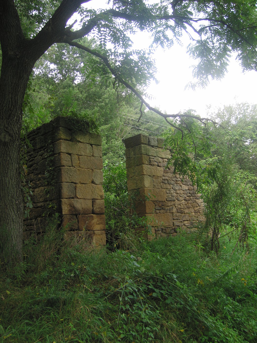
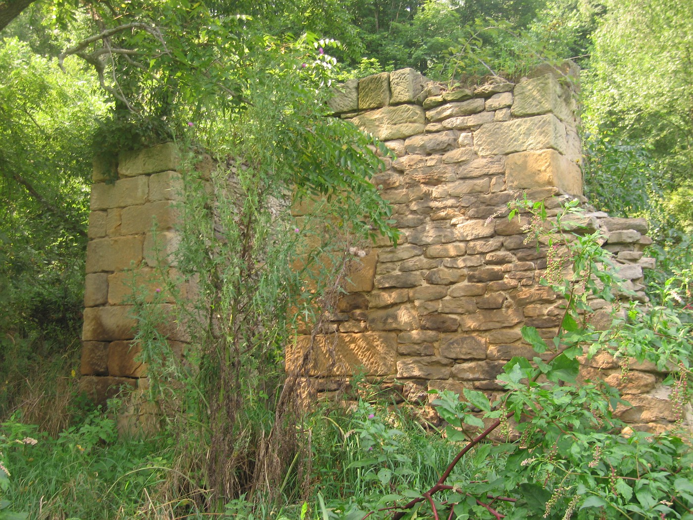
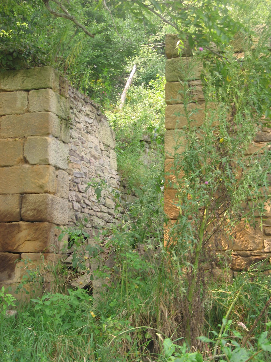
The Old Barn

Gotta love the real tight work around the door frames amd the looser style for the rest of the foundation

Just sitting enjoying time. This would be great inspiration for building your own type of ruin

 The old locust, the weeds, the backdrop, it's perfect.

Saturday, August 26, 2006

The Total Waterfeature


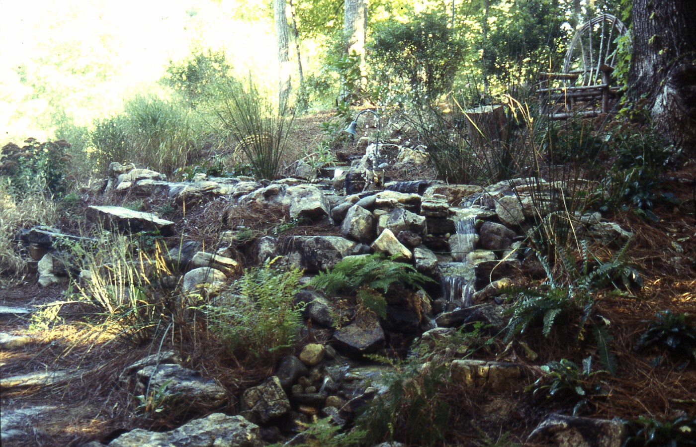
This is a shot that shows the upper falls the upper pond and the series of falls that I talked about yesterday and the day before.

Are there things I would do different if I built it now??? You bet. As I see it if you are not constantly evaluating and critiquing your work-then you will never get better. No matter how happy the client is.

Friday, August 25, 2006

More on "The Falls'


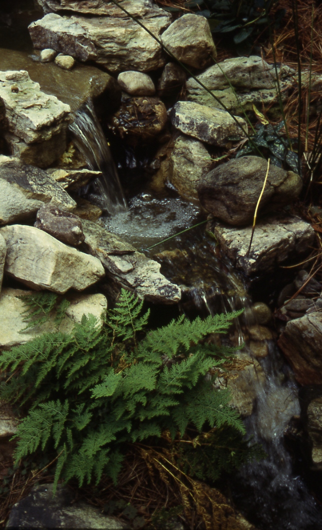
This is a continuation of yesterdays post. This set of little falls is a little further along the waterfeatures path.

The one thing I would like to point out here is notice how the 1st falls, falls directly into a pool of water and the second falls lands directly onto a splash stone. These two distinctly different sounds play off of each other a create a water harmony for the listener. Its what I like to call an indiscernable rhythm that always has interest for the observer.

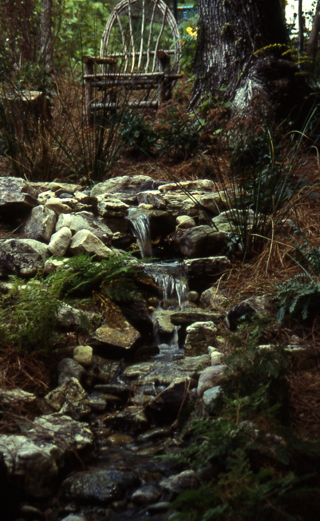
This view is from the bottom of the stream. The stream falls off into a 110 gallon tub that is buried from view. The pump in the container sends the water up above the falls that was posted yesterday.

A few tidbits: The stone is a West Virginia toprock that has a lot of interesting color. You might also notice the mulch is pine straw which means I installed this job in the South, South Carolina to be exact.

It is almost 100% in the shade, which means almost zero algae problems, it also means very few option on blooming aquatic plants-but it is supposed to be a woodland stream so I think it worked out okay.

Thursday, August 24, 2006

The Falls


Can you build it?

Beta Blogger update

If your thinking about changing I would wait. Its still not quite right. Especially if you use Picasa to upload pictures, what's most frustrating is can't get a response beyond the automated responses-I guess we are getting what we paid for.

Also once you go to beta you cannot log in as a Blogger on other Blogger comments boxes to leave anything. Is it because we had to re-register with Google??? I've no idea this stuff is way beyond me.

The template to rearrange stuff is great, and the labels are great but if I had my choice I'd go back at this time.

Ouch !!!

Absolutely nothing to do with Landscape Design, stone, water, waterfeatures, trees, or shrubs. I was just thinking how wacky game shows or reality TV shows were in this country. I was wrong!

Wednesday, August 23, 2006

Summer Snowballs, the Viburnum


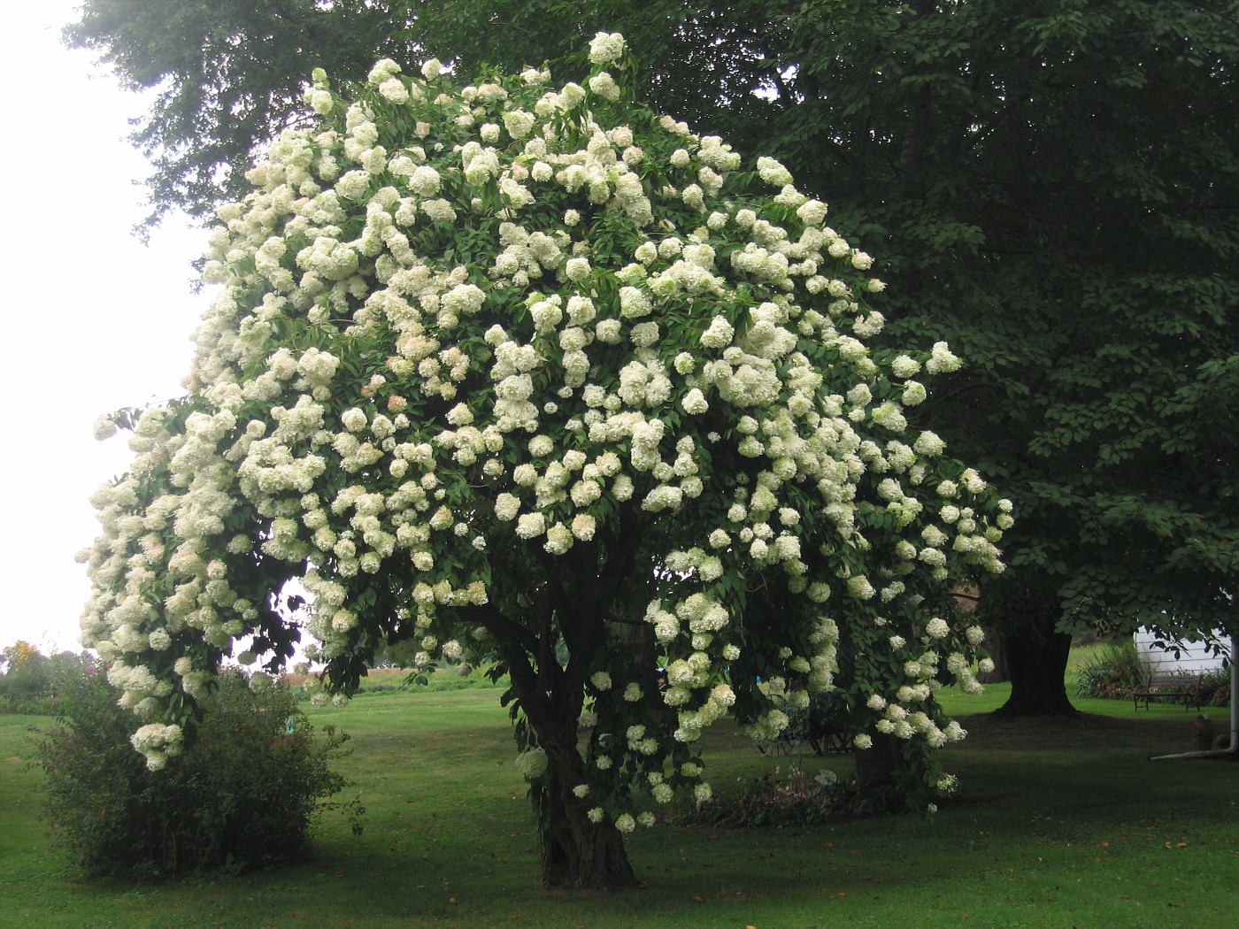
 If you like-love Viburnums you gotta love this one. I was driving home from an appointment and ran across this beauty in a real small Ohio town, it looks great doesn't it.

People are always asking me about small trees, I want small trees. Well here you go there are several Viburnums that go over 10.0' feet in height including

  1. Viburnum sieboldi 'Seneca'
  2. Viburnum x rhytidophylloides 'Allegheny'
  3. Viburnum prunifolium
  4. Viburnum lentago
  5. Viburnum d. 'Autumn Jazz'
So look into this set of woodies you won't be disappointed, as for the professionals we don't use Viburnums enough either and I can't explain why. Spring/summer color, good strong foliage, heavy fruiters, and usually good fall foliage. I just don't get it. I myself am a big culprit and today has reminded me again of the fact that every yard should have some Viburnum.

They are especially useful as a wildlife, bird attractor, screening, or naturalizer also.

Tuesday, August 22, 2006

The Edge


Monday, August 21, 2006

Patio Design 2


More drawings and a continuation from the post on the 18th of this month.

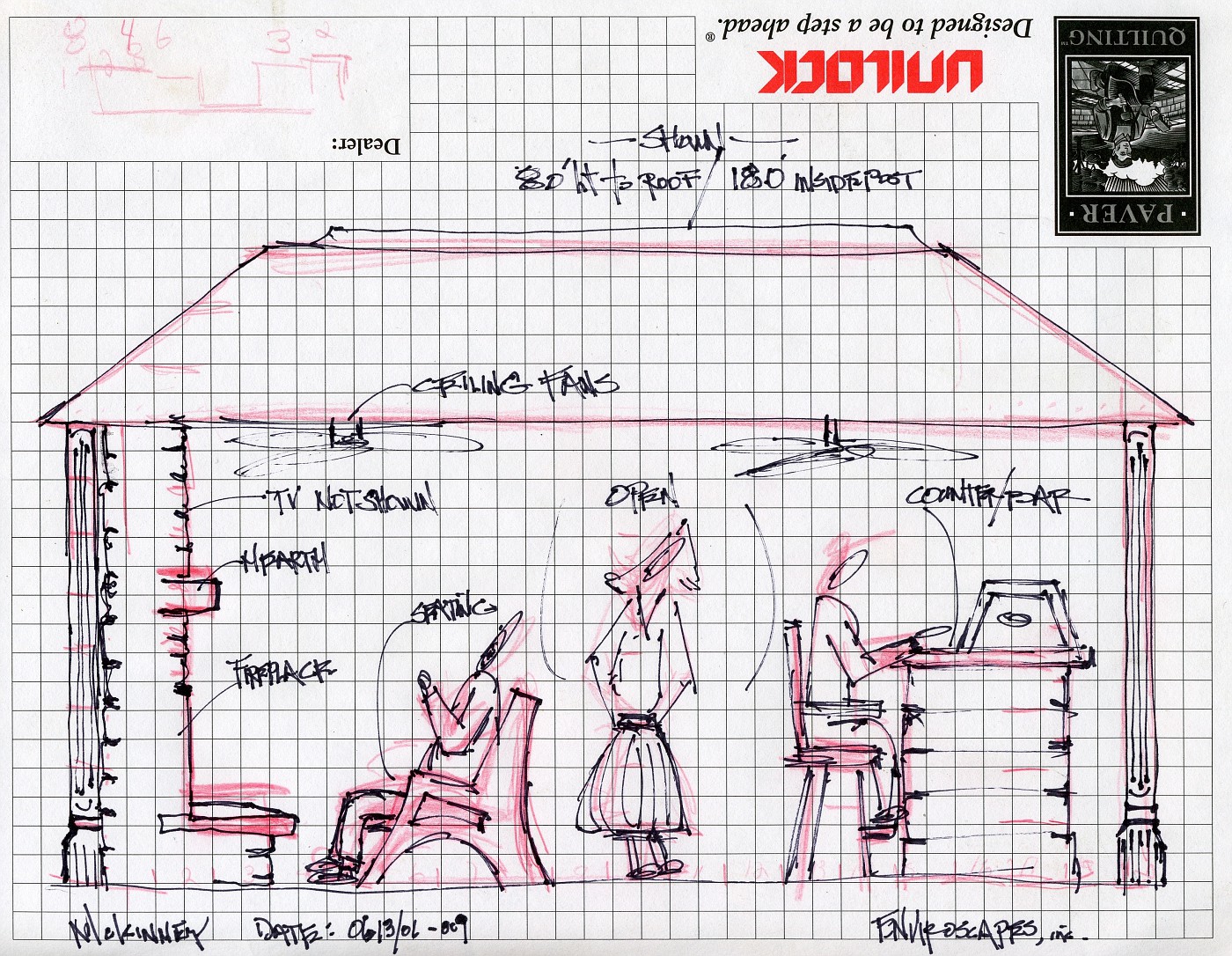
This a a sectional drawing showing how all these elements will relate to each other in scale. This type of scale drawing helps show the human element and really focuses in on how much space is needed to pull this project off. The scale here is one-eighth of an inch equals one foot.


This color rendering is the overlay to show the client the potential for combining all these elements in one space. As of right now the grill is at one end of the backyard and the wet bar is at the other. There is no protection from the elements if you exclude to umbrella over the table which is not shown here.

Combining the rendering along with the elevation or sectional drawing helps paint a picture which enables the homeowners to move along in their decision making process to creat the best possible use of space for their requirements.


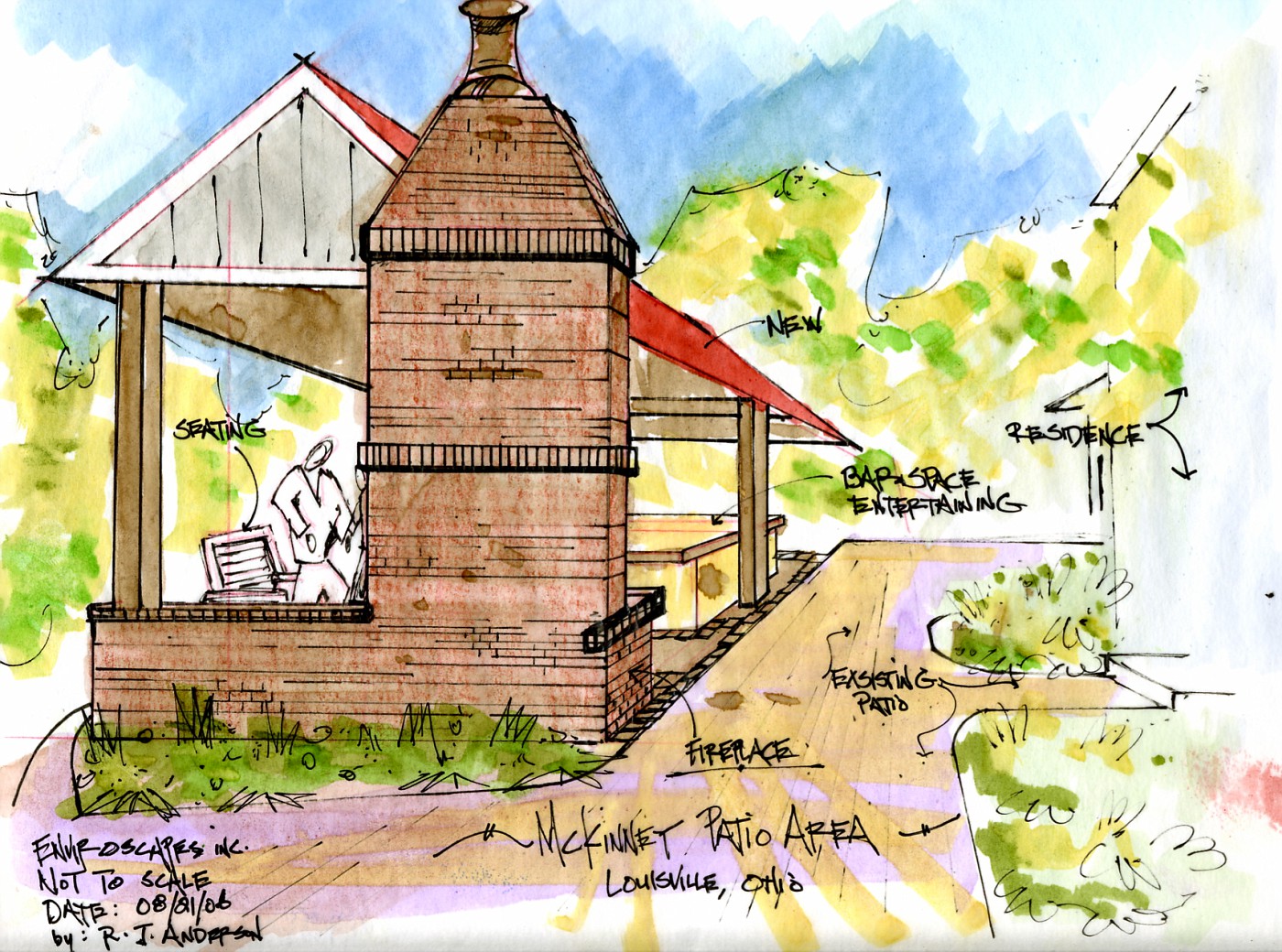
This structure will bring everything together under one roof and will extend the use of this patios season in this Zone 5 backyard.


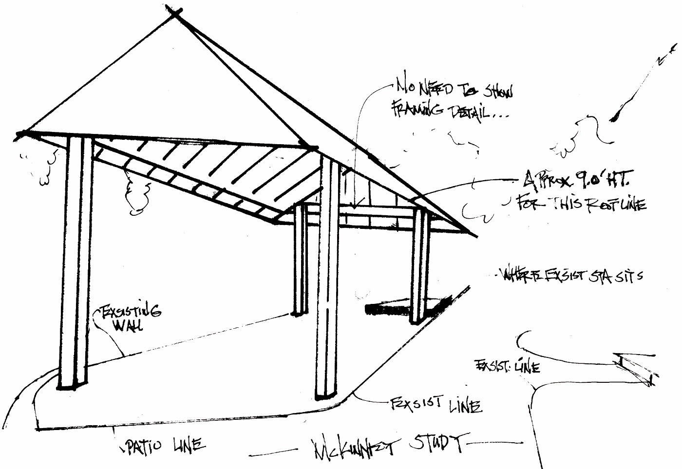
This is a quick study drawing of how the roof line would work out for this design of a new patio space. One point perspective is my goal here, and I am hoping to do an overlay on top of this. whic is what the drawing above is.

I could use this drawing and just draw on it, but if the clients reject my proposal on the color rendering I would have to start from scratch, this way I won't have to do that.

Sunday, August 20, 2006

An Appreciation of Stone 5


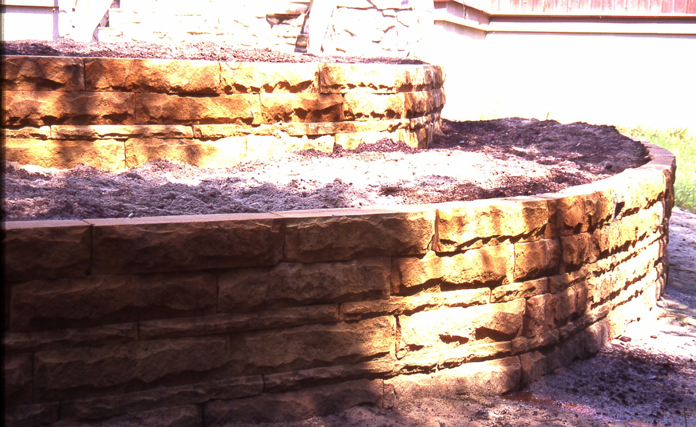
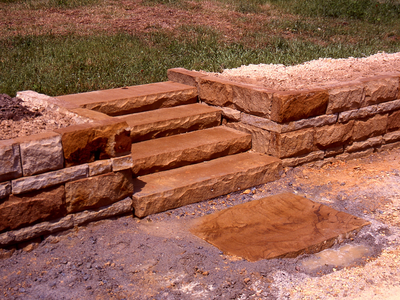
The two photos are from a job of mine installed back in the mid-90's in South Carolina. The stone is from Briar Hill a Stoneyard/Quarry in Central, Ohio.

I have always liked Briar Hill, and will always continue to try and find ways to use it on work I design. The wall stone comes in several different heights which allow for this kind of artistic feel when putting a wall together.

When I personally did this work I always rock-faced the bottom edge a little deeper to create a more interesting shadow line. Try that with modular concrete retaining wall block.


A comment on these steps; they are shipper 48" wide, 16" deep, and 6" high. Just about perfect for outdoor steps in just about any application. Now here's the great part . . . they lay up faster and easier than pouring concrete steps. I cannot think of any reason why these steps would ever be more expensive to install than concrete, and as for the look; well . . . you decide.

Theres one wall stone out of place in this photo, which did get fixed by the way. My other comment is the landing pad stone is a piece of whats called 3" offset.

The backside of these walls is typical construction, gravel, fabric, and pipe. Remembering the enemy of every wall ever made is water, and water pressure.

Saturday, August 19, 2006

Walkways with no Walkers


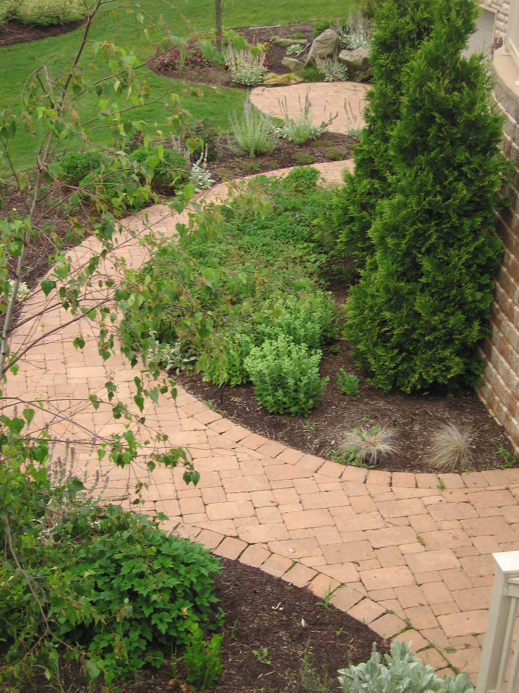
These are a few images I took a couple of weeks ago at a Job that was installed September-October of 2004. I remember the homeowners being very excited about the whole process as this was to be their last home.

When I pulled up the home was empty, and a for-sale sign was in the front yard. I found out the for-sale sign had been there since at least March. So the homeowners are not maintaining the landscape, I don't know who is, most likely the realtor has hired someone. Whoever it is, is not really good with the plant material, I could tell by the
pruning practices on the shrubs, particularly the hydrangea.

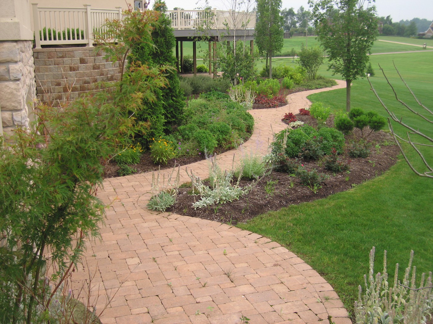
This is what you would see if you had come from around the garage on the right side of the house. This was never meant to be a primary view because the way the drive was placed between the house and 2nd garage visitors would enter the backyard down a set of steps to a landing and then given the option to go off in several directions. Nonetheless this view has turned out okay, even for 2nd year of the garden. I really think it takes 3 years for plants to establish before the root system really takes off and the garden begins to thrive.

This is the view from the top of the stairs looking down onto the garden bed. The small patio space at the upper right was in front of a small garage door where the workshed-potting area was to have been. The walkway continues off to the left, which you can see in the previous photo. The wall on the right was very necessary because we needed to hold up the drive and keep the area level between the house and 2nd garage.

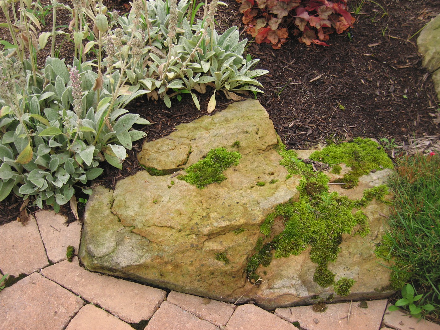
Just a detail of the planting next to the workshed door is, I especially like how the moss as maintained itself and adds character to the scene.

My personal preference is to have the brick field float into any larger stone to help sell the illusion that the stone was there 1st and we had to work around it. You'll notice that the soldier course does come around from the left and finishes off into the boulder. That area was done that way for me to preserve the integrity of the outside arc on that part of the walkway.

Friday, August 18, 2006

The Designed Back Patio.


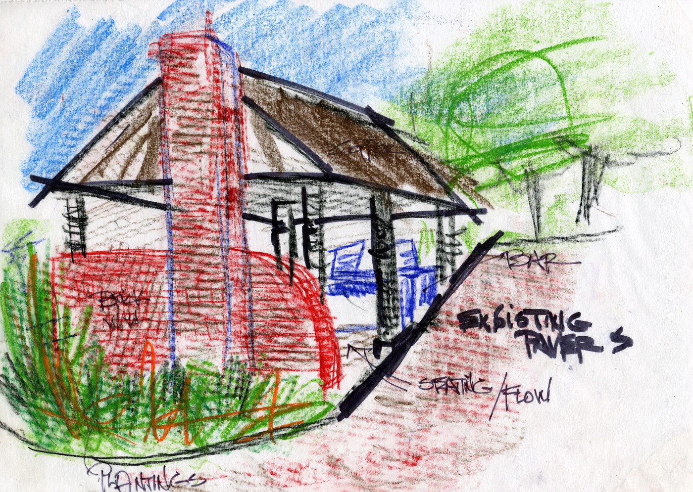
The above is a quick Conceptual drawing for the re-designed space. Very fast less than 10 minutes.

Above is the before photo. The clients are looking for a roofed structure that will allow for a fireplace, seating, a wet bar and grill, also possible TV viewing


These are a couple of very fast 1st conceptuals of backyard entertaining area. What I am trying to show in these initial drawings is this. I want to show myself ways/ideas to present this space design wise. They are asking for a lot of stuff.

To me this is the further refinement of the backyard area closest to the house, an extension of the inside even here, in Zone 5 Ohio.

How I managed to get pics up is seemingly a miracle, lets say it wasn't through normal channels. This Blog stuff is a lot of work!

Beta problems

I have switched over to Blogger beta and now I cannot upload any photo's/images on to my Blog, I had mostly posted through Picasa but am unable to do at the moment. So bear with me, and hopefully all those bright people at Google are fixing this.

I will say this. You would think they would have made Picasa compatible with the new version before offering it. I mean they are all part of Google . . . aren't they?

If you are thinking about switching, I'd wait. Let dopes like me do the suffering for awhile. Especially with the inability to post images.

Thursday, August 17, 2006

A very good Gardening Blog

Yes, yes, I know this Blog, my Blog is about Landscape Design, but no matter how you cut it I am tied to the World of Gardening. Even though I have been highly critical of gardeners when it comes to design because; well . . . . . . even though they are usually lousy designers you got to appreciate their love for what they are doing. Besides there is a good reason for this. A good/great Gardener is really passionate about plants. Usually going beyond passionate, bordering on fanatical.

Don't believe me? Go to a plant sale, or a plant auction, or a charity event where they offer plants and watch the vigor with which the crowd goes after that special herb being offered at $2.99, you wanna see enthusiasm? I'll show you enthusiasm.

So where an I going with this . . . here's where I am going. It is in this fanatical quest to grow the newest, hugest, finest, rarest plant. To grow that which cannot be grown in your zone-to push the envelope in what can or cannot be planted, is exactly where gardeners fail as designers.

Designers should look at how all the overall spaces relate to one another, how people flow from here to there, how the hardscape lays out, how we transition from one level to another, etc., etc. A good Gardener will look for an empty plot of ground, remove the sod, and then amend, amend, amend the soil. To grow the latest and greatest in their collection-more plants, more color, more foliage. More plants!!!

Another way to look at this is Gardeners start with the specifcs (an individual plant) where a good Designer needs to look at the big picture and slowly work down to specifics. I cannot even tell you how many times over the years I've seen beginning Designers, or Gardeners making the transition who get lost in even the simplest design problems because they look small 1st, and get stuck in these small details, unable to move on.

So what does this have to do with Hanna's Blog, well this. Even though it focuses on Gardening-it does it very well, she has a great writing style and like good informational Bloggers she throws a lot of links in her post, and hey! how many people can put Squeaky Fromme and Thomas Jefferson in the same post?

If there were more good landscape Design sites out there I would talk about them and link to them. Are they out there? Let me know if I'm wrong. My friends love to tell me how often I am wrong, you guys might as well join in.

The other reason I am linking to Gardeners is I appreciate their passion for plants and the outdoors, plus I need to look out for all Aesculus glabras out there.

Labels on the Sidebar

Specific topics.
I would think this is only as good as the poster who does the labeling.

So I have gone back through my last 50 post and have tried to identify them with labels and at the same time keep the number down to a reasonable roar. One of the new features for blogger, is that you can label the post and allow for searching. Hey! I'm trying to put out high quality stuff here . . . you know what I mean, high quality.

So I will break down into areas and try to organize that way. I would guess this would allow anyone who wants to look at; say, renderings will be able to do so by hitting that link on the sidebar.

To show you the level of sophistication I am going to here, this post will have the label stuff. That's right stuff, as in all the stuff that has nothing to do with Landscape Design.

Wednesday, August 16, 2006

Changing of the Template

The site looks a little different because I have switched over. Blogger is in a new mode (or something) and I am trying out the new templates/system.

It seems things went pretty smoothly, I checked the site on IE and it seemed to read pretty well, and I have been looking at it in Opera, that seems okay. Once I got everything cut-n-pasted over on the sidebar I felt pretty good. With the way they have the template set up it looks real easy to add/subtract links and other stuff-which I am going to try and keep at a minimum, I hate clutter.

The only thing I could not get to work was Google Ad-Sense, you'd think since this is a google thing thats the 1st thing they would make work right for code dummies like me was Ad-Sense. Oh well, I'm sure it is an easy fix.

Tuesday, August 15, 2006

Update on the Terrace

The drawings of the terrace I had been showing over the past couple of days took a final turn yesterday. After e-mailing the client that I had posted the rendering of his deck idea, I received a quick reply . . . "Oh we are going with extending the concrete and round off the end. We're talking to the contractor about the cost".

Luckily I've reached the point in my career where I take none of this personally. That this is a slam on my work or ideas. In this case this is a client who can't make up his mind, and my guess is he will change again. Which way-not sure.

If you go back to my original drawings for this terrace I had extended the concrete (tiled it over) and put the steps at this end. Look back to July 28th and 25th to see those drawings. It was my intention to limit the amount of surfaces in this small backyard-so; in a way, the client is working with me here.

So where does this leave us? We are back to one surface for the porch/landing, we have only one set of stairs, we have a good amount of space to create a dynamic terrace, and we still have room to install enough plant material to soften, enhance, and improve the space.

I still don't like where the steps are going but this is part of the art of compromise that good designers must go through. This level of dialogue and give and take is something that designers must learn as they improve the level at which the work. The more complicated the project, the higher the dollar, and the level of sophistication requires more than knowing right plant-right place . This is where the real juice comes in and for me I enjoy this, a lot.

The final analysis is simply this . . . if you want to become a really good Landscape Designer you need to remember what that really means---problem solving. It's this problem solving where Landscape Designers really earn their money. After all how many calls do you get when homeowners are happy and satisfied.

Monday, August 14, 2006

The Terrace Battle takes a Turn


The homeowner is still adamant about adding another type of surface material to the backyard, and because he lives on a lake he's looking for something with a little bit of a nautical theme-hence the deck with wood post and "rope for railing".

With the addition of the deck surface we have the porch surface, the stone steps, and the slate for the paved area out on the small lawn. Thats 4 types of surface and thats at least 1 too many in such a large space. But this is a situation where the homeowner seems to be dug in solid.

It appears that I have been able to persuade them to one set of steps, this allows for better flow of traffic through the backyard and actually saves them money in time and materials. The extra set of steps would have been very expensive in terms of how that cost would relate to the overall budget.

When we agree on how the footprint of the deck will look I will post that here. Its going to come down to how the edge is rounded off or not rounded off. A matter of aesthetics vs. space

Sunday, August 13, 2006

An Appreciation of Stone 4


This is on the last day of a hands-on seminar at The Stone Foundation conference in Charleston, South Carolina in November, 2004.

The joinery of the work is superb and great technique in the stone work is on display here. a truly great example of dry stone work. How could you not appreciate that. It gets bigger if you click on it.

Saturday, August 12, 2006

More Appreciation for Nature


I've said it before and I will say it a million time more. "Landscape Designers need to spend more time in the study of nature". This is usually one of my big mantras when talking about building waterfeatures but it applies to every other part of design-study nature. Folks always want to know about butterfly's, what do butterfly's like? what do they go to? etc., etc., Well I guess they like "thistle" all types of thistle and some other well known stuff.

My real point is don't neglect the natives, add some of the rough looking ones into those perennial borders, or find pretty ones-whatever. Just go out and take a look at what is attracted to what, how the combinations work, and so on.

Its Joe-Pye time . . .
Before I took off this morning I dropped by a couple Garden Blogger sites and they were lamenting on how bad, colorless, ratty there gardens were looking, How it was too hot, or not enough water, or . . . just, whatever.

It was so darn depressing, I had to quit reading. As I was driving down some of Ohio's finer back roads I could not get over how much COLOR there was, seemingly everywhere on this very bright very sunny day. Pinks, yellows, purples, magentas, more yellows, blues, whites-lots of whites (it's Queens Anne Lace time also) . . . color everywhere!

Broken record time-look to nature, everyone of the natives I studied this morning has some other cousin that's been hybridized, cultivated, fawned over. Absolutely no reason not to have lots of color in the garden right now, and vibrant, and alive especially with the grasses about to take center stage.

Another big observation, Massing . . . please note when using meadow style flowers-use more than one. Put groups together, make a bold statement. Mother Nature does, you are allowed to also. None of this onesy-twosy stuff. How about 10,12, 17, or 25 yeah! that's it.

Hay!!!
There seems to be universal acceptance that bales (square or round) of hay/straw laying in a cut field bring a smile or warm fuzzy feeling to every observer, it sure does mine. I love to look at this type of scene and am alway on the lookout for another. So the question is . . . is why? What is it about this scene that brings universal love?

Friday, August 11, 2006

Curvilinear Design


This is a quick explanation of Curvilinear Design, this page has been used as a handout in some of my design courses and has also been thrown up on a screen to help me make a point during a discussion of the design process.

Curvilinear is one half of the design story. Formal, or some may say straight line, right angles, or Geometric. In another way of looking at this you could go Geometric vs. Curvilinear, or Formal vs. Informal. And this discussion could go on for hours.

Thursday, August 10, 2006

The Terrace Battle continues


This is a look form the other side concerning how the space above the stone walls would look. This image is a continuation from Tuesdays post.

We are still trying to convince the homeowner he is going to need at least two more steps than he has planned for. In this rendering I am trying to show him that.

This part of Landscape Design, getting the elevations correct in the Hardscape plan is where we separate the novice from the professional. I also would like to think this is where we elevate (pardon the pun) the art of landscape design. The steps can be crude, rough, uneven, un-level, slanted, ugly, etc. or the can be even, level, graceful and flowing. Heck they can even be pleasing to the eye.

There is potential to elevate them above utilitarian-which is whats happening with the advent of modular concrete block. Which are level, and even but lack real style. Well here comes the heat from those guys. But the truth is the truth.

At any rate as I was typing this I was in contact with the homeowner and I need to make another attempt at the landing coming out of the sunroom. Which is the set of doors at the far left.

From the Sketchbook


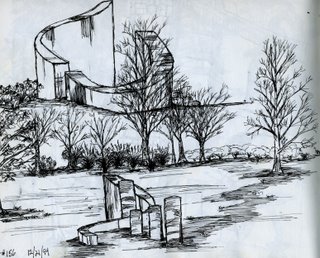
The note says 1994 so who knows what I was working on at that time. There was a time frame there when I built quite a few of these stone and wood benches, and I was always looking for way to incorporate some other type of sculptural element in the project.

Or . . . since it was December 22nd, I might have been sitting in a Waffle House somehwere, whipped out my Rotring pen and just started doodling away.

Wednesday, August 09, 2006

Backyard at Dusk


"The value of practicing nonjudgemental looking is that the longer we look, the more we see."
---Peter London

"Supreme illumination is an arrow straight to hell."
---Zen doctrine
 
"Sensitivity to what is missing is as important as that what is lacking".
--- David Slawson Posted by Picasa

Tuesday, August 08, 2006

Terrace Design, another attempt


This job is a prime example of being called in late on the job. The homeowner has committed to certain aspects of the job and is unwilling/unable/inflexible in his desire to change. The steps are going in on the far right of this photo . . . no matter what. Also the short boulder beds are going to be built . . . no matter what. We need to come out this door onto something . . . no matter what. however there is real debate on "what" that is we will be coming out onto.

I have held out with the explanation for only having one set of steps, coming off these not so deep porches. The drawing below shows what I am trying to do concerning my idea(s). Go down to July 25th and 28th you'll see what I presented in the 1st meeting, which was rejected. The other steps had been started with no plan in mind but they were staying, they were started-they were staying . . . end of discussion.

This is my 1st sketch for the new configuration-it is very rough, but it gives me a good idea of how this would work. I throw in the green to get a idea of space allowed for green and also when I do the next overlay it is easier to read this drawing underneath.

The broad stokes of the marker are much faster to lay down than scribbling in some plants with a pen/pencil. Again allowing me to work faster on the technique which frees' me up to concentrate on the problem at hand . . . getting off that porch down on to the lower terrace.

This rendering with the out of whack perspective line(s) on the house is the one I will show the client. The homeowner will get a much better idea of what we are trying to achieve in his space.

One set of steps to minimize wasting valuable space on transition. This frees up important flat space for the main terrace overlooking the lake. Which is very tight. Wrapping the wall all the way around creates planting beds at 2 heights for added interest. Finally we control the space better by funneling the traffic through one main walkway-the only walkway, freeing up more space to create interesting planting beds along the walkway. Posted by Picasa

I'm a SLOB !!!!!


Thank you John;

Now that I have entered the world of credentialled(sp?) SLOBdom I'm not sure how I'll act.

I want to especially thank you for those kind words about my tag-line. Yes I do care. Now about that landscape of yours . . . . . .

Monday, August 07, 2006

New Fotki address

This is a note for those of you that have bookmarked my Fotki site. This address has changed. Please go to this page. The layout has remained the same for now. Though I expect some tweaking down the road.

For those of you not familar with this site, it's where I keep job images and drawings and renderings of jobs, all the images. I use this site to house these images on-line which allows me (if needed) to communicate with clients.

Waterfeature: Rick Anderson style

 
This is an overview of a 2nd year pond I installed for a Garden Center. Lots going on, I think it looks pretty good. The waterfall and stream enter in from the left. The pond is about 30x16 in dimension.
 
Koi, the key is great filtration, and to not have overload-in other words too many fish to overload the system. This is a delicate balancing situation. Unfortunately most folks think the more fish the better. I would actually like to see homeowners add more Shibukunki, Fantails, and Comets instead of the more demanding Koi. Especially those who aren't that enthusiastic about being hands-on with their waterfeature.
 
Easily my favorite Aquatic plant, the Lotus but it must be held in check or it will easily get out of control-easily. Not only is the flower spectacular but the foliage is great also. On top of that after the flower leaves the seed head left behind is an intriguing focal point. Posted by Picasa

Sunday, August 06, 2006

An Appreciation of Stone 3

  Posted by Picasa
The stone you are looking at was a shot I took on one of my sourcing and buying trips into the North Carolina mountains. There were several guys who had access, or owned property where large, and I mean large masses of fieldstone would be scattered on the mountainside.

Going after the right stone was so much fun it never ever felt like work. It was always a great time going after the good stuff, and hearing all the stories along the way in getting stone off the mountain. I do mean great stories. Rolling Bobcats (the machine), flipping trucks (big dump trucks) and of course the rattle snake stories. Hey, snakes love stone. It's not snakes on a plane, more like snakes in the boulder pile.

Anyway this boulder caught my eye and I was happy to get a great shot of it, I use to use it in presentations where I would talk about this particualr mountainside as my "office". I had spent a lot of time up here pulling stone for jobs. Mostly waterfall/ stream jobs, or outcropping work-perfect stuff.

I'm sure any work I do in the future in the Southeast will lead me back into these mountains in search of the perfect boulder.

Thursday, August 03, 2006

From the Seminar Book

 
"The space is more important than the objects." - ?

"There is only one definition of success-to spend your own life your own way."
-Mark Twain

"Why not go out on a limb, thats where the fruit is anyway." -Shirley Mclaine

"Spend whatever the amount is, but spend the amount with integrity."
-Ryan Gainey Posted by Picasa