Spartanburg, SC knows Horticulture
powered by performancing firefox
I am a Professional Landscape Designer, writer, lecturer, artist, and teacher. I design residential, industrial, and commercial landscapes; using both curvilinear and geometric themes. Adapting to the needs of the client and the site. The Whispering Crane Institute also provides seminars and workshops for those in the "Green Industry"
powered by performancing firefox
Posted by
Rick Anderson
at
3:18 PM
0
comments
![]()
Entertainment Entry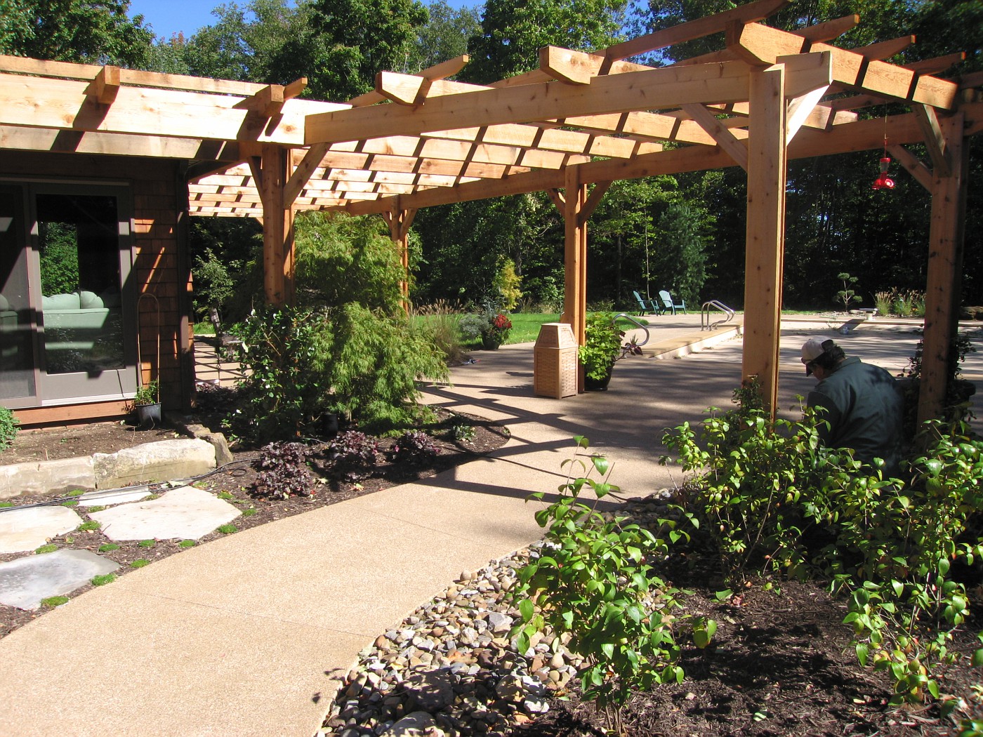 This pergola was designed with several thoughts in mind, several request asked, and the pergola needed to be substantial.
I had looked at the style and size of house and determined right away we needed something with some bulk, girth, and substance.
The homeowners are not fancy, quaint, do-dad type of people that need to look at lots of embellishment or intricate detail.
Finally the space itself is big, big house, big pool, tall trees, and large lawn. Including a long drive with a big parking area to go through before reaching this back yard space.
Instead of just designing the cliche' wrap around the house footprint style arbor I worked hard to design a arbor that would also work as a separator, This separator is to divide the public space and the pool/private space. The physical act of walking through and under such a structure accomplishes this. The mind changes over, the space is now looked at differently.
The cedar pergola was designed not with the intent of keeping out the shade but to act as the conduit of bring the house and landscape together. That's why I think pergolas are so powerful a design tool. Their ability to link elements, spaces, structures, and emotions together in a harmonious way.
The attachment to the house and the post rising from the Earth . . . the connection is made, and can be made more powerful with the addition of vines, climbers and bloomers working their way through the pergola. Where some space below the pergola is solid and safe for footing and other areas are made beds so that plants and people can thrive together and the garden is accessible to human contact.
The other big thought here is often neglected, not even thought of, and usually excites only as a afterthought . . . that thought is shadows. Shadows bring a sense of theater to the garden, The shadow lines magically move there way across the space as the day plays itself out. This continual movement adds dynamic style to the scene and alleviates boredom of looking at the same space in a very un-dynamic style the entire day. Light and shadow in the daylight much too often underlooked, under-appreciated, and very rarely designed for, but designing shadow can be a very powerful design tool.
Every pergola design/designer should keep this in mind when creating the overhead for the pergola. Where is the sun? What is the suns path? What is this path during the most busy time of year using the pergola? What is the pattern to be determined for? Is the overhead designed to block out a large percentage of sunlight? Do crosspieces run with or against the suns path? Does the pergola include 2 sections of crosspieces to create a even more intricate shadow pattern?
Enough questions? For now. We haven't even touched the post, and their embellishment or lack thereof. Or the finish work to the crosspieces . . . the detailing, or lack thereof. Nor vines, nor climbers, nor paint or stain . . . how about going a la natural?
Lots of questions, lots of possibilities, but no doubt one of the most under-utilized structures in residential landscape design.
Posted by
Rick Anderson
at
1:42 AM
4
comments
![]()
Labels: Design Principles, hardscape design, Rick Anderson

Posted by
Rick Anderson
at
12:28 PM
10
comments
![]()
Labels: Plant Material, Stuff
 I believe that water is the only drink for a wise man. ~Henry David Thoreau
Filthy water cannot be washed. ~African Proverb
"Throughout the history of literature, the guy who poisons the well has been the worst of all villains..." -ANON
"Water is a very good servant, but it is a cruel master."
C.G.D. Roberts, "Adrift in America", 1891
"You could not step twice into the same rivers; for other waters are ever flowing on to you."
Heraclitus of Ephesus
"When you drink the water, remember the spring"
Chinese Proverb
"When the well is dry, we learn the worth of water"
Benjamin Franklin
"The stone in the water knows nothing of the hill which lies parched in the sun."
African Proverb
My thanks to Samuel Clemens for the title quote, thanks again Mr. Twain.
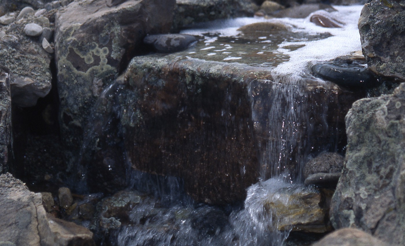
The above falls was built from Colorado fieldstone, the falls in the photo is about 18inches high, and running about 1700 gallons per hour regarding the rate of flow.
Posted by
Rick Anderson
at
1:23 AM
4
comments
![]()
Labels: quotes, waterfall, waterfeature

powered by performancing firefox
Posted by
Rick Anderson
at
11:49 AM
3
comments
![]()
Labels: Design Principles
 Arborculture is the art and practice of doing unusual things with trees to create living works of art. There are even practitioners who grow trees to only cut them down and create furniture.
The photo on the right is a living sculpture by the father of the movement Axel Erlandson. The 6 Sycamores create a fantastic and unusual sculpture.
The photo was taken at Bonfante Gardens in Gilroy, CA. Which is not where these trees started out. They actually started in the San Joaquin Valley as part of Erlandsons Tree Circus. The story of how they got from one place to another is told here, here, and here. The page for Mark Primack is here.
A pdf from Bonfante Gardens which talks about the large aquascape gardens and later in the file talks about the big move of Erlandson's remaining 29 trees from their original location to their present home. It's quite a story of determination and co-operation, and a man who wanted to see these specimens survive. The fellow on the left is Arthur Weichula. Art had some interesting idea about arborculture and other uses for living trees. he was very interested in how living joints, or how inosculation worked.
While looking at all this I was reminded of the ancient art of pleaching, which was developed by the Romans. I say Romans because they were the 1st to speak of it in their writings. it's certainly possible pleaching happened before then. But . . . I digress.
Here's a good explanation, the images were missing when I looked at the page. Here you can see a few good examples of pleaching but the writing on the page looked strange for me. The 2 examples will give you a very good idea of what pleaching is all about. let me know if the links are a problem. In today's World of Arborculture the guru seems to be Richard Reames who has written the book, called ARBORCULTURE, Solutions for a Small Planet. I have not read the book but between his site and his work, and now the book there has been a new growth in interest in this form of living art.
Here is a interview in Cabinet magazine with Richard Reames, and I have a few other links of interest from other place/sites in the world where there is great interest in the art of growing trees to create art:
 Finally, finally . . . a big thanks to Hank over at a Lake County point of View. Thanks a lot, I was just spinning through the day minding my own business and boom! It happened Topiary, more topiary, and after catching another post on topiary on the site (like 3 in 3/4 days) I came across a comment refer to arborculture-that was enough to set me in motion. Now, much later in the day-it's up (the post on arborculture). Thanks Hank.
Posted by
Rick Anderson
at
2:51 PM
2
comments
![]()
Labels: Design Principles, Plant Material
Posted by
Rick Anderson
at
11:46 PM
0
comments
![]()
Labels: Stuff


Posted by
Rick Anderson
at
2:05 PM
0
comments
![]()
Labels: Design Principles, hardscape design, quotes


powered by performancing firefox
Posted by
Rick Anderson
at
11:57 AM
3
comments
![]()
Labels: Nature
 The steps from a wider angle:
On 12/7 I posted a close-up of the stone steps, showing some of the detail. I was after a look of strong yet informal steps that led out on to the lawn.
These steps are the only way to get from the parking court and upper terrace to that front lawn. The large barnstone on the left was needed to hold up the planting bed. This bed was designed in to screen the view of the cars from the street. and create a buffer of green between the view and the asphalt.
The bed swirls on the right before working back into another small wall that took advantage of stone found on the property. This wall was built to hold up the planting bed and upper terrace walkway and patio.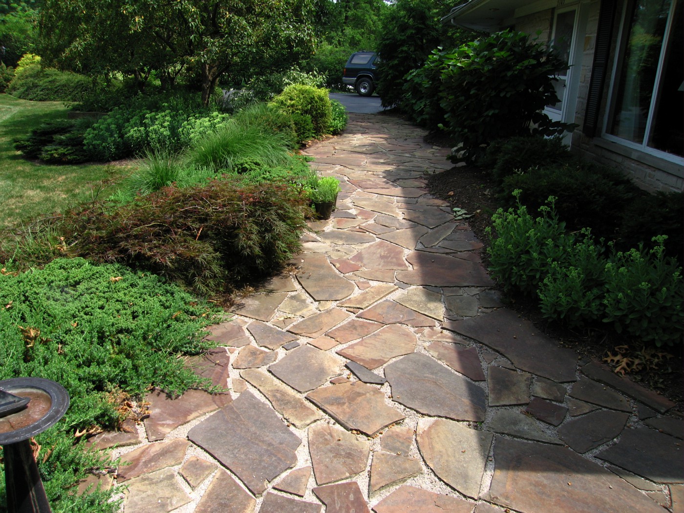
The view from here show the upper terrace. This is a flat stone called Maryland chocolate set on a bed of limestone dust and screenings. The steps are at the far end of this patio between the Crabapple trees. If I remember correctly these are "Sugar Tyme' Crabs.
I would like to point out these pictures were taking last summer, the Summer of 2006, and this job was installed in the Spring of 2000. The patio has held up quite well, and most of the plants are still in the same place we planted them 16 years ago.
I had an opportunity to chat with one of the homeowners. She had pulled in when I was shooting these pictures. We talked about several things and she mentioned how happy they had been with everything all these years. I had to tell her they had done a great job with the upkeep and that everything still looked great.
This view shows a better look at the short wall that holds up the small bed and terrace. The beds; after 16 years, look fairly tidy.
Posted by
Rick Anderson
at
12:07 PM
0
comments
![]()
Labels: Design Principles, Plant Material, stone
Posted by
Rick Anderson
at
10:28 PM
4
comments
![]()
Labels: Design Principles, steps, stone
Posted by
Rick Anderson
at
9:24 AM
0
comments
![]()
Labels: Design Principles, Nature
Landscape management, a relatively new program at Brigham Young University, is highly respected among its professional commu-nity andoften turns into an equally profitable career.
I've seen degrees in Landscape Architecture, Landscape Design, Horticulture, Landscape Technician(2 yr). This is the 1st I've seen in Landscape Management. A degree in this field makes sense as Landscape Companies grow their is a need to have solid designers, foremen, and supervisors on staff.
Posted by
Rick Anderson
at
9:04 AM
1 comments
![]()
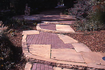 This continues the story from Sundays post on The Appreciation of Stone. I've been asked a few questions and will attempt to answer them here:
Posted by
Rick Anderson
at
11:06 PM
4
comments
![]()
Labels: Design Principles, stone
Spaz in the wheelbarrow We have a low spot in a bed where the water will lay for; up to, 24 hours. The soil is clay, and it's a nasty area. I was able to do some mounding in the middle and back part of the bed to raise those areas, however we know beds have to slope down to their edge. What to do, what to do . . .
Well the entire area is low, water collects, I am not going to raise the entire area because a stone walkway is going through next year, and it needs to be at that height to set up a series of steps out of the low lying area. So it's going to stay low.
This means I have to look for plants that will endure this type of culture/micro-climate. I am one of those who would rather find a plant that lives in a certain type of micro-climate than change the area entirely.
What I have learned over my many years is one change leads to another, to another, to another usually affecting another part of the garden in a very negative way. Specifically moving water, drain water, run-off, etc. Water is at the top of the list.
I have also learned there are plants to adapt to almost every climatic, cultural situation. You just have to learn what works where . . .. a good reason to hire the Professional Designer (shameless plug).
But I digress, the plant in the wheelbarrow, along with Spaz, is Acorus gramineus commonly called sweet flag. Acorus is a short grass and does very well in standing water, temporary flooding, and straight clay soils. I have used Acorus in these conditions from zone 4 down to zone 9 with good results.
Spaz had decided to help us out when he jumped in the wheelbarrow and decided to nap instead-typical cat. Anyone on this cold blustery day I thought I would share this photo and talk about plants and drainage.
Sort of kill two birds with one stone. Uh; maybe that's a bad analogy when cats are involved in the story.
Posted by
Rick Anderson
at
1:49 PM
2
comments
![]()
Labels: Design Principles, Nature, Plant Material
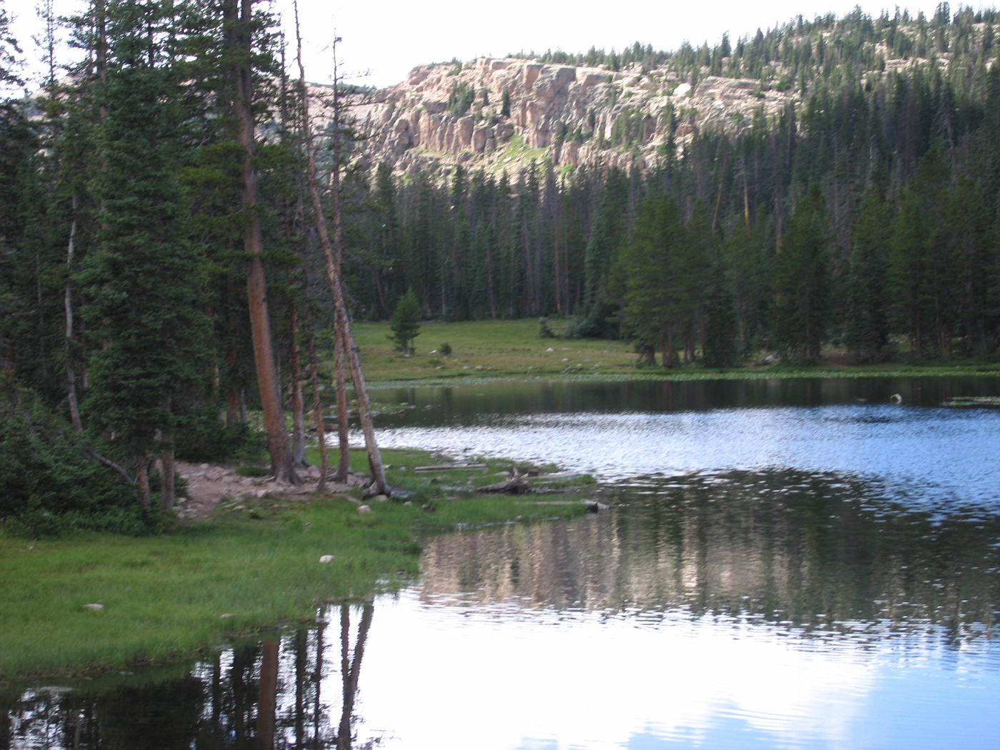 On 11/21/06 I posted a short blurb about books for the laymen in reference to a short list of books for (what I consider) folks who want to design/garden their property. So I was using laymen as a term for someone who is interested in horticulture/gardening but in no way, shape or form receives money for their interest.
On Nov. 27th over at a blog called A Lake County Point of View, the County Clerk was kind enough to refer to another post of mine 27 Books every Landscape Designer Should Read. In this post he also mentioned the 11/21 post; inside that post was a comment about my referring to laymen, and referencing the word layman was a little pretentious-on my part.
This starts a little back and forth, and a question from me about what term should I have used instead of laymen? So today the County clerk post a long discussion (quite interesting) starting with an apology to me-which I didn't think was necessary, but it is accepted.
Now the good stuff, this is a great post on the English language and the importance of words and how they are used, or should be used. It is a fantastic explanation of connotation vs. denotation with a little classical music thrown in.
My point in bringing all this to the forefront? What have I learned? Well one thing I have learned from this Blog was that I needed to craft my wording so that others would understand my way of speaking/talking/writing. I had previously been published over 35 times (mostly trade journals) but always had the other set of eyes look at my writing-the editor. I was lazy, editors made it too easy for me. It was, "just give me the how-to's of the installation, I'll clean it up for publication".
Well that's not the case here with this Blog . . it's me. What I write here is what makes it out to cyberspace and the public world. I gotta tell you, I like it. I like the challenge - a lot. So when I am called out on something, something like this (the use of word laymen), I really don't mind.
I have gotten lazy with some words, for me laymen/layman had become the great catch-all. Laymen was easy. So I ask you this . . . what is a better way to describe those that love to garden? those that like to be out in their private spaces, to dig in the dirt, to nurture those plants? With no thought of monetary reward. To separate Professional from the strict amateur.
By the way A Lake County Point of View is a terrific read all the time, so many interest, so much thought. Heck, just go back and read last weeks entries about Walnut, you'll understand. Great stuff.
*Small confession: my wife has been known to log on here and do a little editing, she is terrific at catching all the typo's and stuff that I am good at missing. Many thanks Mrs. A.
*The above picture was taken at 9,000 or 10,000 feet in the Wasatch Mountains, east of Salt Lake City, Utah. It's worth the visit.
Posted by
Rick Anderson
at
9:59 AM
2
comments
![]()
Labels: quotes, Rick Anderson, Stuff
From the yard, a look before final facing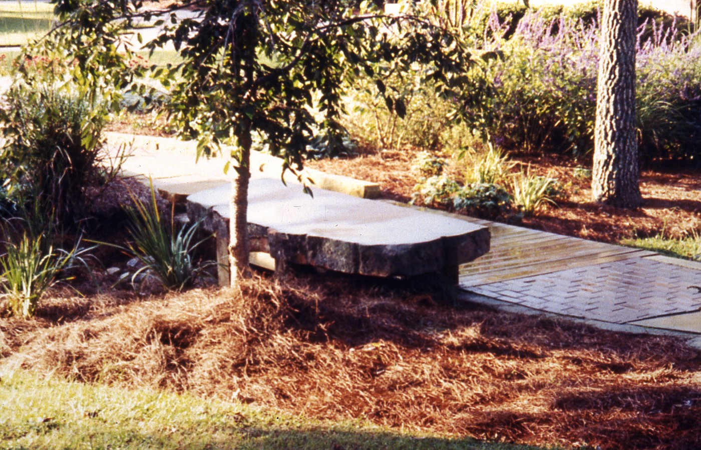 Comments, e-mails, even a phone call. Thought I would show a few more shots of this rather large bench. You can see part of the walkway, a combination of pavers, sandstone slabs, and wood for the bridge.
A look from top of walkway: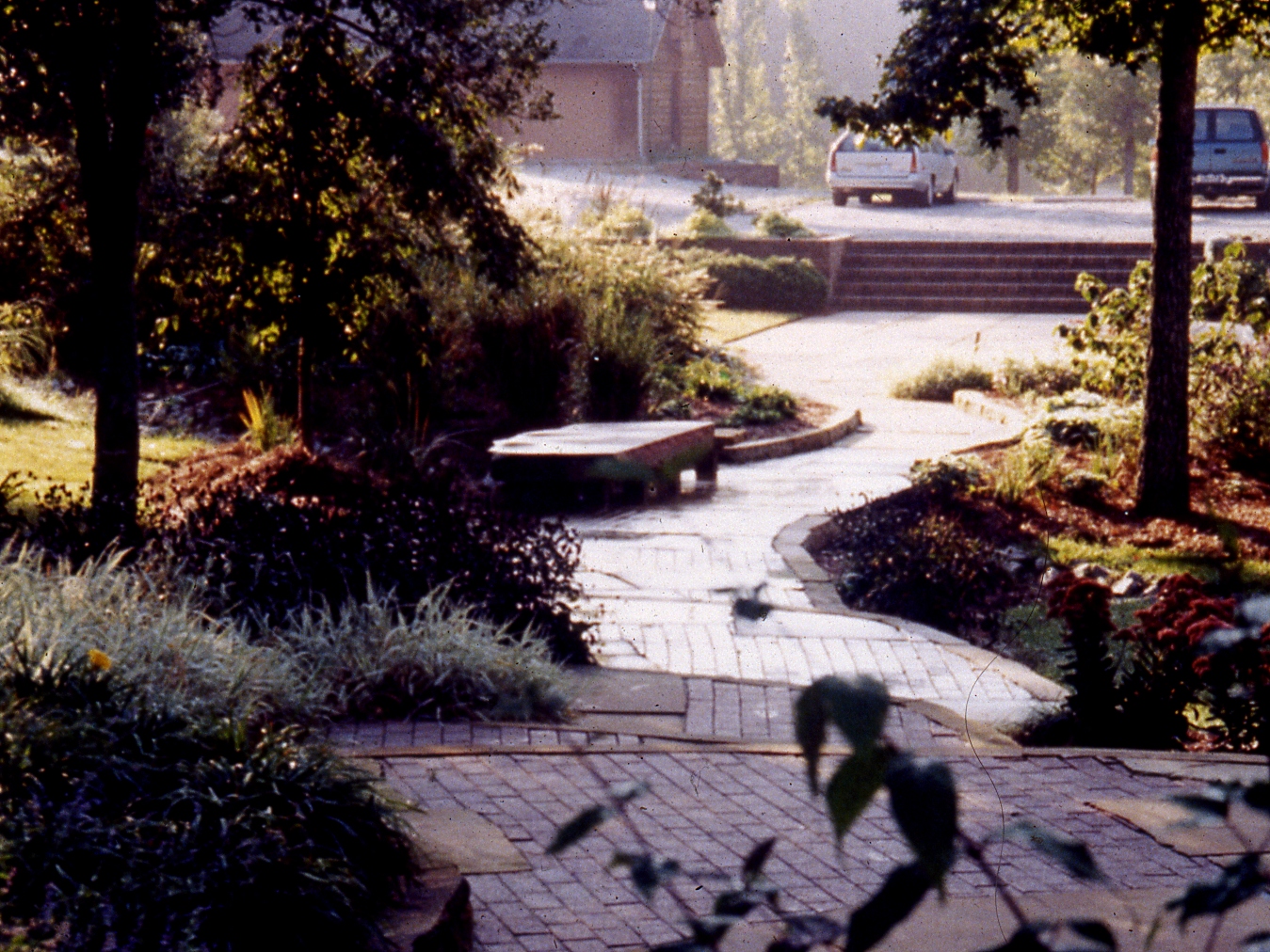 This is a look of the project/walkway in the fall, you can see down to the bench on the left. I was asked to create a pleasant walkway from the front of the house to the pool house.
The client was very adamant in her desire that the walk would be interesting, and those visitors getting out of their vehicles would be able to look over to a very pleasant scene.
The walkway is over 120 ft. long, and the width varies from 5 to 8 feet. All the rules for walkways were thrown out, rules for steps were thrown out, pretty much all rules were thrown out. In the end it was all about the aesthetic, the visual, the experience.
Posted by
Rick Anderson
at
8:56 PM
2
comments
![]()
Labels: Design Principles, stone
A Sandstone Bench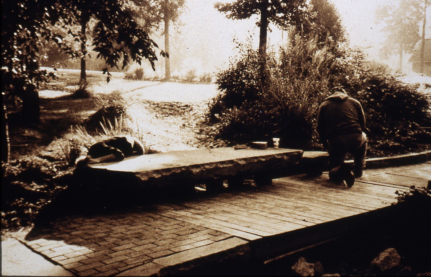 This sandstone slab is just over 9.0 wide and about 3.5 feet deep. We used a tractor with extended forks to set this slab. After it was set I did some facing on the stone to create that interesting edge.
The slab came from the discard pile at Briar Hill Quarries, which is located in nowhere, Ohio. It is truly out in the country very close to Glenmount, Ohio. The folks at Briar Hill are good people. If you call and get Rusty tell him Rick Anderson said hello.
Posted by
Rick Anderson
at
12:00 AM
4
comments
![]()
Labels: stone
Some old Doodle: A interesting article from Southern California about ripping out the yard and filling it full of plants.
Katie Campbell has written a book called Icons of Twentieth-Century Landscape Design, here's an excerpt:
In her book, Icons of Twentieth-Century Landscape Design, Campbell explores 29 sites, from Parc Guell, Gaudi's Art Nouveau extravaganza in Barcelona, to the stark landscape around the Jewish Museum in Berlin; and two Scottish gardens have made their mark on the international design scene.
This article goes into the thought process behind the book and what Ms. Campbell is hoping to accomplish, I look forward to reading this one.
Do you like maps? Do you know how to read a map? Some folks consider large landscape plan drawings-maps. Well I like maps and heck I can even read a complicated landscape plan. Here's a Blog that looks at the World of maps, strange maps to be exact.
Posted by
Rick Anderson
at
2:35 PM
0
comments
![]()
Labels: drawings, Plan view drawings, Stuff
I found another article on the trees for the WTC memorial. This article goes into a rather detailed explanation of the trees, selection, holding area, planting, and culture involved to make this work.
A interesting read.
Posted by
Rick Anderson
at
12:05 PM
0
comments
![]()
Labels: Design Principles, Plant Material
From a article in the NY Times:
"This is the field where 380 swamp white oaks and 57 sweetgums — to be shipped in from nearby states — will be kept and cultivated before making one more journey in 2009, to the World Trade Center memorial in Lower Manhattan".
Swamp white Oaks in new York City, I find that very interesting. Now I am sure people much smarter than me have made this decision, and know what they are doing, but swamp white oaks?
I just have a hard time wrapping my head around this one. To me the cultural requirements just seem so opposite. It will be interesting to see how the prepare the for the planting holes and how much room they allow for root growth, water, oxygen, etc.
Again they are much smarter than me, so I am sure they have this worked out.
By the way this is Quercus bicolor from Michael Dirr's description:
Posted by
Rick Anderson
at
1:37 PM
0
comments
![]()
Labels: Design Principles
Several weeks ago I posted a list of 27 books I thought were good books for the Professional Landscape Designer. I see that Joel Lerner has written a suggested book list for the home gardener.
If Joel suggest this list I am sure it is a good one. I've known Joel since 1989 and have a lot of respect for Joel and his wife Sandy, they are really good people and fun to work with. Joel is also the consummate professional, and well thought of in our industry. Joel also has several books to his credit.
Beyond that he was one of the movers and shakers who had a lot to do with the formation of APLD. APLD is the only professional organization that speaks as the international voice of Professional Landscape Designers.
Having said all that I am sure it's a good list.
Posted by
Rick Anderson
at
12:44 PM
0
comments
![]()
Labels: Stuff
Ta-da! 10 tips for creating a beautiful landscape. Come on down you've won! Quick, neat, easy, no muss-no fuss. I am really tired of these list, they compete with HGTV in what annoys me the most.
The easy way out.
This kind of stuff does more to set us back than move us forward. See, what these list do is tell you the what, but in no way, no shape, no how!!! Nowhere in this list does it even begin to explain the how's . . . the real teaching that needs to be done, the real technique. Just follow this list blindly along and boom . . . . . . beautiful landscape.
So homeowners then become turned off by the whole process, the heartache, the backache! and the lost money.
We professionals then get called to solve the problems, of frustrated, angry, tired, sore, homeowners. At least these people have tried, and then realize they need professional help and call us. I actually feel bad for this group of homeowners as opposed to another type of homeowners.
The no maintenance crowd. Or the doesn't care crowd-because you/service are going to maintain. But that's for another day . . .
Posted by
Rick Anderson
at
12:24 PM
0
comments
![]()
Labels: Design Principles
I have always been fascinated how; we, in the landscape industry use words. Especially how Designers use words to help describe what they are trying to design, to come up with a phrase that matches the situation or solution.
Have you ever seen a worn out path of grass in a lawn? Or a beat down path where people take a short cut? Well apparently there is a phrase for it, and it seems so simple, so perfect That i can't believe I haven't used this phrase before . . . desire path.
I know this will now become part of my toolbox of phraseology, how cool!
Posted by
Rick Anderson
at
12:13 PM
0
comments
![]()
Labels: Design Principles
Color rendering: markers, colored pencils on yellow trace This rendering is another take on what we had discussed last week. Especially the talk about where does the fountain belong, or not belong.
This rendering shows the fountain a little further up the sidewalk with a pergola area further behind and to the right. Do they belong together? I'm not sure, but do Tom and Katie belong together? Not sure there but we are all giving it a shot.
It is important to remember in a conceptual that it is just that . . . . a conceptual. If you are going to critique something, or tear it apart, or move something around-now is the time. The client wanted to see if a pergola/gazebo would work, and where I would suggest it. My take is the structure belongs off to the right and back from the sidewalk.
Back to last week, I'm not any more sure about this idea than the other rendering I had up last week. I'll be real curious how the homeowners react to suggestions. I am pretty sure either solution was beyond their scope of visualization . . . this is not a bad thing or a offhand remark, it's just how these concepts work out.
When clients ask for paving, walkways, structure, classical fountains, driveways, and parking courts . . . it gets complicated. Heck, that's why I get called in.
A unobstructed view of existing front door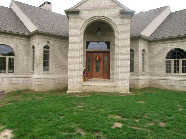 Well here it is. The entry is big, it's massive, it's imposing and it goes absolutely, positively nowhere . . .
Posted by
Rick Anderson
at
11:28 AM
2
comments
![]()
Labels: concept drawings, Design Principles, renderings
This drawing goes with previous renderings.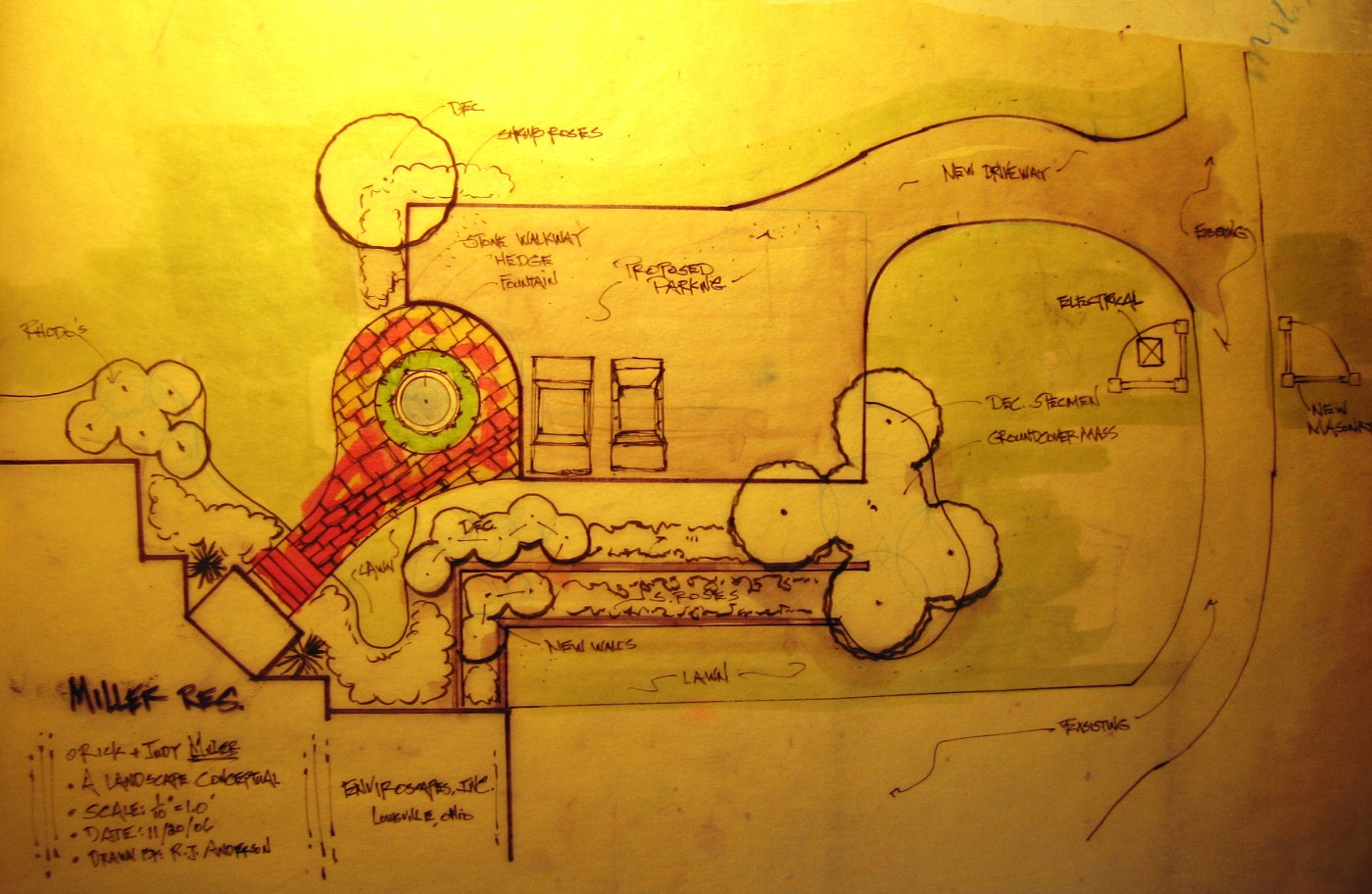 Okay all the hemming and hawing about the fountain and where it goes, what goes with it, or not with it, etc . . . . well here it is.
This is a photo that was shot off the drawing board right after I had finished this drawing. In the lower part of the drawing is the driveway for the garages, from there to the new parking court the height differential is about 8.0' foot.
Everything on the drawing would be new. There are no walls right now, no plant material of any kind, no walkway-nothing. That drive on the far right is there, the drive goes around to the horse barns, but we have to come past the utility boxes to start the new drive up to the parking court.
What does this plan view show us? A new entry drive, a parking court, a walk to the front door, a gathering place (where the fountain is), and how the beds for the plant material would/could work.
Now that I am showing this drawing does it make any more sense? Does it make any more sense to me? I am still not sure I like how this thing lays out, or the flow, but it is, what it is . . .
Posted by
Rick Anderson
at
10:26 AM
2
comments
![]()
Labels: concept drawings, Plan view drawings
A Fountain for nowhere, maybe?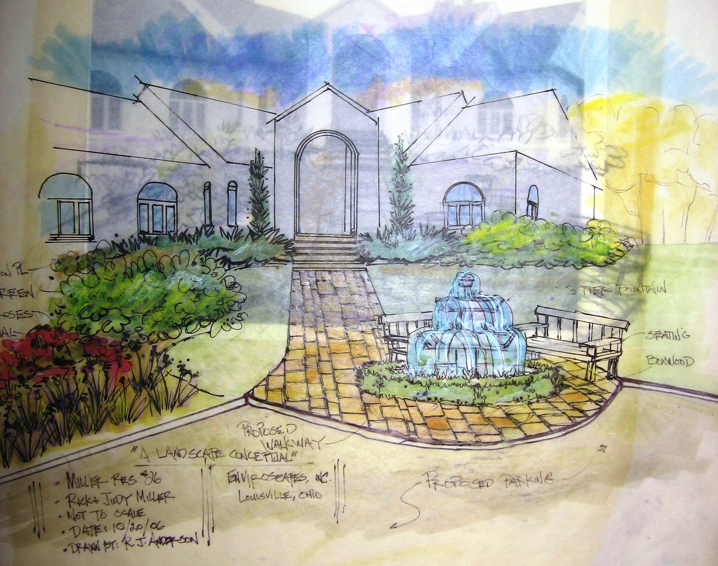 This is the image I spoke of a few posts earlier. I took this right after I finished the drawing. You can see the tracing paper beneath and the original photo beneath that.
On the tracing paper is a sketch done in pencil, what I was after was a outline of the fountain and how it related to where I was guessing the end of the walkway would be-and it was a total guess.
The foreground is the parking court. I would call this an entry garden, or entry courtyard. The homeowners got themselves in a little bit of trouble here. They designed the back of the house to face the primary view (a 5 acre lake). The drive came into the side with a 3 garage door entrance, which wound up being an entire story below the main living level. And the grandiose front door??? Well here it is completely detached from the drive, the garages, the view . . . everything.
So they have lived in the house for awhile and have now realized why no one comes to the front door . . . no one can get to it!!!
So in order to get there we have to get a driveway up there, and we have to park the cars, of course, and then we have to be able to get folks from the parking court to the front door. While we are at it we might as well make the journey from the car to the door interesting. We also need to have a gathering place to say hello or goodbye.
They also need to add some plant material to transition from the house to the surrounding grounds. Right now there is nothing, zip, zada, zero! The softer perennial/grasses to the left act as a buffer zone between the parking and one of the retaining walls to be added.
Do I like the design? not sure . . . I can't decide on the fountain, it seems too exposed and it appears I have taken a very formal subject and placed it in a very informal setting. I'm just not sure it works.
As for the actual drawing . . . by now my loyal readers know I am never satisfied with those drawings, need to keep working on those.
Posted by
Rick Anderson
at
11:28 AM
5
comments
![]()
Labels: concept drawings, Design Principles, renderings
I am not sure how Alina came up with this name for her Blog, but hey it works for her which is all that matters.
Another great post of her fantastic ability to make a page come alive, she is so good with color. Plus this time she throws in a little philosophy. So I think I'll throw some in too.
"Farmer, pointing the way, with a radish" -Issa
Posted by
Rick Anderson
at
11:46 PM
1 comments
![]()
A Blog that takes a unique look at the urban environment, the good and the bad, with the decay and the possibilities of all that entails.
The name: Walking Turcot Yards, it's worth a look.
Posted by
Rick Anderson
at
11:12 PM
0
comments
![]()
Labels: Nature, Rick Anderson, Stuff
They have a list over there for the top 10 jobs to get you outdoors, and Landscape Architect is on the list. I find this rather amusing, actually very amusing.
The LA's I know are chained to their CAD programs on their computer, while at their desk. They also have Botanist on the list, which I also found somewhat amusing.
Check it out . . .
By the way I am a Landscape Designer, not a Landscape Architect in case you were wondering.
Posted by
Rick Anderson
at
10:59 PM
1 comments
![]()
Labels: Stuff
Having fun with a rendering I just realized as I get older my definition of having fun sure has changed. After a day of fooling around with this design I decided to take a couple of shots with the layers piled on top of each other. Woo! hoo! having fun now . . . .
Beneath the colored rendering is a pencil sketch rendering, and below that is th original photo of the entry which I print out in black and white. The black and white image is better for me to read in the sense that the lines are easier to read.
Between you and me I'm not really sure I like this design, I never was one for just having some fountain floating by it's lonesome, these clients seemed pretty adamant about having one however, and trying to find a good spot for it has been driving me crazy.
More on this job, and drawings this week, though the closer we get to the Ohio State ////M*ch*gan game (Columbus has gone crazy), the more difficult it will be to concentrate on such mundane matters as this Blog.
Posted by
Rick Anderson
at
9:55 PM
0
comments
![]()
Labels: concept drawings, Design Principles, renderings, waterfeature
Okay, now I understand someone stealing an occasional lawn mower, or barbecue grill. I mean you can sell the mower and you got to eat. But stealing the furniture? Stealing the flagstone? Stealing the Koi? Then stealing the pond . . . . ?!??!?!? What the heck is going on.
It appears there is a major garden crime wave in Great Britain, and the thieves are busy, really busy.
I have not seen anything like this here, in terms of these types of numbers. If anyone has seen some numbers please pass along the link. I would appreciate it.
I do remember back in the mid-90's when I lived in South Carolina there was a brand new upscale neighborhood where there were several installs and that 1st night a gang of crooks would dig up all the newly planted plants, stripping the landscape bare. This went on for several months and no one was ever caught.
Posted by
Rick Anderson
at
11:25 AM
3
comments
![]()
Labels: Plant Material, Stuff
I recently came across this web-site in China with this one page in English. It talks about the state of Landscape Architecture in China. There is also a lot of discussion about all the growing pains the Chinese are going through.
I have been to China, would love to go back, and know that all these problems are real. The Chinese people are great, everyone I ran across was engaging, fun, interesting, and curious. What I came away with was that the Chinese people aren't much different from us, shocking, and just want to lead a decent life with family and friends, have a decent job, and be consumers-just like us!
Posted by
Rick Anderson
at
11:09 AM
0
comments
![]()
Labels: Stuff
The original: shown to client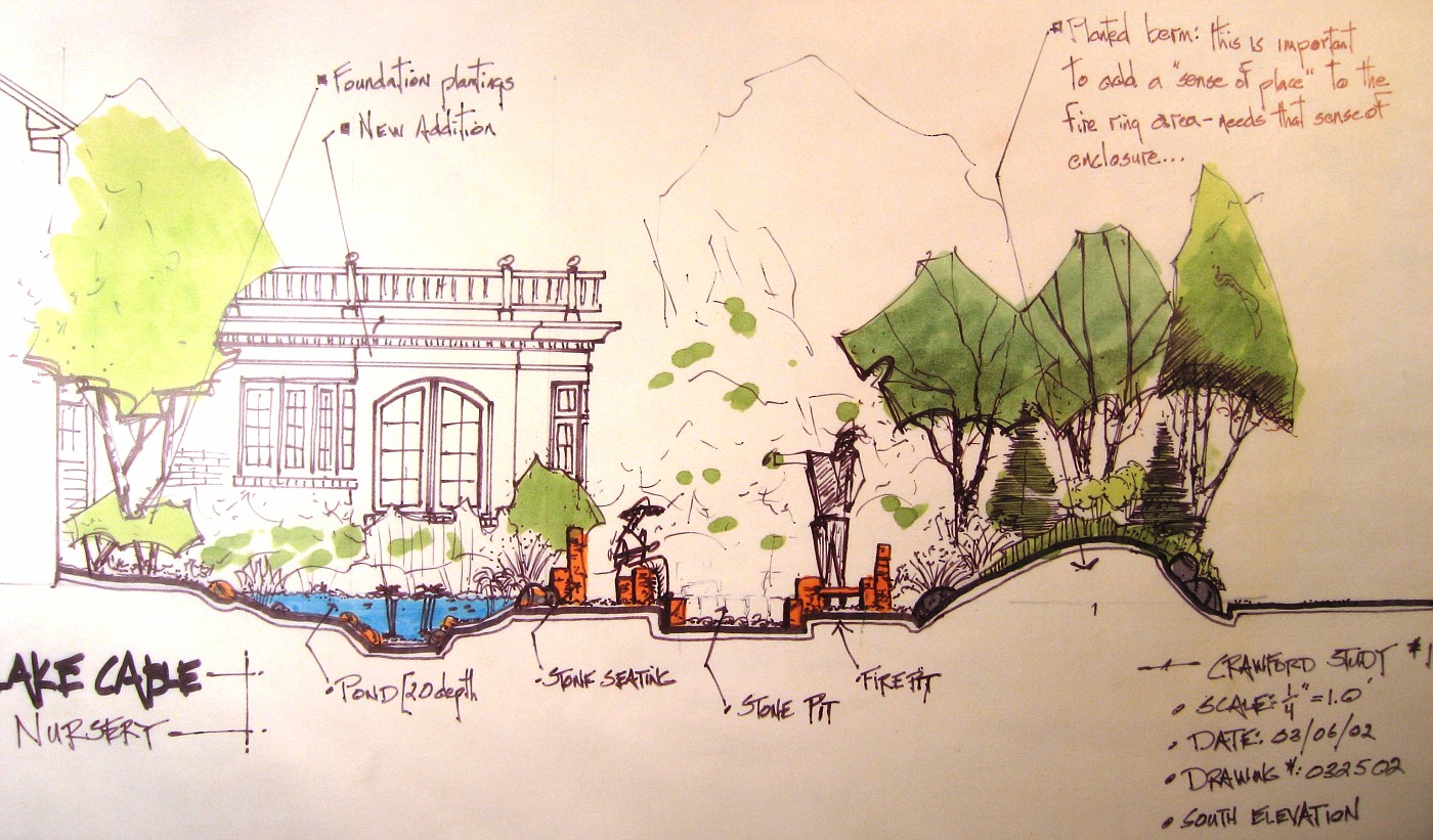
2nd Attempt: on trace, or as I like to say trash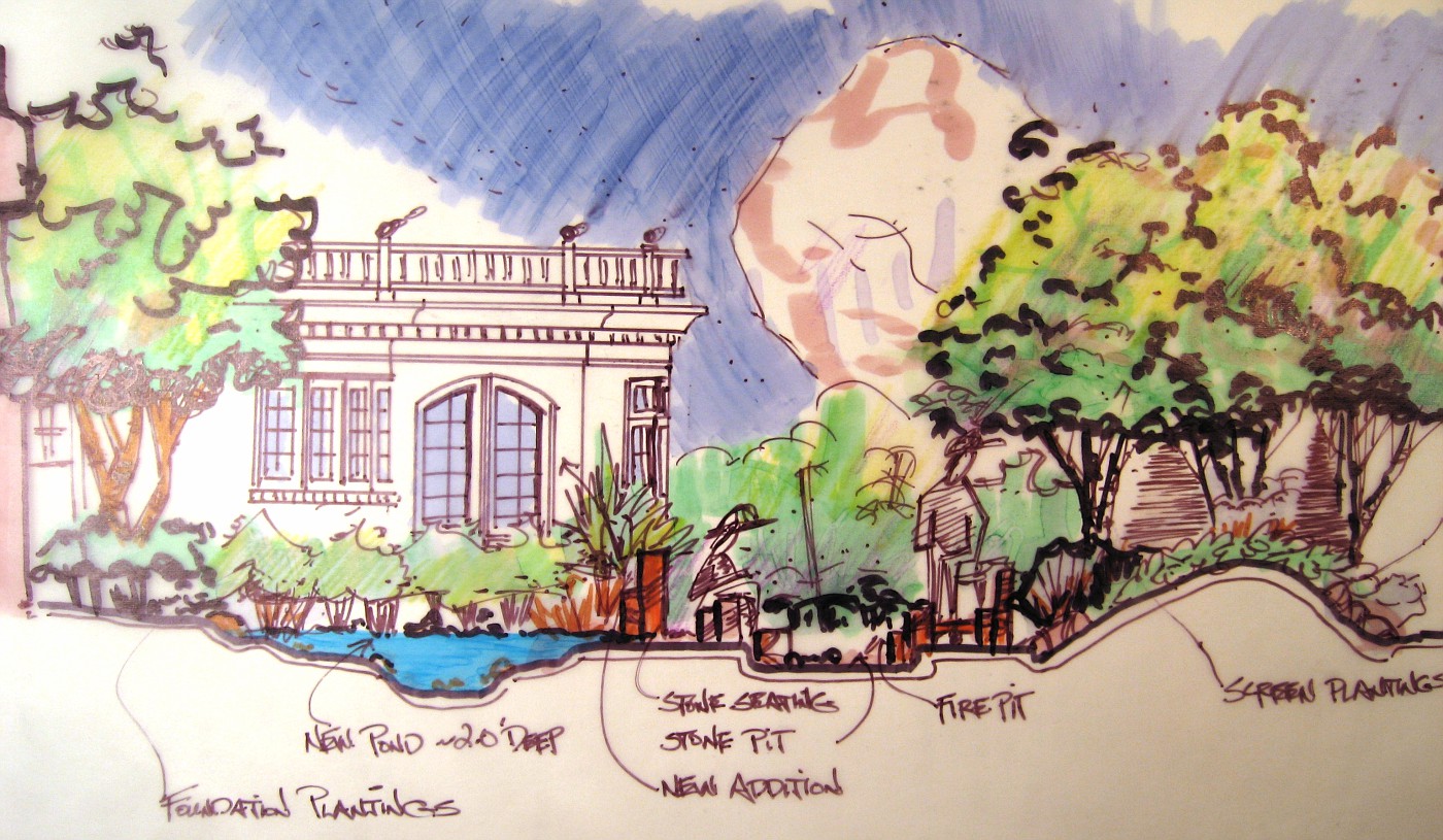
Later attempt: evolved drawing style on Vellum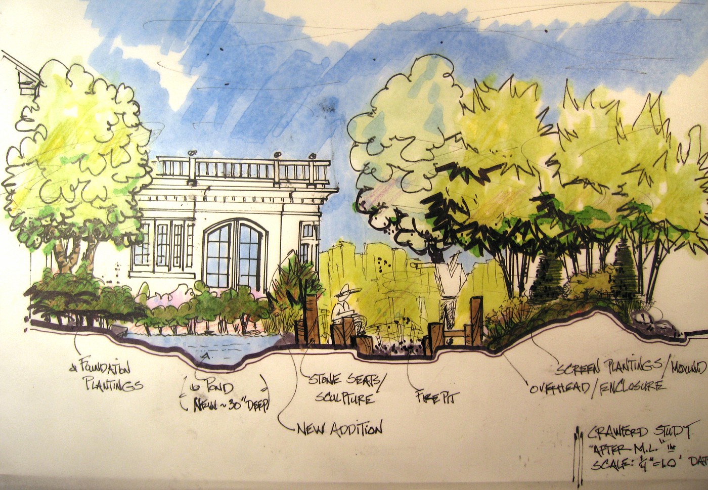
Posted by
Rick Anderson
at
12:11 AM
0
comments
![]()
Labels: concept drawings, drawings, renderings, Sectionaldrawings
Single water falls, and tan sandstone walkways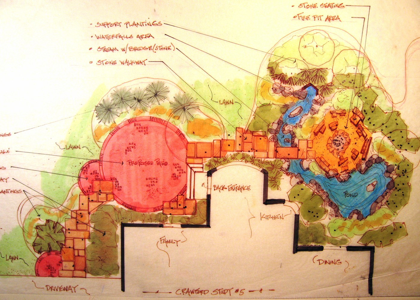 More on the previous post. This was the 1st plan view color drawing that was shown to clients. Take notice that in this conceptual drawing there is only one waterfall, and the walkway is tan in color. the homeowners looked at this drawing and were very impressed.
I then remember them . . . starting to study the drawing and going over ever detail. It was decided pretty quickly they didn't want brown sandstone for the walkway-they were positive about this.
2nd they were very concerned that the one falls would not make enough noise to screen out the eat of the neighborhood noise, and would only one waterfall be loud enough to hear in the kitchen, and breakfast nook.
Normally, I would just show them a different color of stone (actual stone piece), and take some overlay paper and draw the other falls in the hillside. That wasn't going to work here, they wanted to see another drawing (specifically the wife).
So, I called the contractor and said I had to do another drawing for the homeowners, for x amount of hours to do the work (which he hadn't agree to pay me for). He asked me if they were excited about the conceptuals and were they close to jumping in?
I said; heck yeah, they're ready! . . . .
So the previously posted drawing is what they looked at, and of course they jumped in, over original budget request . . . because it was everything they wanted, in a logical layout, and the best parts could be enjoyed/viewed from inside the house.
Color rendering of pond and fire ring Along with the plan view rendering, I showed the clients this conceptual rendering of how this area would relate to the new kitchen addition.
The addition is shown only in black line. I was trying to present the landscaping to add to the backyard, which is why my stuff is in color. We needed to excite them about tha landscaping, Heck they had already agreed to add the kitchen-no need to promote that.
I did; however, have to show how the new landscape would relate and enhance the new space. This rendering does a much better job than anything I could have done on a plan view drawing.
This drawing was the deal-clincher for this side of the backyard. I basically laid this on the table and it was over. Let's go, let's put it in, we can't wait . . . those were the comments.
I've said this before, and will say it some more (hey, I'm a poet!), if you design hardscapes, structure, level transitions, etc . . . you must render. This is the only way to really communicate what you are trying to achieve to the client.
Has for this drawing, I'll have more on my evolution as a designer . . . tomorrow.
Posted by
Rick Anderson
at
11:38 AM
1 comments
![]()
Labels: concept drawings, Design Principles, drawings, hardscape design, Plan view drawings, renderings, Sectionaldrawings, stone, waterfeature
More on yesterdays Hardscape Plan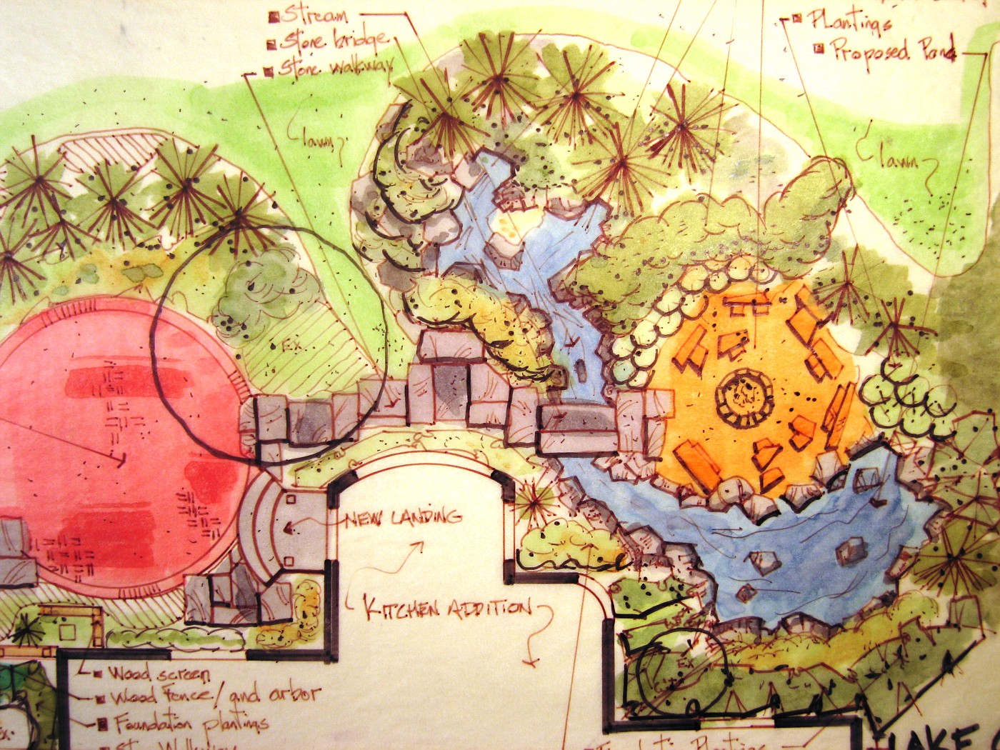 Now we can take a look at where that sandstone walkway goes to. The bridge leads directly to the fire pit area, in a very enclosed area.
Just above the fire pit is the mound with boulders and plantings. To the bottom side the pond surrounds the fire pit. I was trying to create this very intimate space for those who wanted to wander over to this area. While the paver area was more of the public type area.
The homeowner had specifically asked for two separate areas so the adults could gather in one and the kids in another.
Everything was designed with this thought in the back of my head, remember the view from the new kitchen addition . . . remember the view from the new kitchen addition. You can see the breaks in the house line where the windows were being placed . . . there are a lot of them, and we wanted something interesting happening wherever you looked out.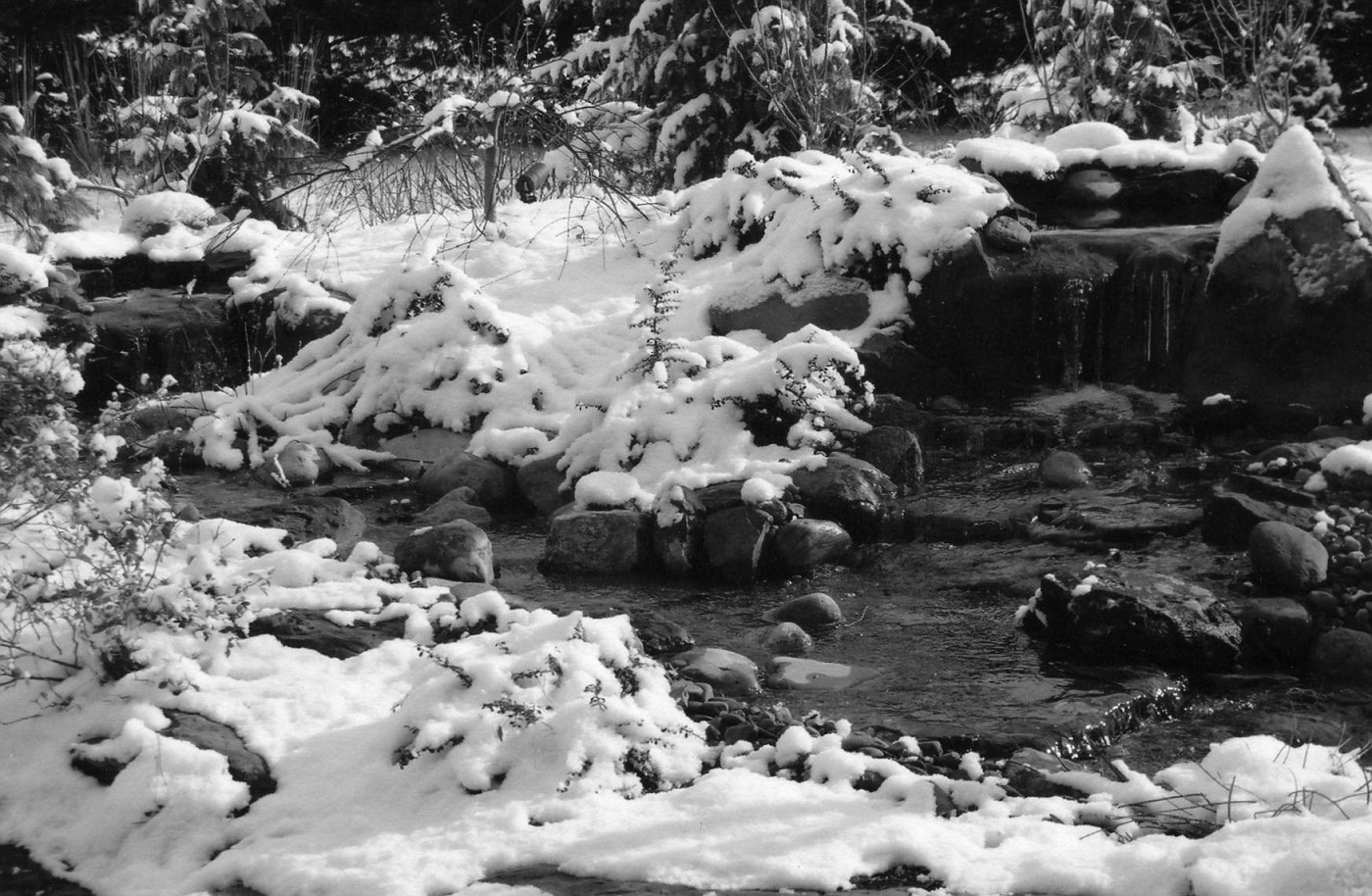 This was taken the 1st winter of the garden. I took this photo with a zoom lens while standing inside the kitchen. Where the window is rounded off they have a breakfast nook set up there.
I think it's a pretty nice look while your sipping on you morning cup of joe, and having a bowl of Cheerios. What do you think?
The falls originate in bio-falls boxes, and I always used 45mil, EPDM liner, covered in stone-usually 3-5 different sizes. I believe this helps with creating a more naturalistic waterfeature. One other thing about siting waterfeatures . . . I like having some sort of evergreen back drop for my falls. I think a good solid screening backdrop helps with selling the realism of the waterfeature.
I am also a sucker for low weeping plants around streams. Plants the branch out over the water, or crawl down into the waters edge. It's more of the blending between land and water to create a; sort of, seamless edge.
Posted by
Rick Anderson
at
1:14 PM
2
comments
![]()
Labels: Design Principles, hardscape design, stone, waterfall
Color Landscape Rendering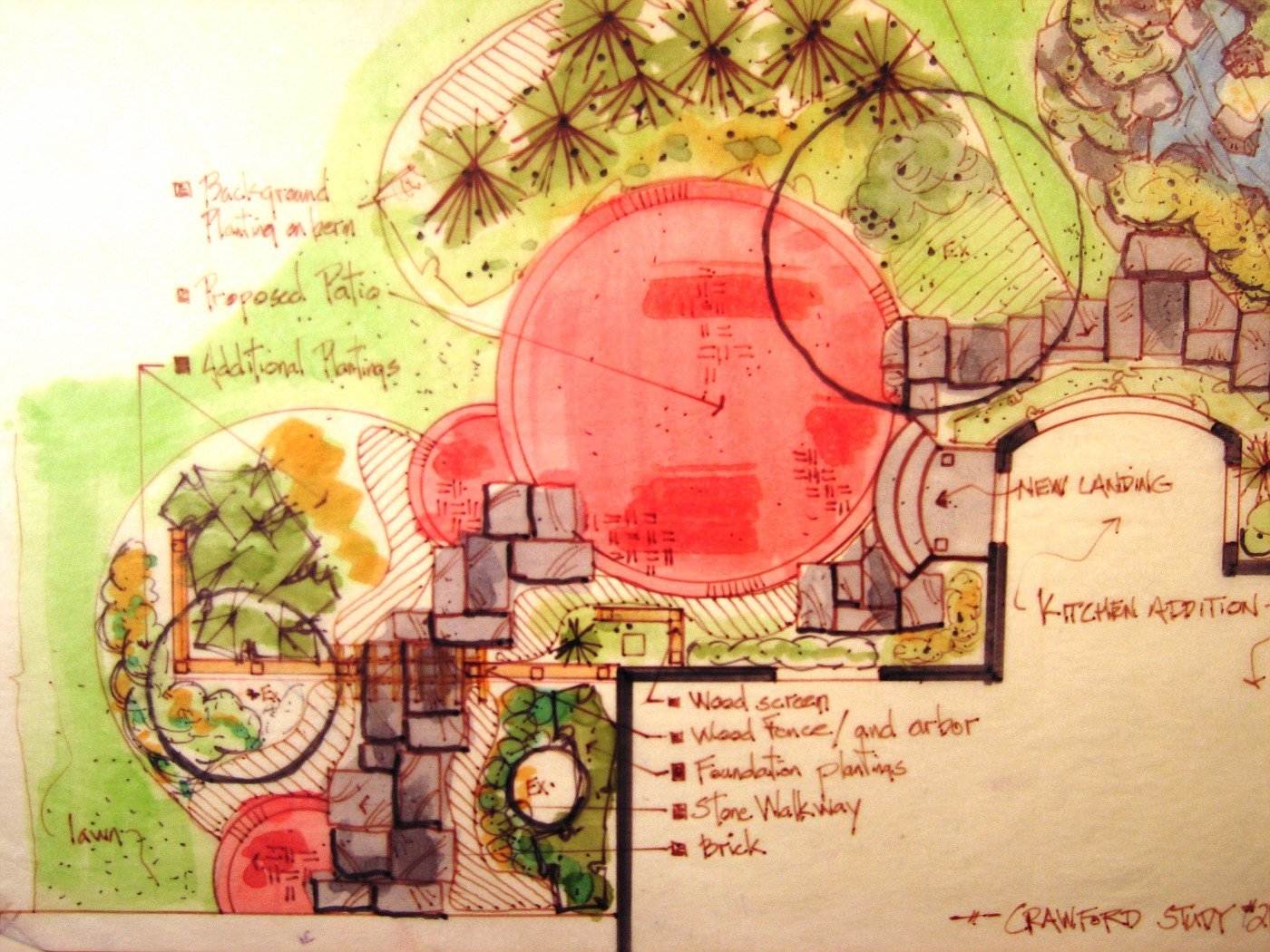 (This drawing goes with last weeks photos)
This was the plan view drawing that was shown to the client. to help finalize how the design would work, and how we could make the patio space work with the new kitchen addition.
The hardscape is so overwhelming here it was really important to get it right on paper. We all wanted the clients to be happy with this layout, and by giving them a precise scale drawing the contractor was able to give the client a very good, and accurate estimate to install the project.
I had been requested by the homeowner to stay within a range of numbers after we had looked at several sets of conceptual drawings. These early conceptual's had rough numbers attached to them, so between those numbers and the rough landscape drawings we were able to come up with this plan rendering.
I was hoping to post some of those rough conceptuals, but, dang it! I can't find them.
Anyway take a look at the drawing, (if you click on it, it enlarges). Then compare to the actual install of the project. I think you'll agree we came pretty close.
Posted by
Rick Anderson
at
9:44 AM
3
comments
![]()
Labels: concept drawings, Design Principles, Plan view drawings, renderings
A Babbling Brook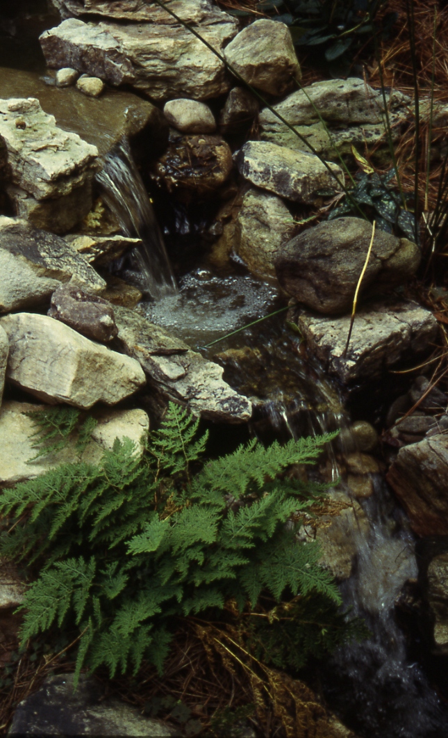 This is part of a series of small falls, that tumble down a 6 or 7 foot embankment. The stone used is a West Virginia fieldstone. A nice gray color with some mineral veins running through the stone to create some real interest.
Because fieldstone is aged, tumbled, rough it makes great stone for waterfeatures because it shows that aging that you are hoping for to sell the naturalism of the waterfeature. To give it that; hey it just might be real.
Posted by
Rick Anderson
at
3:08 PM
0
comments
![]()
Labels: stone
The journey continues, from Yesterday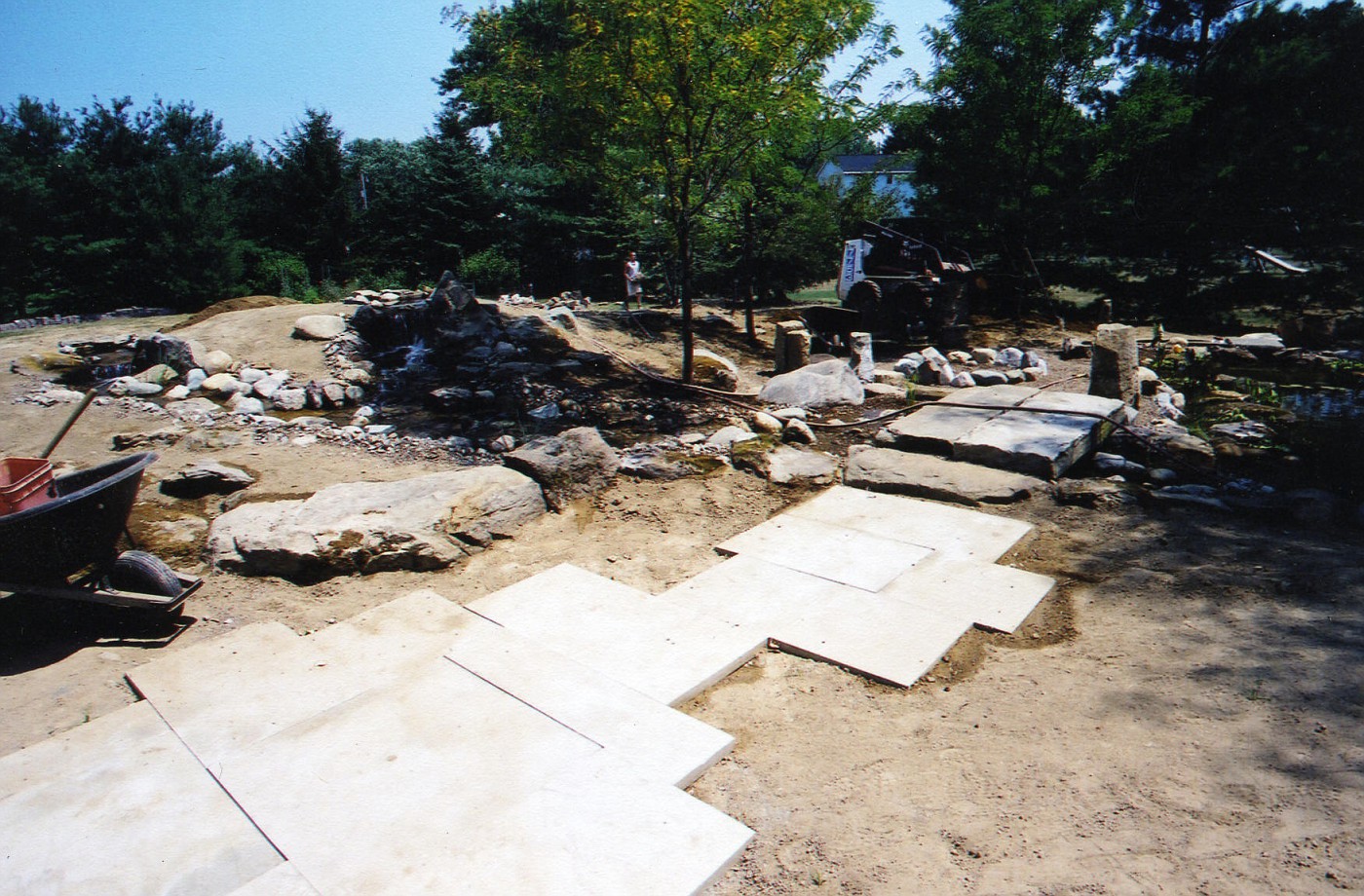 Coming off of the Paver patio the walk through the garden continues on the sandstone walkway. To a bridge made of antique curbstone. Pond is on far right. Fire ring area is across the bridge and double waterfalls are on the left.
That mound is artificial. It was built for falls and streams and to add sense of enclosure to the seating area. More on this later.
Posted by
Rick Anderson
at
11:54 AM
0
comments
![]()
Labels: Construction in-progress, Design Principles, hardscape design, stone
Continuation on Monday's post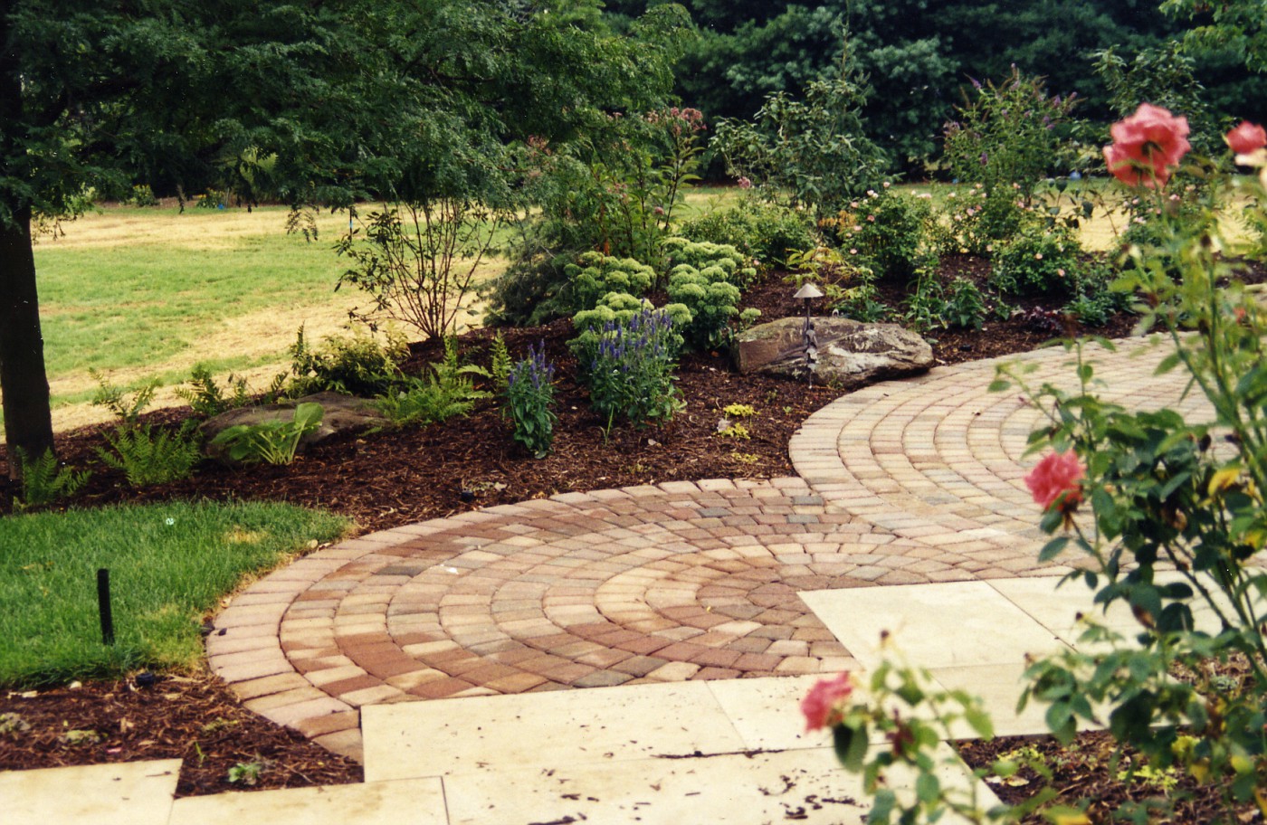 This image is just a pull back from Monday's post and gives you a better idea of how that smaller circle works. The sandstone slabs in the foreground continue to where the gate opening is to enter this garden.
What we are looking at here is what you(the observer) sees when 1st entering this garden space.
A few more steps and a look to the right is where the double waterfall, stream, pond, and fire pit are located.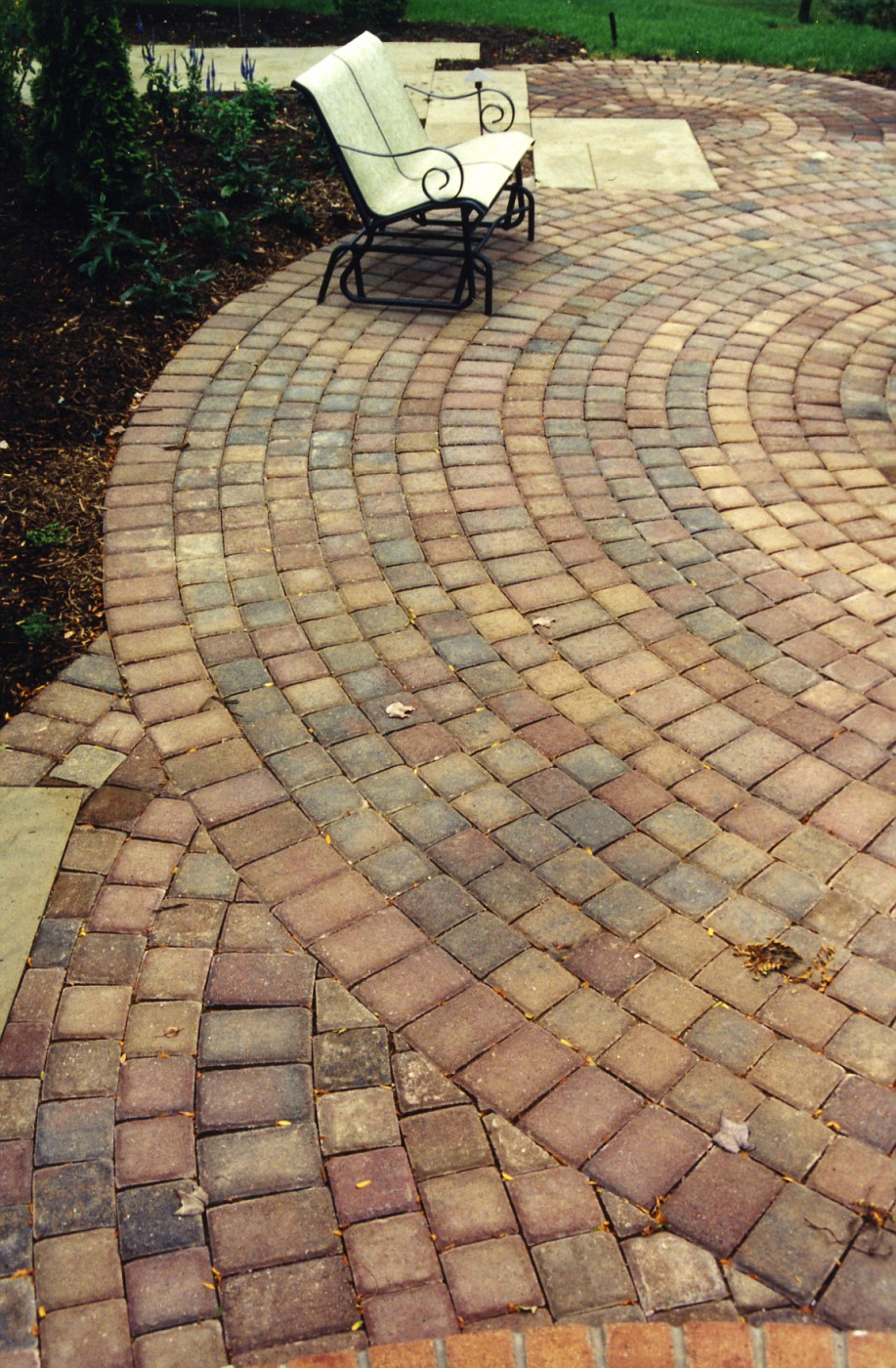 The direction we are looking back to is where the 1st photo was taken from. I would say we can now appreciate the size of the main circle. This patio space had to be large enough to hold a 6 seat table, a couple of small benches, a chaise lounge or two, and a grill whew!!! A lot of stuff.
Plus enough room to navigate around all this stuff without feeling pinched in, cramped, stumbling over each other.
Right at the very bottom of this photo you can see a different color of brick. This is the landing step coming out of, or going into the kitchen. That brick work is all mortared, and the patio is dry-laid on limestone stone dust.
Ohh, one other thing, see that little bit of sandstone to the bottom left, that was specifically designed as a space for the grill. Convenient to the kitchen access, but completely out of the way of foot traffic and other patio furniture.
Posted by
Rick Anderson
at
9:41 AM
3
comments
![]()
Labels: Design Principles, hardscape design, steps, stone
So how about Mad Dogs, Englishmen, and Hogweed fields, Hogweed fields ??? Yep, it appears to be one of many that got away.
How do I find this stuff anyway??? Don't ask . . . ..
Posted by
Rick Anderson
at
8:09 PM
2
comments
![]()
Rock Piles, that's right, rock piles. This is a Blog about some guys who find strange rock piles in the New England area. Their goal is to promote the sites but at the same time keep them secret.
Give them a look they're worth it!
Posted by
Rick Anderson
at
7:40 PM
0
comments
![]()
Brick Hardscape Ideas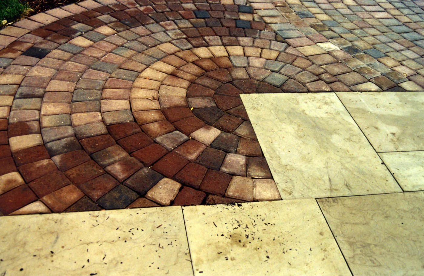 This walkway/patio was one of those tricky designs on paper that you hoped would work out on the ground. It's like I draw this to exact scale, knowing the materials we are using . . . and hoping the field guys can implement the plan correctly.
I knew when I drew this and presented it to the clients that this could look really great in their back yard, I mean really great. I believed one of the keys was making the sandstone work into a good strong pattern.
Luckily for me the supplier was able and willing to give me the sizes I wanted, at the dimensions I wanted. So the stone could be scaled out exactly the way it would w0rk in the space shown. The slabs were cut in some ratio of 12 inches. so the pieces were 1x2, 2x2, 2x3, 1x4.
This also cut down on waste; everything was scaled out, laid out, on paper. That way I knew exactly how many of each piece we needed. I remember we picked up 2 extra of every size in case of breakage, chipping, whatever. These extras were latter used underneath a pergola swing.
After the sandstone walkway was laid out it was a simple matter of laying out a couple of large circles of brick to interact with the sandstone.
I remember moving the circle template around to try and find some sizes that would fit the scene . 1st starting with the largest circle and working to fill in the blanks with the smaller circles; or , slices of circles.
The tri-colored dark pavers are a strong contrast to the tan sandstone slabs. So . . . even with the strong color contrast, a contrast that was, to me very powerful . . . the stone and pavers flow together. I guess you could say the scene is harmonious . . . without being harmonious.
A side note: Over the last few days I had wriggled my way in to a cyberspace argument on planning, specifically . . . why planning is a myth, or bad somehow. I think the above post is a perfect example/explanation of the design process, and is the perfect response to; why design is important, and believe me----Design is important. If you want to move a perennial around, or buy a shrub on a whim . . . go ahead. I just wouldn't recommend buying 7 tons of stone on that same whim.
Posted by
Rick Anderson
at
11:31 AM
0
comments
![]()
Labels: Design Principles, hardscape design
Hidden Millstones In the above photo the unfinished millstones (grindstones) are sitting in stacks so high, long, and deep it almost looks like the rockface of a hill side. This must be where stones were stored before finishing, or heck, it could be a pile of seconds.
 The shape and the outline of the stone is much clearer in this image. The way they're stacked with the outline that is showing (the tracery) . . . this could be a sculptural installation.
I really like how the stone jut out of the hillside, the randomness of the stack, and the shadow lines. It is in those area's of darkness that make the light more pronounced.
The interplay of those elements is a powerful tool in the designers toolbox (How's that for a cliche' ???). The added height of interest, and mystery is great.
Posted by
Rick Anderson
at
10:40 AM
2
comments
![]()
Labels: Design Principles, stone
Dinner Time
Tomorrow is Feed the Birds Day, Saturday the 28th. Now I do not know who proclaimed this, or certified this, or what makes the 28th the day, but tomorrow is the day. Maybe it is tied into the day we turn our clocks back, which signifies that autumn is flying by and old-man Winter is near, boooo!!!.
I originally found out about this on the Treehugger site, and from there went to the RSPB site. The Royal Society for the Protection of Birds. Where you will find just about everything you need to know about feeding birds, and I mean everything.
When looking at this; I am starting to wonder, is this a British Day, a International Day, or something we've hijacked for commercial purposes?.
Actually I am now really wondering because I don't know if the Brits practice Daylight Savings Time. Would this confuse the Queen? Hmmmm, it seems that this post is more about questions than answers.
At any rate, a Landscape Designer has a responsibility to create environments that our beneficial to our feathery friends. Personally, I like it when the client remarks about being a birder, and for me, landscaping to accommodate that hobby is important. Designing for birds leads to a emphasis on plants that allow for cover, food, water, shelter, and protection from predators.
As for the above photo . . . well predators gotta eat, and out here in the country they do a pretty good job of cleaning up road kill. It is part of the cycle of life.
So no matter who's day it is tomorrow here's to our little feathery friends, now go put the cat away . . . at least for tomorrow.
Posted by
Rick Anderson
at
3:22 PM
2
comments
![]()


Farmer, pointing the way . . . with a radish. -Issa
2004-2006 Property of The Whispering Crane Institute, and R. J. Anderson
Even though not a freelancer yet, or maybe I am a freelancer just haven't
gotten any work yet! ha, still loved reading the list. They may be common sense but they can be easily overlooked and who doesn't need a refresher. Congrats on 17, and early congrats on the next 17! And the orange font does just fine, cause if you really want to read it, you will. ha ha