Monday, February 27, 2006

Skecthbook rendering

A rendering from a couple of years ago. Found this when I was going through a pile of stuff. I remember this drawing because the homeowner kept remarking on how they wanted a really spectacular view out the windows and wanted a great place to entertain.

The short of it was the contractor I drew this for did a poor job explaining the install process, along with the fact we were $35,000-$40,000 higher than the other guy looking at project. Even though there idea was not comparable.

The homeowners went the other way. Afterwards; maybe 3-4 weeks after completion I ran into the homeowner. His 1st words were "I made such a huge mistake" He was totally unhappy, and lamented on how he wishes he would have spent the extra money.

It's weird, because now as I look back on this I remember telling the contractor his final price was too low, maybe $12,000 or so. He agreed, but said he really wanted the job. My point is that money he cut off the bid was his profit and maybe more and he still didn't get it, actually saving him money in the final analysis.

I think you should bid the price you need to bid and stay in a healthy business situation and let those shopping on price alone live with their decision. Look for clients who value good work, sound design, quality materials and a philosophy that something that stands the test of time is of the highest value. Posted by Picasa

Saturday, February 25, 2006

The Stone Foundation, David Rael, Multnomah Falls


The Stone Foundation symposium for the year 2006 will be held in Hood River, Oregon. The local host for the event is David Rael of Rhino Tools. David is so pumped up about the vent he started a blog to keep everyome imformed of what is going to happen in Hood River, from Sept. 28th through Oct. 1st.

He posted this picture of Multnomah Falls, awesome shots here and for those of you that know me . . . well; you know this got me pumped. I am ready to make something happen-right now.

TSF is a collection of all types of people with one huge thing in common-STONE. We love stone. What started out as a get-together for Stone masons, particularly those who do dry work, has snow balled into something completely beyond that.

Stone junkies have found out and have just worked their way into the organization. Me, included. Nowhere else can I find these kind of people, and make no mistake about it they are great people. Attend one event and you will understand. You are pulled in for the love of the stone, but become something else when you get to hang with a bunch of folks who love taking rock and turning it into stone. Posted by Picasa

Tuesday, February 21, 2006

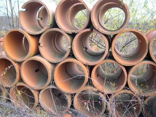
Sewer pipe, or clay tile

Anybody guess what I am going to do with these. There are all collected in the "seconds" pile at a local manufacturer. They come in several shapes and sizes, and there is a color range.

Later this Spring I'll show you what I have attempted with these. Posted by Picasa

Sunday, February 19, 2006

Parking court, a 3rd view

This is a hint of what visitors will see as they pull up into the parking court. Homeowners and regular company will use the drive off to the right.

This shot was taken just a few days ago. This winter the weather seems to have been unusually mild and some work has continued.

Design goal was to extend the architecture away from the house and create a platform (upper terrace) for the residence to become part of the landscape and at the same time separate from the vehicle area.

Boxwoods create mass-collection and tie everything together, Look for strong seasonal color and a strong architectural fountain to be place in a specific area on the parking court wall. Posted by Picasa

Friday, February 17, 2006

Parking Court, another view

Here is a look from the parking court back toward where the previous picture was taken. This mixing of materials is at the absolute maximum.

Why this will work is each of the surface materials is for different reasons. Brick pavers are for vehicular traffic, and bluestone is for pedestrian traffic. The walls and caps are same material as the house. Bringing the architecture of the house out into the landscape. Posted by Picasa

Thursday, February 16, 2006

Landscape Design comes to life

Early last year I showed the 1st conceptuals for this job on this blog. To go through the earliest conceptuals, the more refined renderings, and plan conceptuals, to construction drawings and plantings plans can be a long, long, road.

This is especially true when there are a lot of "cooks" in the kitchen. In reality a good designer has to only listen to 3 things

1. The request of the client: not only the specifics, but also the wishes, the hint at, or the lifestyle they live.

2. The site: As human beings in this day and age we have the manipulate a lot of our World. Manipulation-yes, Control-no. So we have to pay strict attention to the site we are working in/on. We have to respect our natural surroundings, this may limit our expand our client's wishes.

3.Ourselves: What we are today is a sum of every other day of our life. We have to channel our experience in a positve way to make the site and the client come together. Some of what is asked for is inappropiate, or impractical, or poorly thought out. However; it is the client's site and we have an obligation to make their dreams come true-within reason. Sometimes our esperince tells us no, other times yes. We must listen to what we have learned and use it correctly, and . . . we should never stop learning.

The mild winter has allowed the contractor to finish the drive, the rest to be completed at the beginning of the Spring season, I will follow through on this site. Posted by Picasa

Tuesday, February 14, 2006

Sunshine and Trac-hoes

I miss not being able to work with trac-hoes as much as I used too. Moving the really big boulders and making something happen.

This type of work takes a very specific kind of job, the right client, the right site, available stone, and the ability to move it. A fair amount of visualization helps also. Damn, it sure is fun though. it would seem like there would be a lot of pressure involved, but I never felt it . . . too much fun.

It was definitely working with the biggest tools in the toolbox. More on this over the next week or so. Posted by Picasa

Monday, February 13, 2006

Water gardening "shootout" is OVER!

Well the last signficant domino has fallen. Aquascapes Design owned by the hard charging Greg Wittstock has accquired the last competitor. Pondsweep is now part of the Aquascape empire.

Not only did Greg have all the media streaming forth with the opening of his new gig "Aqualand" where the new company headquarters is located. This announcement from Feb. 3rd is thrown on top of that.

My biggest curiousity is what will the loyal Pondsweep customers do. They have refusen to embrace the Aquascape way and shout out that anyone who has-is drinking a kool-aid that is very bad for your health. So where will they go to buy product, I have been to some of their conferences (pondsweep user's only please . . .)and believe me they would rather chug pond scum than give Greg Wittstock a dime of their dough.

Greg had often talked of how he was proud of the simplicity of his product line. That went out the door when he bought Nursey Pro, now with the additional line what will the catalogue look like???

I hope this buyout brings some family happiness to the Wittstocks' I really do. There is no way in hell this will bring happiness to the "no rocks in the bottom" crowd. Maybe Chic over at Savio is salivating, maybe.

It will also be interesting to see what happens to some of the liner guys, a couple of product lines in particular. I'd rather wait till I talk to a few of them before I really comment.

So Greg now has alomst all the professional installer's market, and a really big chunk of retail. How will he respond? How will the company respond? How will the forlorn Pondsweep customers respond-and I am not kidding when I say they probably feel like they were punched in the gut.

Aquascapes Designs is the last man standing-will anyone step up to keep them honest? Will a new/younger/faster more flexible company show up out of the blue? It remains to be seen. Right now it's all Aquascapes Design, all the time.

Saturday, February 11, 2006

A Fast Rendering

Two looks at how a swimming pool could be backed up by a waterfall (left) and a tube slide through the mountain (at water level on right) taking this backyard to another level.

These were done fairly quickly and with as little color as possible, so as not to confuse the issue.

A couple of things:
--The left side of both examples (hot tub area) is real junky, a lot of scribbly lines that I wish I hadn't drawn.
--These were drawn in my sketchbook, partially on-site, and colored back on the drawing desk.
--They were shone with a plan view conceptual of the whole site, and a few other renderings.

Are these perfect? Who knows, each designer must find their own hand when it comes to doing renderings. Renderings are a very powerful communication tool that I recommend highly. It was these two drawings that really got the client juiced, and moving on to his next phase. Posted by Picasa

Friday, February 10, 2006

That ain't a dog in the "house"

Okay, everyone keeps telling me this is a great shot. Well, is it? . . . a great shot.

Yes I know this has nothing to do without landscape design, but it does have everything to do with, composition, lighting, viewing-directing the viewer's attention. If I'm not carfeul I am going to sound like I am getting very philosophical about the principles of landscape design.

By the way, did you notice the paws . . . there's a reason his name is Mr. Thumbs. Posted by Picasa

Thursday, February 09, 2006

Yard Art

Not only is this ridiculous, but the frog is fat, and the frog is wearing a coat-how silly. I wish I had one . . . Posted by Picasa

Monday, February 06, 2006

Feet ? are those shoes of a "rock" mystic

Anyway, that's what it looks like to me . . . Posted by Picasa

Friday, February 03, 2006

Is it real 3

A wider look at this stream in the fall, again the goal was to make as natural as possible, and to stay low key on the terrestial plants to "improve" the naturalistic feel of the site. Posted by Picasa