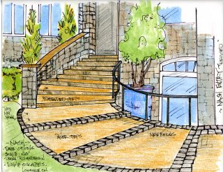
Tuesday, May 30, 2006

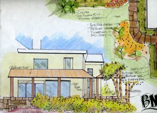
Pergola, Patio Design Rendering

 
This rendering was done off of a photo overlay. The idea was to give the clients a visual feel for how an overhead structure would impact the seating arrangement on the new patio.

This also allowed them to get a grasp of how the new patio might work out, based on previous thoughts I had expressed in earlier concept discussions.

To me it just doesn't make sense to me to try and decide on something like this on plan view drawings. You can't really see anything dimensionally, and you certainly cannot get a feel for how this "lives".

The rendering as a concept tool is much more powerful and creates a more dynamic dialogue between homeowner and client. Posted by Picasa

Monday, May 29, 2006

Design by Nature

 
This was taken yesterday, and I thought it was a good indicator of how Nature designs. It you want something to look "Naturalistic" think large groups, massing, drifts of plants that kind of work their way into each other. Posted by Picasa

Saturday, May 27, 2006

Design QuestionRequest . . .

There has been quite an increase in traffic lately; some of this is due to a link from David Beaulieu at Landscape About.com. Thanks David.

The other note is to say that if you have any questions about a design problem, need to see some sort of quick sketch or rendering-please leave a comment or send me an e-mail, and I will do my best to get back to you.

It is also may be possible to post the drawing/rendering on the blog for others to see. Also, there are other design ideas on my Fotki (see link on sidebar) site where lots of pictures are stored, including over time more of my older work. Takes time to scan all those old slides.

I hope you all have a great memorial Day weekend, and to my overseas readers, well have a great weekend too.

Wednesday, May 24, 2006

Ascension, from the Concept Drawing

This was the drawing I had to show the City Council to receive final approval to work the project. See previous post. This was back when most of my concept drawings were completed in black and white.

I would still prefer to do them all this way, but the client likes looking at renderings with color. Color helps with the visualization of possibilities. Posted by Picasa

Tuesday, May 23, 2006

Ascension, some big-time Boulder Work

This is a shot of a 11 ton stone going into a sculptural piece I did a few years ago in Columbia, South Carolina. A mass-grouping of stones on a hillside to give the appearance of a waterfall.

This mica-schist stone was used as the outcropping and a quartzite was used for the "whitewater". Lights were added for a dramatic element that makes the work come alive in the evening.

This stone is critical because not onlt does it help anchor the right side of the falls, but will hold together visually the entire base of the project.

For a designer/builder the important thing to understand is the sequencing of events, and how critical that is to pull something like this off successfully.

I'm on the far right making sure this stone sits just right on it's base. The crane is rated 100 ton and had to be that large to move big stones way up the hillside. It will interest you to know the prep work and site preparation took as long to complete as the install. It took twice as long to select the stone at the quarry and figure out a good delivery procedure to get the stones in the order in which they were needed. Posted by Picasa

Monday, May 22, 2006

Conceptual Plan

This rendering was in the lower right hand corner of a large color conceptual for a large living space off the house. The idea is to provide some shade but not overwhelm them with shade (darkness) in the back of the house.
The large stone patio is framed by a sandstone retaining wall that steps down onto a full sun level, that steps down onto the grounds surface level that is not quite as "perfect" as the other levels. The long dash line refers to roof line. Posted by Picasa

Friday, May 19, 2006

Sketchbook Conceptuals

These are 3 quick study drawings of a project for a large living and playing space behind a two-story house addition. Overhead roof, 2 levels of patio space, a open area for a fire ring, and the other important spot-a step up into a spa.
Plan view and rendering on the same page of an 11x17 sketchbook. When the project becomes really complicated I invite the client along on the design process and will show them sketch ideas, scribbles on "trash" and any other thing to show them I was working through the problems on their desires to find a good solution.
Another look in a charcoal pencil, quick, fast rough, dirty . . . this is my design process. This enables me to never bog down in details and work on the big picture, without seeing how the spaces relate to each other in a good way . . . it doesn't matter what color the begonia's are. Posted by Picasa

Thursday, May 18, 2006

Backyard Retreat

A quick color conceptual of how things could possibly look in the new backyard. My perspective for this shot is taken right from the water's edge. A small retaining wall at seat height (double duty), screen planting, and a fire pit that ties itself into retaining wall. There is a suggestion of grasses in the right foreground. I like ornamental grasses and water-they really work together. The contrast plus the movement in the wind, a nice double duty for the plant material.
This is obviously a before of the site. A good time for me to come onto the project because absolutely no work has been done to the outside-a clean slate to work with. Lots of work to provide some sort of an expectation of privacy from the neighbors. Posted by Picasa

Tuesday, May 16, 2006

Conifer Land 2

Just some shots from the Conifer area at Hobby Nursery near Loudonville, Ohio
They have a large selection of standards and other "focals" the hard part is to decide how to support these focals in the landscape-what is the best supporting cast???
These were taken last fall-I am going over next week to buy a few things, these shots are a reminder to get going on the project. Posted by Picasa

Saturday, May 13, 2006

Conifer Land

Lots of choices from Hobby Nursery near Loudonville, Ohio

Thursday, May 11, 2006

Entry Steps


This is where I started, you can see in the previous two entries where I went with this. Posted by Picasa

Friday, May 05, 2006

Previous Front Entry

This look was coming straight down the stairs, with all vertical movement, and flat to the drive. Yesterday's image was more steps, shorter risers/wider treads-it will be interesting to see which way homeowner's go . . . Posted by Picasa

Thursday, May 04, 2006

Revised Entry

  Posted by Picasa

Monday, May 01, 2006

Thomas Hobbs

Just finished reading "The Jewel Box Garden" A interesting and very opinionated look at Garden Design.

As someone who works in the Midwestern or Great Lakes part of the U.S. it is hard to look at a lot of west Coast pictures and not be a little envious of the climatic situation. Sure we can pull some of that plant combo stuff off, but for the limited growing season-it is, at times, hard to pull off the look.

We do what we can in the climates we live in and try to find ways to exploit the summer growing season. At any rate no matter where you design there is something in here you will be able to take away and use.

After all, isn't that what we really are asking for as professionals-be it a lecture, or a book, or in attending a symposium???