Spartanburg, SC knows Horticulture
powered by performancing firefox
I am a Professional Landscape Designer, writer, lecturer, artist, and teacher. I design residential, industrial, and commercial landscapes; using both curvilinear and geometric themes. Adapting to the needs of the client and the site. The Whispering Crane Institute also provides seminars and workshops for those in the "Green Industry"
powered by performancing firefox
Posted by
Rick Anderson
at
3:18 PM
0
comments
![]()
Entertainment Entry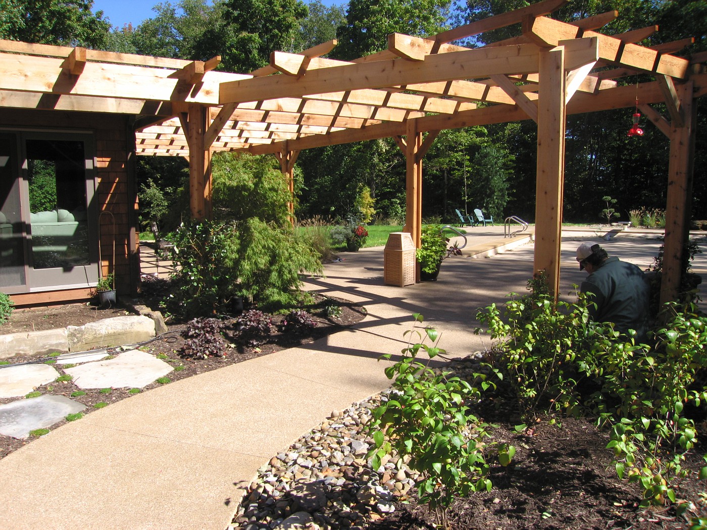 This pergola was designed with several thoughts in mind, several request asked, and the pergola needed to be substantial.
I had looked at the style and size of house and determined right away we needed something with some bulk, girth, and substance.
The homeowners are not fancy, quaint, do-dad type of people that need to look at lots of embellishment or intricate detail.
Finally the space itself is big, big house, big pool, tall trees, and large lawn. Including a long drive with a big parking area to go through before reaching this back yard space.
Instead of just designing the cliche' wrap around the house footprint style arbor I worked hard to design a arbor that would also work as a separator, This separator is to divide the public space and the pool/private space. The physical act of walking through and under such a structure accomplishes this. The mind changes over, the space is now looked at differently.
The cedar pergola was designed not with the intent of keeping out the shade but to act as the conduit of bring the house and landscape together. That's why I think pergolas are so powerful a design tool. Their ability to link elements, spaces, structures, and emotions together in a harmonious way.
The attachment to the house and the post rising from the Earth . . . the connection is made, and can be made more powerful with the addition of vines, climbers and bloomers working their way through the pergola. Where some space below the pergola is solid and safe for footing and other areas are made beds so that plants and people can thrive together and the garden is accessible to human contact.
The other big thought here is often neglected, not even thought of, and usually excites only as a afterthought . . . that thought is shadows. Shadows bring a sense of theater to the garden, The shadow lines magically move there way across the space as the day plays itself out. This continual movement adds dynamic style to the scene and alleviates boredom of looking at the same space in a very un-dynamic style the entire day. Light and shadow in the daylight much too often underlooked, under-appreciated, and very rarely designed for, but designing shadow can be a very powerful design tool.
Every pergola design/designer should keep this in mind when creating the overhead for the pergola. Where is the sun? What is the suns path? What is this path during the most busy time of year using the pergola? What is the pattern to be determined for? Is the overhead designed to block out a large percentage of sunlight? Do crosspieces run with or against the suns path? Does the pergola include 2 sections of crosspieces to create a even more intricate shadow pattern?
Enough questions? For now. We haven't even touched the post, and their embellishment or lack thereof. Or the finish work to the crosspieces . . . the detailing, or lack thereof. Nor vines, nor climbers, nor paint or stain . . . how about going a la natural?
Lots of questions, lots of possibilities, but no doubt one of the most under-utilized structures in residential landscape design.
Posted by
Rick Anderson
at
1:42 AM
4
comments
![]()
Labels: Design Principles, hardscape design, Rick Anderson

Posted by
Rick Anderson
at
12:28 PM
10
comments
![]()
Labels: Plant Material, Stuff
 I believe that water is the only drink for a wise man. ~Henry David Thoreau
Filthy water cannot be washed. ~African Proverb
"Throughout the history of literature, the guy who poisons the well has been the worst of all villains..." -ANON
"Water is a very good servant, but it is a cruel master."
C.G.D. Roberts, "Adrift in America", 1891
"You could not step twice into the same rivers; for other waters are ever flowing on to you."
Heraclitus of Ephesus
"When you drink the water, remember the spring"
Chinese Proverb
"When the well is dry, we learn the worth of water"
Benjamin Franklin
"The stone in the water knows nothing of the hill which lies parched in the sun."
African Proverb
My thanks to Samuel Clemens for the title quote, thanks again Mr. Twain.
The above falls was built from Colorado fieldstone, the falls in the photo is about 18inches high, and running about 1700 gallons per hour regarding the rate of flow.
Posted by
Rick Anderson
at
1:23 AM
4
comments
![]()
Labels: quotes, waterfall, waterfeature

powered by performancing firefox
Posted by
Rick Anderson
at
11:49 AM
3
comments
![]()
Labels: Design Principles
 Arborculture is the art and practice of doing unusual things with trees to create living works of art. There are even practitioners who grow trees to only cut them down and create furniture.
The photo on the right is a living sculpture by the father of the movement Axel Erlandson. The 6 Sycamores create a fantastic and unusual sculpture.
The photo was taken at Bonfante Gardens in Gilroy, CA. Which is not where these trees started out. They actually started in the San Joaquin Valley as part of Erlandsons Tree Circus. The story of how they got from one place to another is told here, here, and here. The page for Mark Primack is here.
A pdf from Bonfante Gardens which talks about the large aquascape gardens and later in the file talks about the big move of Erlandson's remaining 29 trees from their original location to their present home. It's quite a story of determination and co-operation, and a man who wanted to see these specimens survive. The fellow on the left is Arthur Weichula. Art had some interesting idea about arborculture and other uses for living trees. he was very interested in how living joints, or how inosculation worked.
While looking at all this I was reminded of the ancient art of pleaching, which was developed by the Romans. I say Romans because they were the 1st to speak of it in their writings. it's certainly possible pleaching happened before then. But . . . I digress.
Here's a good explanation, the images were missing when I looked at the page. Here you can see a few good examples of pleaching but the writing on the page looked strange for me. The 2 examples will give you a very good idea of what pleaching is all about. let me know if the links are a problem. In today's World of Arborculture the guru seems to be Richard Reames who has written the book, called ARBORCULTURE, Solutions for a Small Planet. I have not read the book but between his site and his work, and now the book there has been a new growth in interest in this form of living art.
Here is a interview in Cabinet magazine with Richard Reames, and I have a few other links of interest from other place/sites in the world where there is great interest in the art of growing trees to create art:
 Finally, finally . . . a big thanks to Hank over at a Lake County point of View. Thanks a lot, I was just spinning through the day minding my own business and boom! It happened Topiary, more topiary, and after catching another post on topiary on the site (like 3 in 3/4 days) I came across a comment refer to arborculture-that was enough to set me in motion. Now, much later in the day-it's up (the post on arborculture). Thanks Hank.
Posted by
Rick Anderson
at
2:51 PM
2
comments
![]()
Labels: Design Principles, Plant Material
Posted by
Rick Anderson
at
11:46 PM
0
comments
![]()
Labels: Stuff


Posted by
Rick Anderson
at
2:05 PM
0
comments
![]()
Labels: Design Principles, hardscape design, quotes


powered by performancing firefox
Posted by
Rick Anderson
at
11:57 AM
3
comments
![]()
Labels: Nature
 The steps from a wider angle:
On 12/7 I posted a close-up of the stone steps, showing some of the detail. I was after a look of strong yet informal steps that led out on to the lawn.
These steps are the only way to get from the parking court and upper terrace to that front lawn. The large barnstone on the left was needed to hold up the planting bed. This bed was designed in to screen the view of the cars from the street. and create a buffer of green between the view and the asphalt.
The bed swirls on the right before working back into another small wall that took advantage of stone found on the property. This wall was built to hold up the planting bed and upper terrace walkway and patio.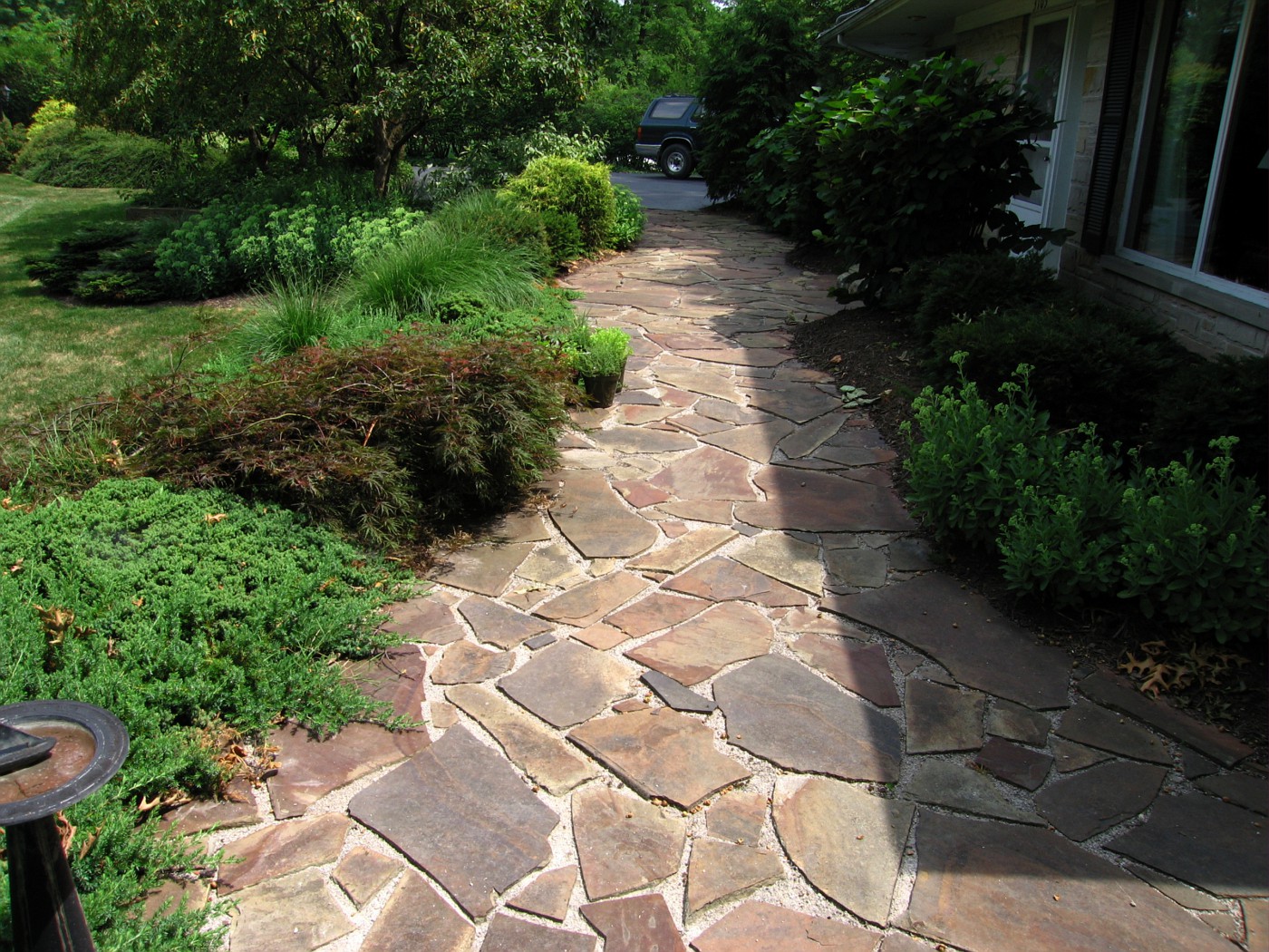
The view from here show the upper terrace. This is a flat stone called Maryland chocolate set on a bed of limestone dust and screenings. The steps are at the far end of this patio between the Crabapple trees. If I remember correctly these are "Sugar Tyme' Crabs.
I would like to point out these pictures were taking last summer, the Summer of 2006, and this job was installed in the Spring of 2000. The patio has held up quite well, and most of the plants are still in the same place we planted them 16 years ago.
I had an opportunity to chat with one of the homeowners. She had pulled in when I was shooting these pictures. We talked about several things and she mentioned how happy they had been with everything all these years. I had to tell her they had done a great job with the upkeep and that everything still looked great.
This view shows a better look at the short wall that holds up the small bed and terrace. The beds; after 16 years, look fairly tidy.
Posted by
Rick Anderson
at
12:07 PM
0
comments
![]()
Labels: Design Principles, Plant Material, stone
Posted by
Rick Anderson
at
10:28 PM
4
comments
![]()
Labels: Design Principles, steps, stone
Posted by
Rick Anderson
at
9:24 AM
0
comments
![]()
Labels: Design Principles, Nature
Landscape management, a relatively new program at Brigham Young University, is highly respected among its professional commu-nity andoften turns into an equally profitable career.
I've seen degrees in Landscape Architecture, Landscape Design, Horticulture, Landscape Technician(2 yr). This is the 1st I've seen in Landscape Management. A degree in this field makes sense as Landscape Companies grow their is a need to have solid designers, foremen, and supervisors on staff.
Posted by
Rick Anderson
at
9:04 AM
1 comments
![]()
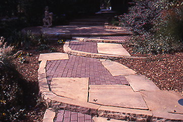 This continues the story from Sundays post on The Appreciation of Stone. I've been asked a few questions and will attempt to answer them here:
Posted by
Rick Anderson
at
11:06 PM
4
comments
![]()
Labels: Design Principles, stone
Spaz in the wheelbarrow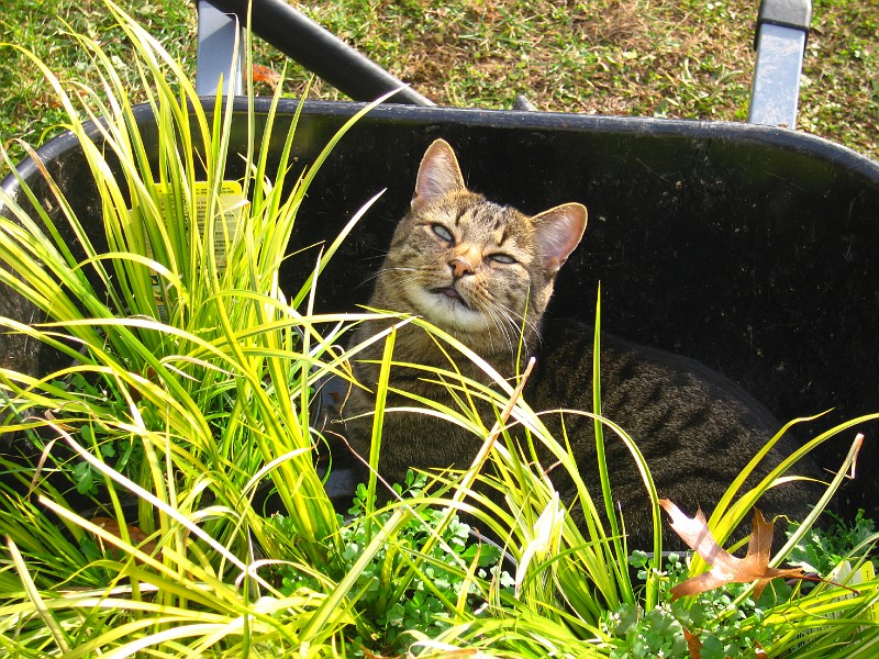 We have a low spot in a bed where the water will lay for; up to, 24 hours. The soil is clay, and it's a nasty area. I was able to do some mounding in the middle and back part of the bed to raise those areas, however we know beds have to slope down to their edge. What to do, what to do . . .
Well the entire area is low, water collects, I am not going to raise the entire area because a stone walkway is going through next year, and it needs to be at that height to set up a series of steps out of the low lying area. So it's going to stay low.
This means I have to look for plants that will endure this type of culture/micro-climate. I am one of those who would rather find a plant that lives in a certain type of micro-climate than change the area entirely.
What I have learned over my many years is one change leads to another, to another, to another usually affecting another part of the garden in a very negative way. Specifically moving water, drain water, run-off, etc. Water is at the top of the list.
I have also learned there are plants to adapt to almost every climatic, cultural situation. You just have to learn what works where . . .. a good reason to hire the Professional Designer (shameless plug).
But I digress, the plant in the wheelbarrow, along with Spaz, is Acorus gramineus commonly called sweet flag. Acorus is a short grass and does very well in standing water, temporary flooding, and straight clay soils. I have used Acorus in these conditions from zone 4 down to zone 9 with good results.
Spaz had decided to help us out when he jumped in the wheelbarrow and decided to nap instead-typical cat. Anyone on this cold blustery day I thought I would share this photo and talk about plants and drainage.
Sort of kill two birds with one stone. Uh; maybe that's a bad analogy when cats are involved in the story.
Posted by
Rick Anderson
at
1:49 PM
2
comments
![]()
Labels: Design Principles, Nature, Plant Material


Farmer, pointing the way . . . with a radish. -Issa
2004-2006 Property of The Whispering Crane Institute, and R. J. Anderson
Even though not a freelancer yet, or maybe I am a freelancer just haven't
gotten any work yet! ha, still loved reading the list. They may be common sense but they can be easily overlooked and who doesn't need a refresher. Congrats on 17, and early congrats on the next 17! And the orange font does just fine, cause if you really want to read it, you will. ha ha