Showing posts with label renderings. Show all posts

Monday, November 20, 2006

Does the Pergola fit the front entry?

Color rendering: markers, colored pencils on yellow trace
This rendering is another take on what we had discussed last week. Especially the talk about where does the fountain belong, or not belong.

This rendering shows the fountain a little further up the sidewalk with a pergola area further behind and to the right. Do they belong together? I'm not sure, but do Tom and Katie belong together? Not sure there but we are all giving it a shot.

It is important to remember in a conceptual that it is just that . . . . a conceptual. If you are going to critique something, or tear it apart, or move something around-now is the time. The client wanted to see if a pergola/gazebo would work, and where I would suggest it. My take is the structure belongs off to the right and back from the sidewalk.

Back to last week, I'm not any more sure about this idea than the other rendering I had up last week. I'll be real curious how the homeowners react to suggestions. I am pretty sure either solution was beyond their scope of visualization . . . this is not a bad thing or a offhand remark, it's just how these concepts work out.

When clients ask for paving, walkways, structure, classical fountains, driveways, and parking courts . . . it gets complicated. Heck, that's why I get called in.

A unobstructed view of existing front door
Well here it is. The entry is big, it's massive, it's imposing and it goes absolutely, positively nowhere . . .

Thursday, November 16, 2006

A Front Entry Fountain

A Fountain for nowhere, maybe?
This is the image I spoke of a few posts earlier. I took this right after I finished the drawing. You can see the tracing paper beneath and the original photo beneath that.

On the tracing paper is a sketch done in pencil, what I was after was a outline of the fountain and how it related to where I was guessing the end of the walkway would be-and it was a total guess.

The foreground is the parking court. I would call this an entry garden, or entry courtyard. The homeowners got themselves in a little bit of trouble here. They designed the back of the house to face the primary view (a 5 acre lake). The drive came into the side with a 3 garage door entrance, which wound up being an entire story below the main living level. And the grandiose front door??? Well here it is completely detached from the drive, the garages, the view . . . everything.

So they have lived in the house for awhile and have now realized why no one comes to the front door . . . no one can get to it!!!

So in order to get there we have to get a driveway up there, and we have to park the cars, of course, and then we have to be able to get folks from the parking court to the front door. While we are at it we might as well make the journey from the car to the door interesting. We also need to have a gathering place to say hello or goodbye.

They also need to add some plant material to transition from the house to the surrounding grounds. Right now there is nothing, zip, zada, zero! The softer perennial/grasses to the left act as a buffer zone between the parking and one of the retaining walls to be added.

Do I like the design? not sure . . . I can't decide on the fountain, it seems too exposed and it appears I have taken a very formal subject and placed it in a very informal setting. I'm just not sure it works.

As for the actual drawing . . . by now my loyal readers know I am never satisfied with those drawings, need to keep working on those.

Tuesday, November 14, 2006

Landscape Conceptual

Having fun with a rendering
I just realized as I get older my definition of having fun sure has changed. After a day of fooling around with this design I decided to take a couple of shots with the layers piled on top of each other. Woo! hoo! having fun now . . . .

Beneath the colored rendering is a pencil sketch rendering, and below that is th original photo of the entry which I print out in black and white. The black and white image is better for me to read in the sense that the lines are easier to read.

Between you and me I'm not really sure I like this design, I never was one for just having some fountain floating by it's lonesome, these clients seemed pretty adamant about having one however, and trying to find a good spot for it has been driving me crazy.

More on this job, and drawings this week, though the closer we get to the Ohio State ////M*ch*gan game (Columbus has gone crazy), the more difficult it will be to concentrate on such mundane matters as this Blog.

Sunday, November 12, 2006

Evolution of Landscape Rendering Presentation

The original: shown to client

2nd Attempt: on trace, or as I like to say trash

Later attempt: evolved drawing style on Vellum

Thursday, November 09, 2006

Backyard Patio story continues.

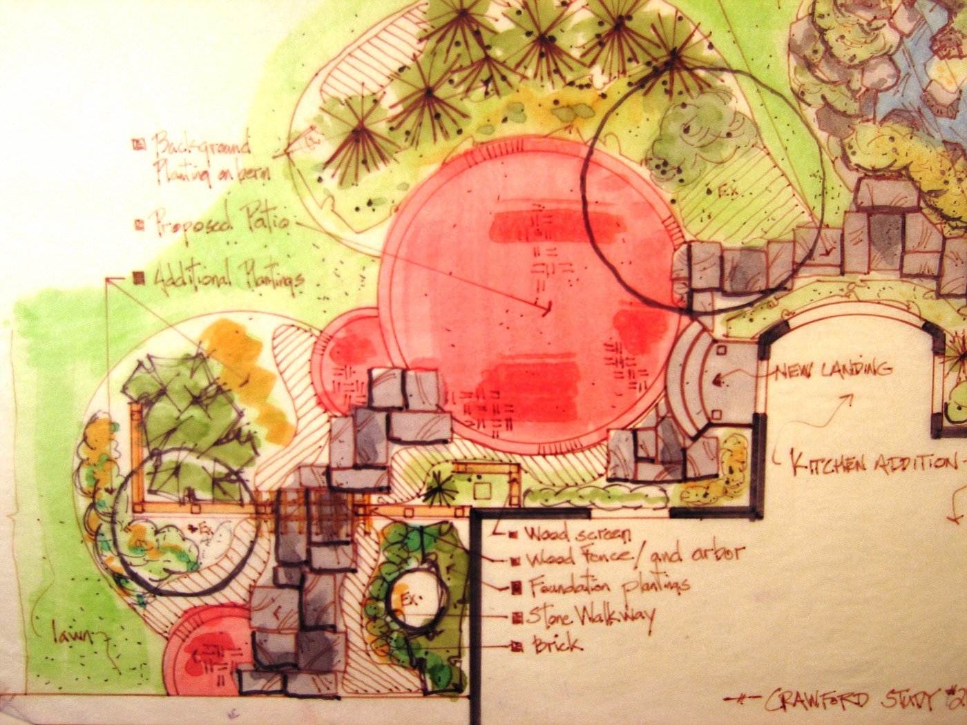
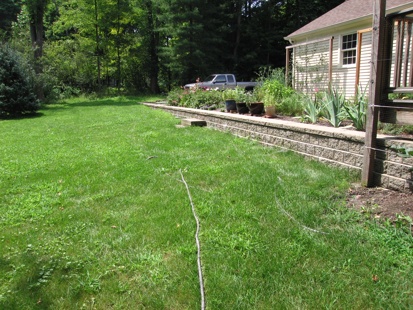
Single water falls, and tan sandstone walkways
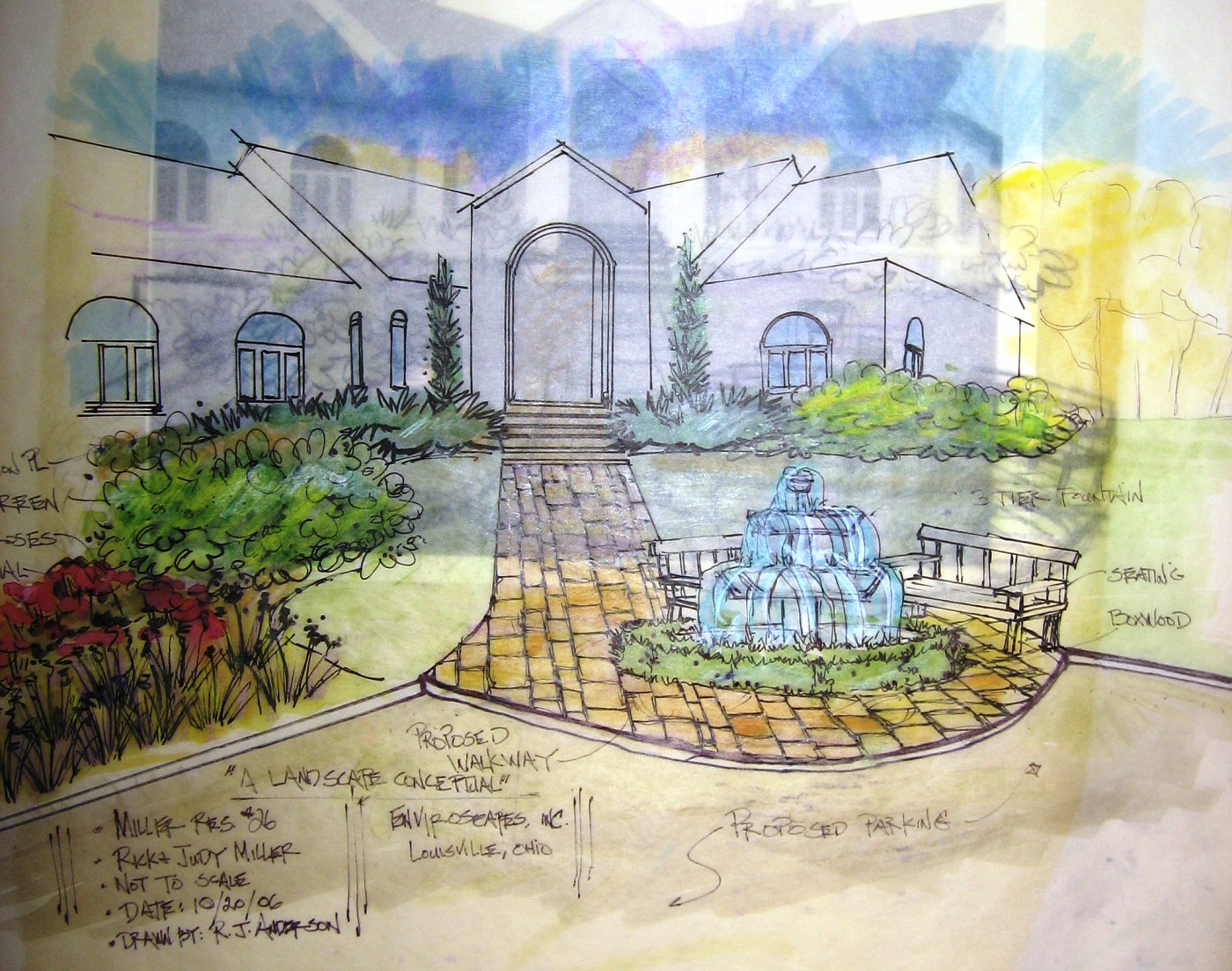
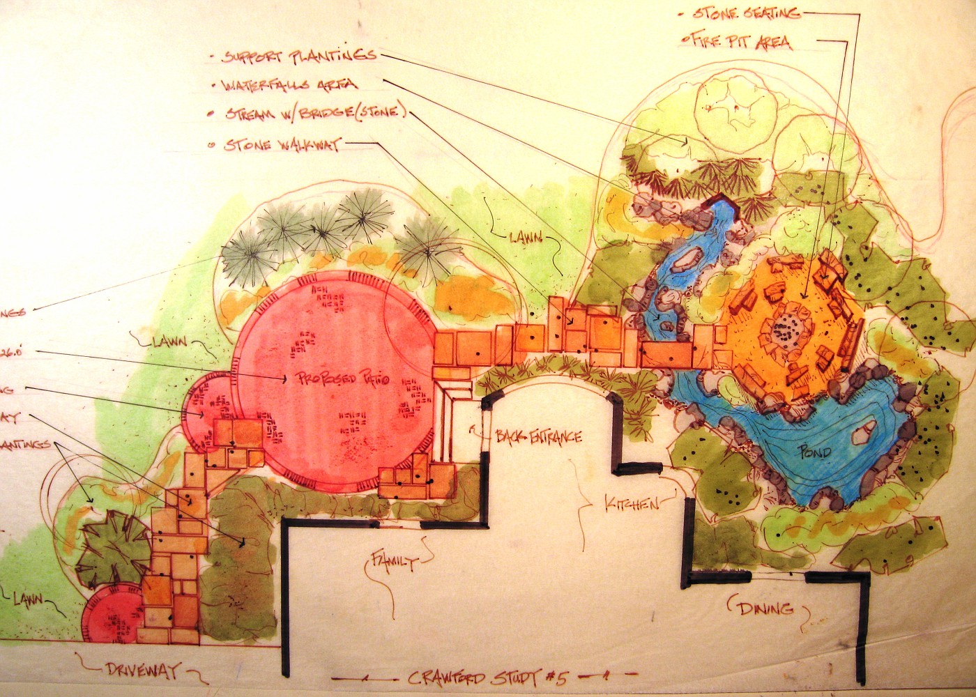
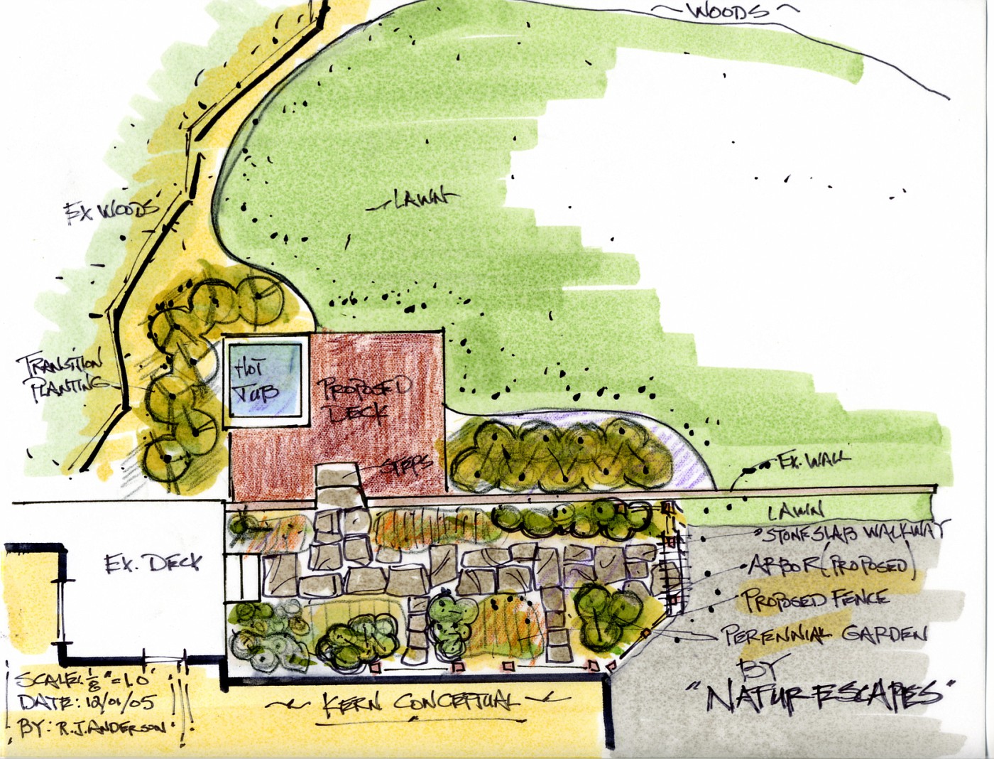
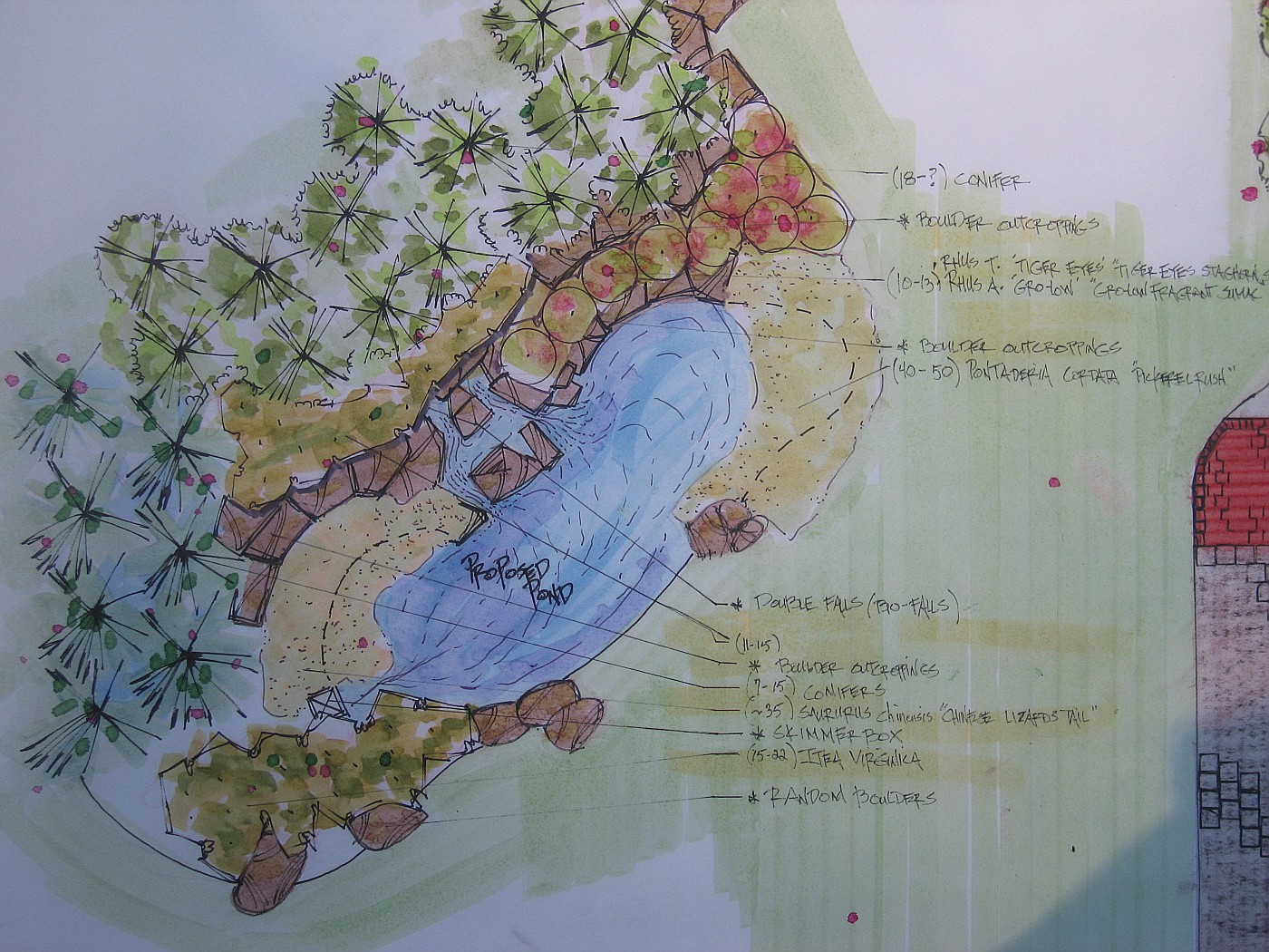
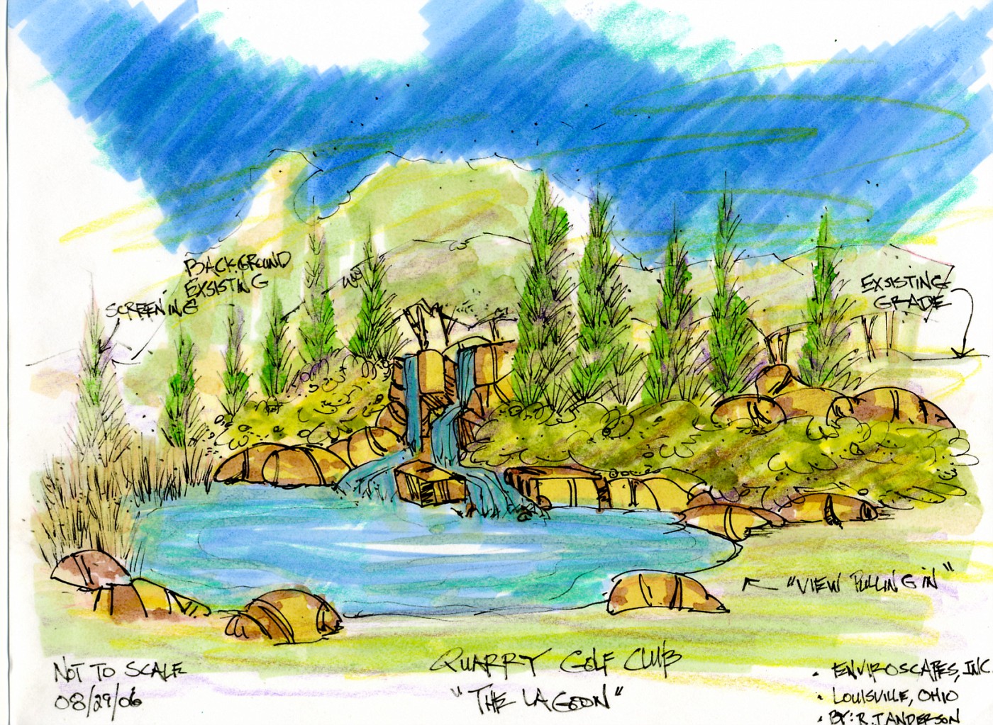
More on the previous post. This was the 1st plan view color drawing that was shown to clients. Take notice that in this conceptual drawing there is only one waterfall, and the walkway is tan in color. the homeowners looked at this drawing and were very impressed.

I then remember them . . . starting to study the drawing and going over ever detail. It was decided pretty quickly they didn't want brown sandstone for the walkway-they were positive about this.

2nd they were very concerned that the one falls would not make enough noise to screen out the eat of the neighborhood noise, and would only one waterfall be loud enough to hear in the kitchen, and breakfast nook.

Normally, I would just show them a different color of stone (actual stone piece), and take some overlay paper and draw the other falls in the hillside. That wasn't going to work here, they wanted to see another drawing (specifically the wife).

So, I called the contractor and said I had to do another drawing for the homeowners, for x amount of hours to do the work (which he hadn't agree to pay me for). He asked me if they were excited about the conceptuals and were they close to jumping in?

I said; heck yeah, they're ready! . . . .

So the previously posted drawing is what they looked at, and of course they jumped in, over original budget request . . . because it was everything they wanted, in a logical layout, and the best parts could be enjoyed/viewed from inside the house.

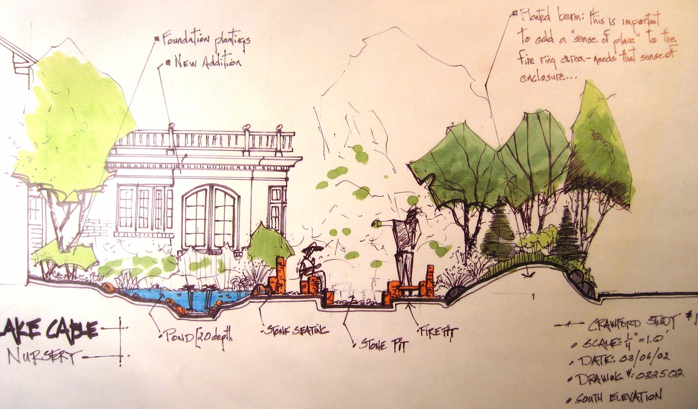
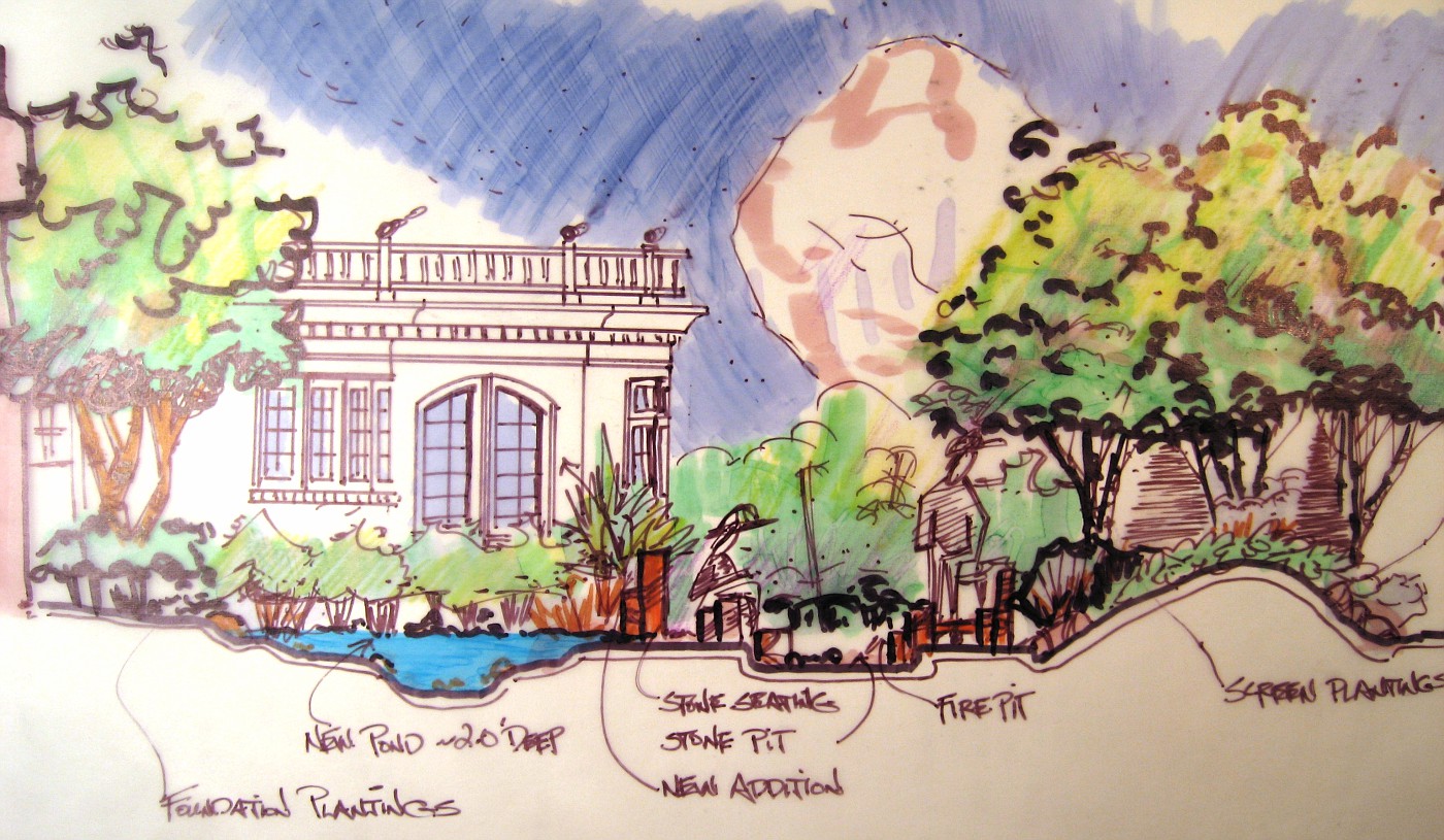
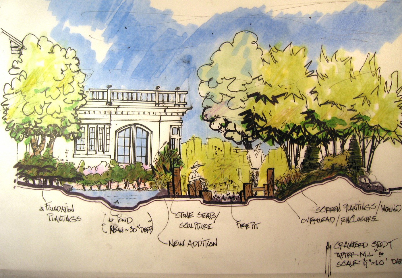
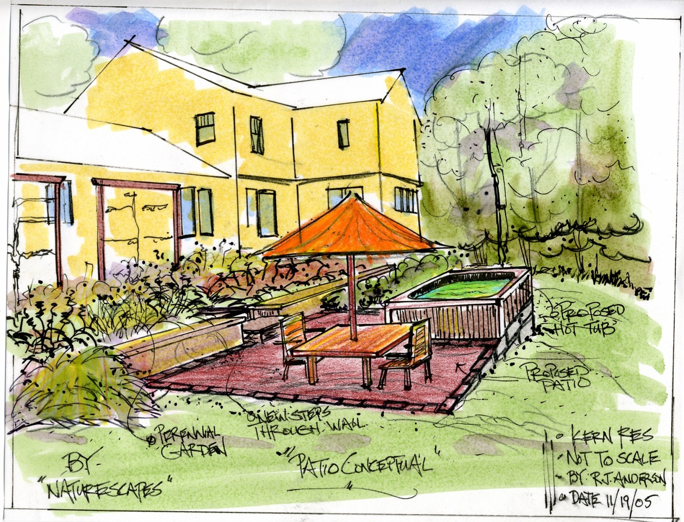
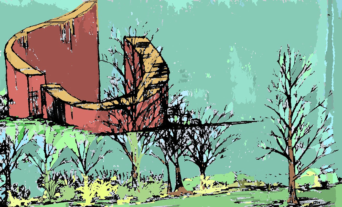
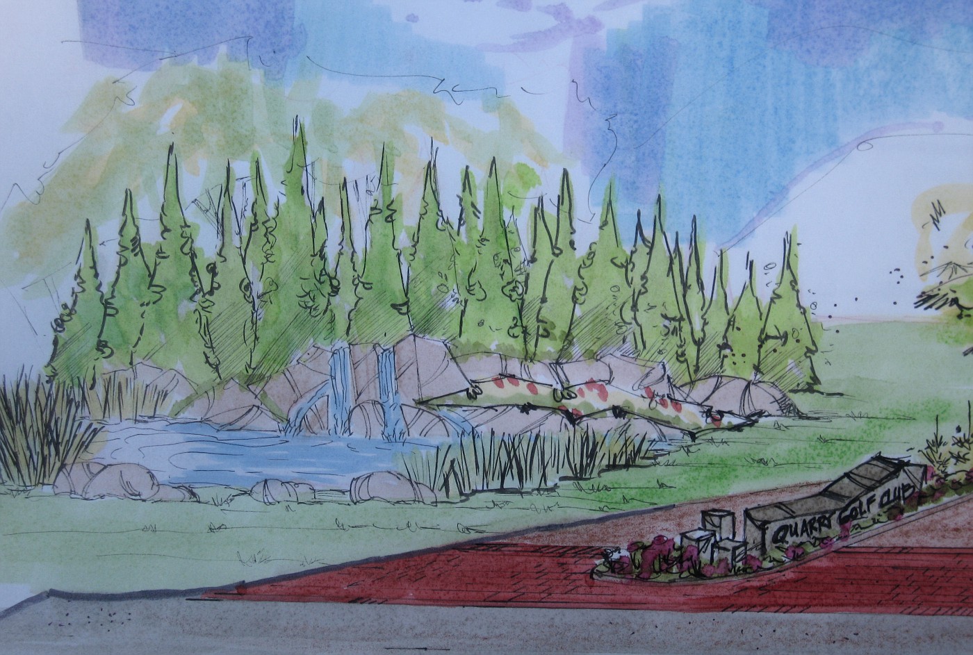
Color rendering of pond and fire ring
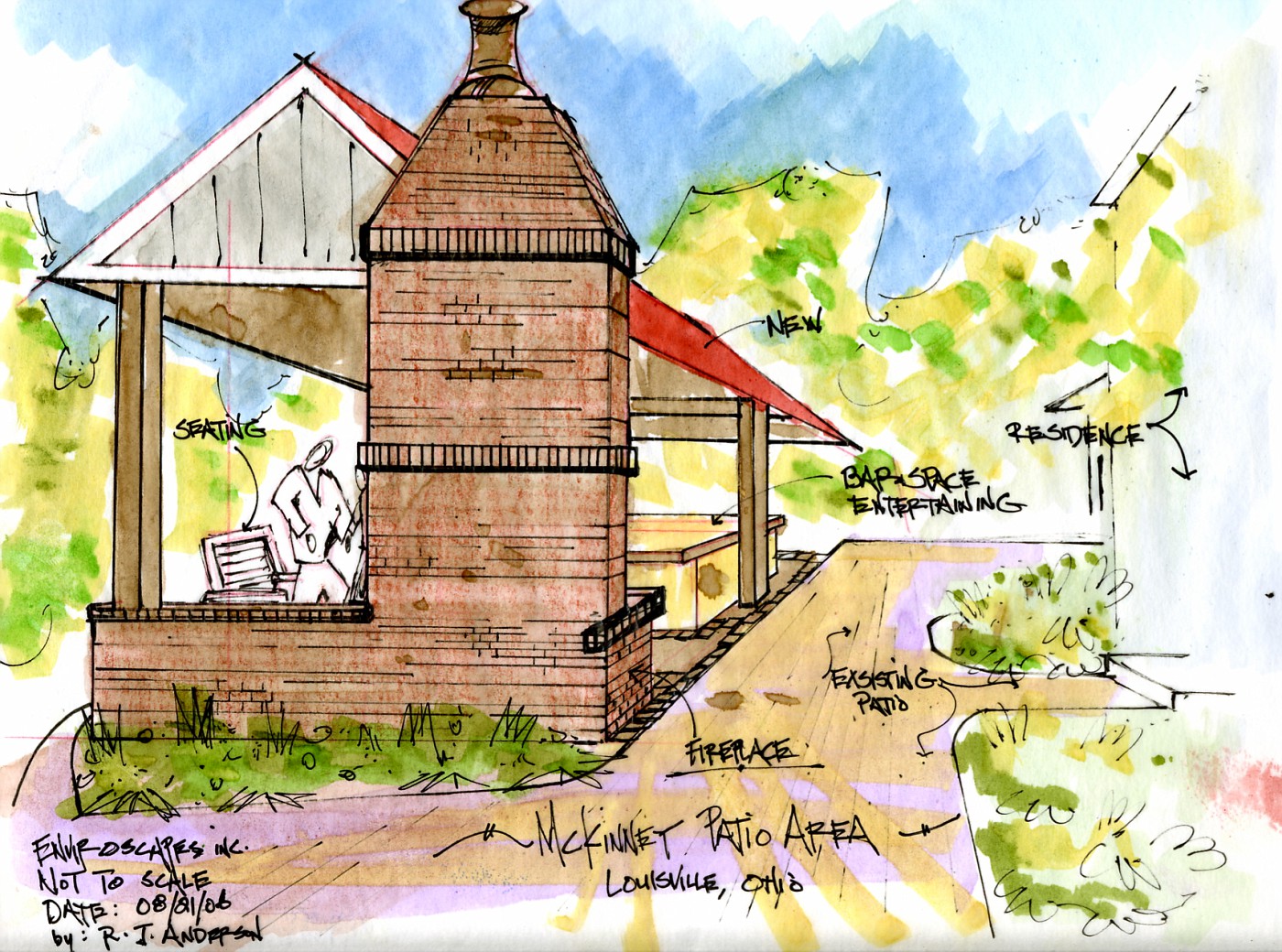
Along with the plan view rendering, I showed the clients this conceptual rendering of how this area would relate to the new kitchen addition.

The addition is shown only in black line. I was trying to present the landscaping to add to the backyard, which is why my stuff is in color. We needed to excite them about tha landscaping, Heck they had already agreed to add the kitchen-no need to promote that.

I did; however, have to show how the new landscape would relate and enhance the new space. This rendering does a much better job than anything I could have done on a plan view drawing.

This drawing was the deal-clincher for this side of the backyard. I basically laid this on the table and it was over. Let's go, let's put it in, we can't wait . . . those were the comments.

I've said this before, and will say it some more (hey, I'm a poet!), if you design hardscapes, structure, level transitions, etc . . . you must render. This is the only way to really communicate what you are trying to achieve to the client.

Has for this drawing, I'll have more on my evolution as a designer . . . tomorrow.

Monday, November 06, 2006

Sandstone Walk, with Paver Patio, the drawing

Color Landscape Rendering
(This drawing goes with last weeks photos)

This was the plan view drawing that was shown to the client. to help finalize how the design would work, and how we could make the patio space work with the new kitchen addition.

The hardscape is so overwhelming here it was really important to get it right on paper. We all wanted the clients to be happy with this layout, and by giving them a precise scale drawing the contractor was able to give the client a very good, and accurate estimate to install the project.

I had been requested by the homeowner to stay within a range of numbers after we had looked at several sets of conceptual drawings. These early conceptual's had rough numbers attached to them, so between those numbers and the rough landscape drawings we were able to come up with this plan rendering.

I was hoping to post some of those rough conceptuals, but, dang it! I can't find them.

Anyway take a look at the drawing, (if you click on it, it enlarges). Then compare to the actual install of the project. I think you'll agree we came pretty close.

Wednesday, October 18, 2006

Entryway, continued from yesterday . . .

This rough rendering over the photo, gives me an idea of how a fountain may work into the landscape . . . tied into the proposed circular drive. The idea of a fountain here is a request of the homeowners.

This very fast drawing with a Sharpie is just a way of sizing it in. The conceptual drawings shown below were done on trace over the top of this image

This color rendering was done with the intent to show it to the homeowners during the concept(s) meeting.
The biggest difference between this drawing and the plan view drawing shown yesterday . . . the boxwood is shown wrapped around the fountain.

After seeing the fountain just setting out there all alone, the idea was to extend the parking pad, add space for a gathering spot, and some benches.  Tying the fountain area into the house and landscape.


This last color rendering was a desire by me to give the homeowners another look at how a waterfeature could fit into the landscape. As though it were part of the foundation planting.

The parking pad is designed large enough to also act as a gathering space for guest and the homeowner, while moving the waterfeature off to the side.

This look; to me, is more contemporary in style. The 3-tier fountain out front surrounded by the boxwood is much more traditional. Personally I like the more contemporary look here. The final decision rest with the homeowners.

It is the Designers job to give the homeowner realistic options to get to the final decision. Hopefully one that the homeowners are happy with, and the design works with the site.

Tuesday, October 03, 2006

Conceptual Rendering, Waterfall

A Waterfall Rendering-selling stone.

 These 2 landscape renderings were drawn into my sketchbook on the job site. Normally thses days I make a few notes, shoot a lot of pictures, and just absorb the site. Then I go back and draw something up on the board to present to the client, during the conceptual meeting.

Here  . . . I drew up these 2 conceptuals right on site. My tools of choice for a on-site drawing are; a couple of Sharpie pens (different sizes), and one or two Chartpak markers, in this case  . . . just one . . .  a brown one. Now here's the interesting part about using minimal color.

What is the Focus  ???

Focus; as in, what am I trying to achieve in the renderings for the client. Here, the owner operates a retail stone yard. There focus is to sell stone, whether by wholesale or retail, but the focus is to sell stone. So when I do a drawing for someone like this. I'm going to promote how the stone will be displayed, and used . . . . promote the stone highlighting with a brown or gray marker.

Had this been for a retail nursery what color would I have used? Green, of course! I would want to help
promote the plant material and a way to highlight that plant material would have been the priority. 
The conceptual would have been slightly different, the stone not quite as prominent. 

Had this been for a private residence I would have used very little brown, a swipe or two of 
green, and a blue marker to highlight the water feature. The homeowner usually fixates on the water 
feature anyway, so that's where the focus need to be.

Let's review, for these conceptual on-site renderings . . . keep them fast, loose, un-specific. Keep color to a minimum highlighting the important stuff only. I can't emphasize this enough about highlighting . . . keep it
to a minimum, a touch of color will take you a long way.

Thursday, September 28, 2006

The Garden "above" the Hot Tub

The Garden Entry

 This concept drawing was to give the homeowner an idea concerning the changes to the upper terrace. Turn the space into a perennial and cutting garden. It is the only part of the yard getting full sun through mid-day and the afternoon.

Plus it allows for a nice walk from the drive to either the back deck or new patio. A nice little pleasant walk. The trellis' are partially up on the left, the homeowner has an interest in espalliers for some apple trees.

The important thing to remember about quick concept drawings like this is to present an idea of where the space could/may go. Realize the fence doen't have to look exactly like this, of the overhead exactly like that. What is important is realize that I am suggesting a short open fence with a arbor type opening.

These quick conceptuals tell that story, and allow for homeowners to visualize their future. Or; has I have mentioned before, they may blow this idea completely out of the water. Time to go in  a different direction. Good designers usually do not have to start over because they have learned one very important thing-listening.

When a good designer listens to their clients they usually are able to come up wtih a good solution, or something very close to what the clients are looking for.

Wednesday, September 27, 2006

More on the Hot-tub

Looking from the Other Direction

 This drawing was done to show the homeowners how this would look from the other direction. This view shows the relationship between the new patio and the small retaining wall. The patio shown here really gives the viewer a better idea of its size for the new landscape.

I stayed with the square layout for the patio, becuase it plays off the square base of the hot-tub. A square patio  fits nicely with the straight lines of the short retaining wall and the straight lines of the deck.

For those of you not familar with this type of design. Straight lines, all right angles, strong squares means we are looking at Geometric design as opposed to Curvilinear or naturalistic.

Geometric must be harder to pull off because just about every landscape I see these days is some sort of wavy line-usually a weak/lazy wavy line. Which everyone likes to call naturalistic; or, "ooooh, look how natural . . . oooh"      Aaahhhh!!! Enough to drive me crazy!

Tuesday, September 26, 2006

Where does the Hot-Tub Go???

This is the Exsisting Landscape

I was asked to come up with an idea for a designed space where the seating area was extended out onto the exsisting lawn, a perennial/cutting garden above the wall, and find a place for a hot-tub.

It made sense to tie the hot-tub into the deck space so there would be good solid footing to get to the tub from the house, and at the same time keep it fairly close to the house and yet be in its own space. While not infringing the patio/entertaining space.

My Version of New Landscape

Designing hot-tubs into these spaces, heck designing hot-tubs into almost any backyard . . .  is tough. They are big clunky boxes, even the best designed ones are big clunky boxes. Add in the logistical requirements needed to run hot-tubs. The electrical, plumbing, servicing, etc.

Whats even worse is most designers don't even try to add in the hot-tub in a harmonius way. Homeowners . . . forget about it, just drop the box on the patio.

The real problem is that this is usually considered something needed for a private space, but almost always is sited in the most public of spaces, sometimes right next to the picnic table or grill . . . how romantic!!! Which is the context in which most homeowners ask me to find a space for the hot-tub . . . a clam, quiet, romantic place for the husband-wife.

Where space considerations are a factor usually the best we can do is place the tub in a corner of the patio. The corner chosen should be the one where there will be the least amount of traffic or commotion. Away form the back and forth of people. Hopefully the patio will be large enough to allow for furniture and other stuff to be placed on the opposite end. Add to that landscaping that will compliment the space, and compliment the mood of the space.

A Conceptual Plan View of the Landscape Design

This is a plan view drawing of the same space shown in the rendering above. These conceptual drawings work together to tell the story of where this space could go.

I have spoken about this before, the plan-view drawing is how most designers/contractors present their solutions to homeowners-it doesn't work. Most Americans can't read a road map, and most people are not good at visualization. The plan-view drawing helps solve neither of these issues. Where the rendeering does solve those problems.

The solution is right in front of them, it's like the story of a picture is worth a 1,000 words. Well then, what's a rendering worth? To the homeowne? To the contractor?

The rendering shows the potential of the space, and the plan-view drawing shows the scale of the impacted space. Together they present the entire story of the space's potential.

Monday, September 18, 2006

Another from the sketchbook

Monolith type Yard Art

Maybe someday, somewhere for somebody . . . .

Saturday, September 16, 2006

From the Sketchbook

Waterfeature

 This was a black and white line drawing I had scanned from one of my idea books, and turned into a color drawing using Paintnet. I guess what I am really doing is using several different types of mediums now when I doodle.

I have often talked about how important it is to doodle if you are in a creative field or endeavor.Doodling switches me into a total different mindset, and I've noticed the more I doodle-or if my doodling gets real intense-a lot of ideas begin to flow, and flow fast they do.

What's really fun; especially when it's late . . . like right now as I post this. Is that the World seems so quiet I can go with that quiet for one kind of thought process/ solution finder, or I can go totally opposite. Put on the headphones, crank up the music, and let it just rip.

I have actually reached the point where I can watch my right arm draw-very weird to watch. It's like there is some sort of dis-attachment between mind and body. I guess it's what some would call  being in the zone. Heck-in my case it may be me out of the zone.

So I think that the doodling thing . . . is good.  for many reasons:

  • To kill time.
  • To start the creative process.
  • To warm up for actual rendering/design work.
  • To find solutions in a quick, stress-free way.
  • To aggravate teachers (yes I was one of those).
  • Work with different tools . . . as in no pressure to draw with the pen/marker that a final drawing will be completed with.
  • Impress people who can only draw stick men and circle trees . . .
So there you have it, get busy doodling, it's only 10 till 3:00 AM my time.

Thursday, September 14, 2006

Landscape Rendering, and Elevational Drawing

Never Built

This was a fairly quick rendering that I have pulled out of my archives. Its dated Fall, 2002. The drawing show the possibility of a gazebo that has a stream and falls wrapped around on a hillside.

I always thought the contractor of record did a poor job of selling this job and lost it to another contractor who put in something much less substantial for almost the same amount of money. Sour grapes on my part-maybe so.

Then again maybe I could have come up with a better set of drawings to help sell the project. I know that if I were to draw this today it would be at more of an angle to the gazebo, and there would be some color thrown in .

Monday, September 11, 2006

Color Rendering of Entry

Final Color Rendering for Presentation

This is the drawing that will be presented at the next meeting. There is still a little detail to add to finish it out. Hopefully to make it jump off the page just a little more. The previous post on Sept. 5th, and Sept. 9th were the steps before this drawing.

By showing those very simple conceptuals we were able to grasp where the client wanted to go with the entry, the wow feeling they were after. By putting in the time on these presentation drawings a few things will happen. The excitement level has been; and continues to build, for the clients. This will allow the contractor to put together a dynamic proposal to install the work at a higher number than what was originally discussed. The drawing will also be used as a sales tool  by the client to get others involved and also be used as a marketing tool until the landscape can be installed.

I should point out that this is not the entire drawing-this is a cropped copy of a digital image shot with a camera looking down over the table.  So you are not seeing the entire drawing.

If you're interested the are a lot more before shots of this project here. I believe most of the rough conceptual drawings and a lot of cropped images of the larger drawings are there also.

If everything goes well here the next big decision will be to decide on the height of the falls, and to start to get into specifics on the plant material. As you can see by the drawing we are in agreement on the form and spread of the shrubs-now we need to match based on the desired effect and the scene we are trying to create.

Saturday, September 09, 2006

Color Renderings and Plan View Conceptual

Plan view of the Pond


This shows the lagoon-pond area in plan view. The backdrop of the conifers, and some of the surrounding plant material, including the aquatics that flow from the pond out on the edges of the banks of the pond.

The drawing also shows the relationship of this area to the actual entryway, and the space involved for the area to flow together. The hillside for the falls will have to be made and the the backdrop of conifers will be added to sell the illusion of a natural waterfall.


Rendering of Entry and Pond


This is the follow-up to the September 5th entry on the Blog. This is part of a larger drawing that will be shown to the clients to give them an idea of the entire picture for the possibilities on what the entrance could be.

The big difference in this drawing is to show a larger number of conifers for the backdrop. This was a specific client request after seeing the initial concept drawings for the entry.

Tuesday, September 05, 2006

The Entryway

The Before Shot

The stakes in the middle of the drive are where I was told the island would be placed, plus I was given a Engineered drawing of how the lanes would be laid out and their dimensions.

I was asked to come up with a sign for the island and show how some of the surrounding landscape could possibly look.

The Rendering

 So this is the initial color rendering of what I see happening in this area. This has been shown to the client and I am re-working drawings right now to show where we are looking at possible final solutions. for the entryway.

A cnage in the apron, a slight change in the brick strips, an additional paving surface, and a fleshing out of the landscape along the way up the hill.

Wednesday, August 30, 2006

The Design Process, another example

The Before Shot

This before image shows the area of focus for the conceptuals. The client is looking for some sort of dramatic water feature into the sub-division and golf course. In order to make that happen we are going to have to build something between 8 and 12 foot high. Then in order to sell the illusion of the falls we will need to add a dynamic and beleivable backdrop. Piece of Cake ?!?

The Warm-up sketch, Initial thoughts, or Day-dreaming.

This is an example of a warm up drawing for me. Before doing any overlays. Since I was doing stone and water I better warm up with . . . stone and water. Plus start gearing my thought towards a strong backdrop.

The Concept sketch on a copy of photo (direct).

Normally I lay down some tracing paper and start looking at possibilities, but I had a pretty good idea of what I wanted to do in this area and started drawing away. The key here is to try and make the ratios look right, and to not mess up proportions of what I am after.

Especially the relationship of the falls and the lagoon, or pond. Remember the goal here is to wet the appetite of the client by showing them the potential of what there site has to offer based on 3 things.

  1. Their request for what they need, and or want.
  2. The site itself, what will it allow or not allow-what it is capable of.
  3. The Designers talents, skill level, knowledge.
The Color Rendering

This color rendering is good enough to show to the client to give them an idea of how things will lay out. The black and white will also be part of the discussion. This is fine for the 2nd meeting when all these possibilites are discussed in a more informal way.

If there is to be a 3rd meeting with some other higher-ups the drawings will all be in color and more refined. There will also be a plan view drawing showing how this relates to the actual entry drive. Speaking of that drive-more on that tomorrow.


Monday, August 21, 2006

Patio Design 2


More drawings and a continuation from the post on the 18th of this month.

This a a sectional drawing showing how all these elements will relate to each other in scale. This type of scale drawing helps show the human element and really focuses in on how much space is needed to pull this project off. The scale here is one-eighth of an inch equals one foot.


This color rendering is the overlay to show the client the potential for combining all these elements in one space. As of right now the grill is at one end of the backyard and the wet bar is at the other. There is no protection from the elements if you exclude to umbrella over the table which is not shown here.

Combining the rendering along with the elevation or sectional drawing helps paint a picture which enables the homeowners to move along in their decision making process to creat the best possible use of space for their requirements.


This structure will bring everything together under one roof and will extend the use of this patios season in this Zone 5 backyard.


This is a quick study drawing of how the roof line would work out for this design of a new patio space. One point perspective is my goal here, and I am hoping to do an overlay on top of this. whic is what the drawing above is.

I could use this drawing and just draw on it, but if the clients reject my proposal on the color rendering I would have to start from scratch, this way I won't have to do that.

Sunday, August 20, 2006

An Appreciation of Stone 5


The two photos are from a job of mine installed back in the mid-90's in South Carolina. The stone is from Briar Hill a Stoneyard/Quarry in Central, Ohio.

I have always liked Briar Hill, and will always continue to try and find ways to use it on work I design. The wall stone comes in several different heights which allow for this kind of artistic feel when putting a wall together.

When I personally did this work I always rock-faced the bottom edge a little deeper to create a more interesting shadow line. Try that with modular concrete retaining wall block.


A comment on these steps; they are shipper 48" wide, 16" deep, and 6" high. Just about perfect for outdoor steps in just about any application. Now here's the great part . . . they lay up faster and easier than pouring concrete steps. I cannot think of any reason why these steps would ever be more expensive to install than concrete, and as for the look; well . . . you decide.

Theres one wall stone out of place in this photo, which did get fixed by the way. My other comment is the landing pad stone is a piece of whats called 3" offset.

The backside of these walls is typical construction, gravel, fabric, and pipe. Remembering the enemy of every wall ever made is water, and water pressure.