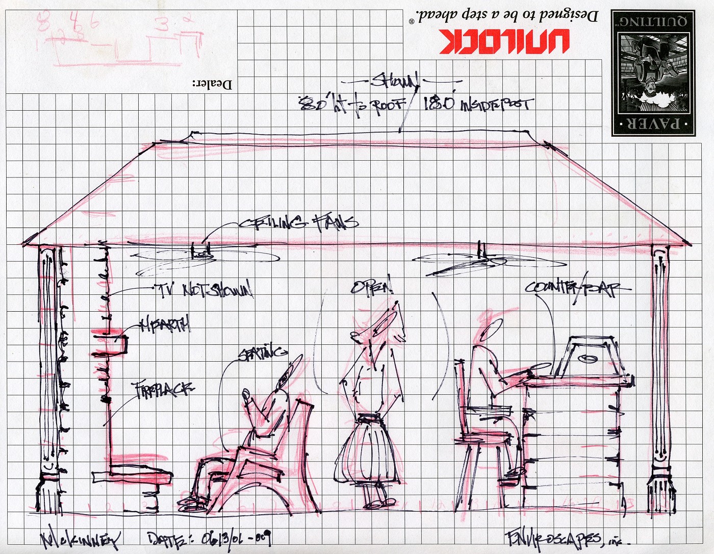
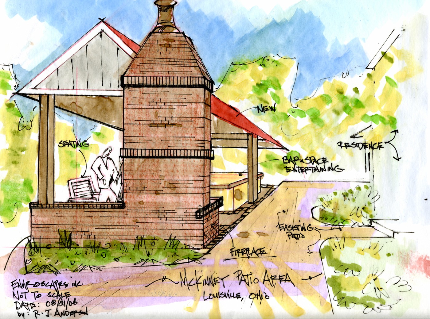
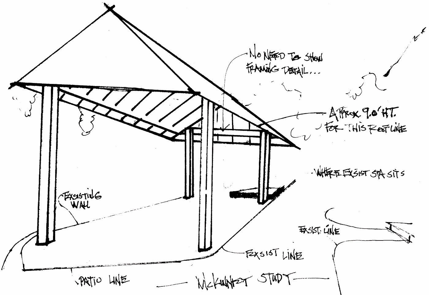
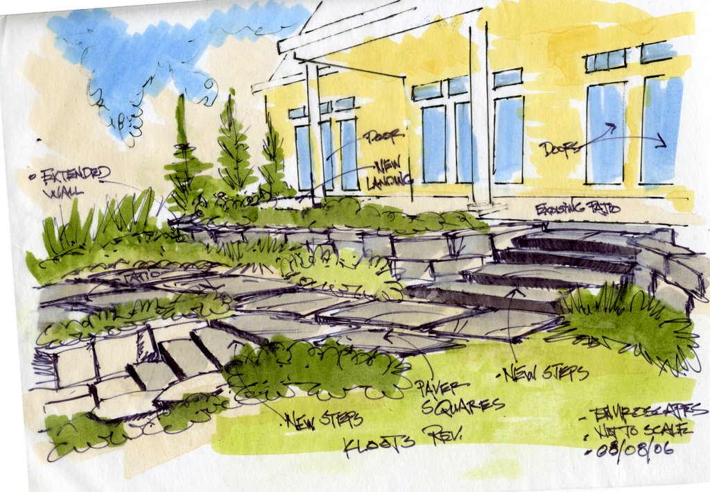
Showing posts with label hardscape design. Show all posts

Thursday, December 28, 2006

Pergola Design

Entertainment Entry
This pergola was designed with several thoughts in mind, several request asked, and the pergola needed to be substantial.

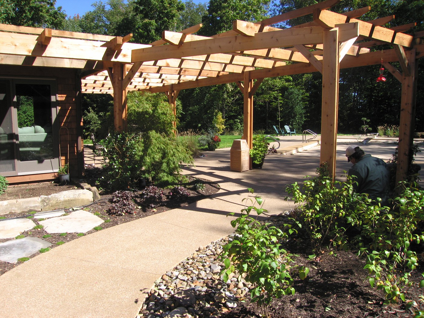
I had looked at the style and size of house and determined right away we needed something with some bulk, girth, and substance.

The homeowners are not fancy, quaint, do-dad type of people that need to look at lots of embellishment or intricate detail.

Finally the space itself is big, big house, big pool, tall trees, and large lawn. Including a long drive with a big parking area to go through before reaching this back yard space.

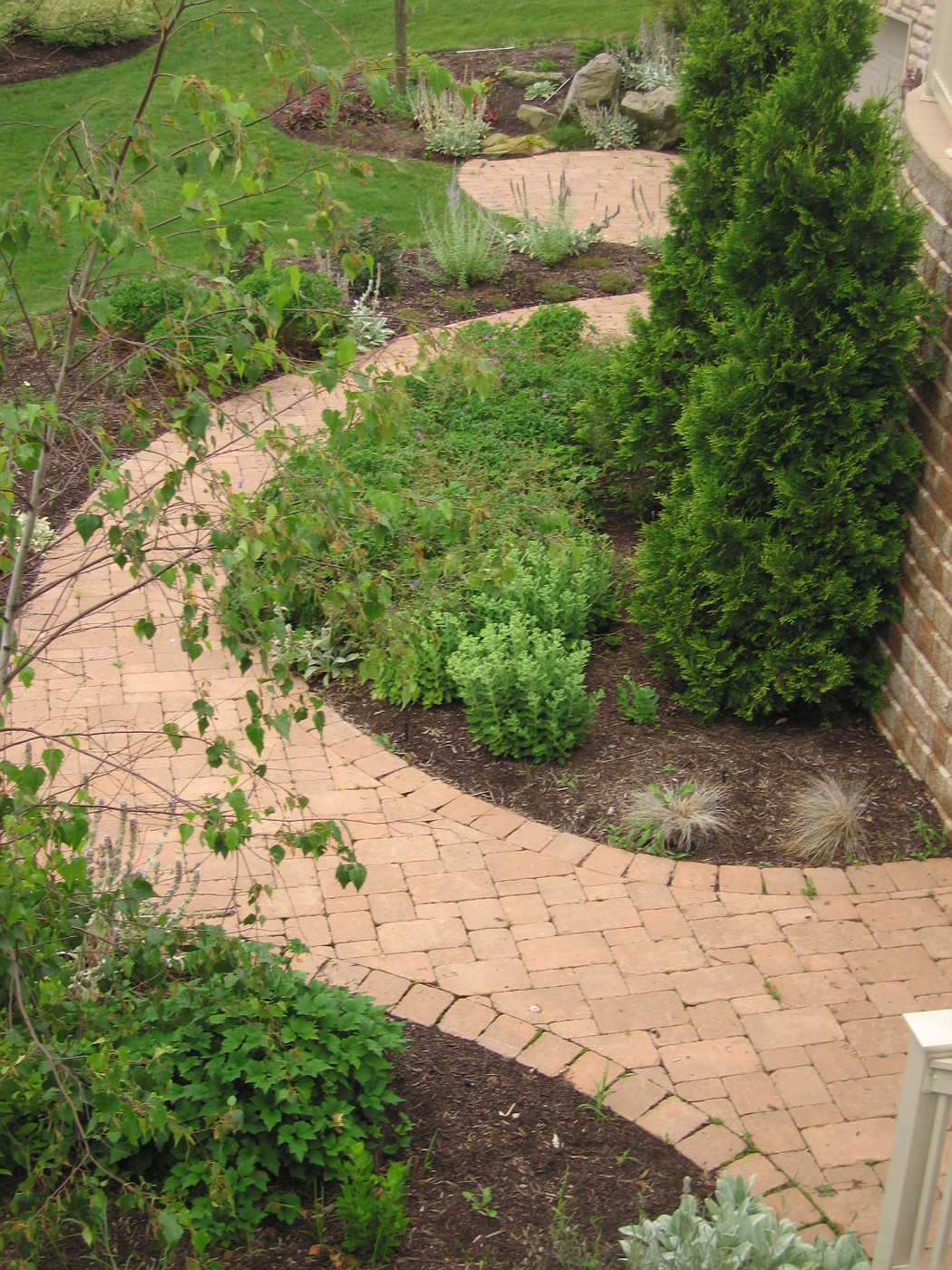
Instead of just designing the cliche' wrap around the house footprint style arbor I worked hard to design a arbor that would also work as a separator, This separator is to divide the public space and the pool/private space. The physical act of walking through and under such a structure accomplishes this. The mind changes over, the space is now looked at differently.

The cedar pergola was designed not with the intent of keeping out the shade but to act as the conduit of bring the house and landscape together. That's why I think pergolas are so powerful a design tool. Their ability to link elements, spaces, structures, and emotions together in a harmonious way.

The attachment to the house and the post rising from the Earth . . . the connection is made, and can be made more powerful with the addition of vines, climbers and bloomers working their way through the pergola. Where some space below the pergola is solid and safe for footing and other areas are made beds so that plants and people can thrive together and the garden is accessible to human contact.

The other big thought here is often neglected, not even thought of, and usually excites only as a afterthought . . . that thought is shadows. Shadows bring a sense of theater to the garden, The shadow lines magically move there way across the space as the day plays itself out. This continual movement adds dynamic style to the scene and alleviates boredom of looking at the same space in a very un-dynamic style the entire day. Light and shadow in the daylight much too often underlooked, under-appreciated, and very rarely designed for, but designing shadow can be a very powerful design tool.

Every pergola design/designer should keep this in mind when creating the overhead for the pergola. Where is the sun? What is the suns path? What is this path during the most busy time of year using the pergola? What is the pattern to be determined for? Is the overhead designed to block out a large percentage of sunlight? Do crosspieces run with or against the suns path? Does the pergola include 2 sections of crosspieces to create a even more intricate shadow pattern?

Enough questions? For now. We haven't even touched the post, and their embellishment or lack thereof. Or the finish work to the crosspieces . . . the detailing, or lack thereof. Nor vines, nor climbers, nor paint or stain . . . how about going a la natural?

Lots of questions, lots of possibilities, but no doubt one of the most under-utilized structures in residential landscape design.

Tuesday, December 12, 2006

Martha Schwartz interview

I just ran across this interview in Metropolismag.com. I was hoping to read a good in-depth, insightful interview. Let's just say I was disappointed. it comes across a one of those 20 pop questions type of interviews. Not quite what's your favorite color, instead we get . . . bookmarks? Bookmarks? Martha doesn't have any by the way.

Martha has continually pushed the envelope and has marketed her brand well. Her work gets lots of press, her people submit for awards (which they win), and the critics are severe. Sounds like someone at the top.


The infamous HUD Plaza.

I was hoping for some insight into her design process, and how she reads sites. Interprets the area she is going to work in. The best we get is her insistence on physically seeing the site and this tid-bit:

Most useful tool: My equal-space divider. You quickly divide things—as opposed to measuring them out—which is a godsend: I work fast and I’m bad at math.

Still if you are not familiar with her work take a look at the article, and then go to the firm's website, one of those fancy flash pages. Here you will get a much better understanding of her work, and a better understanding of the publicity machine, look at the amount of print, not including all the critics columns


Residence in SW, New Mexico, I believe.

For more info on Martha here is the Wiki entry for her. I was speaking earlier about how she has been lambasted by some . . . here you go.

To counter that Martha has won the Cooper-Hewitt design award, 2006 in Landscape Design (scroll down). The award was for her design of the Grand Canal Square in Dublin, Ireland, for a really great breakdown of that project I found this, and this from Ireland.

Martha is more of the artist side than the horticulture side of the picture and this mindset has put her on the opposite side of the fence with a lot of folks in the landscape design world. There is usually a lot of stuff going on in her projects, some would consider them very busy or not very people-friendly. You could even say they are better to look at and admire from a distance, than to actually participate in.

Her designs are not for everyone, but I admire her ability to push the envelope and take a chance in her public projects. Even if some projects weren't perfect who can say that all of their's were. I sure can't, can you? can anyone?

The important thing is to dream, to think big, to continue to reach out to be the best you can, the most expressive. The most creative. Keep going Martha.

powered by performancing firefox

Thursday, November 09, 2006

Backyard Patio story continues.

Single water falls, and tan sandstone walkways
More on the previous post. This was the 1st plan view color drawing that was shown to clients. Take notice that in this conceptual drawing there is only one waterfall, and the walkway is tan in color. the homeowners looked at this drawing and were very impressed.

I then remember them . . . starting to study the drawing and going over ever detail. It was decided pretty quickly they didn't want brown sandstone for the walkway-they were positive about this.

2nd they were very concerned that the one falls would not make enough noise to screen out the eat of the neighborhood noise, and would only one waterfall be loud enough to hear in the kitchen, and breakfast nook.

Normally, I would just show them a different color of stone (actual stone piece), and take some overlay paper and draw the other falls in the hillside. That wasn't going to work here, they wanted to see another drawing (specifically the wife).

So, I called the contractor and said I had to do another drawing for the homeowners, for x amount of hours to do the work (which he hadn't agree to pay me for). He asked me if they were excited about the conceptuals and were they close to jumping in?

I said; heck yeah, they're ready! . . . .

So the previously posted drawing is what they looked at, and of course they jumped in, over original budget request . . . because it was everything they wanted, in a logical layout, and the best parts could be enjoyed/viewed from inside the house.

Color rendering of pond and fire ring
Along with the plan view rendering, I showed the clients this conceptual rendering of how this area would relate to the new kitchen addition.

The addition is shown only in black line. I was trying to present the landscaping to add to the backyard, which is why my stuff is in color. We needed to excite them about tha landscaping, Heck they had already agreed to add the kitchen-no need to promote that.

I did; however, have to show how the new landscape would relate and enhance the new space. This rendering does a much better job than anything I could have done on a plan view drawing.

This drawing was the deal-clincher for this side of the backyard. I basically laid this on the table and it was over. Let's go, let's put it in, we can't wait . . . those were the comments.

I've said this before, and will say it some more (hey, I'm a poet!), if you design hardscapes, structure, level transitions, etc . . . you must render. This is the only way to really communicate what you are trying to achieve to the client.

Has for this drawing, I'll have more on my evolution as a designer . . . tomorrow.

Tuesday, November 07, 2006

Color; Plan View Drawing

More on yesterdays Hardscape Plan
Now we can take a look at where that sandstone walkway goes to. The bridge leads directly to the fire pit area, in a very enclosed area.

Just above the fire pit is the mound with boulders and plantings. To the bottom side the pond surrounds the fire pit. I was trying to create this very intimate space for those who wanted to wander over to this area. While the paver area was more of the public type area.

The homeowner had specifically asked for two separate areas so the adults could gather in one and the kids in another.

Everything was designed with this thought in the back of my head, remember the view from the new kitchen addition . . . remember the view from the new kitchen addition. You can see the breaks in the house line where the windows were being placed . . . there are a lot of them, and we wanted something interesting happening wherever you looked out.

This was taken the 1st winter of the garden. I took this photo with a zoom lens while standing inside the kitchen. Where the window is rounded off they have a breakfast nook set up there.

I think it's a pretty nice look while your sipping on you morning cup of joe, and having a bowl of Cheerios. What do you think?

The falls originate in bio-falls boxes, and I always used 45mil, EPDM liner, covered in stone-usually 3-5 different sizes. I believe this helps with creating a more naturalistic waterfeature. One other thing about siting waterfeatures . . . I like having some sort of evergreen back drop for my falls. I think a good solid screening backdrop helps with selling the realism of the waterfeature.

I am also a sucker for low weeping plants around streams. Plants the branch out over the water, or crawl down into the waters edge. It's more of the blending between land and water to create a; sort of, seamless edge.

Friday, November 03, 2006

Sandstone Walk, with Paver Patio

The journey continues, from Yesterday
Coming off of the Paver patio the walk through the garden continues on the sandstone walkway. To a bridge made of antique curbstone. Pond is on far right. Fire ring area is across the bridge and double waterfalls are on the left.

That mound is artificial. It was built for falls and streams and to add sense of enclosure to the seating area. More on this later.

Thursday, November 02, 2006

Hardscape Design

Continuation on Monday's post
This image is just a pull back from Monday's post and gives you a better idea of how that smaller circle works. The sandstone slabs in the foreground continue to where the gate opening is to enter this garden.

What we are looking at here is what you(the observer) sees when 1st entering this garden space.
A few more steps and a look to the right is where the double waterfall, stream, pond, and fire pit are located.
The direction we are looking back to is where the 1st photo was taken from. I would say we can now appreciate the size of the main circle. This patio space had to be large enough to hold a 6 seat table, a couple of small benches, a chaise lounge or two, and a grill whew!!! A lot of stuff.

Plus enough room to navigate around all this stuff without feeling pinched in, cramped, stumbling over each other.

Right at the very bottom of this photo you can see a different color of brick. This is the landing step coming out of, or going into the kitchen. That brick work is all mortared, and the patio is dry-laid on limestone stone dust.

Ohh, one other thing, see that little bit of sandstone to the bottom left, that was specifically designed as a space for the grill. Convenient to the kitchen access, but completely out of the way of foot traffic and other patio furniture.

Monday, October 30, 2006

The Importance of Hardescape Design

Brick Hardscape Ideas
This walkway/patio was one of those tricky designs on paper that you hoped would work out on the ground. It's like I draw this to exact scale, knowing the materials we are using . . . and hoping the field guys can implement the plan correctly.

I knew when I drew this and presented it to the clients that this could look really great in their back yard, I mean really great. I believed one of the keys was making the sandstone work into a good strong pattern.

Luckily for me the supplier was able and willing to give me the sizes I wanted, at the dimensions I wanted. So the stone could be scaled out exactly the way it would w0rk in the space shown. The slabs were cut in some ratio of 12 inches. so the pieces were 1x2, 2x2, 2x3, 1x4.

This also cut down on waste; everything was scaled out, laid out, on paper. That way I knew exactly how many of each piece we needed. I remember we picked up 2 extra of every size in case of breakage, chipping, whatever. These extras were latter used underneath a pergola swing.

After the sandstone walkway was laid out it was a simple matter of laying out a couple of large circles of brick to interact with the sandstone.

I remember moving the circle template around to try and find some sizes that would fit the scene . 1st starting with the largest circle and working to fill in the blanks with the smaller circles; or , slices of circles.

The tri-colored dark pavers are a strong contrast to the tan sandstone slabs. So . . . even with the strong color contrast, a contrast that was, to me very powerful . . . the stone and pavers flow together. I guess you could say the scene is harmonious . . . without being harmonious.

A side note: Over the last few days I had wriggled my way in to a cyberspace argument on planning, specifically . . . why planning is a myth, or bad somehow. I think the above post is a perfect example/explanation of the design process, and is the perfect response to; why design is important, and believe me----Design is important. If you want to move a perennial around, or buy a shrub on a whim . . . go ahead. I just wouldn't recommend buying 7 tons of stone on that same whim.

Tuesday, October 17, 2006

Conceptual drawing for entryway

This drawing was to give the clients a look at a more formal entrway to their front door. Usung a circular driveway paved with a common material, except for the area right in front of the entry into the house.

This area would be out of some sort of paver to play off of the material used on the house, I guess what I want to say there was going to be some brick trim on the house and we were looking to complment those colors.

The idea of the fountain was a request of the homeowner, they wanted to see if I could work it into the landscape. The house, the entry and fountain lent itself to a more formal planting which is shown in the drawing. With the boxwood hedge lining the driveway, and the massing of shrubs along the front of the house.

Added October 18th: The decision to do this drawing in plan view only was to show the spatila relationship between the elements on the parking pad. The rendering above shows how the fountain would look out in open space.

Tuesday, October 03, 2006

Conceptual Rendering, Waterfall

A Waterfall Rendering-selling stone.

 These 2 landscape renderings were drawn into my sketchbook on the job site. Normally thses days I make a few notes, shoot a lot of pictures, and just absorb the site. Then I go back and draw something up on the board to present to the client, during the conceptual meeting.

Here  . . . I drew up these 2 conceptuals right on site. My tools of choice for a on-site drawing are; a couple of Sharpie pens (different sizes), and one or two Chartpak markers, in this case  . . . just one . . .  a brown one. Now here's the interesting part about using minimal color.

What is the Focus  ???

Focus; as in, what am I trying to achieve in the renderings for the client. Here, the owner operates a retail stone yard. There focus is to sell stone, whether by wholesale or retail, but the focus is to sell stone. So when I do a drawing for someone like this. I'm going to promote how the stone will be displayed, and used . . . . promote the stone highlighting with a brown or gray marker.

Had this been for a retail nursery what color would I have used? Green, of course! I would want to help
promote the plant material and a way to highlight that plant material would have been the priority. 
The conceptual would have been slightly different, the stone not quite as prominent. 

Had this been for a private residence I would have used very little brown, a swipe or two of 
green, and a blue marker to highlight the water feature. The homeowner usually fixates on the water 
feature anyway, so that's where the focus need to be.

Let's review, for these conceptual on-site renderings . . . keep them fast, loose, un-specific. Keep color to a minimum highlighting the important stuff only. I can't emphasize this enough about highlighting . . . keep it
to a minimum, a touch of color will take you a long way.

Monday, September 11, 2006

More on Yesterdays Post

The Circle in Winter

 
I've often talked about how much I appreciate the way water looks in the wintertime and how the liquid flow of the water cuts through the clean white snow.

Before I had designed my 1st firepit in this style I did spend some time contemplating how this would look in the winter- after all it's where we live, we have to deal with the snow, and should appreciate the change of the season. Unfortunately that is something that a lot of Landscape Designers fail to do, and that's too bad because in most of the country(World) we have 4 distinct seasons and all  4 seasons should be planned for. Besides . . . Fred would have done the same thing.

An aside; I had not contemplated the owner adding a bowl to the center of the firepit. She added this brass bowl to burn small fires in. Does it take away from the natural feel of the space-maybe. However you look at it,any Designer should remember we work for the client. Our job is to work with them, using our knowledge,  the cultural concerns of the site, and the clients wishes, dreams, desires for their landscape.

And celebrate all that nature has to offer us.

Tuesday, September 05, 2006

The Entryway

The Before Shot

The stakes in the middle of the drive are where I was told the island would be placed, plus I was given a Engineered drawing of how the lanes would be laid out and their dimensions.

I was asked to come up with a sign for the island and show how some of the surrounding landscape could possibly look.

The Rendering

 So this is the initial color rendering of what I see happening in this area. This has been shown to the client and I am re-working drawings right now to show where we are looking at possible final solutions. for the entryway.

A cnage in the apron, a slight change in the brick strips, an additional paving surface, and a fleshing out of the landscape along the way up the hill.

Monday, August 21, 2006

Patio Design 2


More drawings and a continuation from the post on the 18th of this month.

This a a sectional drawing showing how all these elements will relate to each other in scale. This type of scale drawing helps show the human element and really focuses in on how much space is needed to pull this project off. The scale here is one-eighth of an inch equals one foot.


This color rendering is the overlay to show the client the potential for combining all these elements in one space. As of right now the grill is at one end of the backyard and the wet bar is at the other. There is no protection from the elements if you exclude to umbrella over the table which is not shown here.

Combining the rendering along with the elevation or sectional drawing helps paint a picture which enables the homeowners to move along in their decision making process to creat the best possible use of space for their requirements.


This structure will bring everything together under one roof and will extend the use of this patios season in this Zone 5 backyard.


This is a quick study drawing of how the roof line would work out for this design of a new patio space. One point perspective is my goal here, and I am hoping to do an overlay on top of this. whic is what the drawing above is.

I could use this drawing and just draw on it, but if the clients reject my proposal on the color rendering I would have to start from scratch, this way I won't have to do that.

Sunday, August 20, 2006

An Appreciation of Stone 5


The two photos are from a job of mine installed back in the mid-90's in South Carolina. The stone is from Briar Hill a Stoneyard/Quarry in Central, Ohio.

I have always liked Briar Hill, and will always continue to try and find ways to use it on work I design. The wall stone comes in several different heights which allow for this kind of artistic feel when putting a wall together.

When I personally did this work I always rock-faced the bottom edge a little deeper to create a more interesting shadow line. Try that with modular concrete retaining wall block.


A comment on these steps; they are shipper 48" wide, 16" deep, and 6" high. Just about perfect for outdoor steps in just about any application. Now here's the great part . . . they lay up faster and easier than pouring concrete steps. I cannot think of any reason why these steps would ever be more expensive to install than concrete, and as for the look; well . . . you decide.

Theres one wall stone out of place in this photo, which did get fixed by the way. My other comment is the landing pad stone is a piece of whats called 3" offset.

The backside of these walls is typical construction, gravel, fabric, and pipe. Remembering the enemy of every wall ever made is water, and water pressure.

Saturday, August 19, 2006

Walkways with no Walkers


These are a few images I took a couple of weeks ago at a Job that was installed September-October of 2004. I remember the homeowners being very excited about the whole process as this was to be their last home.

When I pulled up the home was empty, and a for-sale sign was in the front yard. I found out the for-sale sign had been there since at least March. So the homeowners are not maintaining the landscape, I don't know who is, most likely the realtor has hired someone. Whoever it is, is not really good with the plant material, I could tell by the
pruning practices on the shrubs, particularly the hydrangea.

This is what you would see if you had come from around the garage on the right side of the house. This was never meant to be a primary view because the way the drive was placed between the house and 2nd garage visitors would enter the backyard down a set of steps to a landing and then given the option to go off in several directions. Nonetheless this view has turned out okay, even for 2nd year of the garden. I really think it takes 3 years for plants to establish before the root system really takes off and the garden begins to thrive.

This is the view from the top of the stairs looking down onto the garden bed. The small patio space at the upper right was in front of a small garage door where the workshed-potting area was to have been. The walkway continues off to the left, which you can see in the previous photo. The wall on the right was very necessary because we needed to hold up the drive and keep the area level between the house and 2nd garage.

Just a detail of the planting next to the workshed door is, I especially like how the moss as maintained itself and adds character to the scene.

My personal preference is to have the brick field float into any larger stone to help sell the illusion that the stone was there 1st and we had to work around it. You'll notice that the soldier course does come around from the left and finishes off into the boulder. That area was done that way for me to preserve the integrity of the outside arc on that part of the walkway.

Tuesday, August 15, 2006

Update on the Terrace

The drawings of the terrace I had been showing over the past couple of days took a final turn yesterday. After e-mailing the client that I had posted the rendering of his deck idea, I received a quick reply . . . "Oh we are going with extending the concrete and round off the end. We're talking to the contractor about the cost".

Luckily I've reached the point in my career where I take none of this personally. That this is a slam on my work or ideas. In this case this is a client who can't make up his mind, and my guess is he will change again. Which way-not sure.

If you go back to my original drawings for this terrace I had extended the concrete (tiled it over) and put the steps at this end. Look back to July 28th and 25th to see those drawings. It was my intention to limit the amount of surfaces in this small backyard-so; in a way, the client is working with me here.

So where does this leave us? We are back to one surface for the porch/landing, we have only one set of stairs, we have a good amount of space to create a dynamic terrace, and we still have room to install enough plant material to soften, enhance, and improve the space.

I still don't like where the steps are going but this is part of the art of compromise that good designers must go through. This level of dialogue and give and take is something that designers must learn as they improve the level at which the work. The more complicated the project, the higher the dollar, and the level of sophistication requires more than knowing right plant-right place . This is where the real juice comes in and for me I enjoy this, a lot.

The final analysis is simply this . . . if you want to become a really good Landscape Designer you need to remember what that really means---problem solving. It's this problem solving where Landscape Designers really earn their money. After all how many calls do you get when homeowners are happy and satisfied.

Thursday, August 10, 2006

The Terrace Battle continues


This is a look form the other side concerning how the space above the stone walls would look. This image is a continuation from Tuesdays post.

We are still trying to convince the homeowner he is going to need at least two more steps than he has planned for. In this rendering I am trying to show him that.

This part of Landscape Design, getting the elevations correct in the Hardscape plan is where we separate the novice from the professional. I also would like to think this is where we elevate (pardon the pun) the art of landscape design. The steps can be crude, rough, uneven, un-level, slanted, ugly, etc. or the can be even, level, graceful and flowing. Heck they can even be pleasing to the eye.

There is potential to elevate them above utilitarian-which is whats happening with the advent of modular concrete block. Which are level, and even but lack real style. Well here comes the heat from those guys. But the truth is the truth.

At any rate as I was typing this I was in contact with the homeowner and I need to make another attempt at the landing coming out of the sunroom. Which is the set of doors at the far left.

Tuesday, August 08, 2006

Terrace Design, another attempt


This job is a prime example of being called in late on the job. The homeowner has committed to certain aspects of the job and is unwilling/unable/inflexible in his desire to change. The steps are going in on the far right of this photo . . . no matter what. Also the short boulder beds are going to be built . . . no matter what. We need to come out this door onto something . . . no matter what. however there is real debate on "what" that is we will be coming out onto.

I have held out with the explanation for only having one set of steps, coming off these not so deep porches. The drawing below shows what I am trying to do concerning my idea(s). Go down to July 25th and 28th you'll see what I presented in the 1st meeting, which was rejected. The other steps had been started with no plan in mind but they were staying, they were started-they were staying . . . end of discussion.

This is my 1st sketch for the new configuration-it is very rough, but it gives me a good idea of how this would work. I throw in the green to get a idea of space allowed for green and also when I do the next overlay it is easier to read this drawing underneath.

The broad stokes of the marker are much faster to lay down than scribbling in some plants with a pen/pencil. Again allowing me to work faster on the technique which frees' me up to concentrate on the problem at hand . . . getting off that porch down on to the lower terrace.

This rendering with the out of whack perspective line(s) on the house is the one I will show the client. The homeowner will get a much better idea of what we are trying to achieve in his space.

One set of steps to minimize wasting valuable space on transition. This frees up important flat space for the main terrace overlooking the lake. Which is very tight. Wrapping the wall all the way around creates planting beds at 2 heights for added interest. Finally we control the space better by funneling the traffic through one main walkway-the only walkway, freeing up more space to create interesting planting beds along the walkway. Posted by Picasa

Tuesday, August 01, 2006

Concept Drawings a Great Read

 
This is my version of a concept drawing in the best sense. It's loose but to scale, it's flowing and fluid but the spatial relationships are factual.

The clients are able to read this along with a series of renderings that I take to the meeting and are able to start a dialogue on what they really wnat for the landscape. Heck I'll even give them the pencil and they can start drawing away-they love the empowerment.

This inclusion of the client really makes for a better design. Knowing what they really want allows me to actually go farther into creating great spaces. This enthusiasm from the client allows me to push my envelope even wider.

To this day and as long as I do this I will never understand how Designers, Architects, or large Design-Build firms (the biggest offender) think they can go from a simple interview to a finalized Master Plan with no discussion in between, none. To me this does no justice to the client, or the site. Especially when this gets into large dollars, as a matter of fact the larger the job the more meetings involved-it becomes a process.

Is this necessary for a $2,000.00 job? No, of course not. But when I hear, am told, or actually see projects that go from a interview to master plan for $40,000.00, $60,000.00, or even $100,000.00 I am baffled, and sometimes this happens without the designer even doing the interviewing! Its done by a salesperson. If there are any homeowners reading this; please, interview with the designer and not the sales guy, things/desires/wishes/likes/dis-likes will be lost in the process.

These concepts are just that-concepts, and they should be explained that way. A work in progress, a jumping off point, a place to open up real dialogue about what the space needs-or should look like. This is not only where we really find out what the client wants, but what they don't want. How very important.

These plan conceptuals along with the renderings tell a story, a real story about where a site is going-its a great read. Posted by Picasa

Saturday, July 29, 2006

Waterfall


Yippee !!!! Look what I get to design and work on . . . after the fact. The spa is poured, the walls are up, and the deck has been installed. Now they want the waterfall(to look natural) to go in against this wall; look dramatic, look natural, and work perfectly. Uh, did I mention it was to look natural?

Man, do I ever love my job!!!

p.s. Did I mention the the decking(stamped concrete)had been installed. Posted by Picasa

Friday, July 28, 2006

More on the Terrace Design

 
This is another drawing of the same angle with different materials. I'm going to call this a warm-up drawing for the day. I did change the paver material color and lower how the plants would look.
 
Sectional Drawing: Not quite a true sectional because I added a few things that would not be on the section line I cut through the plan view. It does show the homeowner a good look at the relationship between the porch/steps/ and patio. A real quick drawing with the number one intention of showing how the steps would work out.

This was not taken off a photograph. Sectionals are good to show transition, change of elevation, and spacing. For me personally it is always better to show in some type of scale so these relationships show correctly. Posted by Picasa