Showing posts with label drawings. Show all posts

Saturday, November 25, 2006

A link kind of day

Some old Doodle:
A interesting article from Southern California about ripping out the yard and filling it full of plants.

Katie Campbell has written a book called Icons of Twentieth-Century Landscape Design, here's an excerpt:
In her book, Icons of Twentieth-Century Landscape Design, Campbell explores 29 sites, from Parc Guell, Gaudi's Art Nouveau extravaganza in Barcelona, to the stark landscape around the Jewish Museum in Berlin; and two Scottish gardens have made their mark on the international design scene.
This article goes into the thought process behind the book and what Ms. Campbell is hoping to accomplish, I look forward to reading this one.

Do you like maps? Do you know how to read a map? Some folks consider large landscape plan drawings-maps. Well I like maps and heck I can even read a complicated landscape plan. Here's a Blog that looks at the World of maps, strange maps to be exact.

Wednesday, November 15, 2006

Ice-Cream Monster Toon Cafe

I am not sure how Alina came up with this name for her Blog, but hey it works for her which is all that matters.

Another great post of her fantastic ability to make a page come alive, she is so good with color. Plus this time she throws in a little philosophy. So I think I'll throw some in too.

"Farmer, pointing the way, with a radish" -Issa

Sunday, November 12, 2006

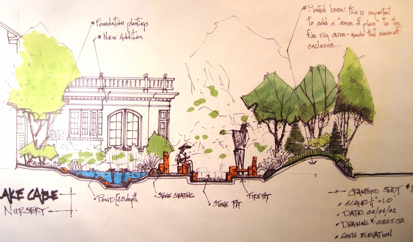
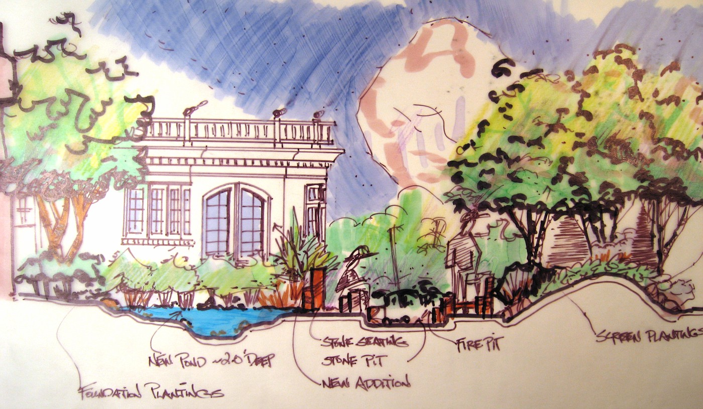
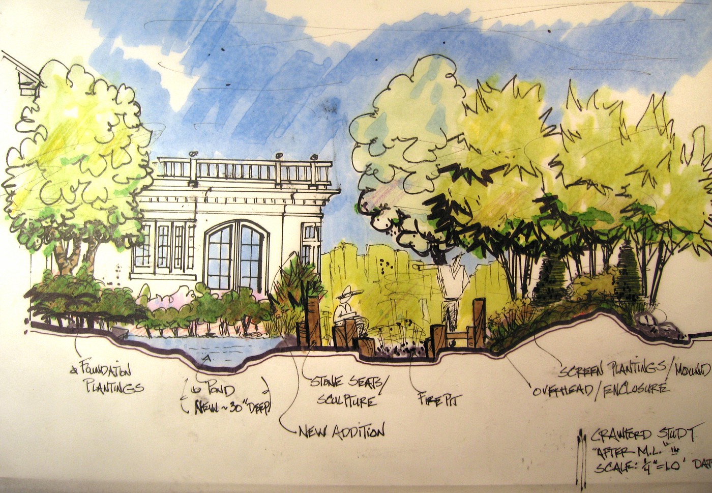
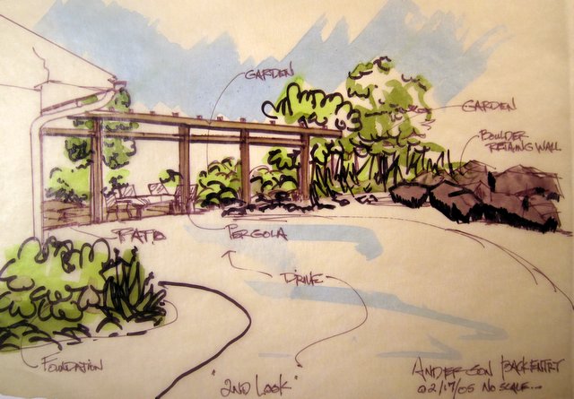
Evolution of Landscape Rendering Presentation

The original: shown to client

2nd Attempt: on trace, or as I like to say trash

Later attempt: evolved drawing style on Vellum

Thursday, November 09, 2006

Backyard Patio story continues.

Single water falls, and tan sandstone walkways
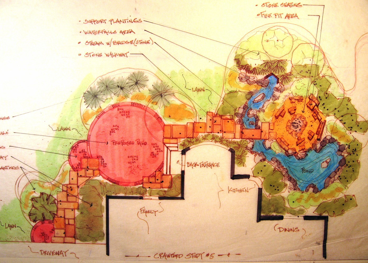
More on the previous post. This was the 1st plan view color drawing that was shown to clients. Take notice that in this conceptual drawing there is only one waterfall, and the walkway is tan in color. the homeowners looked at this drawing and were very impressed.

I then remember them . . . starting to study the drawing and going over ever detail. It was decided pretty quickly they didn't want brown sandstone for the walkway-they were positive about this.

2nd they were very concerned that the one falls would not make enough noise to screen out the eat of the neighborhood noise, and would only one waterfall be loud enough to hear in the kitchen, and breakfast nook.

Normally, I would just show them a different color of stone (actual stone piece), and take some overlay paper and draw the other falls in the hillside. That wasn't going to work here, they wanted to see another drawing (specifically the wife).

So, I called the contractor and said I had to do another drawing for the homeowners, for x amount of hours to do the work (which he hadn't agree to pay me for). He asked me if they were excited about the conceptuals and were they close to jumping in?

I said; heck yeah, they're ready! . . . .

So the previously posted drawing is what they looked at, and of course they jumped in, over original budget request . . . because it was everything they wanted, in a logical layout, and the best parts could be enjoyed/viewed from inside the house.

Color rendering of pond and fire ring
Along with the plan view rendering, I showed the clients this conceptual rendering of how this area would relate to the new kitchen addition.

The addition is shown only in black line. I was trying to present the landscaping to add to the backyard, which is why my stuff is in color. We needed to excite them about tha landscaping, Heck they had already agreed to add the kitchen-no need to promote that.

I did; however, have to show how the new landscape would relate and enhance the new space. This rendering does a much better job than anything I could have done on a plan view drawing.

This drawing was the deal-clincher for this side of the backyard. I basically laid this on the table and it was over. Let's go, let's put it in, we can't wait . . . those were the comments.

I've said this before, and will say it some more (hey, I'm a poet!), if you design hardscapes, structure, level transitions, etc . . . you must render. This is the only way to really communicate what you are trying to achieve to the client.

Has for this drawing, I'll have more on my evolution as a designer . . . tomorrow.

Tuesday, October 03, 2006

Conceptual Rendering, Waterfall

A Waterfall Rendering-selling stone.

 These 2 landscape renderings were drawn into my sketchbook on the job site. Normally thses days I make a few notes, shoot a lot of pictures, and just absorb the site. Then I go back and draw something up on the board to present to the client, during the conceptual meeting.

Here  . . . I drew up these 2 conceptuals right on site. My tools of choice for a on-site drawing are; a couple of Sharpie pens (different sizes), and one or two Chartpak markers, in this case  . . . just one . . .  a brown one. Now here's the interesting part about using minimal color.

What is the Focus  ???

Focus; as in, what am I trying to achieve in the renderings for the client. Here, the owner operates a retail stone yard. There focus is to sell stone, whether by wholesale or retail, but the focus is to sell stone. So when I do a drawing for someone like this. I'm going to promote how the stone will be displayed, and used . . . . promote the stone highlighting with a brown or gray marker.

Had this been for a retail nursery what color would I have used? Green, of course! I would want to help
promote the plant material and a way to highlight that plant material would have been the priority. 
The conceptual would have been slightly different, the stone not quite as prominent. 

Had this been for a private residence I would have used very little brown, a swipe or two of 
green, and a blue marker to highlight the water feature. The homeowner usually fixates on the water 
feature anyway, so that's where the focus need to be.

Let's review, for these conceptual on-site renderings . . . keep them fast, loose, un-specific. Keep color to a minimum highlighting the important stuff only. I can't emphasize this enough about highlighting . . . keep it
to a minimum, a touch of color will take you a long way.

Friday, September 22, 2006

Another great Link

 During the last week I had several folks stop by and drop comments on several different topics, this of course, leads you to look at their sites. One of those commenters was Alina Chau who is a illustrator and artist. And a artist she is.
 
I hope everyone takes a look at her site. Most importantly take a long look at her doodles and sketchbook
post. It shows great insight into the design process. Which every designer including yours truly needs to continually improve and adjust. They are terrific. Thanks Alina!

Someday I think I will have to host a seminar where we do nothing but lok at the design process, 
through the doodle, rough-sketch, sketchbooks, loose line way of graphic thinking. 
To my way of thinking this is where I see a lot of CAD Landscape Designers fail. 

They do no rough sketches, doodles, anything. Just straight to the layout of the house/property and right onto the landscape . . . probably having it look just like the last 10 designs. I've seen 
a lot of these designs from other LD's where it is just the same thing over and over.

At any rate go look at Alina's great work, very inspiring!!!

Saturday, September 16, 2006

From the Sketchbook

Waterfeature

 This was a black and white line drawing I had scanned from one of my idea books, and turned into a color drawing using Paintnet. I guess what I am really doing is using several different types of mediums now when I doodle.

I have often talked about how important it is to doodle if you are in a creative field or endeavor.Doodling switches me into a total different mindset, and I've noticed the more I doodle-or if my doodling gets real intense-a lot of ideas begin to flow, and flow fast they do.

What's really fun; especially when it's late . . . like right now as I post this. Is that the World seems so quiet I can go with that quiet for one kind of thought process/ solution finder, or I can go totally opposite. Put on the headphones, crank up the music, and let it just rip.

I have actually reached the point where I can watch my right arm draw-very weird to watch. It's like there is some sort of dis-attachment between mind and body. I guess it's what some would call  being in the zone. Heck-in my case it may be me out of the zone.

So I think that the doodling thing . . . is good.  for many reasons:

  • To kill time.
  • To start the creative process.
  • To warm up for actual rendering/design work.
  • To find solutions in a quick, stress-free way.
  • To aggravate teachers (yes I was one of those).
  • Work with different tools . . . as in no pressure to draw with the pen/marker that a final drawing will be completed with.
  • Impress people who can only draw stick men and circle trees . . .
So there you have it, get busy doodling, it's only 10 till 3:00 AM my time.

Thursday, September 14, 2006

Landscape Rendering, and Elevational Drawing

Never Built

This was a fairly quick rendering that I have pulled out of my archives. Its dated Fall, 2002. The drawing show the possibility of a gazebo that has a stream and falls wrapped around on a hillside.

I always thought the contractor of record did a poor job of selling this job and lost it to another contractor who put in something much less substantial for almost the same amount of money. Sour grapes on my part-maybe so.

Then again maybe I could have come up with a better set of drawings to help sell the project. I know that if I were to draw this today it would be at more of an angle to the gazebo, and there would be some color thrown in .

Saturday, September 09, 2006

Color Renderings and Plan View Conceptual

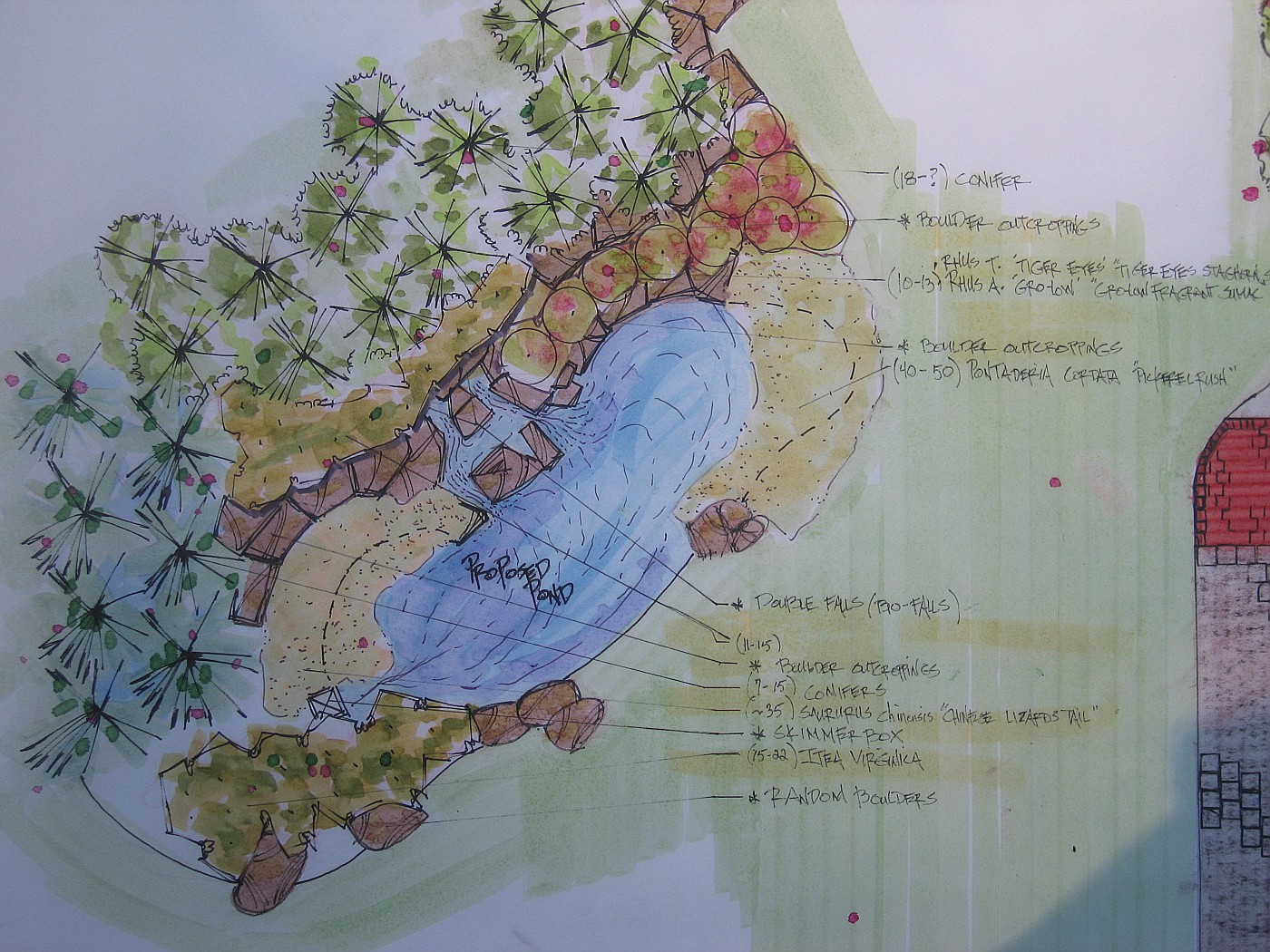
Plan view of the Pond


This shows the lagoon-pond area in plan view. The backdrop of the conifers, and some of the surrounding plant material, including the aquatics that flow from the pond out on the edges of the banks of the pond.

The drawing also shows the relationship of this area to the actual entryway, and the space involved for the area to flow together. The hillside for the falls will have to be made and the the backdrop of conifers will be added to sell the illusion of a natural waterfall.


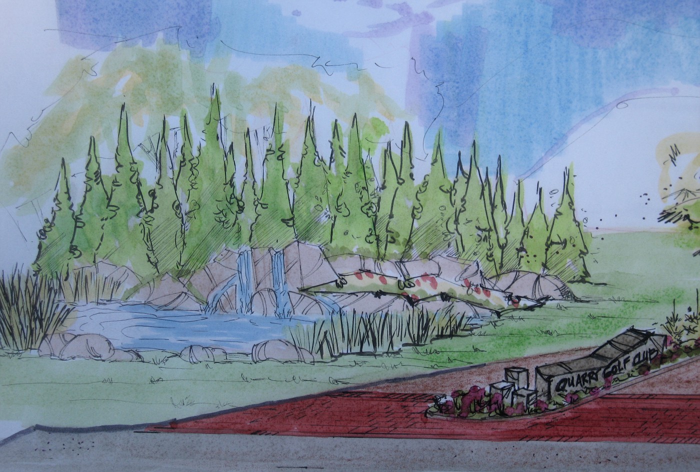
Rendering of Entry and Pond


This is the follow-up to the September 5th entry on the Blog. This is part of a larger drawing that will be shown to the clients to give them an idea of the entire picture for the possibilities on what the entrance could be.

The big difference in this drawing is to show a larger number of conifers for the backdrop. This was a specific client request after seeing the initial concept drawings for the entry.

Friday, September 08, 2006

Thoughts from Others.


"As soon as you talk to someone about an idea you have-they're going to dilute it."
-Leonardo DaVinci

"Go to the pine if you want to know the pine." -Basho

"A lie can travel halfway around the World, before truth can even tie its shoes."
-Mark Twain

Tuesday, September 05, 2006

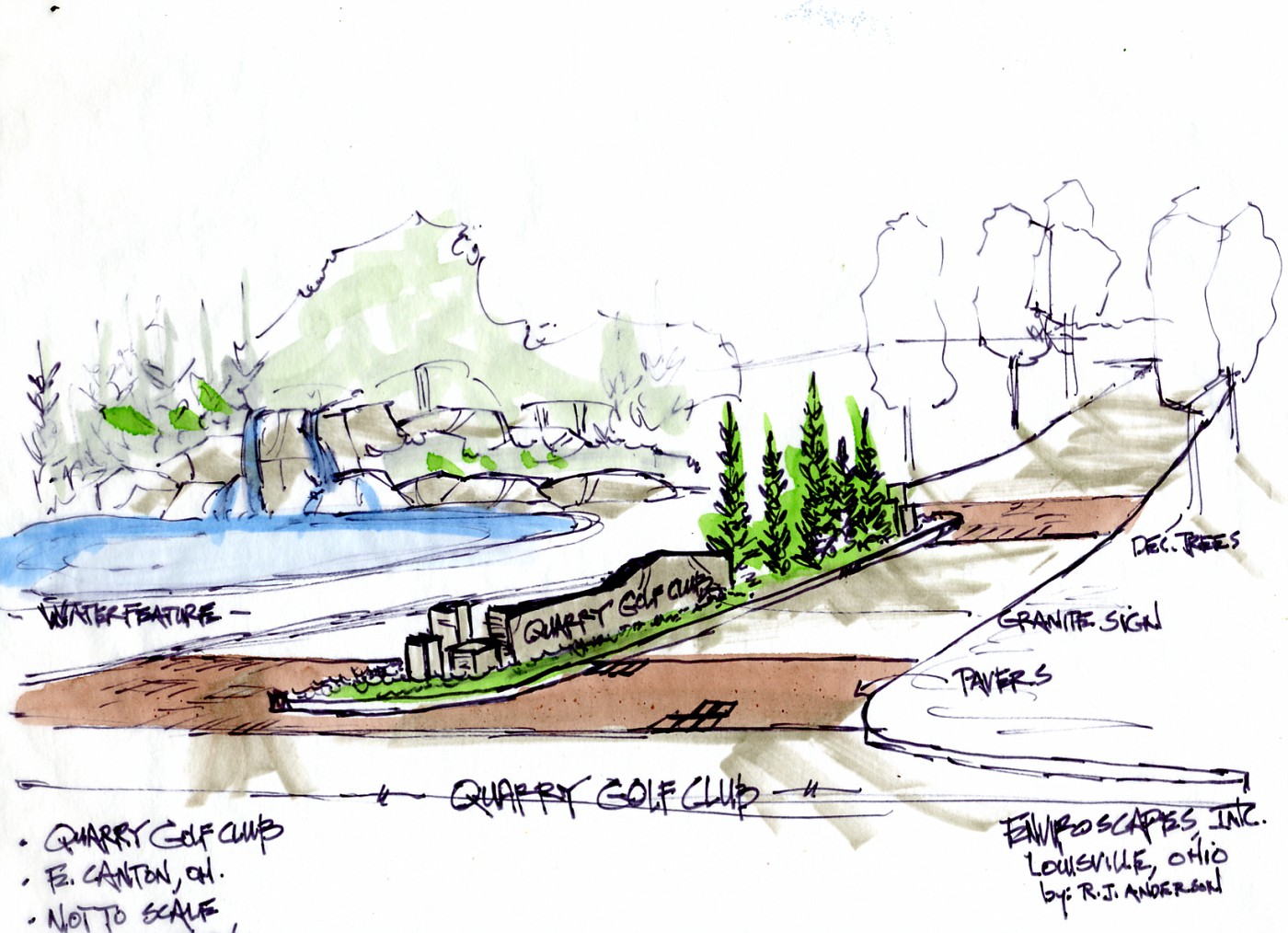
The Entryway

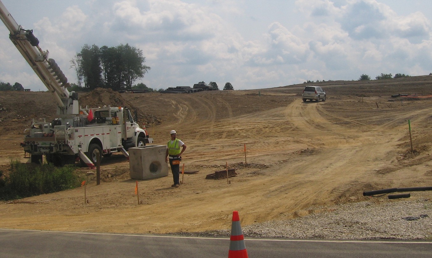
The Before Shot

The stakes in the middle of the drive are where I was told the island would be placed, plus I was given a Engineered drawing of how the lanes would be laid out and their dimensions.

I was asked to come up with a sign for the island and show how some of the surrounding landscape could possibly look.

The Rendering

 So this is the initial color rendering of what I see happening in this area. This has been shown to the client and I am re-working drawings right now to show where we are looking at possible final solutions. for the entryway.

A cnage in the apron, a slight change in the brick strips, an additional paving surface, and a fleshing out of the landscape along the way up the hill.

Friday, August 11, 2006

Curvilinear Design


This is a quick explanation of Curvilinear Design, this page has been used as a handout in some of my design courses and has also been thrown up on a screen to help me make a point during a discussion of the design process.

Curvilinear is one half of the design story. Formal, or some may say straight line, right angles, or Geometric. In another way of looking at this you could go Geometric vs. Curvilinear, or Formal vs. Informal. And this discussion could go on for hours.

Friday, May 19, 2006

Sketchbook Conceptuals

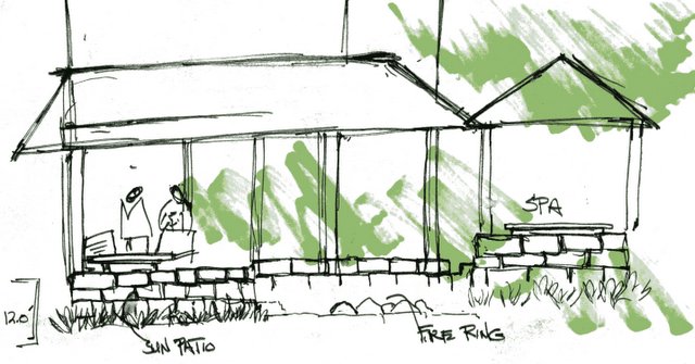
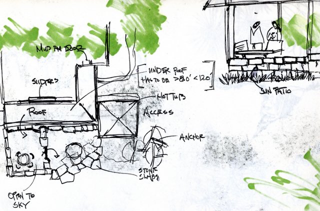
These are 3 quick study drawings of a project for a large living and playing space behind a two-story house addition. Overhead roof, 2 levels of patio space, a open area for a fire ring, and the other important spot-a step up into a spa.
Plan view and rendering on the same page of an 11x17 sketchbook. When the project becomes really complicated I invite the client along on the design process and will show them sketch ideas, scribbles on "trash" and any other thing to show them I was working through the problems on their desires to find a good solution.
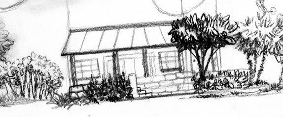
Another look in a charcoal pencil, quick, fast rough, dirty . . . this is my design process. This enables me to never bog down in details and work on the big picture, without seeing how the spaces relate to each other in a good way . . . it doesn't matter what color the begonia's are. Posted by Picasa

Wednesday, January 04, 2006

Quick Rendering . . . . .

This is an example of a fast conceptual sketch done over the top a a printed out image, taken with a digital camera. when done quickly like this I am trying to convey a sense of what this space has the potential to turn into.
What I try to show is the relationship of vertical elements, some of the greenery. and any other focal that might have some importance-in this case the boulders on the left.
I also will do several versions of the same scene and then pare that number down to no more than two-any more would be the cause of indecision. I feel that is the optimal number to show clients. Then let them pick the conceptual that best fits any vision they may have had. If they had no vision, then hopefully one of the choices will have stirred some interest.

Posted by Picasa

Wednesday, December 28, 2005

"Sketchbook"

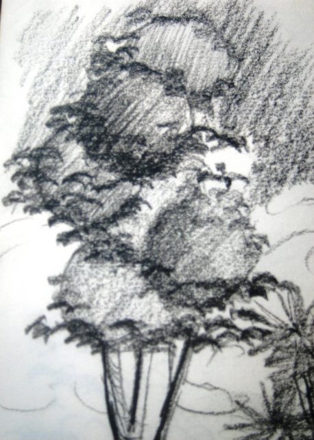
Just a little something out of my sketchbook, fooling around with different ways to draw trees. Starting out with circles, and then moving to a graphic symbol to give the feeling of leaves/motion in the tree. If I remember I did this with a charcoal pencil. Posted by Picasa